













- A FinTech brand extends into the product. Customers judge the company through its website, onboarding, transaction screens, notifications and support messages. Each interaction contributes to the same brand experience.
- Category conventions make FinTech brands look alike. Familiar colours, typography and language help customers recognise financial services, but companies still need a recognisable position and way of communicating.
- Brand identity needs shared rules. Positioning, messaging, terminology, visual elements and design systems give marketing, product, sales and support a common reference.
- The right brand changes with the business. Entering a new market, launching a product line or moving upmarket may require a different level of brand work, from updated messaging to a new identity.
- A rebrand has operational consequences. Product interfaces, legal entity names, customer communications and partner materials all need to reflect the change.
Brief overview of what this guide covers:
- What an identity includes beyond the logo
- Why FinTech brands look alike, and which conventions to keep
- Where customers decide whether to trust you
- How to build an identity in 4 stages
- How to decide what to change when the business moves on
We draw on more than 8 years of FinTech projects under Goodface Agency, continued since 2026 at Goodface FinTech Firm.
What a FinTech brand identity really means
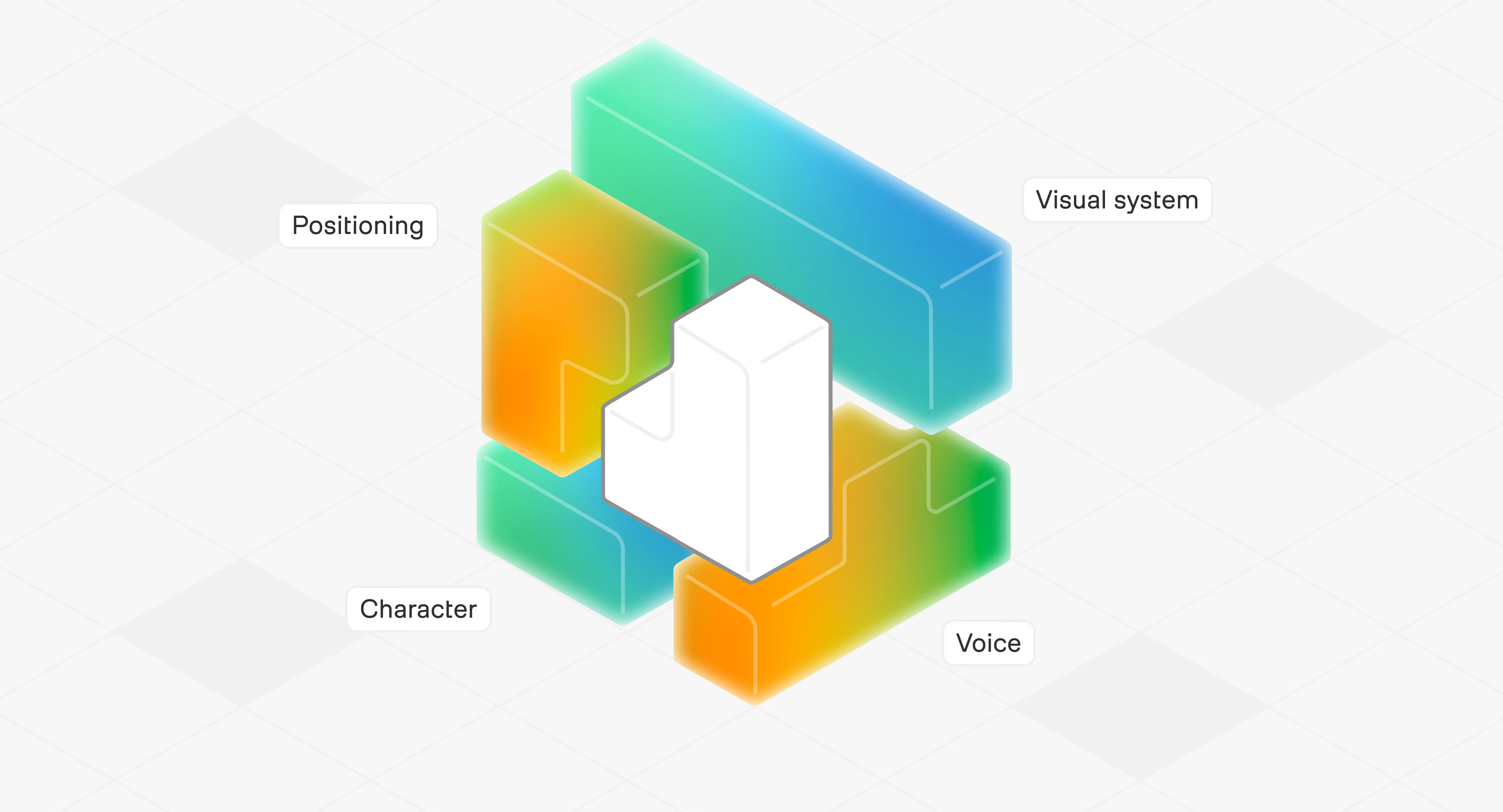
A FinTech brand identity is the set of decisions about how a company presents itself—positioning, character, voice, and visual system—plus the rules that keep those decisions consistent wherever customers meet it, including the product.
Identity and image are different things. In Jean-Noël Kapferer's terms:
- Identity is what the company decides to be.
- Image is what customers conclude from everything they encounter.
A company with a working product already has an image, even if it has never invested in branding.
That image does not stay with existing customers. It resets at the start of the next customer's journey, in referrals, reviews, and whatever a prospect heard before the first call.
Brand work starts by understanding the image customers already have, then defining the identity the company wants to build.
In FinTech, the product is one of the most important places where customers experience the brand.
The brand makes promises, but the product either keeps or breaks them. In FinTech, that gap can affect more than customer perception, influencing retention, referrals, and a prospect's willingness to consider the company. The link runs in both directions:
- The product has to reflect the brand. Before choosing, customers meet the brand through positioning, the website, and the sales deck. After choosing, they meet it in the product. If the product's words, visuals, and behaviour differ from what marketing showed, customers conclude that the promise was only marketing.
- The brand has to reflect the product. A brand that promises more than the product delivers (for example, advertising "instant" payments when settlement takes until the next day) makes the gap between promise and experience impossible to ignore.
Why FinTech brands tend to look alike
FinTech brands often look alike because most of them borrow the same visual signals of stability from banking:
- Blue and grey palettes
- Geometric sans-serif type
- Abstract lines suggesting speed or connection
- The same three claims: fast, secure, simple

Why it happens
Many FinTech teams gravitate towards brand archetypes associated with competence and authority, such as the Sage or the Ruler. These often translate into restrained visual choices: cool colours, geometric typography and familiar financial imagery. When too many companies make the same choices, the category starts to look alike.
Why the convention is useful
Raymond Loewy's MAYA principle — "Most Advanced Yet Acceptable" — offers a useful way to think about this balance. It suggests that innovation is easier to accept when it retains some recognisable features of what people already know. For a payments brand, this means introducing a distinctive visual identity without removing every familiar signal of a financial service. If the brand looks unlike anything buyers associate with handling money, they may need to work harder to understand what the company does and whether it feels credible.
What it costs
When providers share the same visual codes and make the same claims, buyers have fewer reasons to distinguish between them beyond price and features. In B2B, this makes it harder for a company to earn a place on an enterprise shortlist. Meanwhile, the sales team has to do more work to explain why its offer is different.
How distinctive elements start
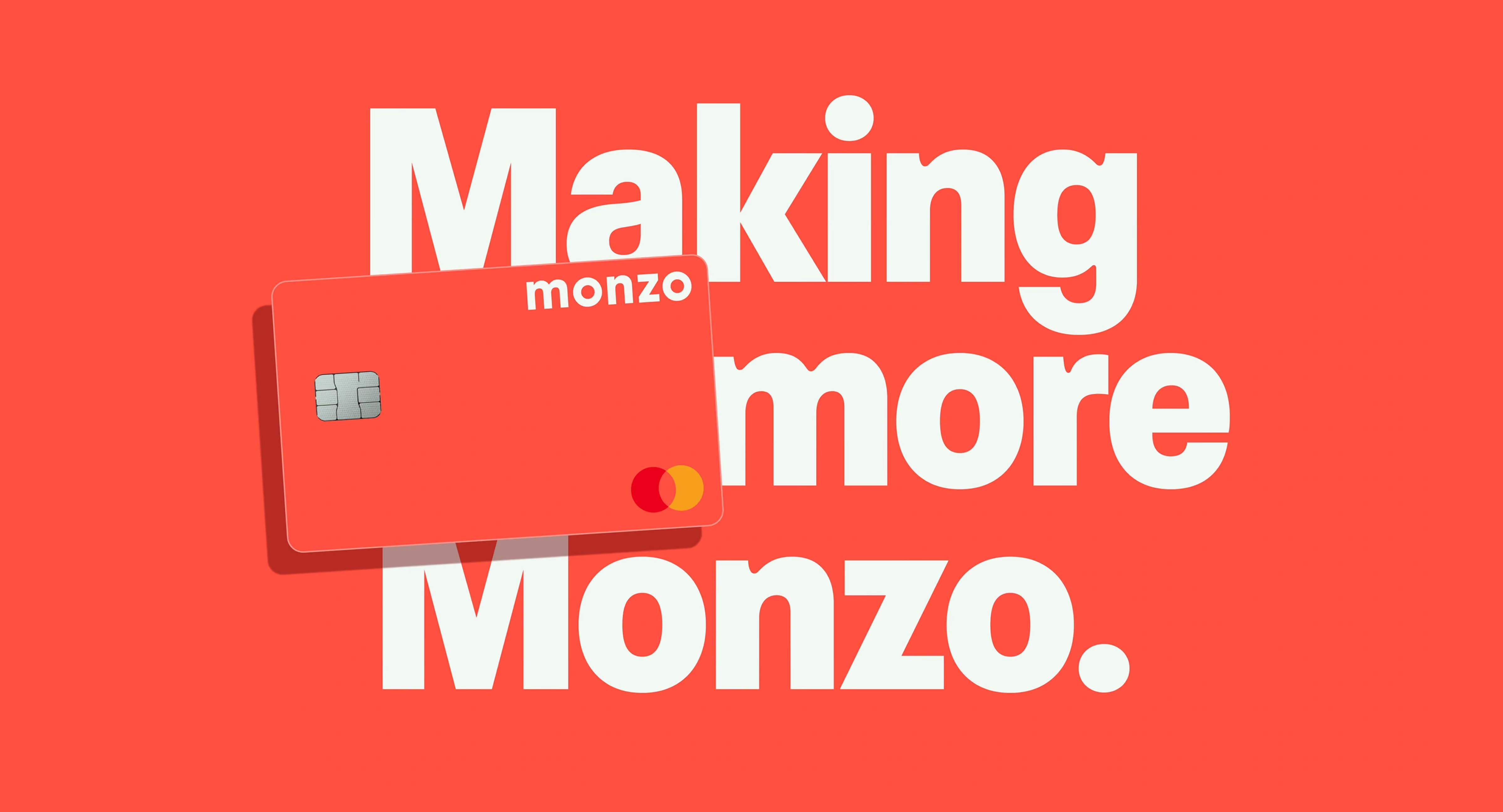
Monzo’s hot coral card began with a practical design decision. The team tested several neon colours with friends and early investors, and hot coral emerged as the clear favourite. The colour later became a distinctive brand asset: Monzo built its meaning around warmth, empathy and a more human approach to banking. What began as an experimental choice was reinforced through customer response and developed into a recognisable part of the brand.
Breaking the category code on purpose
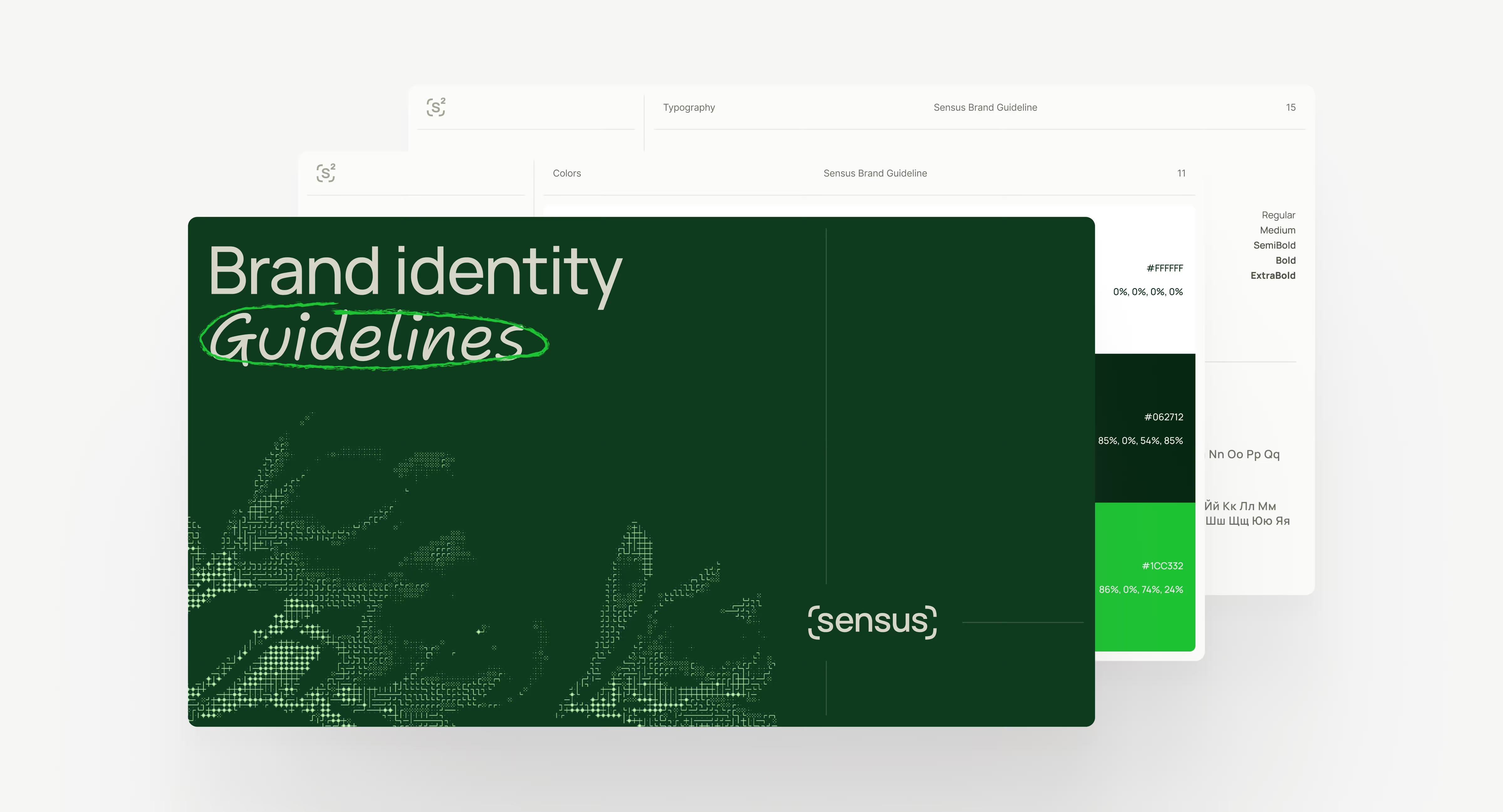
Payment infrastructure brands often share dark interfaces, abstract technology graphics, and infrastructure-first messaging. When Sensus, a white-label payment orchestration platform, prepared to enter a new market, our team built its visual identity around a "Smart & Simple" concept. Natural colours, custom typography and subtle illustrations made the brand more approachable, while the website introduced the platform's technical capabilities step by step.
A rule for FinTech brand identity. Keep the signals that help buyers assess credibility: legible numbers, clear regulatory information, and a considered approach to communicating about money.
Differentiate where buyers compare providers: in your positioning, point of view, language, and the way your product explains its value.
Where customers decide whether to trust a FinTech brand
Customers test a FinTech brand at every stage of the relationship, and their questions change as they go. Marketing owns the first stage. The next 2 belong mostly to product, compliance, operations, and support.
What customers experience in the last 2 stages returns to the first one as reputation: reviews, referrals, and what a prospect heard before the first sales call. A brand that only marketing applies ends up competing with its own customers' stories.
Verbal identity carries much of the weight here
Any company can call itself secure. A licence is a fact the customer can check: "Authorised by the Financial Conduct Authority as an electronic money institution", with the firm reference number and a link to the FCA register, gives a buyer something to verify. Wording about regulatory status needs approval from your compliance team before it goes live.
In the UK, clear communication is also a regulatory expectation. Since 31 July 2023, the FCA's Consumer Duty has required firms to support retail customers' understanding through their communications, and the regulator expects firms to test those communications (FCA Handbook, PRIN 2A.5). For a consumer FinTech, the brand voice and the compliance requirement now point in the same direction.
The signals change with the buyer
A head of payments evaluating infrastructure looks for licences in each market, uptime history, documentation quality, and how quickly sales engineers answer technical questions. A consumer opening a current account looks at the card, the notifications, and how fast support replies. Both are brand experiences; they need different evidence.
For marketing, the difficulty is authority
The team responsible for the brand rarely approves a verification screen or an account-hold notice. Brand decisions reach beyond marketing's remit through 3 shared tools:
- A glossary that product, support, and compliance use when they write
- A design system that product teams build with, so brand decisions arrive as components
- A joint review of high-stakes messages, such as fee changes, holds and rejections, before they go live
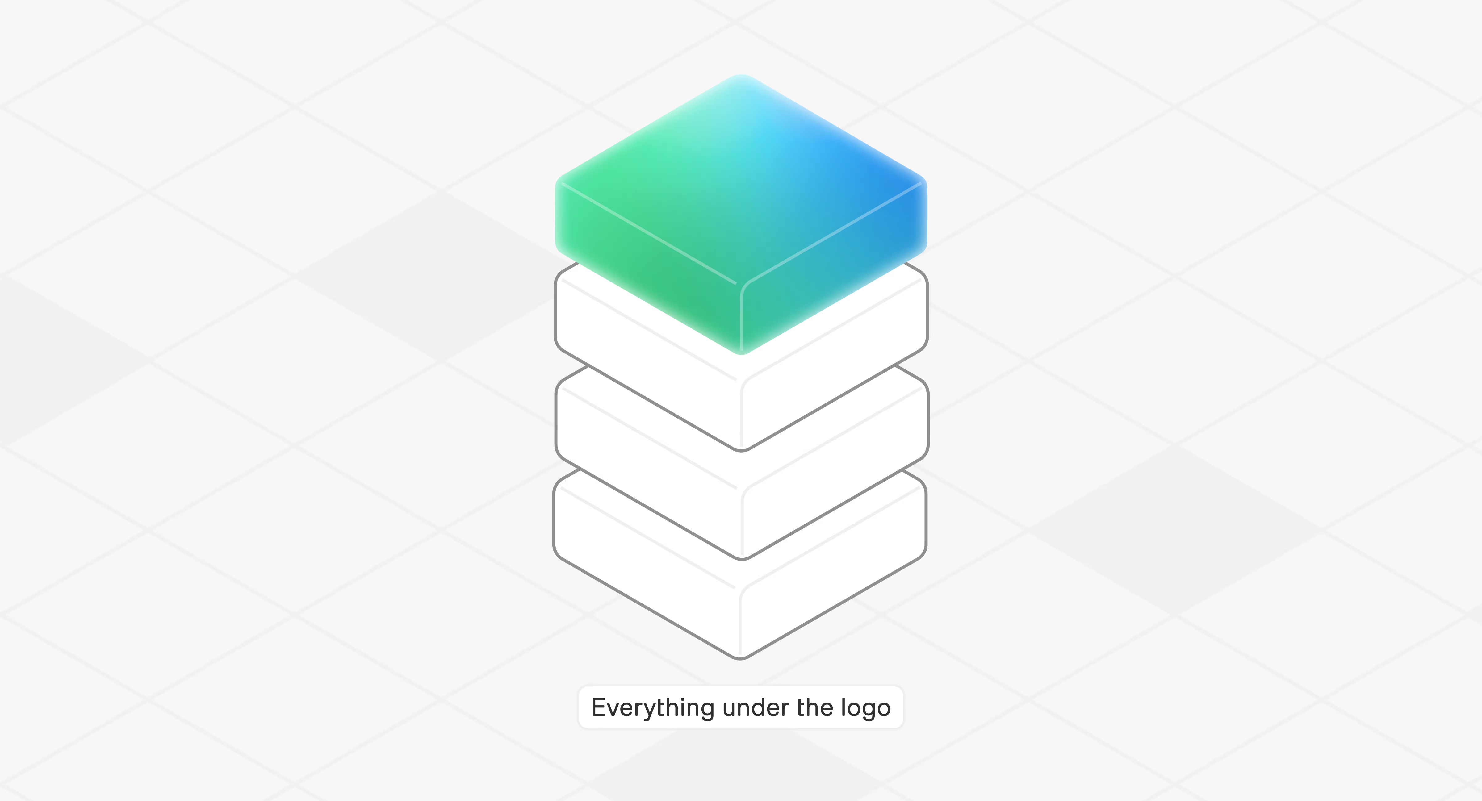
What should a FinTech brand identity include?
Positioning
Brand strategy starts with clear positioning. In FinTech, a buyer's alternatives aren’t limited to competing providers. For a B2B payments company, it may include staying with an existing bank, building the capability in-house, or ignoring the problem as acceptable. Positioning needs to explain why changing the current solution is worth the effort and risk, apart from why you’re different from others.
When positioning is unresolved, the design team ends up making strategic decisions by choosing visuals. A debate about whether the brand should feel "premium" or "accessible" is usually a positioning question no one has answered.
Character and archetype
Brand character describes how a company behaves: what it notices, how direct it is and how it treats uncertainty. Archetypes can be used as a working tool to define that character, often by combining a dominant archetype with a supporting one. The value is not in choosing a label, but in agreeing on how the brand should behave across different situations.
The practical value shows in disagreements. When marketing wants a bolder headline, and compliance wants a caveat, an agreed character tells both teams how the brand behaves in that situation. Treat the archetype as a starting point: a Sage brand built only from the archetype checklist ends up in the same blue as everyone else.
Voice, terminology, and messaging
Voice sets how the brand sounds. Messaging sets what it says to each audience at each stage. FinTech brands need a third piece most guides skip: a glossary. Each fee, product, account type, and action gets one name, used on the website, in the app, in support macros, and in the sales deck. A glossary costs little to produce and stops the same fee from appearing under 3 different names on the website, in the app, and on the invoice.
Visual identity
Visual identity encompasses the elements customers recognize a brand by: the logo, colors, typography, and the design system that carries them into the product. In FinTech, it serves a functional purpose because customers use it to read amounts, statuses, and warnings, such as an emotional purpose, reflecting brand evolution from point A to point B.
Visual identity covers the elements customers recognise a brand by: the logo, colours, typography and the design system that carries them into the product. In FinTech, it serves a functional purpose because customers use it to read amounts, statuses and warnings.
1. Logo design
A FinTech logo has to work at different sizes and across touchpoints most brands never face: an app icon, the front of a payment card, a partner's checkout under "powered by", a dark-mode dashboard and a one-time-passcode SMS sender name. Infrastructure brands also appear next to their clients' brands, so the logo has to sit beside another company's identity without competing with it.
2. Colour palette
In FinTech, functional colours belong to the brand. Green for a completed payment, amber for pending, and red for a failed transfer or negative balance carry meaning customers act on. If the primary brand colour is red, decide early how an error will look, so customers do not read every branded screen as a warning.
Contrast is part of the same decision. Starling Bank has said its redesigned cards meet the AAA colour contrast standard.
3. Typography
Financial interfaces show more numbers than most products, so the typeface has to handle them. Check that zero and the capital letter O are easy to tell apart, as are 1, l and I, and that the font offers tabular figures so amounts line up in statements. When Starling Bank changed its font, it explained the choice by the need to distinguish "O" from "0" in account numbers and transaction details.
4. Design system
A design system turns the visual identity into rules that product and marketing teams build with:
- Design tokens for colour, type, and spacing, shared by the website and the app
- Components for the screens where trust is tested: amount fields, status labels, verification steps and error messages
- Usage rules that explain when each component applies, so new screens follow the brand without a design review each time
Without a design system, the product team rebuilds the brand screen by screen, and the result drifts from the guidelines within a few releases.


How verbal and visual signals work together
Customers read words, visuals, and product behaviour together. When these contradict each other, customers believe the less flattering one:
- A cheerful illustration on a screen announcing an account freeze reads as indifference.
- A legal template under a playful brand looks like the company stops being on the customer's side.
In FinTech, non-verbal brand signals also come from how the product behaves: how quickly a confirmation appears, how a pending payment is explained, and whether an error tells the customer what happened and what to do next. Define how the brand should communicate in high-stakes situations such as fee changes, account restrictions, declined transactions and service outages. The tone may become quieter and more precise, but it should remain recognisably consistent with the brand.
The product layer and design system
A design system provides the rules for applying a brand across digital products. But consistency is not the end goal. What matters is how those rules shape the experience: how customers navigate the product, understand information, and respond to important moments. This is where the brand moves beyond visual identity and becomes part of the product itself.
One example from our practice — Orbital
Orbital, a financial services ecosystem for global B2B clients, shows the cost of waiting too long. The company had grown into an international player while its brand and website still reflected an earlier stage. The challenge was to bring the experience up to the level of the business without discarding the recognition the existing identity had built. Our team modernised the existing identity instead of replacing it and built a design system Orbital's teams use for presentations, campaigns and product pages.
The brand reached the product through 2 decisions:
- Navigation follows how enterprise clients evaluate providers: by industry, service and capability, rather than the company's internal structure.
- The same logic reaches internal tools: our team redesigned the interfaces Orbital uses to work with large financial datasets.
Guidelines and rules for change
Brand guidelines describe how to use every element above, with examples for each touchpoint: a website section, a sales slide, a support reply or an error message. They also need a clear owner responsible for coordinating and approving updates — from a new product name to an additional colour — and ensuring that changes reach marketing, sales, product and support teams at the same time. Without that process, guidelines can quickly become outdated as the business introduces new product lines.
How to create a FinTech brand identity
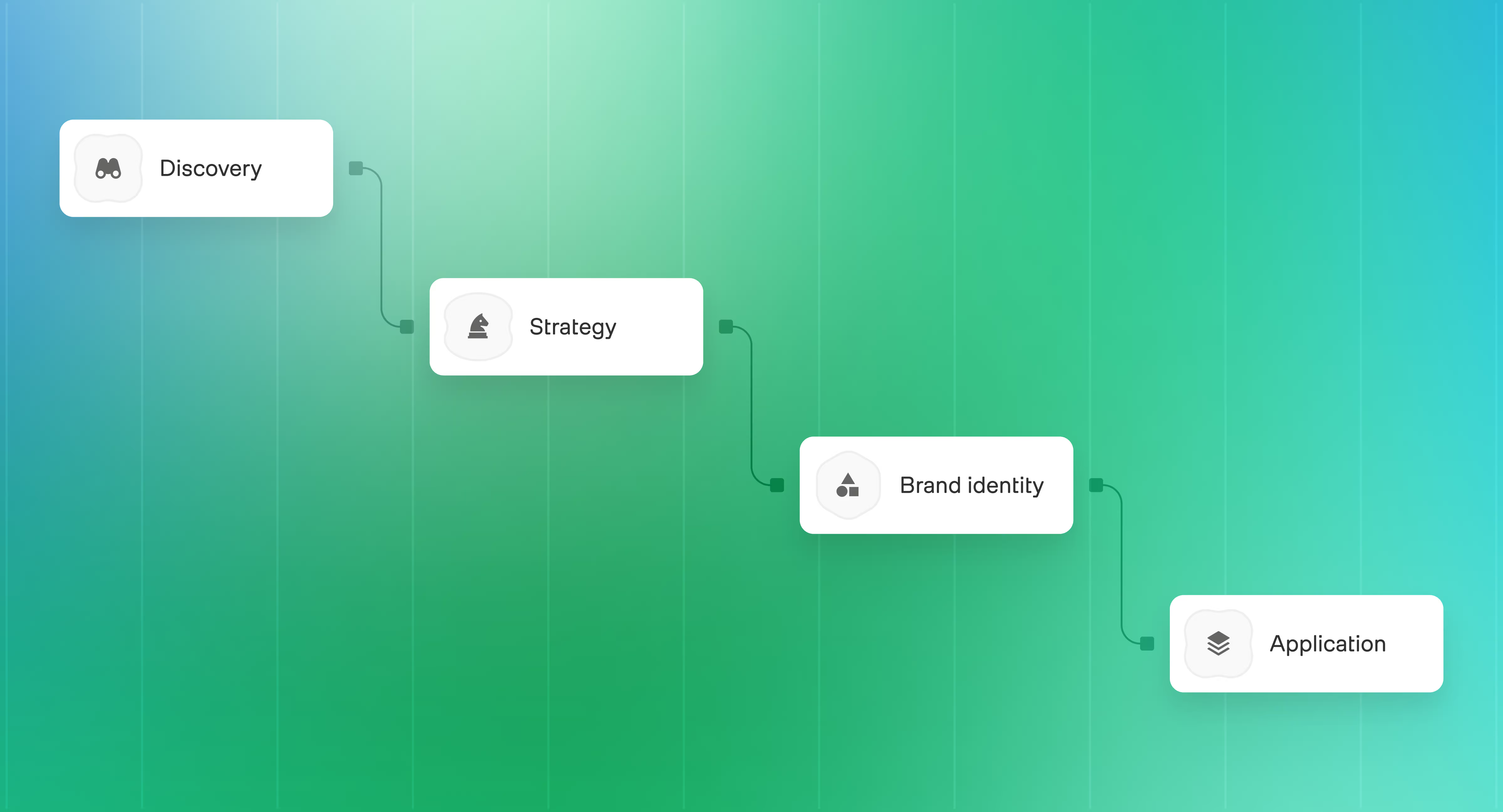
1. Discovery: what do customers and the market believe now?
The team audits the current brand, maps competitors and the wider set of alternatives, and interviews stakeholders and customers. The most useful questions are about recent behaviour:
- why customers chose you,
- what they compared you with,
- and where they nearly gave up.
Sales call notes, lost-deal reasons, and support tickets about fees often show the gap between the intended brand and the image faster than a survey does. They can also show where prospects struggle to understand the offer, what weakens confidence during evaluation, and which parts of the customer experience create friction after the sale.
A common mistake is skipping this stage because "we know our customers". Founders often know the people who adopted the product early, but the company may now be trying to reach a different segment, enter a new market or move upmarket. The assumptions that worked at the beginning may no longer be enough.
In a rebrand, Discovery also decides what to keep: the names, colours and phrases customers already recognise and use when they recommend you.
2. Strategy: what should the brand stand for?
The team defines the brand positioning, value proposition, messaging, archetype and tone of voice. The output is a written direction the decision-makers agree on before anyone designs a logo. A design review then has criteria: does this option express the direction we agreed on?
3. Brand identity development: how does the direction look and sound?
The team builds the logo system, visual identity, brand guidelines, asset library, and the design system that connects brand and product. Test the identity on the touchpoints where trust is decided: a fee breakdown, an identity check, an error message, a sales deck slide. A mood board shows how a brand feels; a failed-payment screen shows whether it holds up. Your legal and compliance team reviews claims and disclosures at this stage, before launch.
4. Application: does the brand work across every touchpoint?
The team applies the identity to the website, product, sales materials, campaigns, and customer communications, and plans the rollout. For a rebrand, the rollout plan also covers:
- What existing customers will notice, and when and where they will learn about it
- Legal entity names, licence and register records, app store listings and the name customers see on bank statements
- The order of change, so customers do not encounter the new brand on the website and the old one in the product for longer than planned
When a FinTech brand needs to change
A FinTech brand usually needs to change when the business has changed more than the brand. This happens when a company enters a new market, expands its product portfolio, targets a different audience, or changes its business model.
The change does not have to be a full rebrand. We look at it in 3 levels:
- Uncover. The business is in good shape, but the brand undersells it. The team researches why customers choose the company and changes how it explains the offer, often keeping the visual identity.
- Upgrade. The team keeps the elements customers recognise and trust, while updating messaging, the visual system and the product experience where needed.
- Rebuild. The business model, audience, or offer has changed significantly so the brand needs a new foundation: positioning and architecture, then new messaging and identity.
The TransferWise rename shows an upgrade
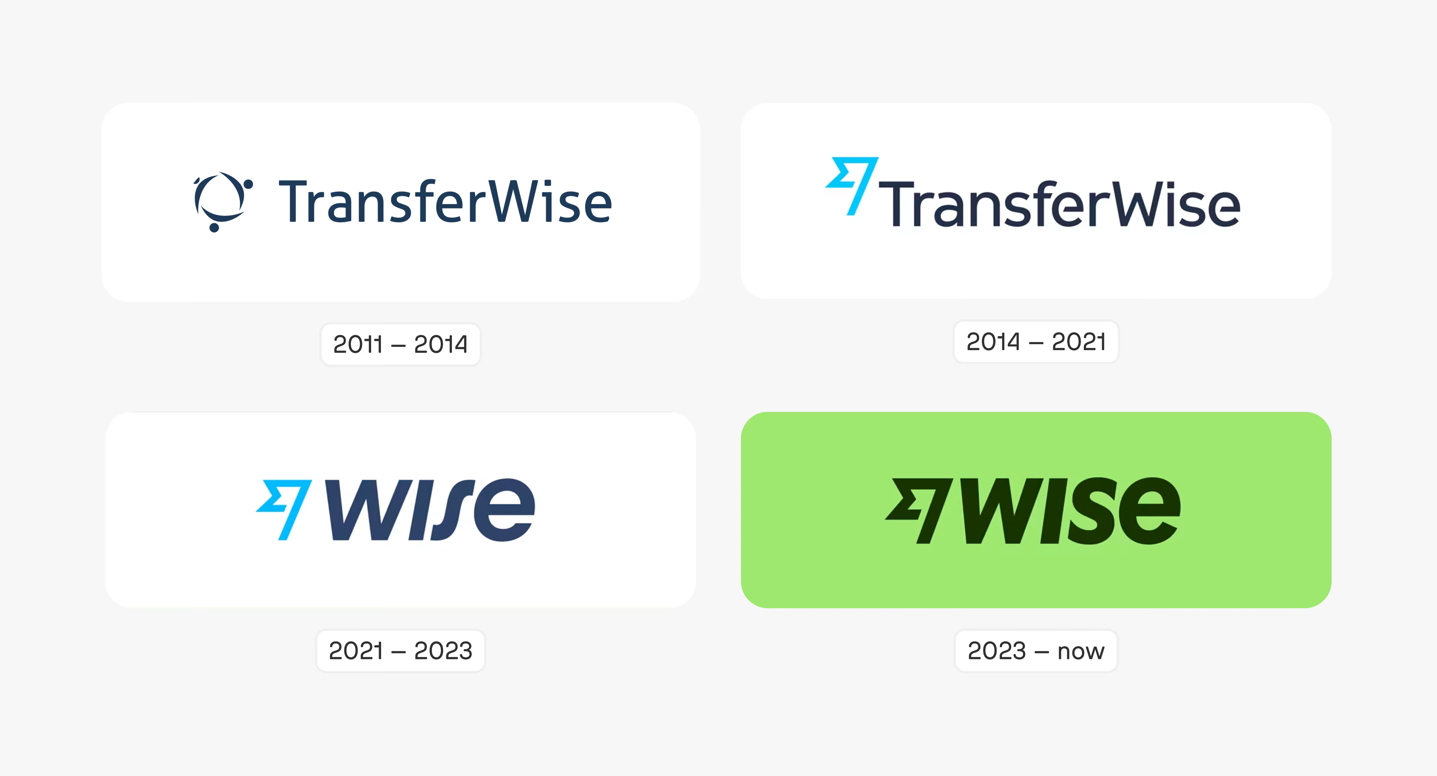
In February 2021, TransferWise renamed itself Wise. Its CEO, Kristo Käärmann, said the business had outgrown its original goal of making international transfers cheaper (FinTech Global). The change removed the word that tied the brand to a single service, while keeping the name Wise.
The same rename shows what a FinTech rebrand involves beyond design. A member of the Wise brand team described changing legal entity names in several jurisdictions and informing regulators in every country where the company operated (Fintech R&R interview). For a regulated company, the rollout plan needs the legal and compliance teams from the start.
A rename also creates a window for fraud. When TransferWise became Wise, the company warned customers that scammers might use the change to impersonate it (Wise). A rebrand rollout should therefore explain how customers can recognise genuine communications and what the company will never ask them to do.
Goodface FinTech Firm projects show how an Upgrade and a Rebuild differ in practice
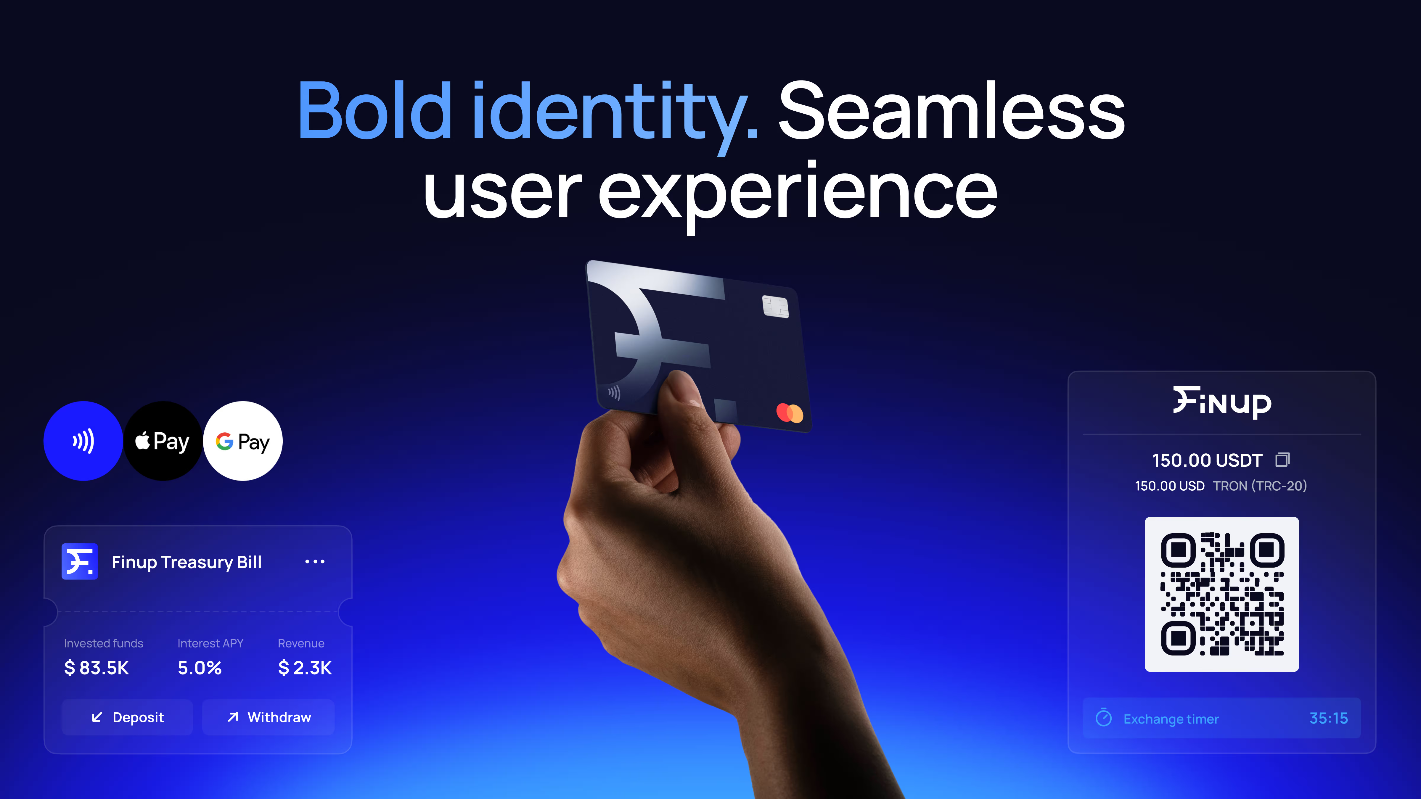
FinUp
A virtual card platform for fiat and crypto spending had a working product, recognition in its home market, and a brand that still looked regional. Our team kept the elements that carried that recognition and built a stronger system around them across the logo, payment cards, product interface, and website. Looking back, we would agree on a keep-or-change list at the very start: deciding during the project which parts still represented the company meant revisiting choices that an early framework would have settled.
Magnetiq Bank
Expansion into new countries called for a new name, visual identity, design system, and website. The bank's marketing team defined the name and positioning; our team translated them into the logo, identity, guidelines, design system, and a website that explains products to B2B clients before the first sales conversation. Before the rebrand, staff used different design templates, so the component library also had to change how teams produced day-to-day materials. The logo and identity received a Red Dot Award in 2025.
Why a new logo is not a new brand
A new logo changes how the company looks where customers first discover it. A rebrand changes what customers understand and experience across the whole relationship:
- Positioning and messaging: who the company serves and how it explains its value
- Brand architecture: how products, plans, and features are named and related
- The product layer: interface patterns, functional colours, the words in flows and notifications
- Operational details: legal entity names, licence records, app store listings, email senders and statement descriptors
When only the logo changes, customers meet the new look on the website and the old company everywhere else, which is the inconsistency the rebrand was meant to remove.
What a rebrand changes in the first months and the following years
Neither column contains a revenue figure, deliberately. A rebrand changes what customers understand. What they do next also depends on price, product, and timing, which the section on what branding cannot fix covers below.
The right depth depends on what the company is doing:
FinTech brand identity vs traditional financial branding
Traditional financial brands earn trust through age, scale and physical presence; FinTech brands have to earn it through how the product behaves and how openly the company explains itself.
The 2 groups now meet in the middle. Banks building digital products face the opposite problem to start-ups: they already hold trust, and they need the new product to feel new without disowning the parent brand.
A FinTech moving upmarket needs the reverse: enough established signals to sit on an enterprise buyer's shortlist, without losing the clarity that won its first customers.
What branding cannot fix
A brand identity makes a company's strengths and constraints easier to understand; it cannot remove the constraints. Before starting brand work, check whether the problem sits somewhere else:
- The price is uncompetitive. Clearer fee communication can help customers understand what they are paying for. But if the price is higher than the alternatives and the customer sees no additional value to justify it, branding will only make a weak proposition easier to recognise.
- Regulation sets the friction. Identity checks and transaction monitoring are required. Good copy and design can explain why a step exists and how long it takes; they cannot skip it.
- The product is unreliable. Customers who experience repeated outages or failed payments will judge the brand by those failures, however consistent the visual identity is.
- The business has not chosen a direction. If the company has not decided which customers it serves first, a new identity will express that indecision in a new typeface.
Measurement has limits too. A rebrand usually launches alongside other changes, so a rise in conversion or a shorter sales cycle rarely has one cause. Agree before launch on which signals you will watch, such as onboarding completion, support tickets about fees, questions prospects ask on sales calls, win or loss notes, and what else changed in the same period.
Where to start
Start where trust is tested after the sale: verification, the first transaction, fee changes, holds, and support replies. Collect what customers see there, put it next to your homepage and your sales deck, and ask one question: would a customer believe these came from the same company? The gaps will show whether you need clearer messaging, a shared glossary, a more consistent design system or a broader review of your brand strategy.
Sources
- Kapferer, J.-N. (2012). The New Strategic Brand Management. London: Kogan Page.
- Monzo community: Hugo Cornejo on the hot coral card
- Monzo community: visual brand refresh Q&A
- FCA Handbook, PRIN 2A.5: Consumer Duty, consumer understanding
- FinTech Global: TransferWise rebrands to Wise
- Fintech R&R: interview on the TransferWise to Wise rebrand
- Wise: New look, same old Wise