











.avif)
- Revolut borrows Instagram Stories' swipeable format for in-app education, keeping a 40+ feature super-app legible via a customizable home screen.
- Klarna's checkout copy "Pay in 3 × €29.67" restructures how users perceive cost — a single-line behavioral design decision.
- Wise publishes fee comparisons showing when competitors are cheaper than Wise itself, making radical transparency its entire UX strategy.
- Flatpay went from 0 to €1.5B in 3 years on word-of-mouth alone by making one flat, upfront fee its whole brand.
- Trustly's checkout shows the user's own bank's login screen instead of a Trustly-branded one, borrowing trust from an institution users already rely on.
- Mambu treats API docs as brand surface — for engineers evaluating infrastructure, a badly named endpoint is a trust deficit.
Most fintech products look the same — clean dashboards, soft gradients, promises of control. Yet when it comes to actually trusting them with money, most users hesitate. Because trust in FinTech happens in the first few seconds of opening the interface.
European FinTech has produced some of the most recognisable financial products of the last decade. Digital banks, payment platforms, accounting tools, and financial infrastructure companies now serve millions of people and businesses across very different markets.
Their products also face a similar design problem: financial software gets complicated quickly. More accounts, payment methods, integrations, regulations, and data all have to fit into experiences that people still need to understand at a glance.
That makes the design choices behind these products worth looking at.
Below are 15 European FinTech unicorns across digital banking, payments, and financial SaaS. We are not ranking them. We picked them because each one takes a different approach to a familiar product-design problem.
This article was prepared by the Goodface FinTech firm and draws on our experience designing FinTech products used by millions of users globally. We’re a FinTech product design and development agency that helps companies reach their next growth milestone.
Note: This is our list, not a competition or ranking.
Top FinTech unicorns list
Digital Banking Unicorns
- Revolut — Multi-product digital bank serving consumers and SMEs across Europe
- Starling Bank — UK-based profitable digital bank with strong SME lending presence
- N26 — German-licensed mobile-first retail bank
- monobank — Ukrainian mobile-only retail banking platform
- Qonto — SME-focused digital banking and financial management platform
Payment Orchestration Unicorns
- Klarna — BNPL and merchant checkout infrastructure network
- Checkout — Enterprise-grade cloud payment processing and orchestration platform
- Wise — Cross-border payment and multi-currency financial infrastructure
- Adyen — Global unified commerce and payment acquiring platform
- Trustly — Open banking-powered account-to-account payment network
- Flatpay — Integrated payment terminals and processing for European SMBs
FinTech SaaS & Accounting Unicorns
- Pennylane — Accounting and financial management SaaS for SMBs and firms
- DataSnipper — AI-powered audit automation platform built into Excel
- Pigment — Enterprise performance management and financial planning SaaS
- Mambu — SaaS cloud banking platform
Digital banking unicorns
Revolut — Making a dense product feel personal
You open Revolut, and nothing feels crowded — which is remarkable for a product with 40+ features.
.avif)
The brand is monochrome authority: black, white, one electric accent.
The UX move nobody talks about enough: borrowing the Instagram Stories swipeable card format to explain banking concepts inline. New feature? A story. Spending insight? A story. Full-screen, 5 seconds, one CTA. Banking education that doesn't feel like banking education.
Pair that with a customizable home screen where users surface only what they use, and a 40-feature super-app stops feeling overwhelming. That's UX design working at the level of perception
Starling Bank — The rebrand that proved "calm" is a strategy
.avif)
Starling Bank redesigned its typography to make sure you never confuse “O” and “0.” In finance, small details like that build trust.
The same thinking appears in Spaces, where they split savings into clearly separated buckets with names and progress indicators.
Make things impossible to misread — whether it’s a letter or your money.
N26 — The bank that made onboarding the product
%2B1.avif)
N26 leans into a strict, modern visual system: clean typography, lots of empty space, and no decorative elements like mascots or illustrations. The result is a consistent, almost architectural interface — every screen follows the same logic. That restraint does the work. At scale, consistency reads as reliability.
The physical card reinforces the same idea. Its matte finish, weight, and distinct appearance extend the product experience beyond the app — a tangible signal of premium status that doesn’t need in-app labels or notifications.
Together, the product and the physical object carry the same message:
Clarity and discipline as the brand.
monobank — Ukraine's unicorn built on a cat and a 4.9 rating
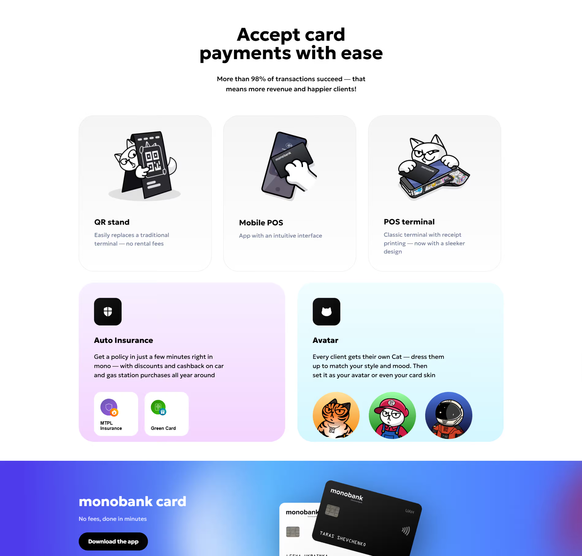
monobank took a very different route from the restrained visual language of many European digital banks. Its cat mascot, playful interface details, and distinctive payment sounds gave the product a recognizable personality from the start.
The cat also became part of the referral experience, while the payment sounds created another small point of recognition.
That makes the example particularly interesting from a product-design perspective. Brand identity does not always sit around the interface. Sometimes it becomes one of the things users experience while completing everyday tasks.
Qonto — Looks like Figma, works like a bank
.avif)
Qonto brings banking, payments, invoicing, credit, and other financial tools into one business account. Its website makes that breadth easy to scan by breaking the offer into distinct visual modules.
Each card focuses on one part of the product, with a short explanation supported by either product UI or photography. The dark interface keeps the overall system consistent while allowing each module to have its own visual treatment.
For a product with a lot to offer, the structure does much of the explaining.

Payment Orchestration Unicorns
Klarna — Making financial information easier to read at checkout
.avif)
Before 2017, pink was essentially absent from FinTech — Klarna's introduction of Klarna Pink was a calculated rejection of blues and navies, psychologically precise: approachable and non-threatening for a service trying to make credit feel less intimidating.
The 2024 refresh, built entirely in-house with typefaces by Colophon Foundry, locked "curiously bold" as the guiding personality — straight-talking clarity balanced with playful confidence.
At checkout, "Pay in 3 × €29.67" is the most consequential single-screen copy decision in consumer fintech — it doesn't hide the total; it restructures the psychological relationship to it. That's fintech UX operating at the level of behavioral design.
Checkout — Complex payment infrastructure but human-first UI
.avif)
Checkout operates in payment infrastructure, but its website rarely leads with infrastructure. The homepage puts payment moments at the centre: people shopping, merchants working, cards, phones, and familiar brands such as eBay, Spotify, ASOS, and Uber.
The black background and electric blue accents give the page a strong visual identity, while the collage of photographs creates a sense of scale without relying on technical diagrams or dense product screens.
The product sits in the background. The experience around the payment takes the foreground.
Wise — Transparency as the entire UX strategy
.avif)
Wise documented their design principle as: "Transparent — No Hidden Fees. They are obvious, digestible, and understandable. The user can therefore make decisions fairly," — a UX principle framed as an ethical one, and the lime green brand color communicates exactly that.
The fee comparison showing competitors' pricing — including cases where Wise isn't the cheapest — is transparency so complete that users trust the product more as a result.
Showing a competitor is cheaper, inline, during your own conversion flow is the bravest moment of honesty in fintech UX — and it works precisely because no traditional bank would ever do it.
Adyen — Making enterprise payments feel less corporate
.avif)
Adyen serves large global businesses with a complex payments infrastructure, yet its website avoids the usual enterprise-fintech visual language.
The homepage leads with photography, bold typography, and Adyen’s bright green rather than dashboards, diagrams, or technical product screens. Customer logos sit directly within the hero, giving the page a strong sense of scale without filling the interface with product claims.
The contrast is interesting: the business is highly technical, while the brand experience stays direct and editorial.
Trustly — Borrowed trust as a design strategy
.avif)
Trustly's checkout widget surfaces the user's own bank's login experience rather than a Trustly-branded one — not handing data to a stranger, but logging into a bank you already trust. The brand deliberately erases itself to borrow credibility from an institution with which the user already has a relationship.
The design choice is subtle: Trustly reduces its own visual presence at the moment when the customer needs to feel comfortable sharing financial information. Familiarity comes from the institution the user already knows.
Flatpay — Pricing clarity as brand identity
.avif)
.avif)
Small business owners are anxious about payment fees, and legacy incumbents have always used complexity to obscure overcharging — Flatpay's entire brand is the antidote. One flat rate, shown upfront, on everything; a terminal that looks honest; a merchant dashboard in plain language and large type designed for people who are not accountants.
The design earns trust by what it keeps invisible. That audience empathy in information design is what built a €1.5B company in three years on word-of-mouth, not advertising — the direct result of a dashboard design built around the user's actual anxiety.
Fintech SaaS & Accounting Unicorns
Pennylane — Making complex financial work feel approachable
.avif)
Pennylane brings accounting, invoicing, cash management, and financial reporting into one product. Its interface uses a restrained palette of deep teal, mint, and bright green, giving a complex financial workspace a more approachable visual character.
The same system carries across the website and product, while dashboards, charts, and financial data remain the focus of the interface. The result is a product that looks closer to modern business software than traditional accounting tools.
DataSnipper — The billion-dollar Excel add-in
.avif)
The most counterintuitive product design decision in this list: build inside Excel — auditors have years of muscle memory, and any product requiring a context switch faces an adoption wall. DataSnipper was removed entirely. The complete brand and UX/UI overhaul, modernizing the visual identity for an international audience and streamlining onboarding into a self-service flow, was delivered in four weeks.
The killer detail is the document cross-referencing UI: colored highlights visually connecting a figure in a working paper to its source in a bank statement across files. You can see the evidence trail. The work feels done because you can see it's done — and that feeling of control is what drives adoption in regulated industries.
Pigment — Showing planning as a collaborative workflow
.avif)
Pigment is a business planning platform built around budgeting, forecasting, and analysis. Its website puts the product workflow at the centre of the story, combining a real planning interface with the people and actions around it.
The hero shows a budget analysis dashboard alongside messages describing AI-assisted tasks, reviews, and presentations. The composition places the product in a working context, with people, data, and AI actions appearing together in the same planning workflow.
Mambu — When the product is the configuration canvas
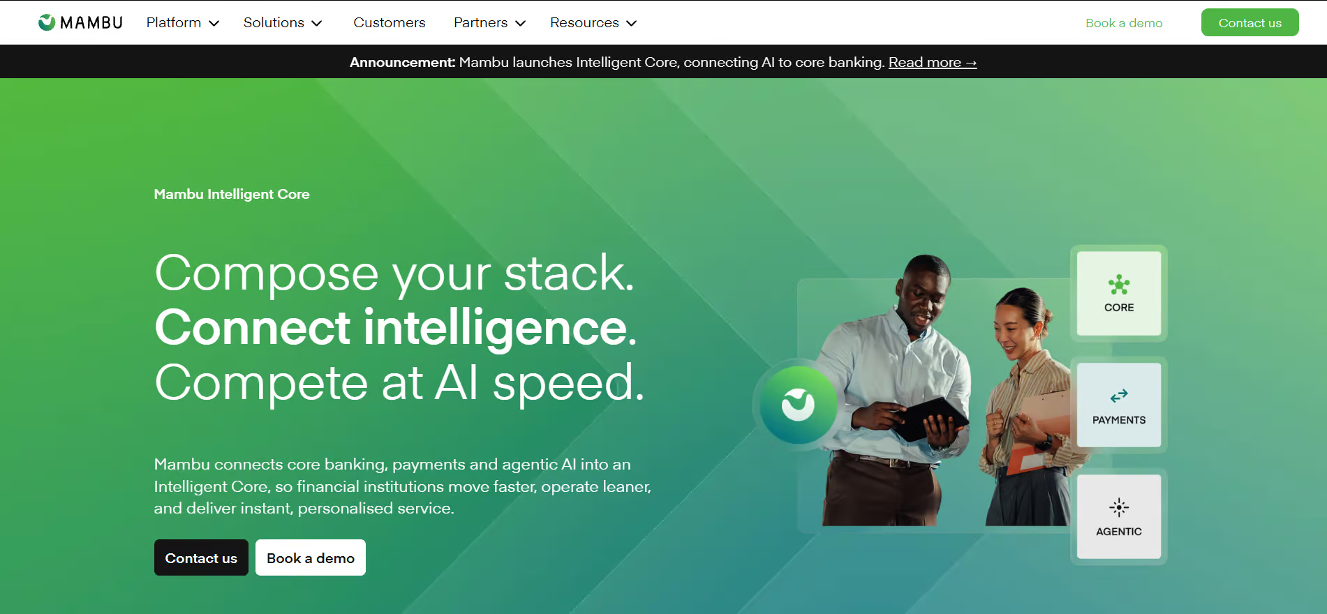
No warm illustrations, no consumer-facing softness — Mambu's brand signals technical gravitas because, for an audience trusting a platform with their entire banking infrastructure, looking serious is looking trustworthy, and that restraint is a deliberate brand identity choice.
The UX challenge is communicating infinite configurability without creating paralysis, and the design extends beyond the dashboard: API documentation with clean navigation, precise error messaging, and well-structured code examples carry as much brand weight as any screen, because for a platform sold to engineers and implementation teams, developer experience is UX design, and every poorly named endpoint is a trust deficit.
What these products have in common
The 15 companies above work across very different parts of FinTech, so their interfaces naturally look different. Some reduce complexity through personalization, some through consistency, some through transparency, and some by fitting into workflows people already know.
The useful part is not to copy any particular visual style. It is to look at the decision behind it.
A banking app, payment dashboard, or financial SaaS product gets harder to design as the business grows. New markets add new requirements. More products create more navigation. More users bring different expectations.
The strongest design decisions tend to start with that reality and give it a clear place in the experience.
Learn about our Editorial policy
.avif)