

















- Banking UX design changes after PMF. Once a product has customers, more features, markets, roles, and compliance rules start to accumulate around the original UX.
- The main problem is rarely that individual screens are badly designed. More often, the product logic outruns the business logic.
- A mature digital banking product needs to prioritize journeys by user role, frequency, and context rather than giving every feature equal weight.
- Mobile banking UX design should connect naturally with web banking rather than turn the desktop product into a smaller interface.
- Compliance, permissions, and ops complexity need to be designed into the journey rather than added as interruptions around it.
- A redesign makes sense when the current UX can no longer support the way the business operates day-to-day.
How much of your banking product still works the way you originally intended?
Let’s imagine a customer has been using your banking app for a while. She knows where to check her balance, how to make a payment, and where to find the things she uses most.
Then she needs something she hasn’t done before. She opens the app, looks around, and starts following the path that seems right. The terminology feels slightly different from what she has seen elsewhere in the product. One step asks for information she seemingly provided before. Another sends her to a screen she hasn’t seen before.
Nothing looks obviously wrong. She can probably get through it. But the product experience takes more effort than it should.
This tends to happen as financial products grow. New products come in, teams add new flows, markets bring new requirements, and existing journeys pick up another step here and another exception there. Each decision can make sense on its own. The customer still treats all of them as one product.
That is the Zero hour where banking UX design becomes a different kind of challenge. You have to look at what has accumulated across the product, where those decisions start to clash, and which parts are actually getting in the way of the next stage.
In this piece, we’ll look at the areas where that tends to happen — from core journeys and mobile to customer roles, compliance, and the systems that keep the experience together.
Banking leaders are looking at user journeys differently
The banking race was a big part of adding digital features. According to Deloitte’s 2024 study, the emphasis is shifting: leading banks are paying more attention to key processes and customer experience than just adding more features. The research covered 349 banks in 44 countries and 1,005 digital banking capabilities.
The message is fairly simple: more functionality does not automatically make a banking product more useful. At some point, the harder job is deciding what belongs where, for whom, and in which part of the journey.
Start with the journeys that carry the most weight
When a banking product becomes harder to use, it is tempting to go screen by screen and mark everything that feels outdated. That can keep a design team busy for months.
A better place to start is the journey that matters most to the business. Map it from the first action to the last, including the moments when the customer switches devices, waits for a decision, needs another person to approve something, or runs into an exception.
Take a payment:
- Where does it start?
- What does the customer need to know before confirming it?
- Which checks happen in the background?
- What happens if they close the app halfway through?
- Can someone else approve it?
- What does the same payment look like on mobile?
These questions quickly move you away from individual screens and toward the product logic behind them. The seams are usually more revealing than the screens.
So before kicking off a redesign, figure out which journeys are actually worth pulling apart

Give different users room to do their jobs
A business banking account rarely has one person behind it. The owner may want a quick view of cash and upcoming payments. An accountant may need transaction-level detail. Someone in operations may spend most of their day reviewing and approving payments.
Putting all of that into one default interface sounds tidy. It can also make everyone work harder.
The useful question is not “Who is our primary user?” It is “What does each person need to see and do to get their part of the job done?”
That distinction shaped our work on Emerald24.

Emerald24: one account, different jobs
Emerald24 serves business owners, finance managers, and operations specialists. During the redesign, we mapped functionality against importance and frequency of use.
High-frequency actions stayed within easy reach. More specialised functionality moved deeper into the product.
The home screen followed the same logic. Business owners got a clearer overview, while accountants could still drill down into the detailed financial information their work required.
You don’t have to choose between a calm interface and a powerful one. You need to decide what earns attention first.
That is a more useful starting point for banking ux ui design than trying to give every feature the same visibility.
Let mobile do its own job
A banking app isn’t a desktop product squeezed into a smaller rectangle.
The customer may open it while travelling, approve a payment between meetings, check whether a transfer arrived, or respond to an authentication request. The context changes what deserves attention.
So when you bring a desktop journey over to mobile, ask a more useful question than “How do we fit this on the screen?”
What does the customer actually need to do here, and where might they pick the journey up again?
That is where mobile banking ux design starts to differ from responsive UI work. The terminology, account states, and transaction logic should line up across channels. The interface does not need to be identical.
Emerald24: picking up where you left off
Emerald24 customers could start certain actions on the web and continue them on mobile. The redesign connected those journeys so the change of device did not feel like starting over.
That meant thinking through the handoff, authentication, and state of the transaction — not simply rearranging desktop components for a smaller screen.
Deloitte's research points in the same direction: customers use mobile and online banking for different types of tasks, while still expecting the channels to feel consistent.
Compliance can stay in the flow without taking it over
Everyone in banking knows the feeling: another requirement lands on a journey that already has enough steps. The requirement itself may be non-negotiable. Its place in the journey often is not.
This is where product, compliance, and UX teams need to think through the process together. Which information is needed now? Which can wait? What does the customer need to understand before moving on? What happens if they do not have the required document?
Those decisions have a bigger effect on the experience than the visual treatment of the form.
Emerald24: making a long onboarding process easier to work through
Emerald24's onboarding combined identity verification, document submission, and validation into a lengthy process. Goodface broke it into smaller steps, made progress visible, and allowed customers to return to earlier stages.
The required checks stayed in place. The time to reach the review stage dropped from 40–60 minutes to 20–30 minutes.
The lesson is useful beyond onboarding: when a regulated flow feels heavy, first work out which parts are fixed and which parts the product has simply carried forward.
That is where UX design for banking creates room without pretending the constraints don’t exist.
More personalization can also make banking UX worse
Personalization sounds like an obvious improvement until the product starts making assumptions the customer does not understand.
BCG's 2024 research across more than 23,000 consumers found that around four-fifths were comfortable with personalized experiences. But two-thirds had also experienced personalization they considered inaccurate or invasive, with some choosing to disengage from the interaction.
For banking, the stakes are higher.
A bank may know a customer's income, spending patterns, account history, location, and financial behaviour. That creates opportunities for useful contextual experiences. It also creates a narrow line between relevance and unnecessary interference.
Good UX design in banking therefore needs to answer a harder question than “Can we personalize this?”
It should ask whether the personalization helps the customer make a decision, complete a task or understand something important.
If not, the data probably does not belong in the interface.
When multiple teams shape the same user experience
Once several teams ship into the same product, consistency becomes a product decision.
A payment team may introduce one confirmation pattern. Another team may handle account changes differently. A third may add a new product with its own terminology because, at the time, that was the fastest way to get it out the door.
Individually, those choices can hold up. Put them next to each other, and the customer has to work out the rules for themselves.
That is usually where a design system knocks on doors. The useful part of it is the set of decisions behind things like payment state shifts, team troubleshooting, display of amounts, and product terminology, and the most vital — what the team does when a new feature comes along.
If those decisions live only inside individual teams, every new feature can throw a wrench in the works. If they are shared, teams can move faster without pulling the experience in a different direction every time.
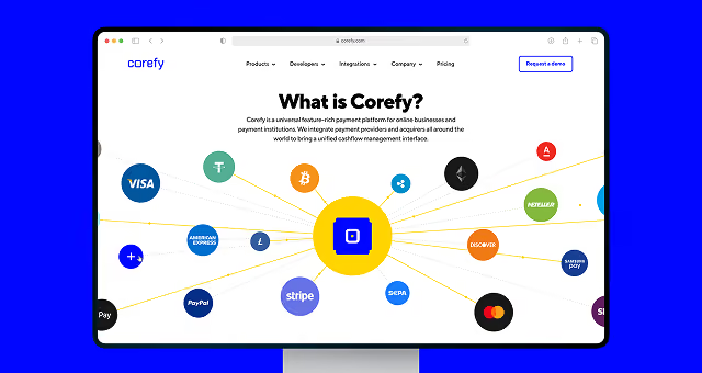
Corefy: making room for what comes next
Corefy had more than 650 payment providers and 400+ payment methods to explain across a product that kept expanding.
That put pressure on more than the website's information architecture. The team needed a system that could accommodate new products and pages without forcing designers to rethink the same patterns from scratch.
Goodface built that system into the redesign.
The point was to make the next addition easier to fit in.
That is a more useful measure of a design system than how complete its component library looks.
A banking UX/UI design doesn’t stop at the login screen
A customer may first meet a bank through a campaign, explore the website, start onboarding, open the app, and contact support later that week.
They don’t separate those interactions by department.
So what happens when marketing promises one thing, the website explains another, and the product uses a third vocabulary? The problem is no longer inside the app.
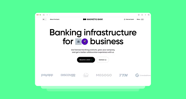
Magnetiq Bank: carrying one identity across the entire experience
Magnetiq Bank was preparing to enter new markets and introduce new products. Goodface worked across the brand identity, website, banking product interfaces, and design system.
The goal was to make the bank read as the same company wherever a customer encountered it.
LaFinteca: when the promise and the product need to line up
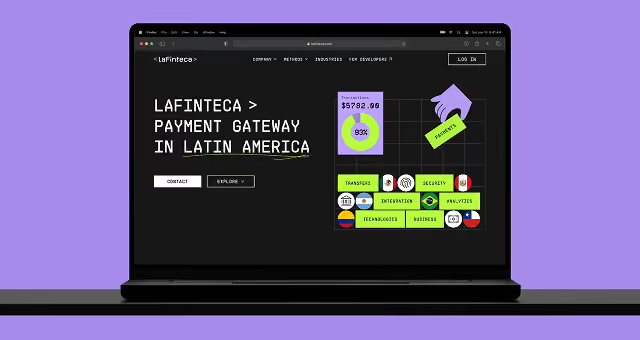
LaFinteca was expanding across Latin America, which meant the company had to make its positioning, website, and merchant experience tell the same story.
Goodface connected those pieces rather than treating the product interface as a separate exercise.
That matters when trust is part of the sale.
If the story changes after the customer logs in, someone has to explain the difference.
Usually, the customer does not have time for that.
So, does the product actually need a redesign?
A five-year-old interface is not a good enough reason to rebuild a banking product. Neither is a competitor launching a nicer app.
The stronger signals usually show up in the way the product handles change:
- New features keep making navigation heavier. The product has added functionality faster than it has revisited the hierarchy.
- Different teams own different parts of the same journey. Each part works; the whole experience does not quite line up.
- Web and mobile have drifted apart. Customers have to learn the same task twice.
- Important actions compete with occasional ones. The navigation reflects everything the product can do rather than what customers actually need.
- Onboarding keeps getting longer. New checks and exceptions have been added, but nobody has stepped back to map out the whole journey.
- One interface serves very different roles. Specialists and occasional users end up paying for each other's requirements.
These are much stronger signals than “the UI looks old.” And they point to different responses.
Sometimes you need a focused UX audit. Sometimes one journey needs to be reworked. Sometimes the information architecture has reached the point where a broader redesign makes sense.
Before you commit to the biggest option, figure out which problem you are actually paying to solve.
Key takeaways
A banking product can keep adding features, markets, roles, and compliance requirements without anyone making a particularly bad design decision. The trouble starts when those decisions no longer fit together.
That is when teams usually need to step back and look at the product as a whole: how people move through it, what different roles need, where web and mobile meet, and which rules should guide the next change.
Here are a few things worth taking away from this article:
- Look at user journeys before screens. If the same task requires users to follow different logic across the product, another round of UI work will only take you so far.
- Give different users different paths. A business owner, accountant, and operations specialist may use the same banking product every day, but they rarely need the same things from it.
- Treat web and mobile as one product experience. People move between devices. Their work should not have to start from scratch each time.
- Build compliance into the CX. Verification, approvals, and document checks won’t disappear. The team can still decide where to enter the flow and how much the user has to handle at once.
- Use the next feature as a sanity check. If every new requirement creates another exception, the product still needs clearer rules underneath the interface.
A redesign also gives the team a chance to lay down those rules: how states work, how roles affect access, how recurring actions behave, and where new functionality should sit.
That work starts paying off when the next product decision comes along, and the team can move forward without starting from scratch.


