













Magnetiq Bank.
Fintech brand identity design services and website redesign for a B2B bank


Magnetiq is a European banking infrastructure based in Latvia, empowering a wide range of entities across licensed banking products, BaaS, e-commerce acquiring, and fintech solutions.
Challenge
The bank set out to enter new countries and markets with more accessible products, and to strengthen its position in the European fintech space.
That ambition required a brand to match it: one that could stand alongside Luminor, SEB, Swedbank, Clear.Bank, and Banking Circle, and still be visually distinct enough to be remembered.
The existing brand platform needed a stronger unified identity. The visual elements weren't fully aligned with the bank's narrative, and product explanations on the site could be more action-oriented for business clients. Staff were using different design templates, which made marketing campaigns less efficient and created inconsistency across the company’s communications.
That’s why the bank needed a full rebranding:
- a new name,
- a new visual identity,
- a comprehensive design system,
- a website that could do the commercial work of explaining the product to B2B clients before any human conversation started.
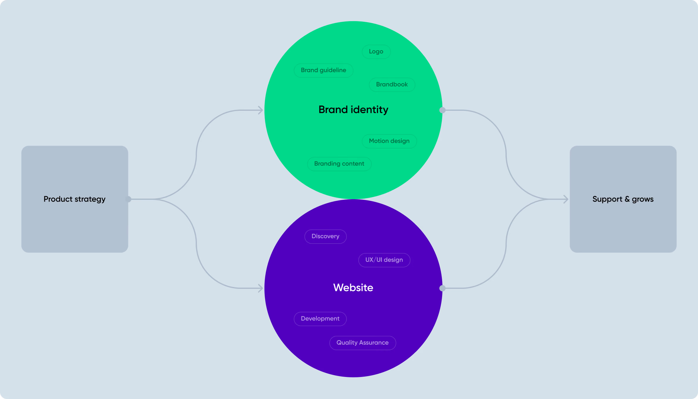
We were responsible for the entire new digital design: logo, corporate identity creation, brand guidelines, and design system — as well as rethinking the bank’s website design and product UI
Magnetiq’s marketing team had developed the name, brand positioning, and marketing strategy before we joined the project. Our role was to translate that foundation into a visual identity and digital experience.
The core collaboration idea sits between a bank and its clients, leading to the name Magnetiq. It refers to magnetism — attraction and connection between two parties — while remaining clear and easy to use across European markets.
Once the positioning and naming were established, Goodface took over the digital design work with a clear starting point and final destination — turn that idea into a visual system that could work consistently across the bank’s digital and physical touchpoints.






Logo & visual identity
The first point was designing a new logo: something elegant but simple and recognisable, capturing the essence of the new positioning.
Magnetic Bank aimed to enter new countries and markets with new innovative and more accessible products, aiming to boost their standing in the FinTech world. So they needed a rebranding, which would reflect these ambitions. The challenge? Crafting a top-notch design that would position them as one of the major players alongside other big European companies.
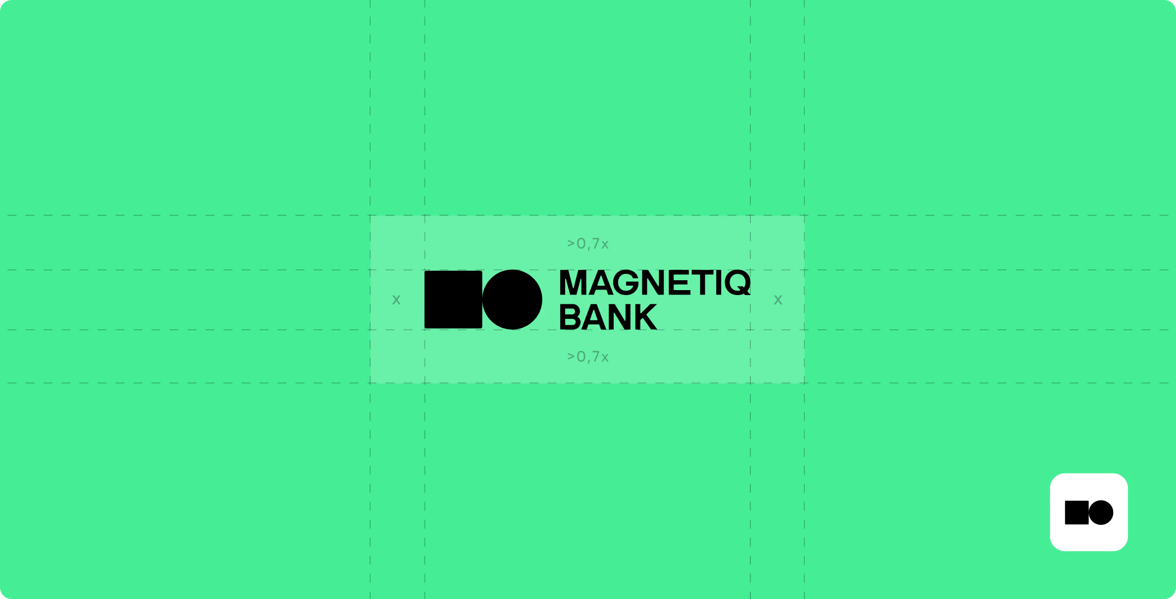
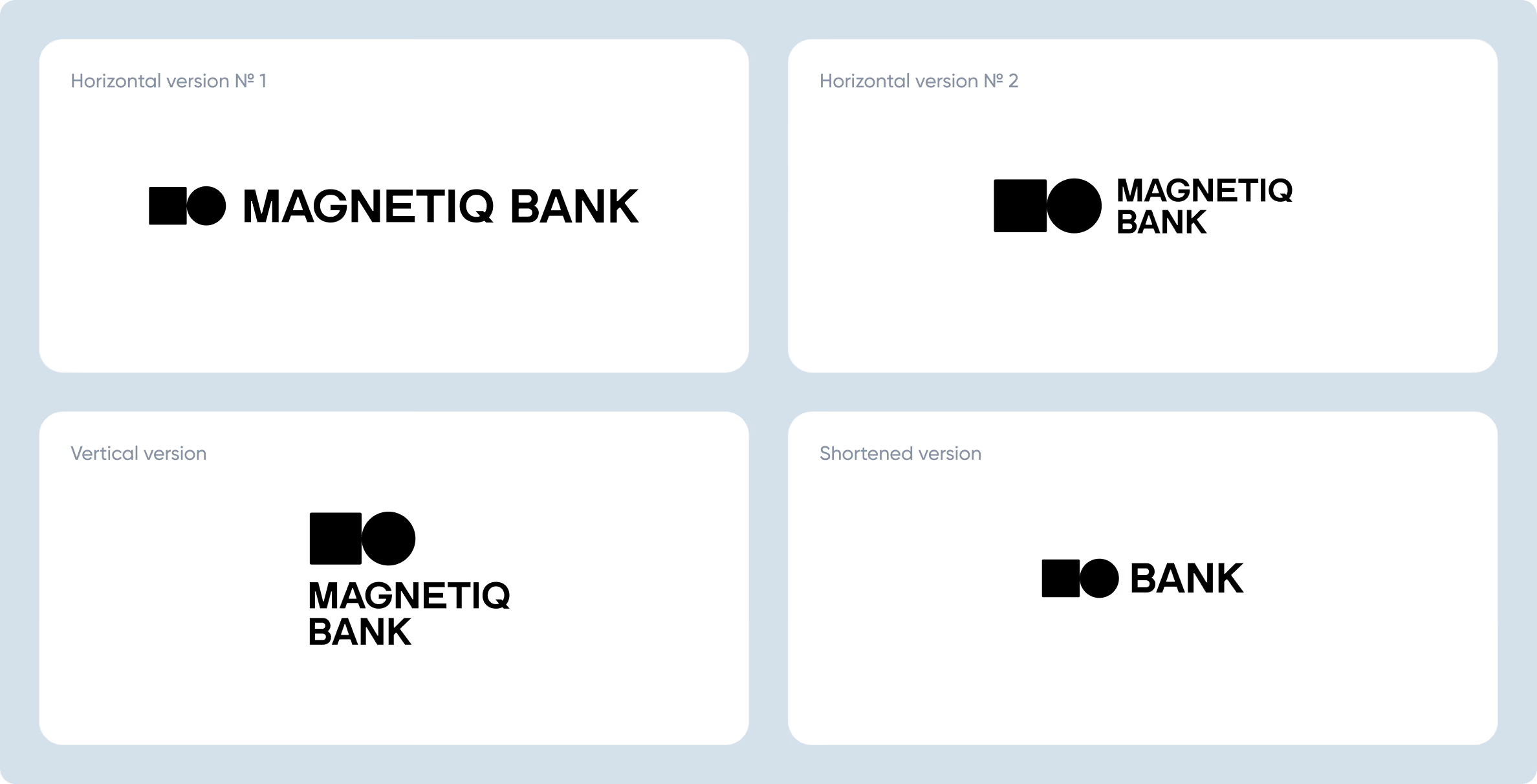
Our designers put forward a few concepts, and here’s the final choice. The mark works at any size, functions in horizontal, vertical, and shortened versions, without requiring explanation.
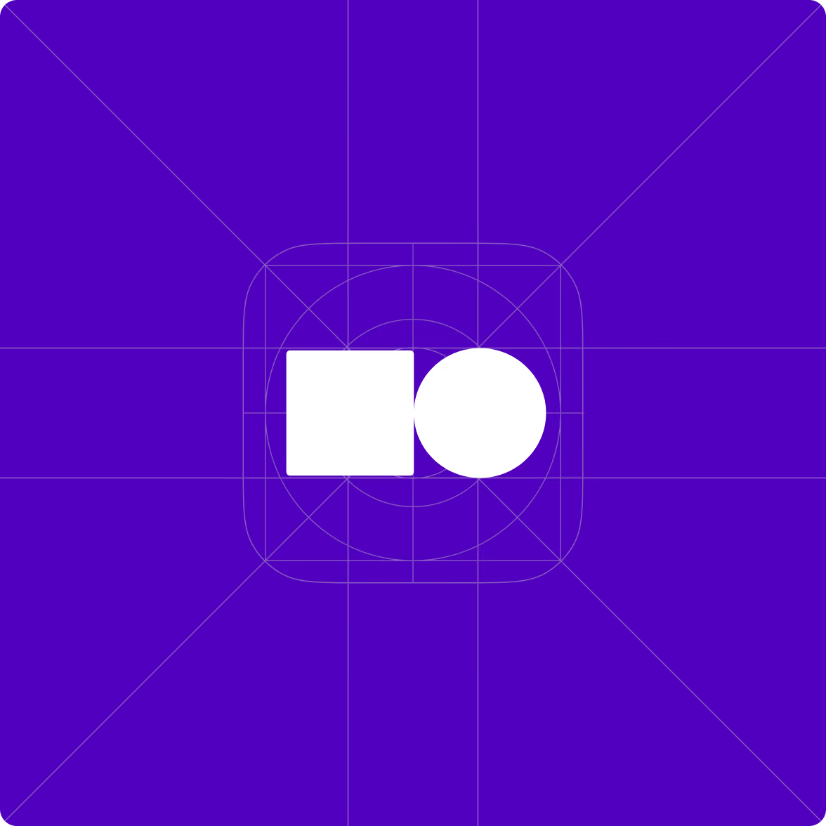
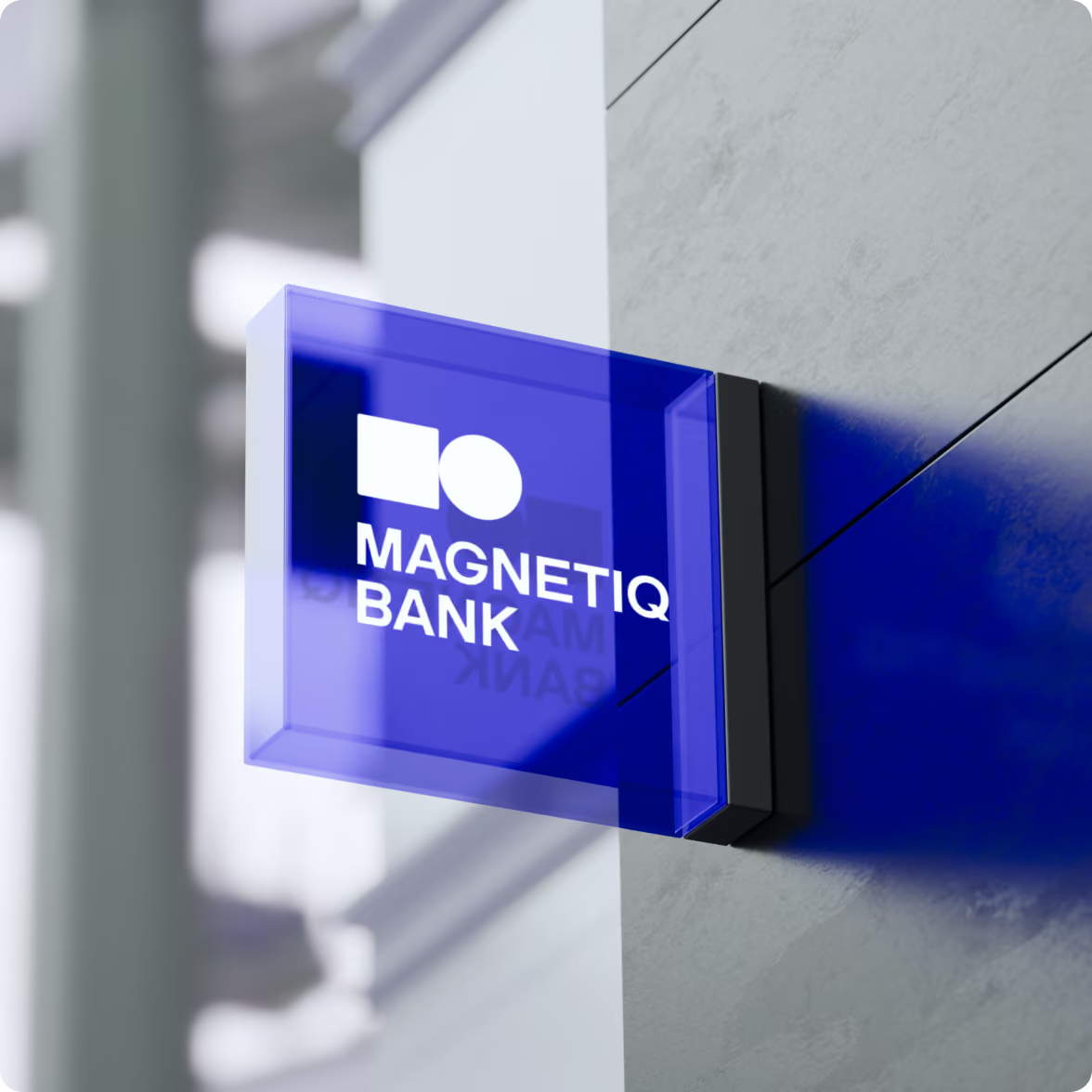
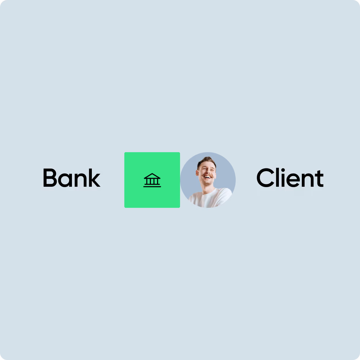

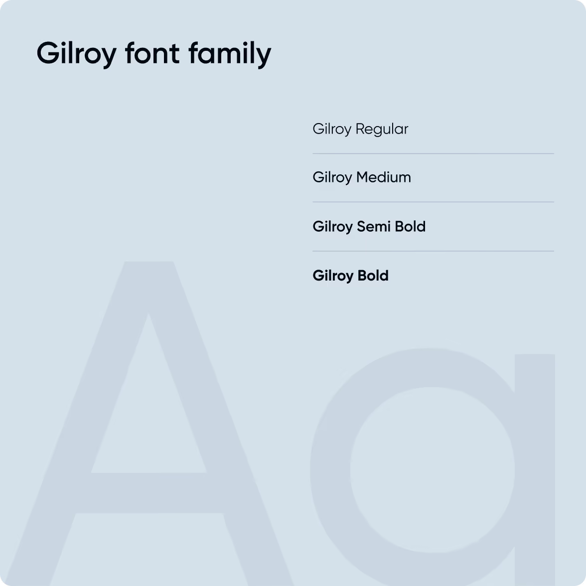
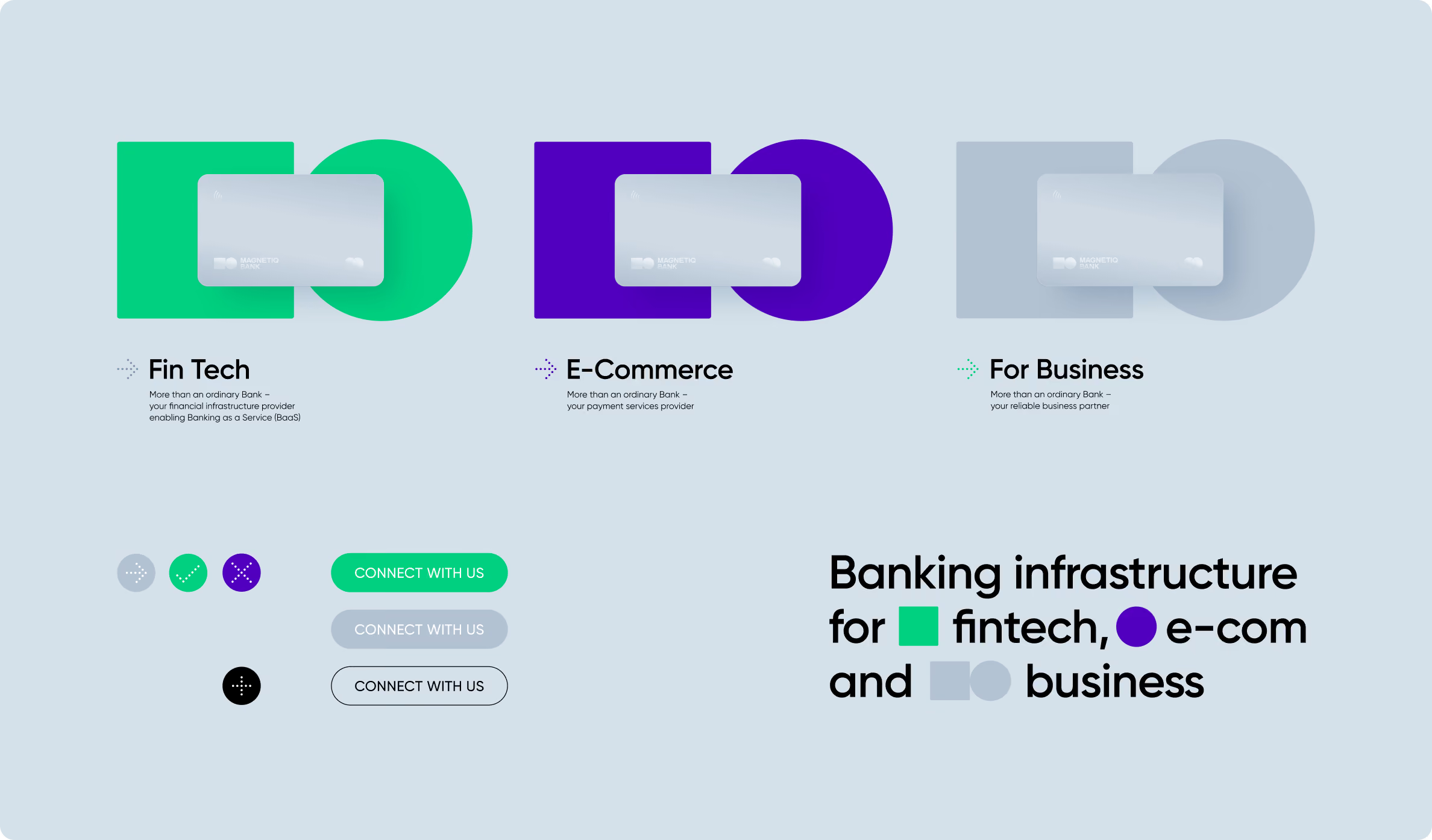
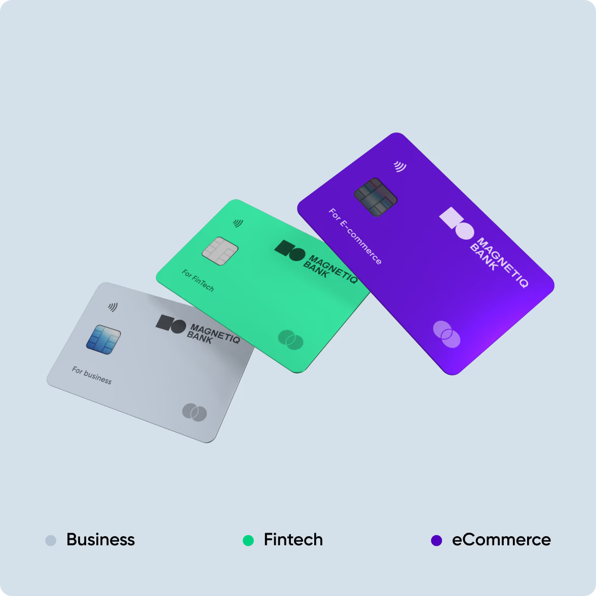
From there, we laid the groundwork for the full visual identity — new colours, fonts, graphic methods, and design elements that hold together across every context in which the bank operates.
The green-and-black palette is deliberately distinct in the European banking landscape, where most players default to blue. Visual distinctiveness in a competitive field is a business advantage, not an aesthetic preference.
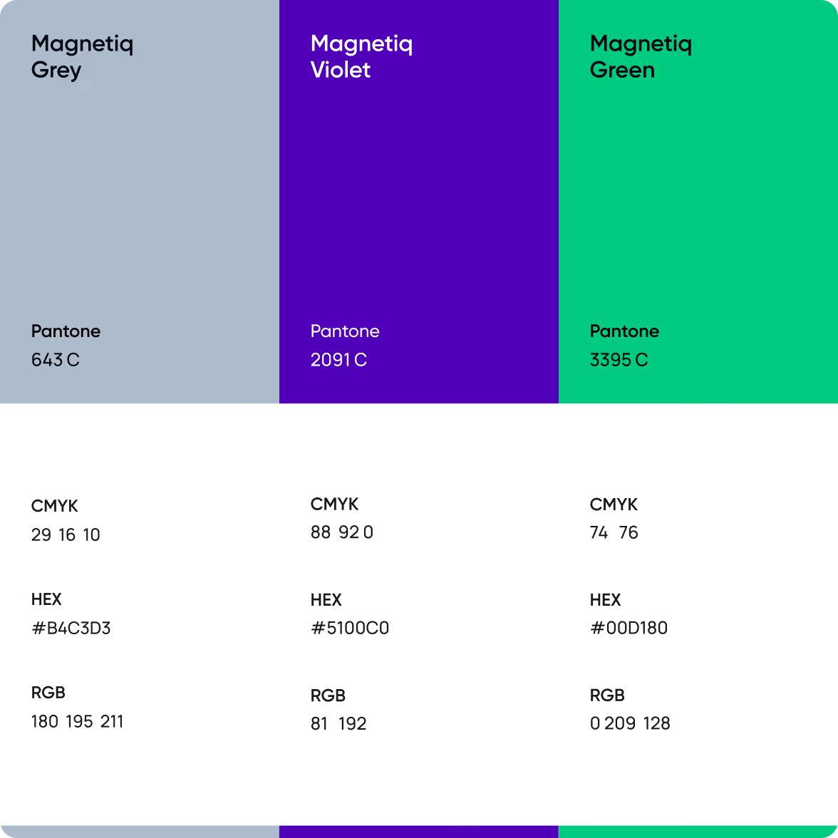
Brand guideline
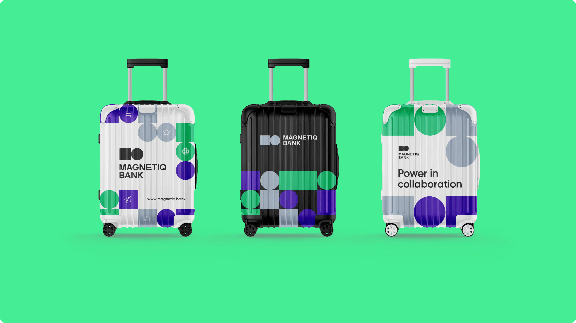
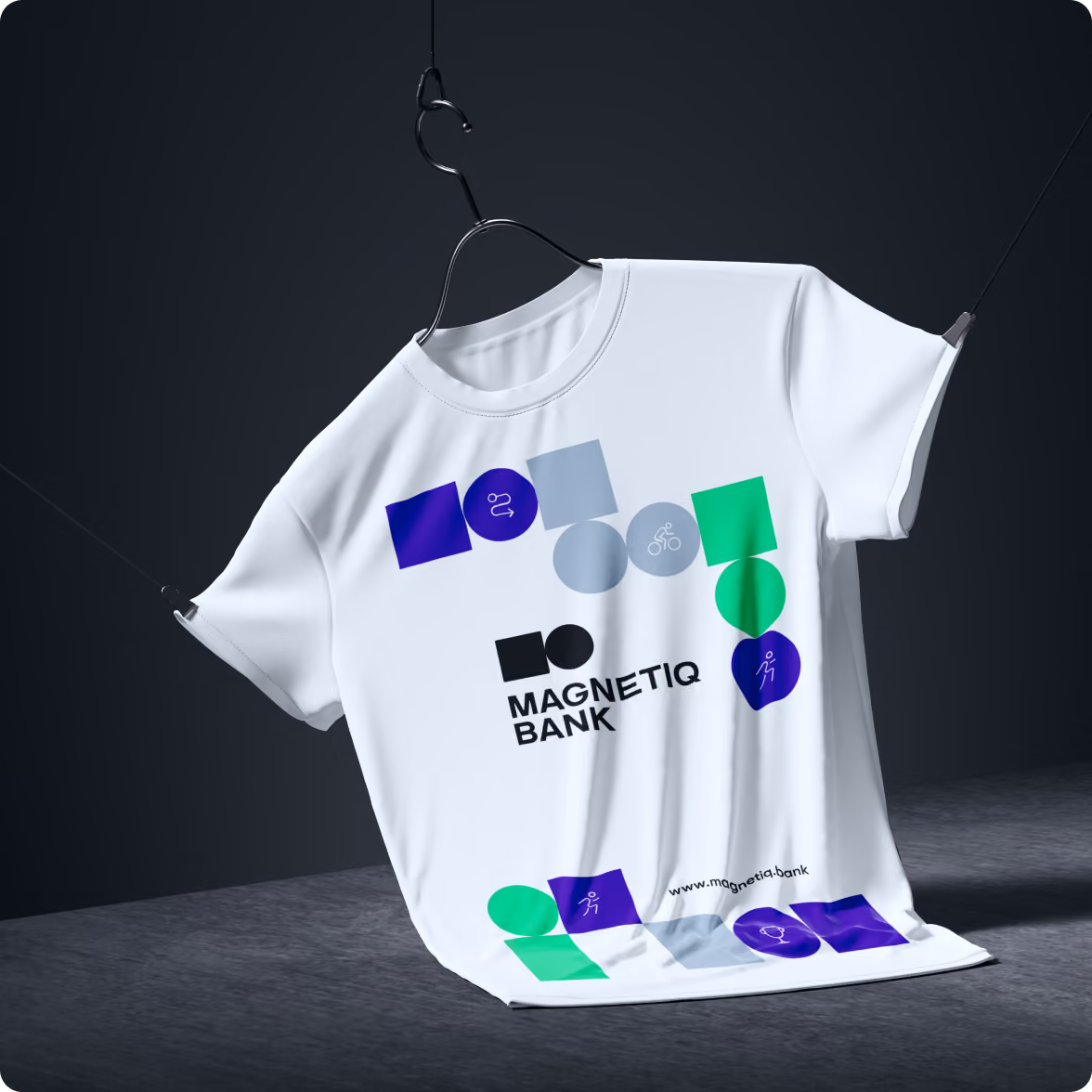
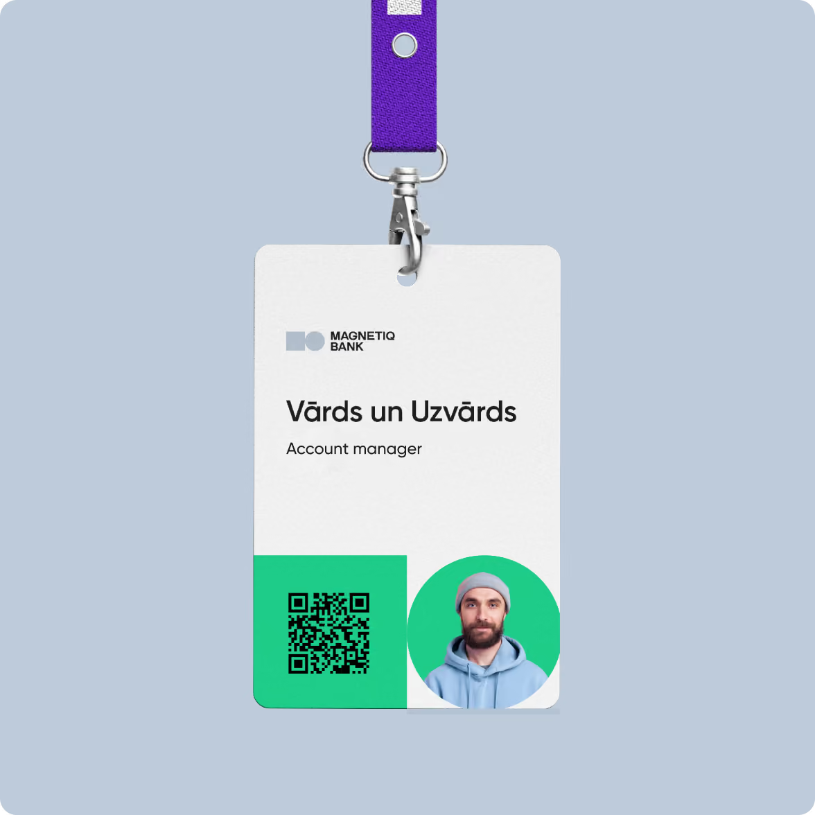
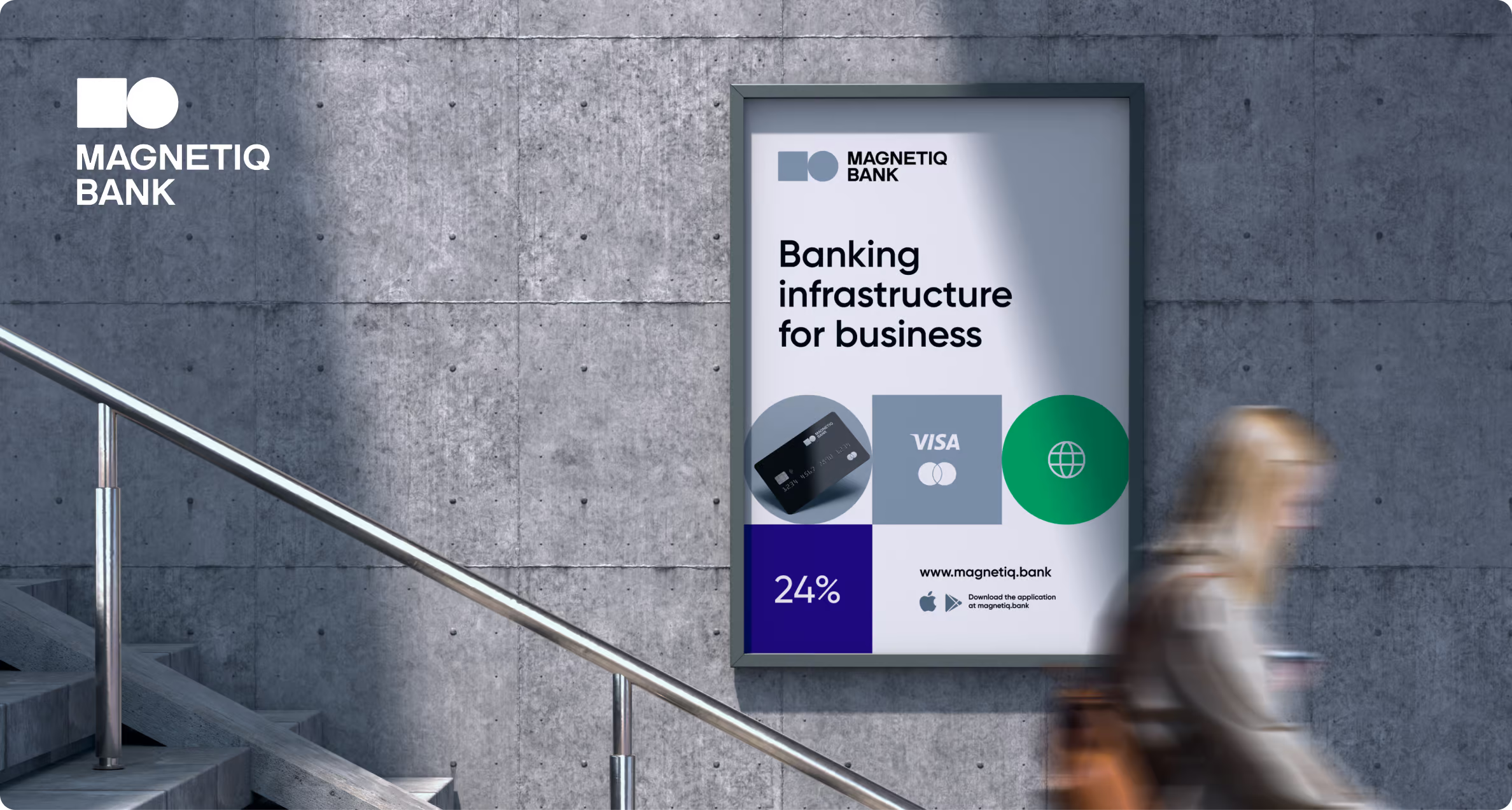
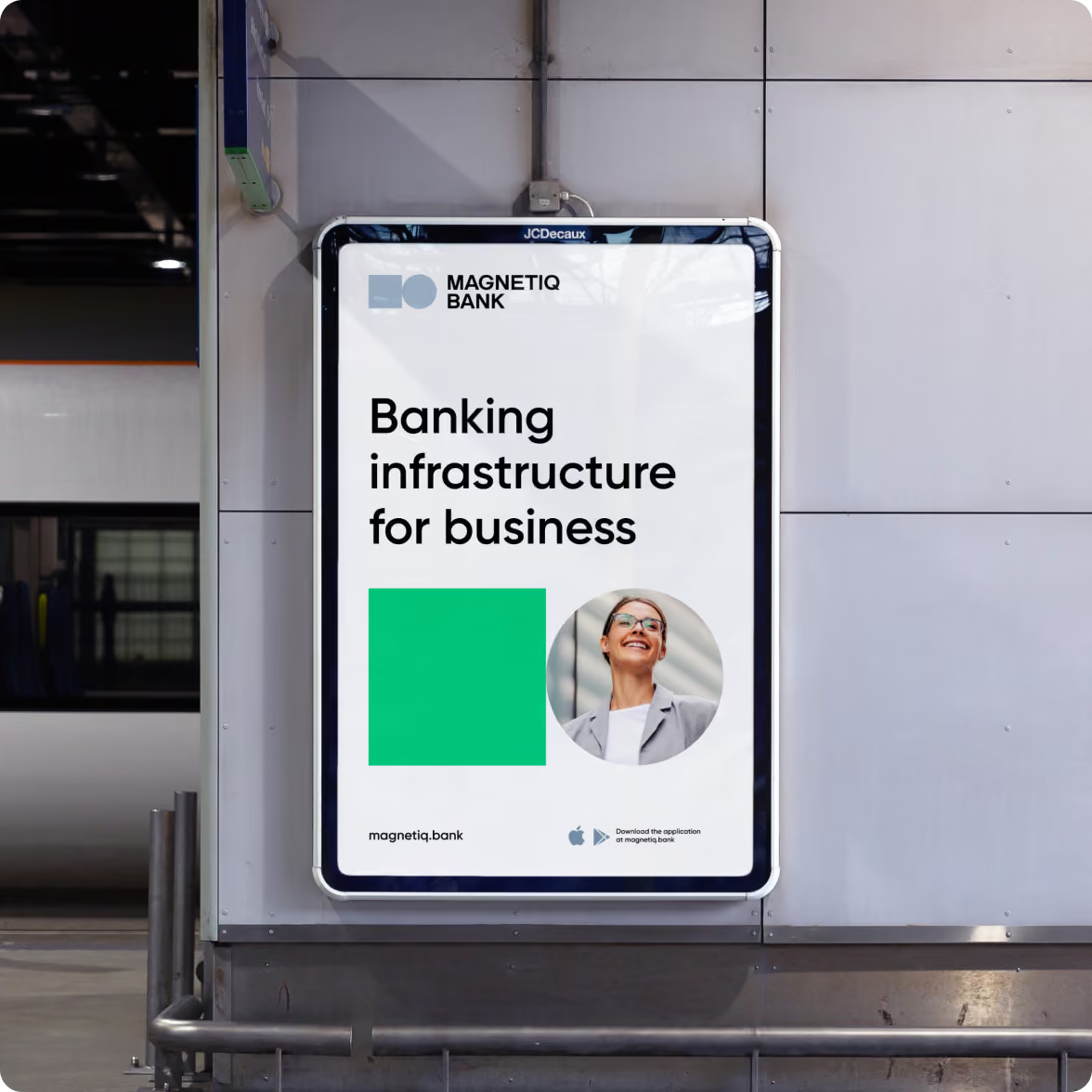
Magnetiq Bank needed more than rules for using its logo. The brand had to work across digital and physical touchpoints, different teams, and new markets, so we built the guidelines around how the identity would be used in practice.
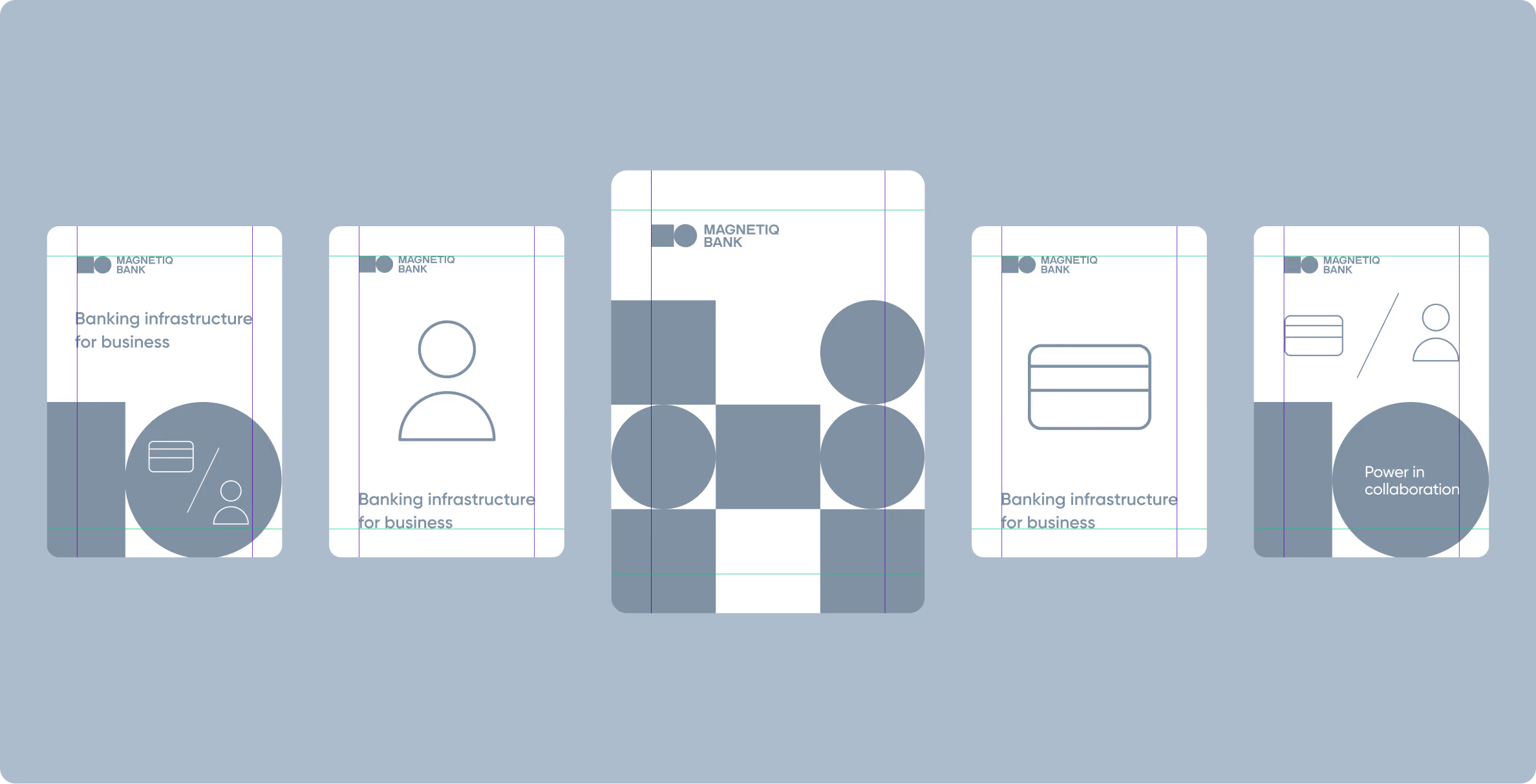
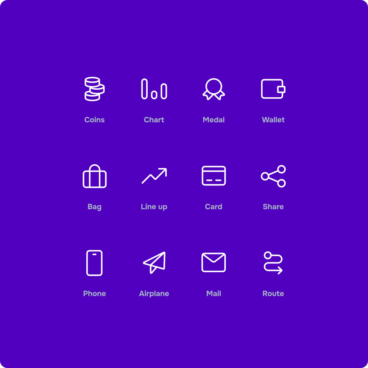
The system covers colour, typography, iconography, UI components, spacing, and the conventions that connect different brand materials. We documented these decisions clearly so teams could work with the system without revisiting the reasoning behind every element.
Design system
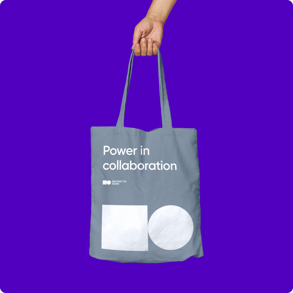
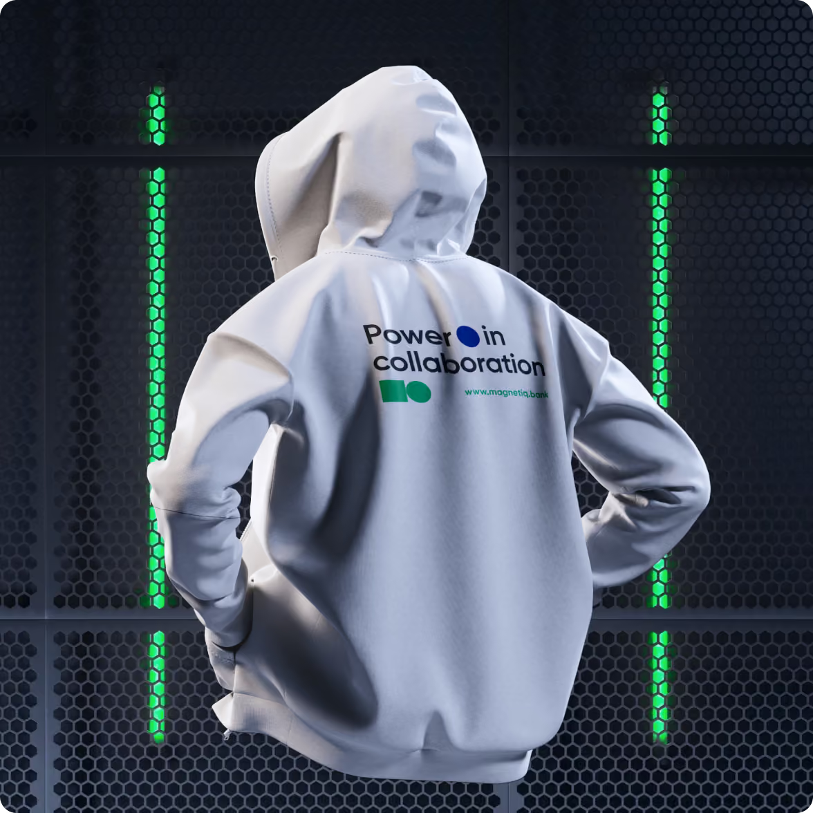
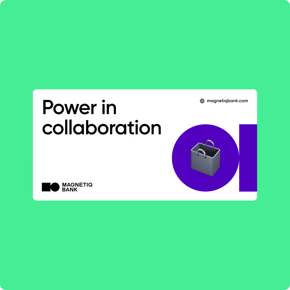
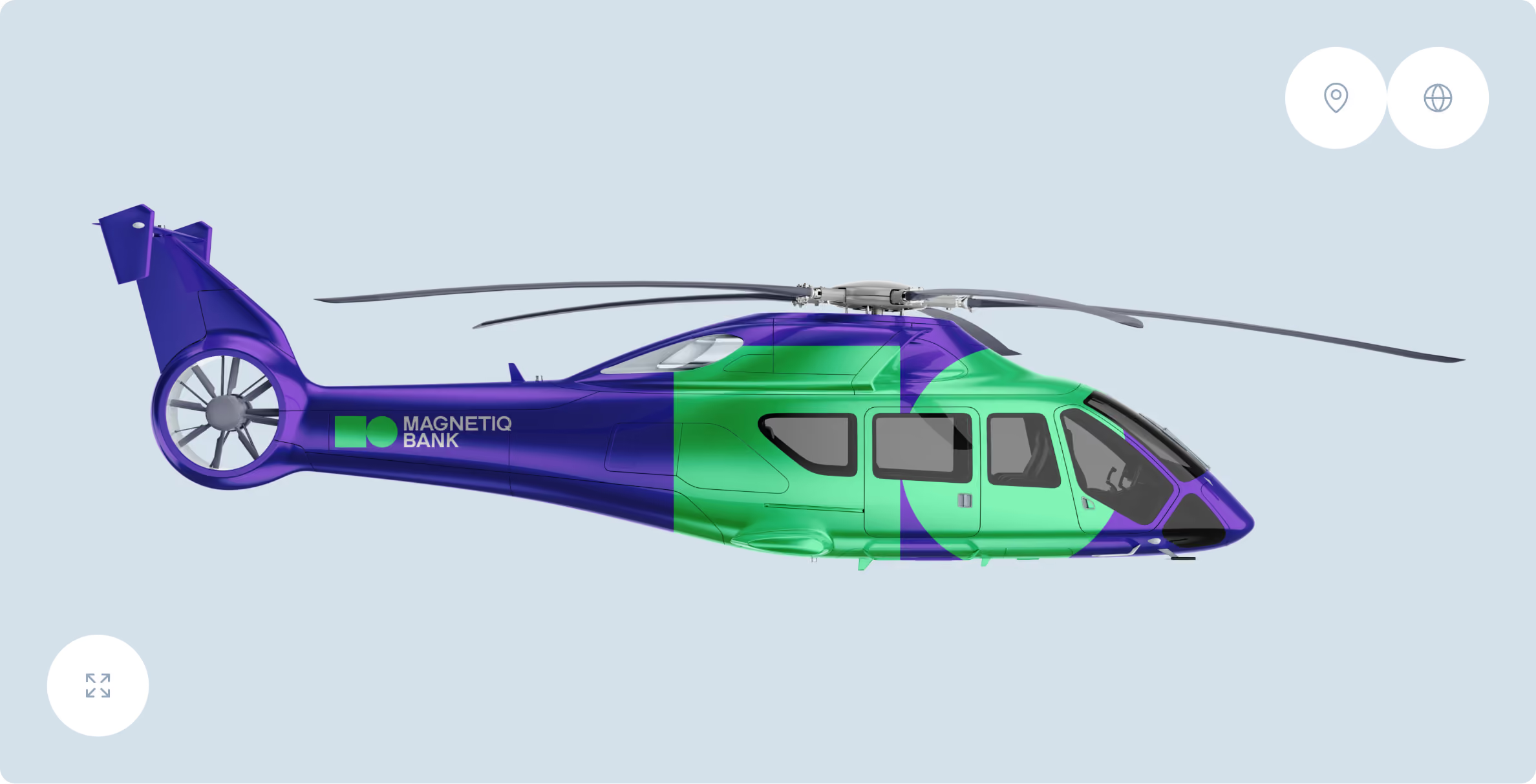
We also developed a component library for digital and offline materials, with shared styles and components that can be reused across the brand. Changes to core styles can be applied across the screens and materials that use them, reducing the need to update each asset separately.
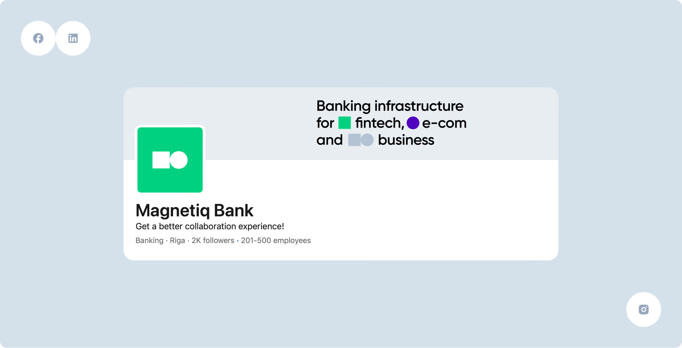

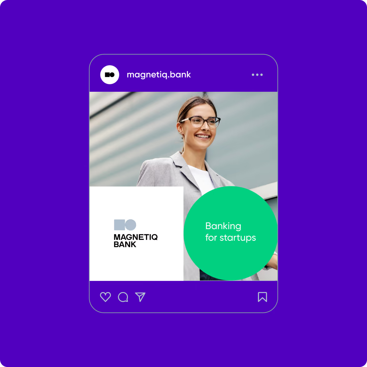
The system also gives local teams room to adapt materials for different markets while keeping the core visual identity consistent. Clear documentation and reusable components make it easier for teams to create new materials without checking out the same design decisions each time.

.webp)

Website design
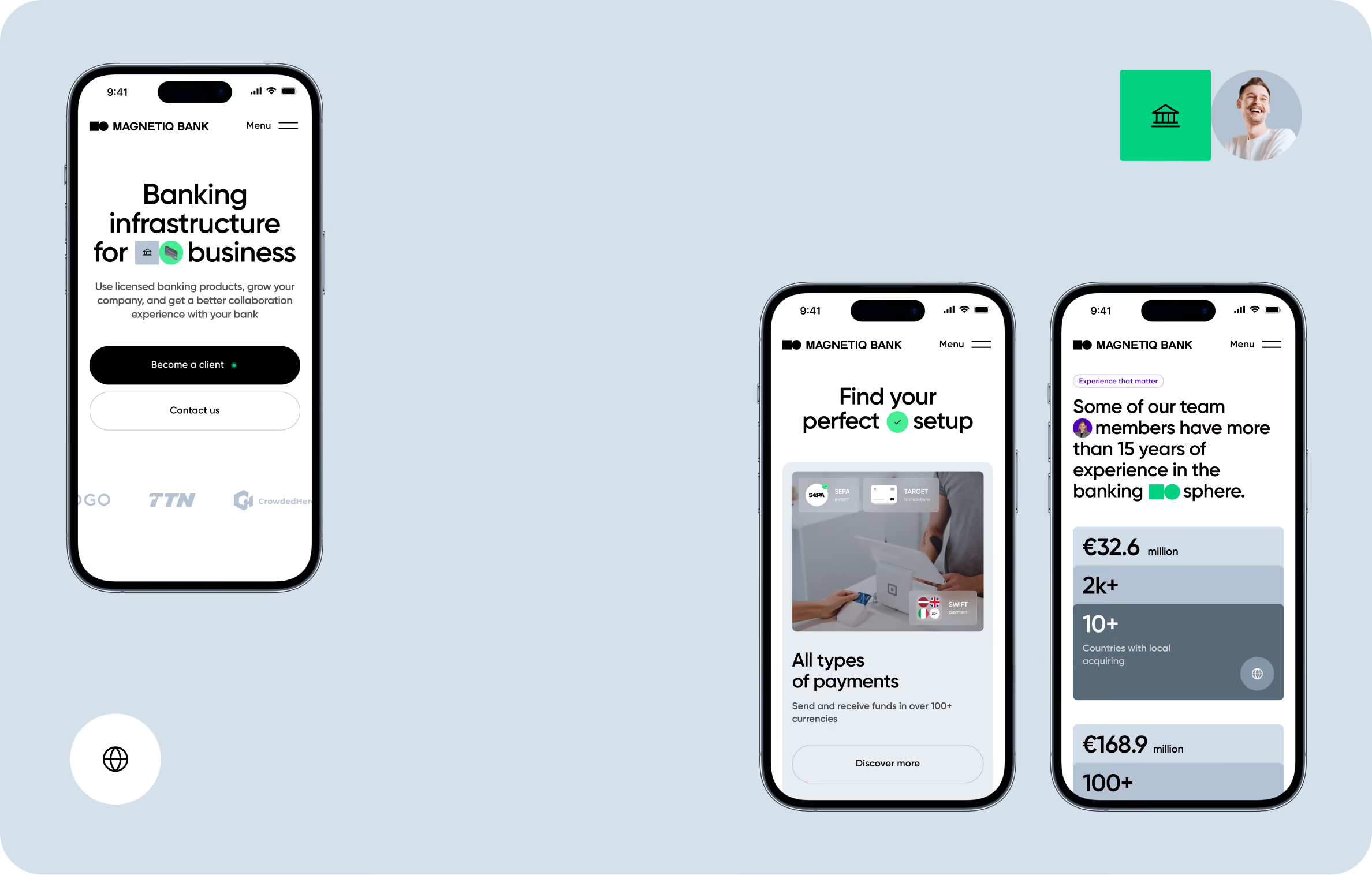
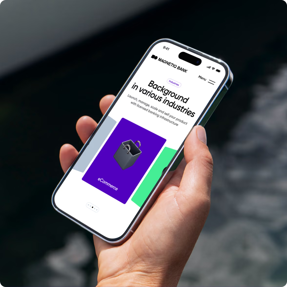
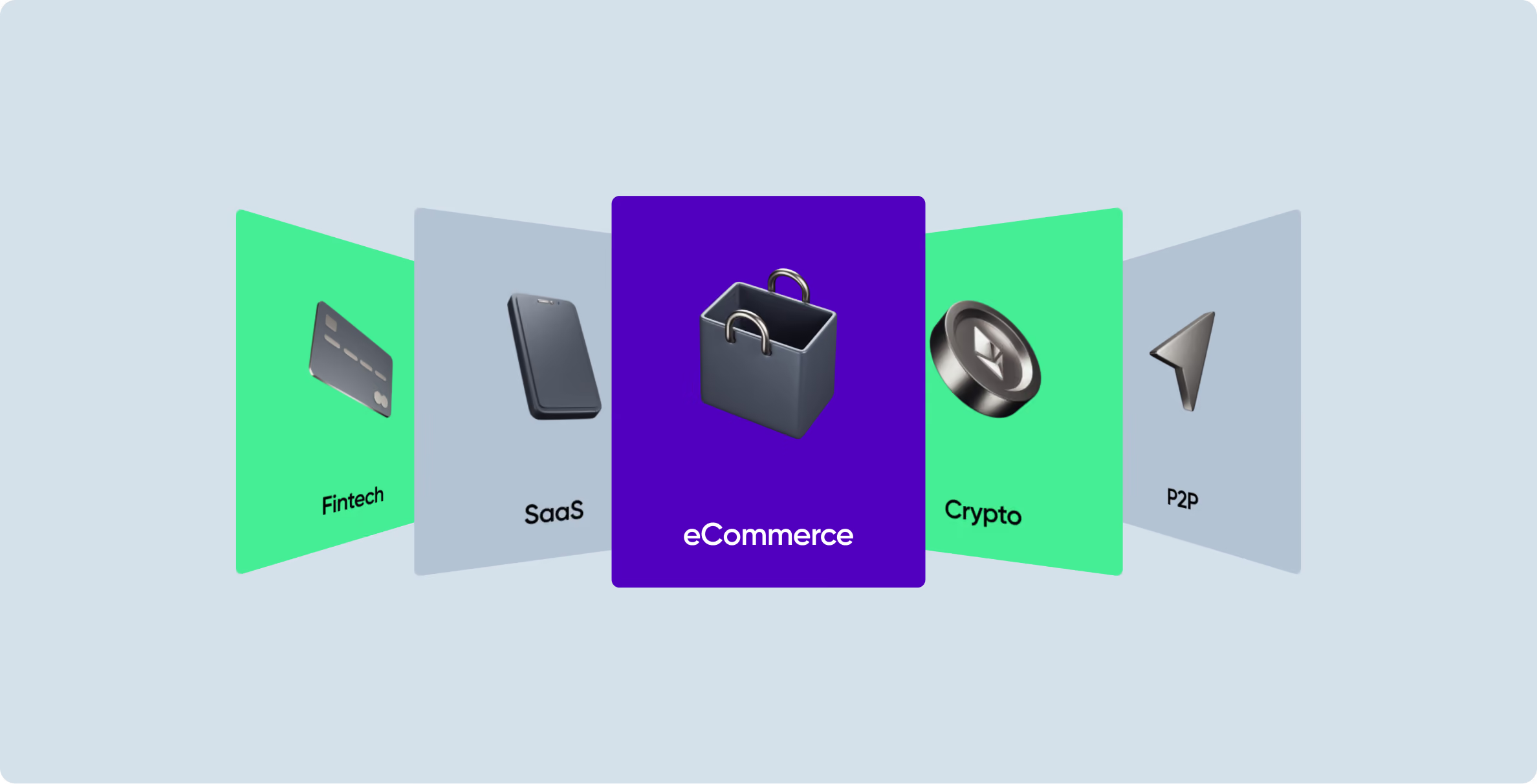
The site helps B2B clients understand Magnetiq’s offering before they speak with the team. We structured the journey around three questions: what Magnetiq does, who it serves, and which products can meet a client’s needs. Product pages give finance and operations teams enough detail to assess the offering on their own.
We built every page from the same design system. Shared components and patterns keep the visual structure consistent from the homepage to product detail pages, while giving the team a faster way to add new pages as the bank expands its web presence.
Goodface handled both design and development, so the same team carried the design decisions through to the live site. We translated the layouts, components, and interaction patterns directly into the final product rather than handing them over to another team for implementation.
Website development & testing
We developed the website with the same design system that shaped the interface, carrying its components, layouts, and interaction patterns into the front end. We structured the codebase so Magnetiq’s team can add pages, update content, and adapt materials for new markets without rebuilding the site.
We tested the website throughout the build rather than leaving QA until the end. The team checked each component against the design system as we implemented it, catching inconsistencies early and keeping the final interface aligned with the approved design.
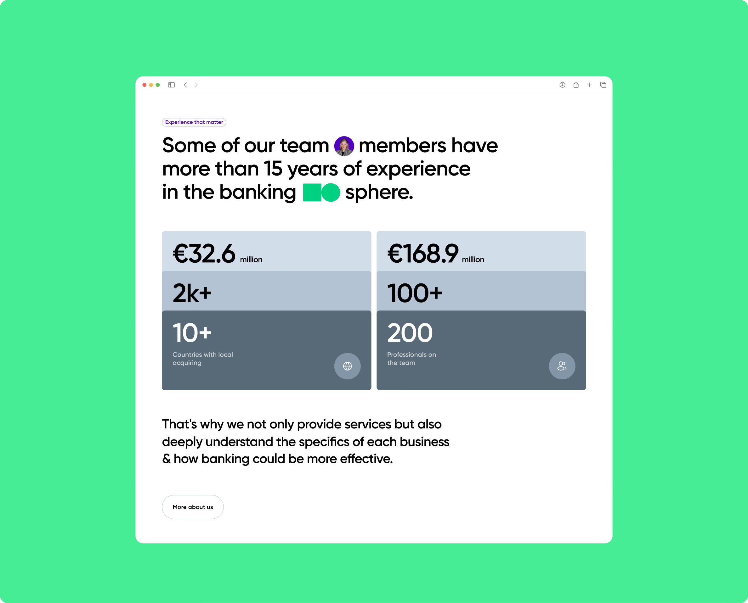
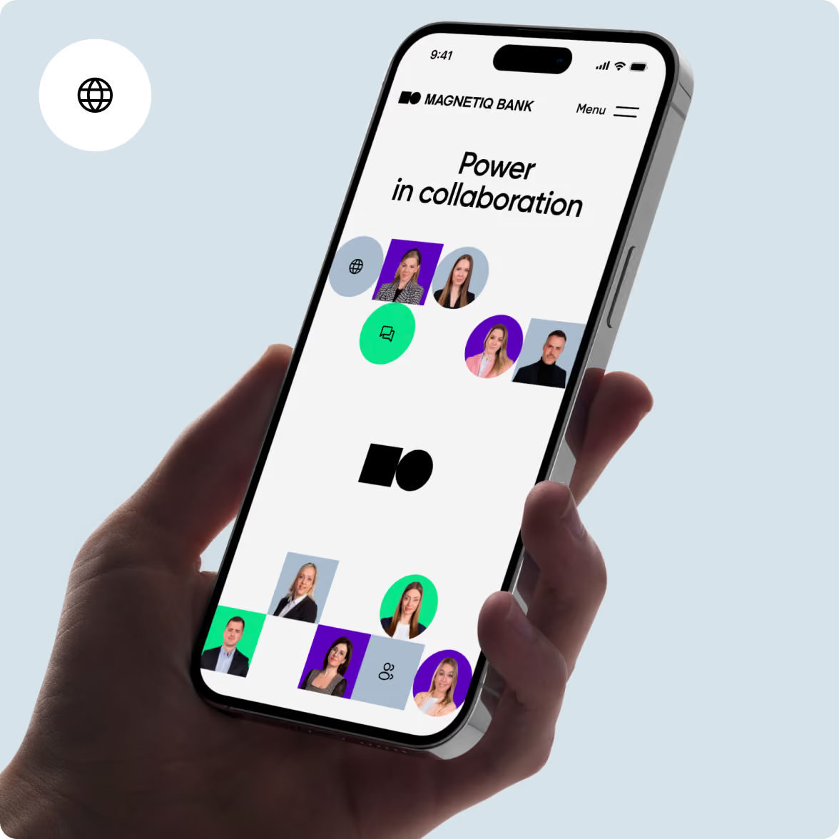
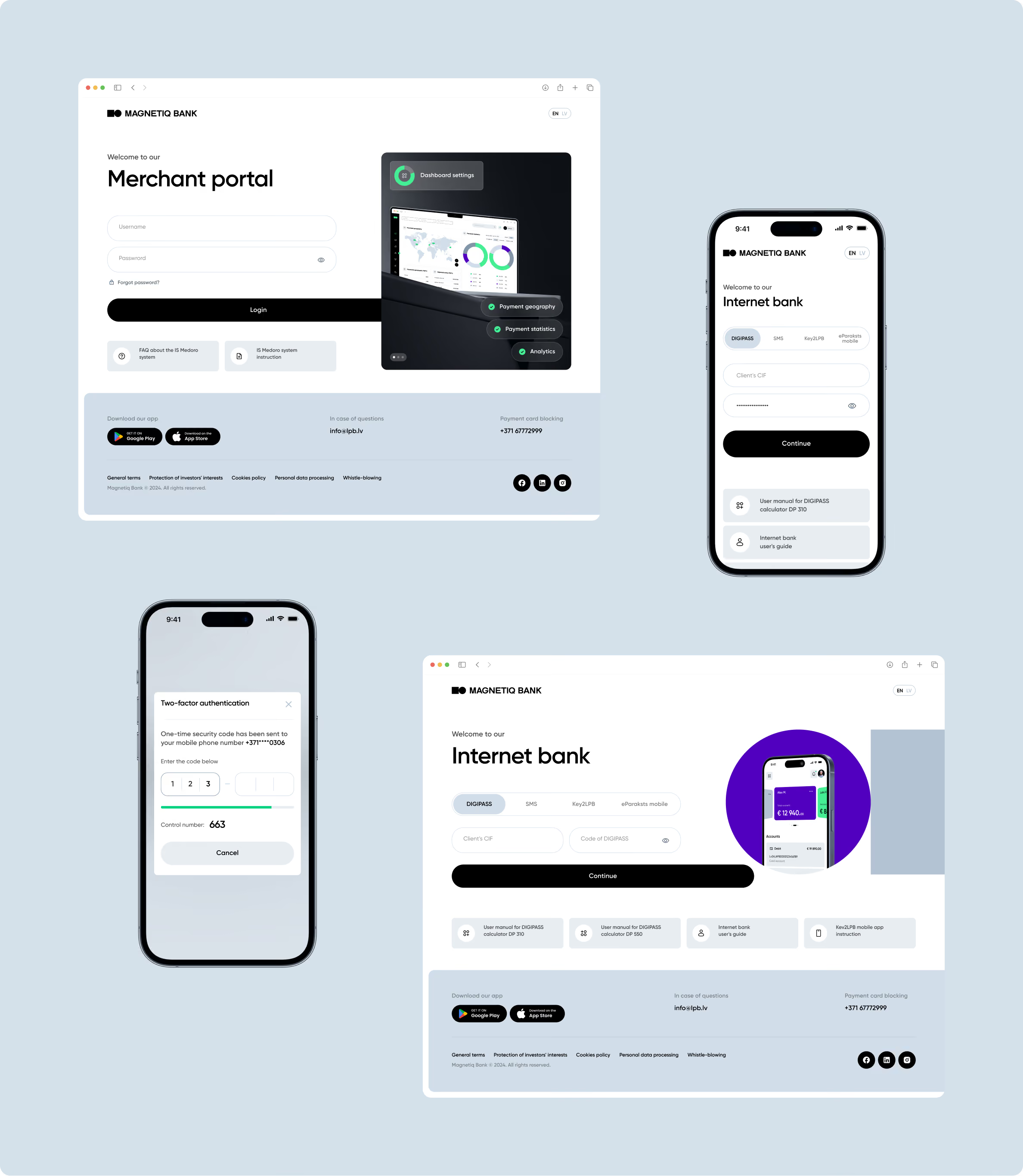
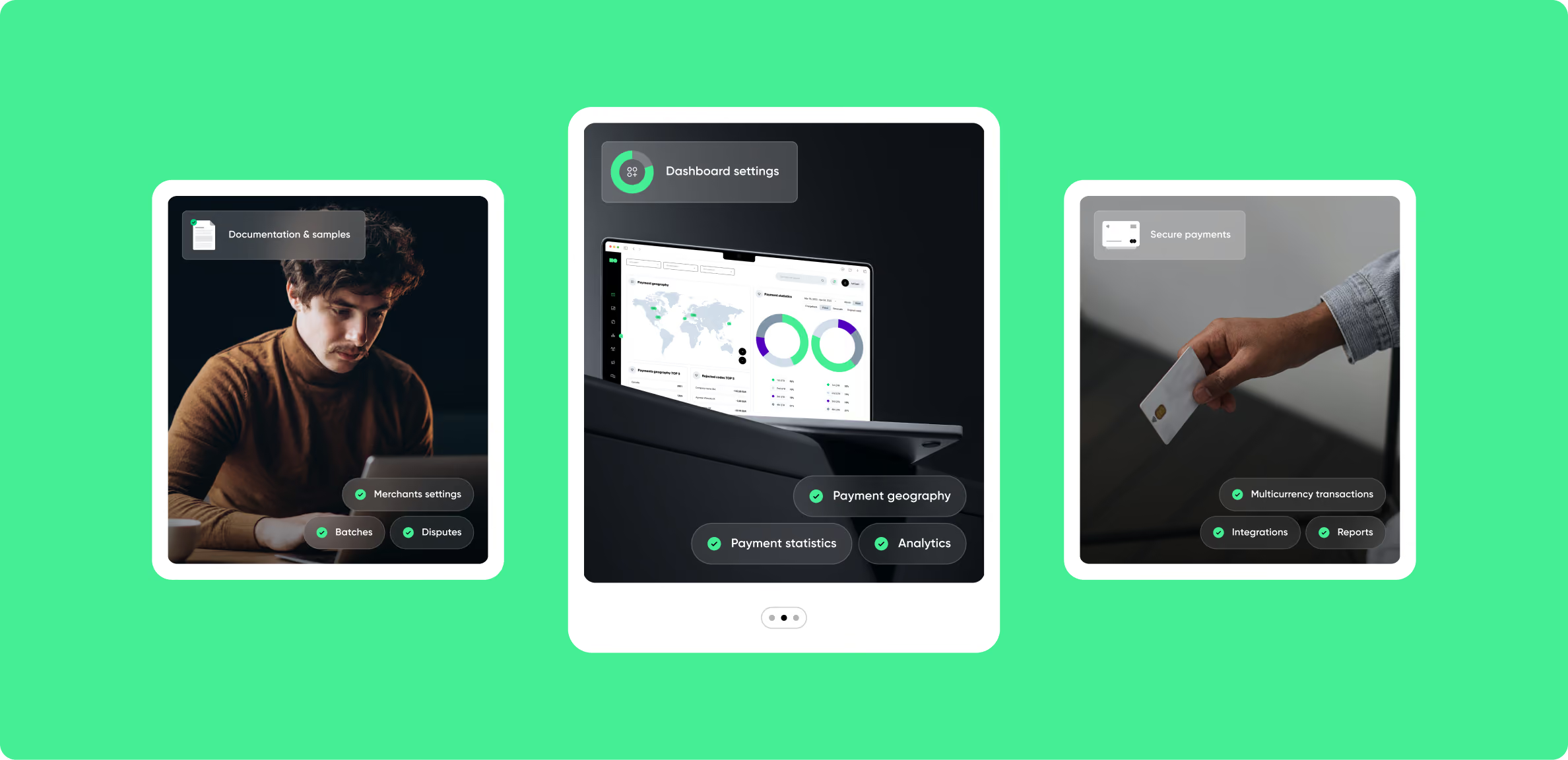
A new logo, a complete design system, a brand book, a live website, and Red Dot Award recognition.
The project brought Magnetiq’s brand and digital presence into one system. Goodface delivered the logo, visual identity, design system, brand book, and website, while Magnetiq’s marketing team continued to use the system across its communications.
The design system is already in use across the bank’s marketing materials. The team can create new assets within the same visual language instead of returning to the original project for each new piece.
That became an important test of the work after launch. The identity had to remain clear and usable for people who were not involved in creating it, as the bank continued to build new materials and expand its digital presence.
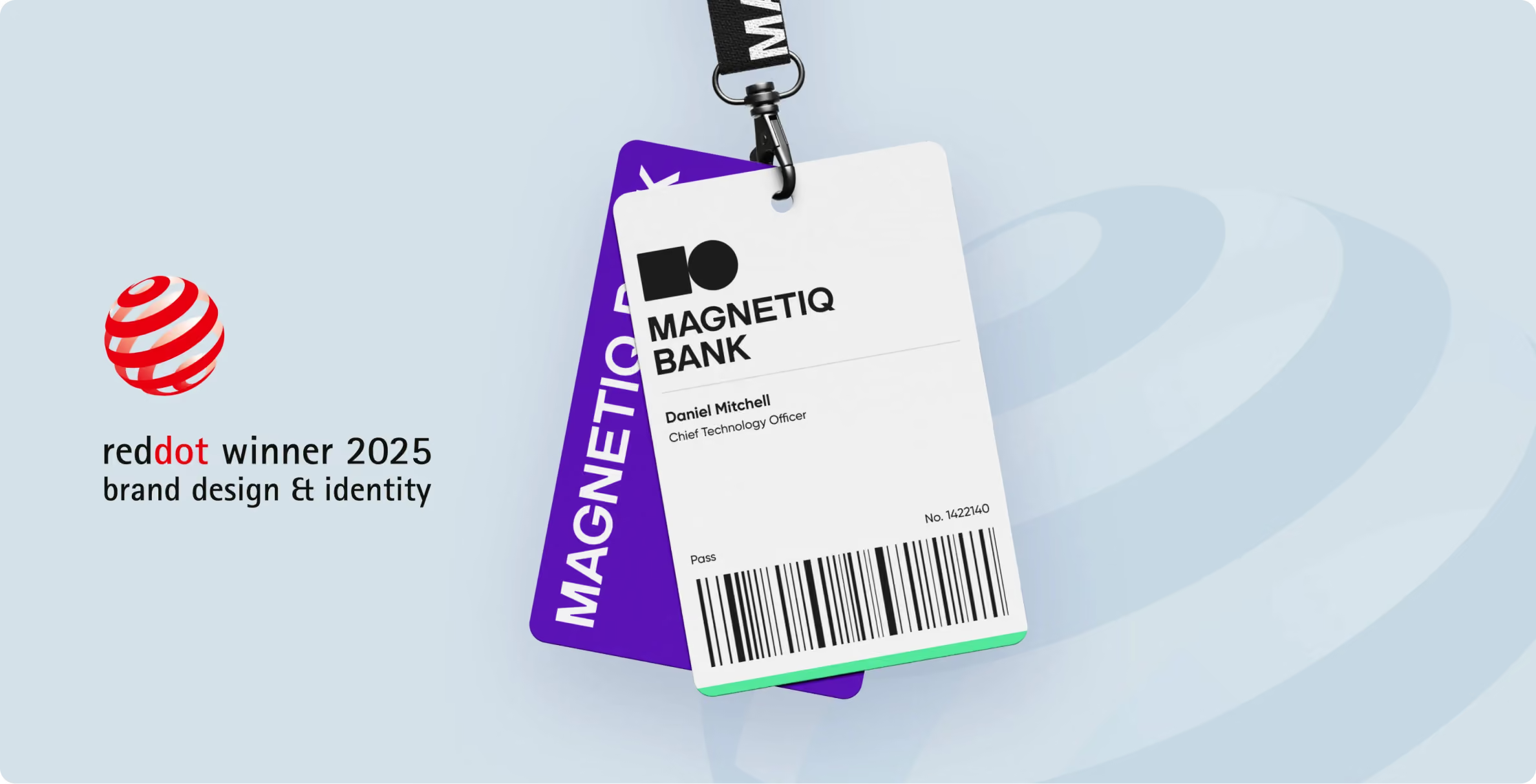
The brand strategy and visual identity were developed in parallel. It made the process faster, but it also meant both teams had to stay closely connected throughout the project.
Goodface led the design track — logo, visual identity, design system, and website. The marketing team worked on positioning, strategy, and naming. These tracks couldn’t develop independently: the name influenced what the visual identity needed to communicate, while the visual direction affected how the new name was perceived.
Regular check-ins gave both teams a chance to test those decisions as they developed. Design directions were reviewed against the positioning, while the marketing team could see and react to visual concepts before the identity was finalised.
By the end, the name, mark, colour palette, and website were built from the same brand idea rather than connected at the final stage. That consistency came from developing strategy and design together, with both teams shaping the work along the way.
Parallel tracks between brand strategy and visual design save time. They also create moments where a naming decision late in the process requires extra visual work reviews.
We handled this well on the Magnetiq project, but the coordination overhead was real. For future projects of this scope, we’d build more formal sync points between the strategy and design tracks earlier — to reduce the cost of late pivots.
The parallel approach was the right call for this timeline. There’s a slightly tighter version of that workflow, and we’ll use it next time.
CAN LEARN
A bank rebrand needs to give teams more than a new visual identity.
The Magnetiq Bank project started with a clear brand position that the marketing team had already defined. The name shaped what the logo needed to communicate. That direction then informed the visual identity, which in turn gave the design system and website a clear foundation.
For banks and FinTech companies considering a similar project, the design work needs a clear starting point. Where do you want to sit in the market? Who are you trying to reach? What should the brand communicate? And how will different teams use the identity once the project is complete?
The answers should guide the visual identity and the systems built around it. Brand guidelines define how teams use the existing identity. A design system goes further by giving them reusable components and rules for creating new digital and physical materials.
That distinction becomes especially useful as a bank enters new markets. Local teams can create landing pages, campaigns, presentations, and product interfaces from the same system without having to make the core design decisions again.
Want to start a project with us?

Your request has been sent and will contact you soon by this email yourmail@mail.com

Let's discuss your upcoming project on a call

We usually reply within 1 hour during working hours: 9:00–20:00 (GMT+3)


.avif)