












Emerald24.
UX/UI design and corporate website redesign for digital payment platform

Emerald24 is a UK-based digital payment and EMI provider offering multi-currency accounts, cross-border transactions, and financial infrastructure for businesses allowing users to hold, send, and receive funds in more than 30 currencies.
Challenge
When the product's internal complexity started to slow users down — through fragmented onboarding, cluttered dashboards, and inconsistent cross-platform flows — the company brought in Goodface to rethink their UX design from the ground up.
The platform remained reliable, but users began to complain about convenience and legacy interfaces; however, specifically, it was deeper:
- Onboarding combined verification, documentation, and validation into a single extended flow
- Dashboards mixed high-frequency and secondary actions without clear prioritization
- Web and mobile pursued similar goals but relied on different interaction patterns
At the same time, the corporate website no longer reflected the company’s maturity.
- Its visual identity lacked cohesion.
- Its structure didn’t represent the breadth of services.
- The number of pages and content depth didn’t match the product's scale.
In the first workshops, we skipped the feature wishlist and asked simpler questions: where do users get stuck, what do internal teams need to stay compliant, and what breaks when the product grows. Those answers set the direction for everything that followed.
The product and the website had the same problem — both had grown without a plan to grow. Fixing them separately would have meant doing the same thinking twice, so the company tackled both at once. That decision also changed how we worked together. What was scoped as a project became an ongoing collaboration.
How we approached the project
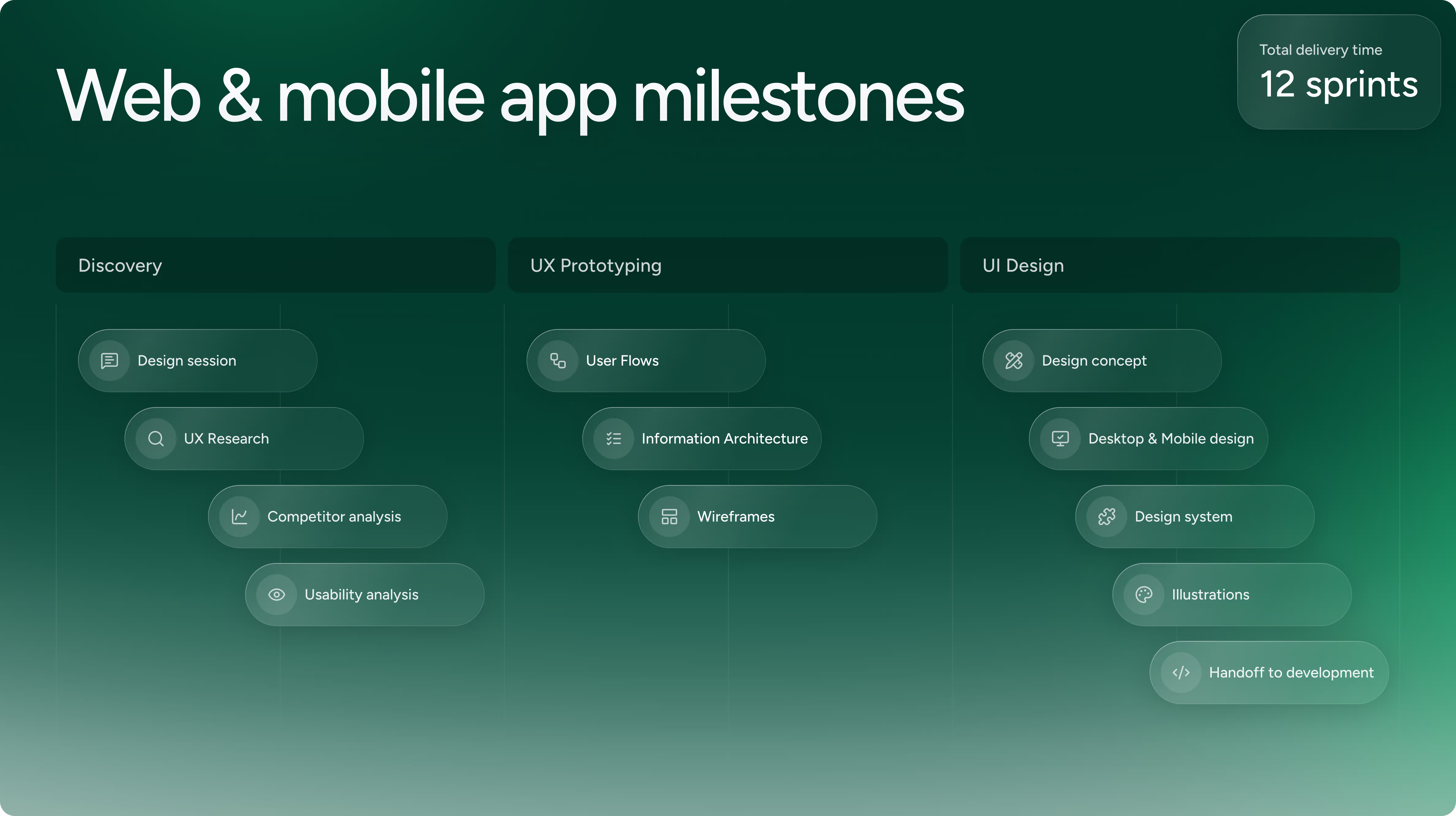
Goodface worked across the web and mobile banking interfaces, onboarding, and the corporate website. Rather than improving individual screens in isolation, we first looked at how the product worked as a whole: how users moved through key tasks, where compliance requirements affected the experience, and which parts of the system would become harder to manage as the product grew.
This gave the team a common framework for the UX/UI work and website redesign. Product decisions could then be made against the same set of user, operational, and business requirements.
What the fintech platform needed to support
We structured the product design process around three groups of requirements.
- For users, everyday tasks such as onboarding, payment approvals, and account management needed to work clearly across web and mobile. The experience had to remain familiar when users moved between platforms.
- For internal teams, compliance requirements needed to remain visible without turning every task into a manual review. The system also had to make future changes easier to introduce.
- For the business, the digital banking platform needed enough structure to support new capabilities without creating more coordination work across teams.
These requirements gave the team a basis for prioritising decisions. When different needs competed, we could assess the trade-offs against how the product actually operated rather than relying on interface preferences.
Working model
We worked directly with Emerald24’s product, compliance, and operations teams throughout the project. Regulatory and operational requirements were part of the design process from the start, so product decisions could be reviewed with the people responsible for those areas as the work progressed. The team defined the product structure and implemented it in parallel, rather than separating strategy,
The roadmap we agreed on
The work followed five connected decisions:
- Establish product logic that stays consistent across web, mobile, and key banking flows.
- Rebuild onboarding as a staged progression while keeping compliance requirements visible.
- Create a clearer action hierarchy for high-density banking screens.
- Align interaction patterns across web and mobile so users do not have to relearn the same tasks.
- Redesign the corporate website to communicate the wider fintech product ecosystem clearly.
The sequence kept the work focused on the underlying product structure first, before moving into individual interface decisions and the corporate website.






Product
Website
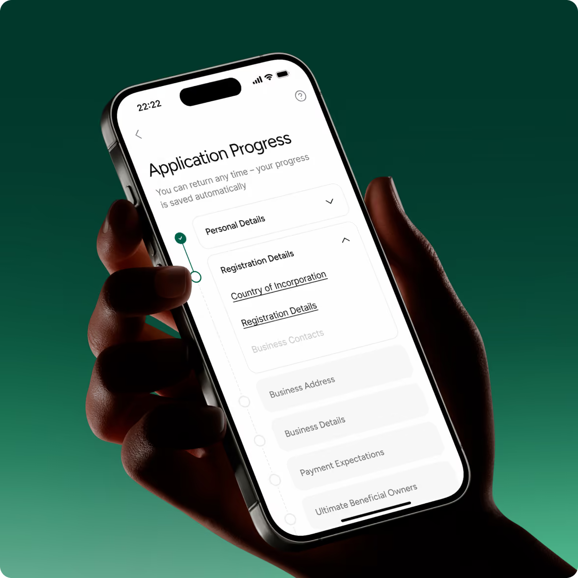
Gradual onboarding flow
The previous onboarding flow combined identity verification, document submission, and validation in one long process. We divided it into smaller stages, each focused on a single step.
Users move through verification gradually and can always return to previous information without restarting the flow. Compliance requirements remain fully visible, but they no longer accumulate into one overloaded form.
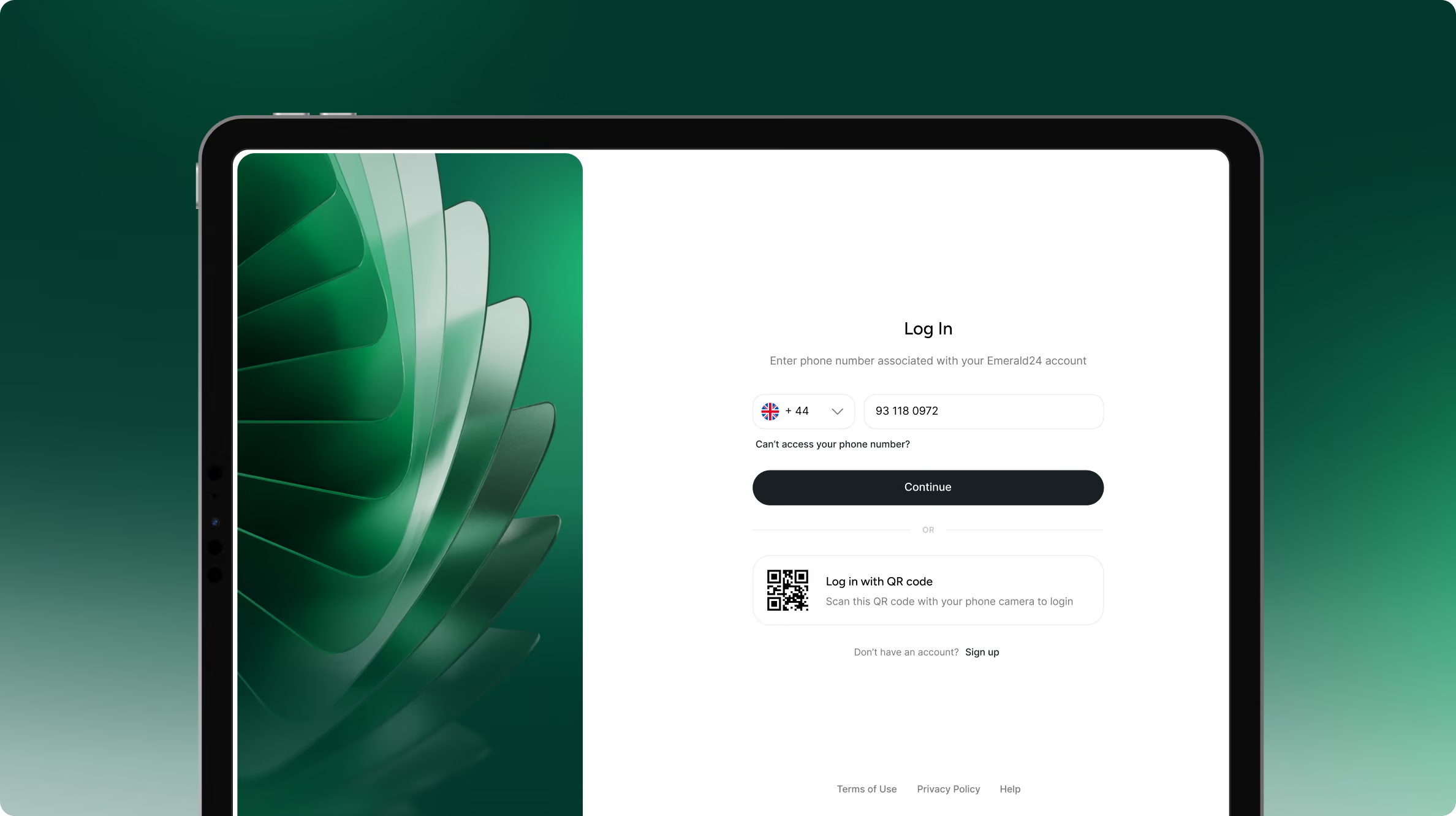
As a result, new users complete onboarding with less fatigue and fewer interruptions cutting time to reach the review stage from 40–60 minutes to 20–30 minutes.
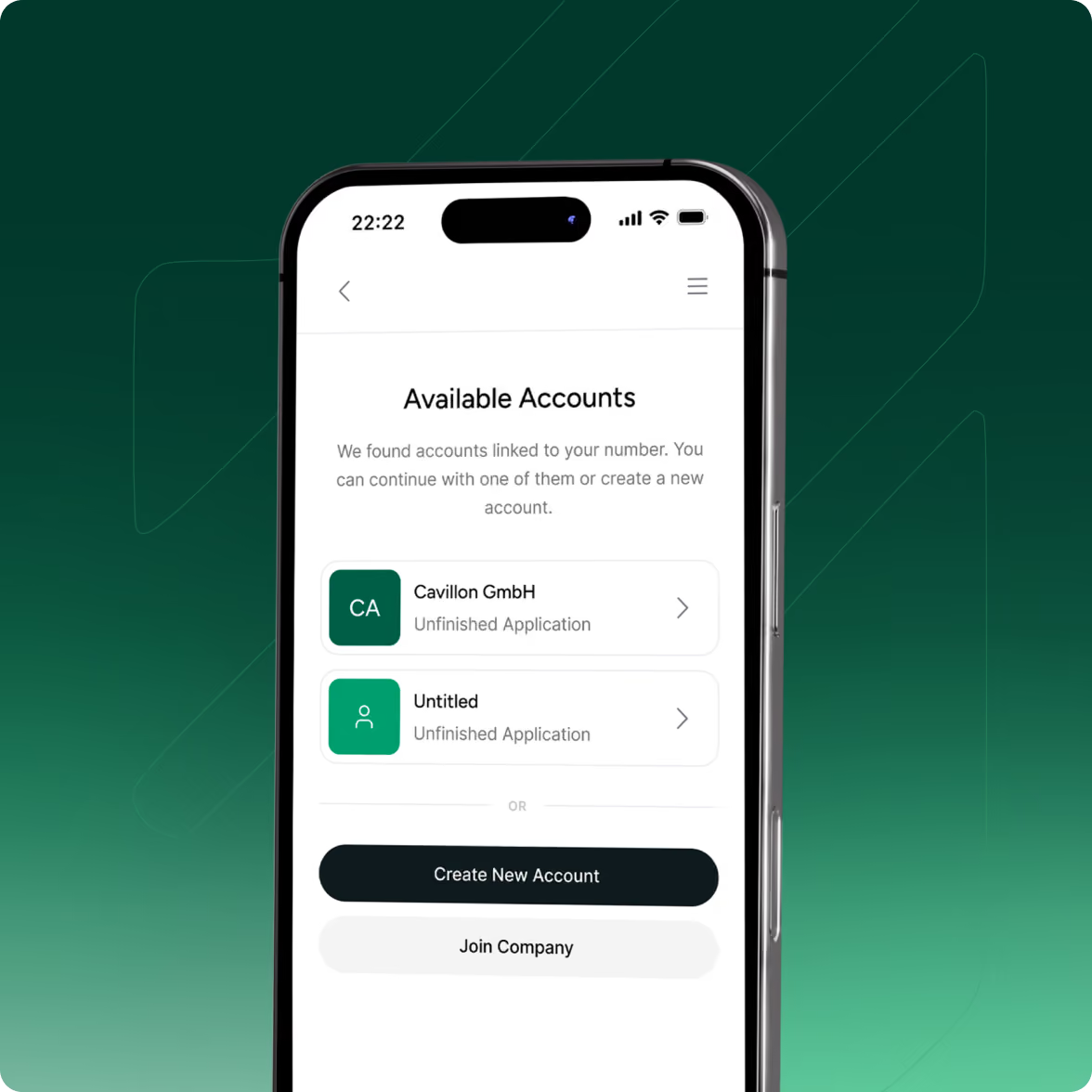
Progressive disclosure
We restructured the application process into a series of clear steps with visible progress. Each stage asks for only the information needed at that point, so users can move through the application without having to process everything at once.
We also automated parts of the flow and removed outdated offline steps, turning the application into a fully digital process. Users can leave and return later without repeating information they have already provided.
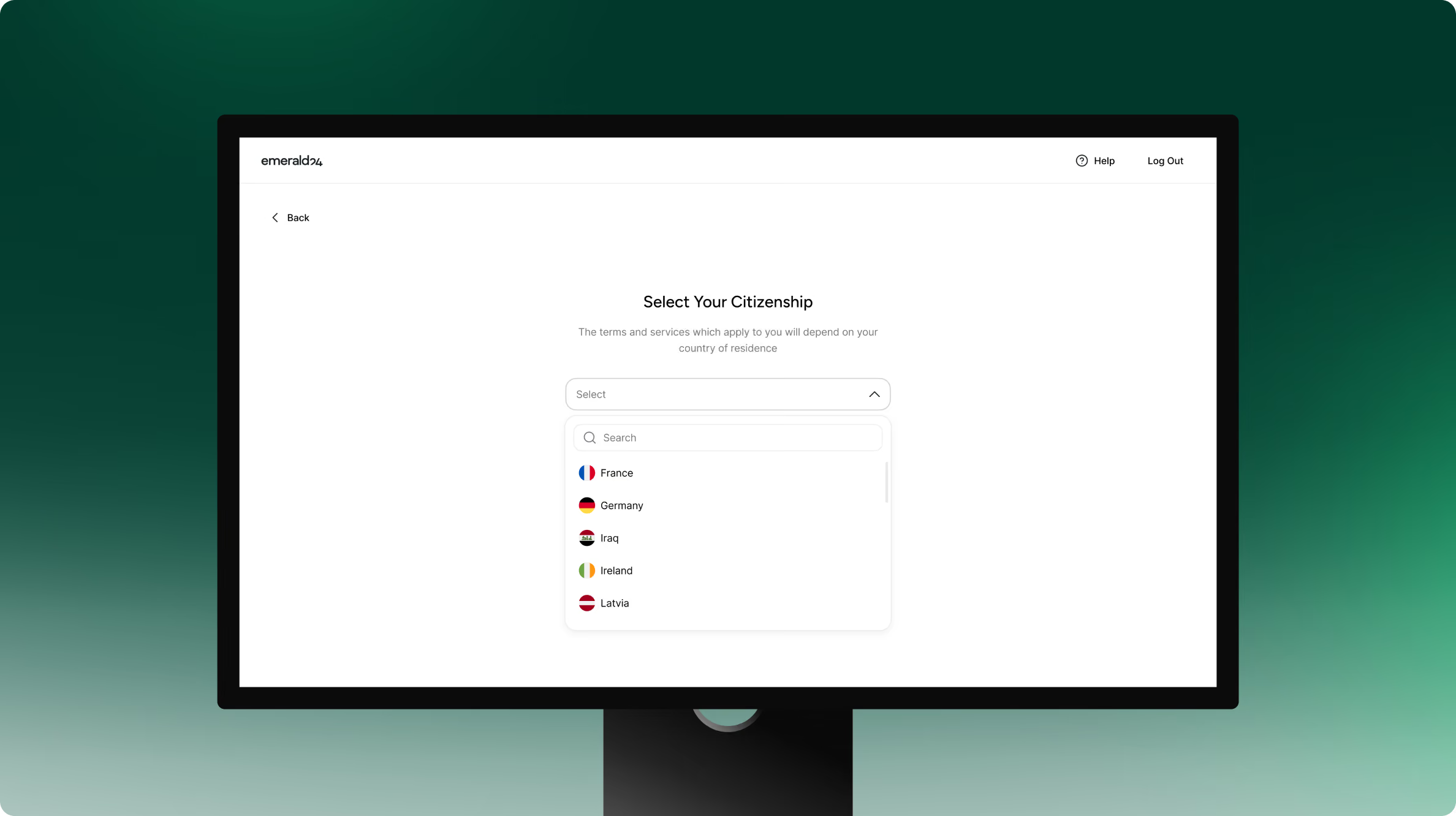
Key documents are requested early in the process to avoid delays further down the line. Users can also go back at any stage to review or update their information without losing their place in the application.

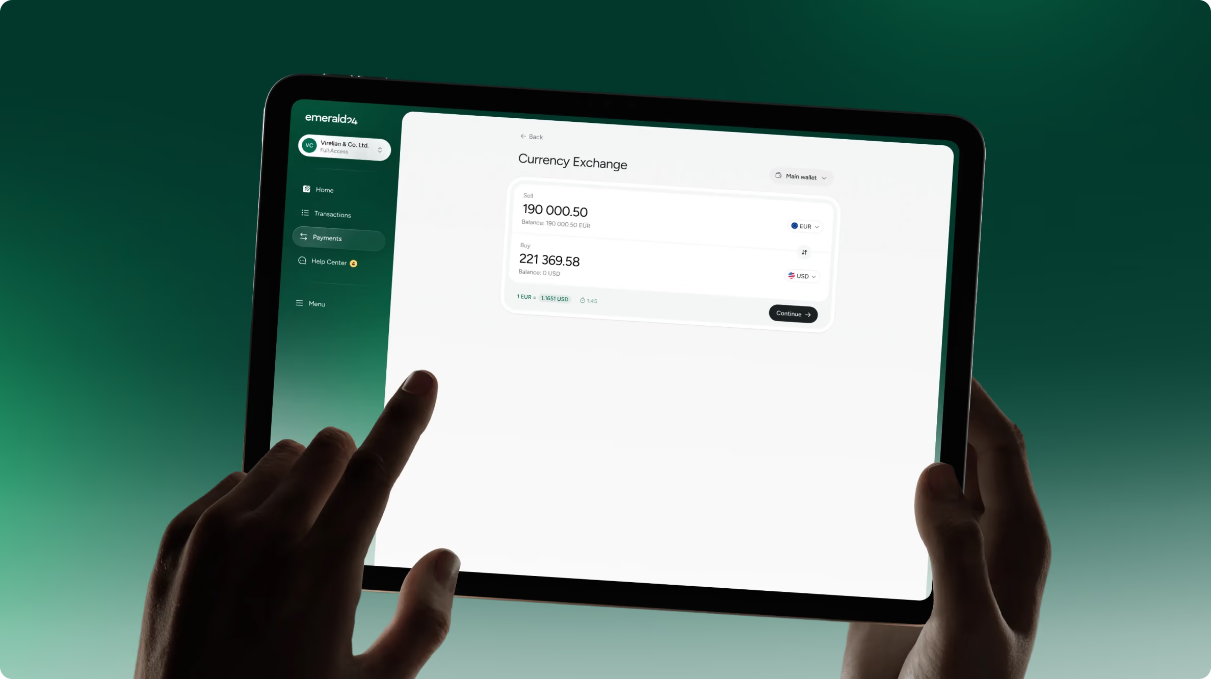
Synced digital payment flows across web & mobile apps
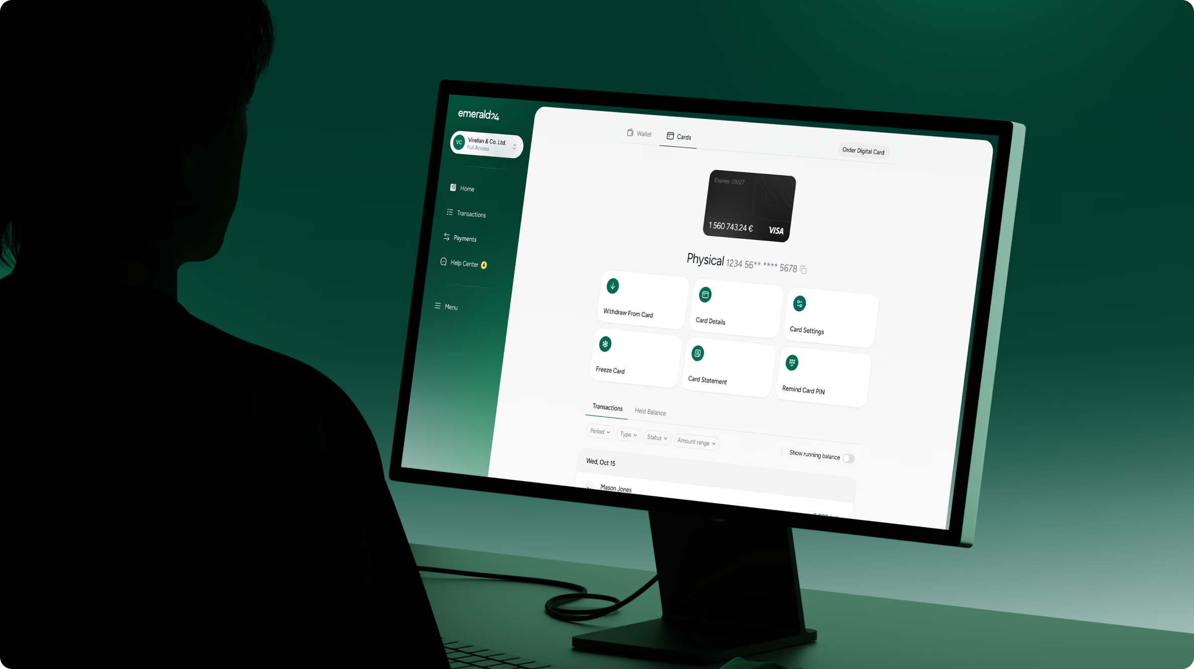
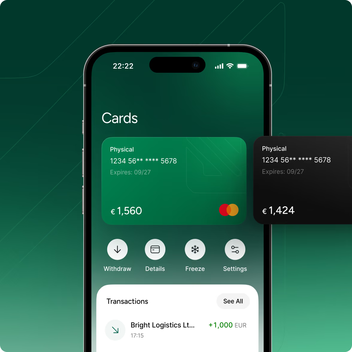
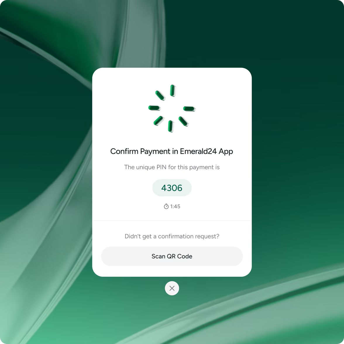
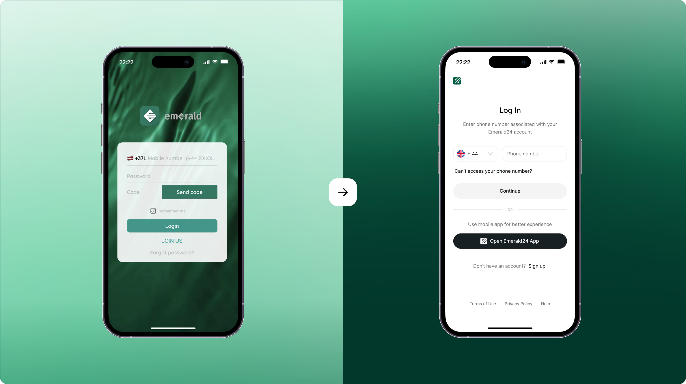
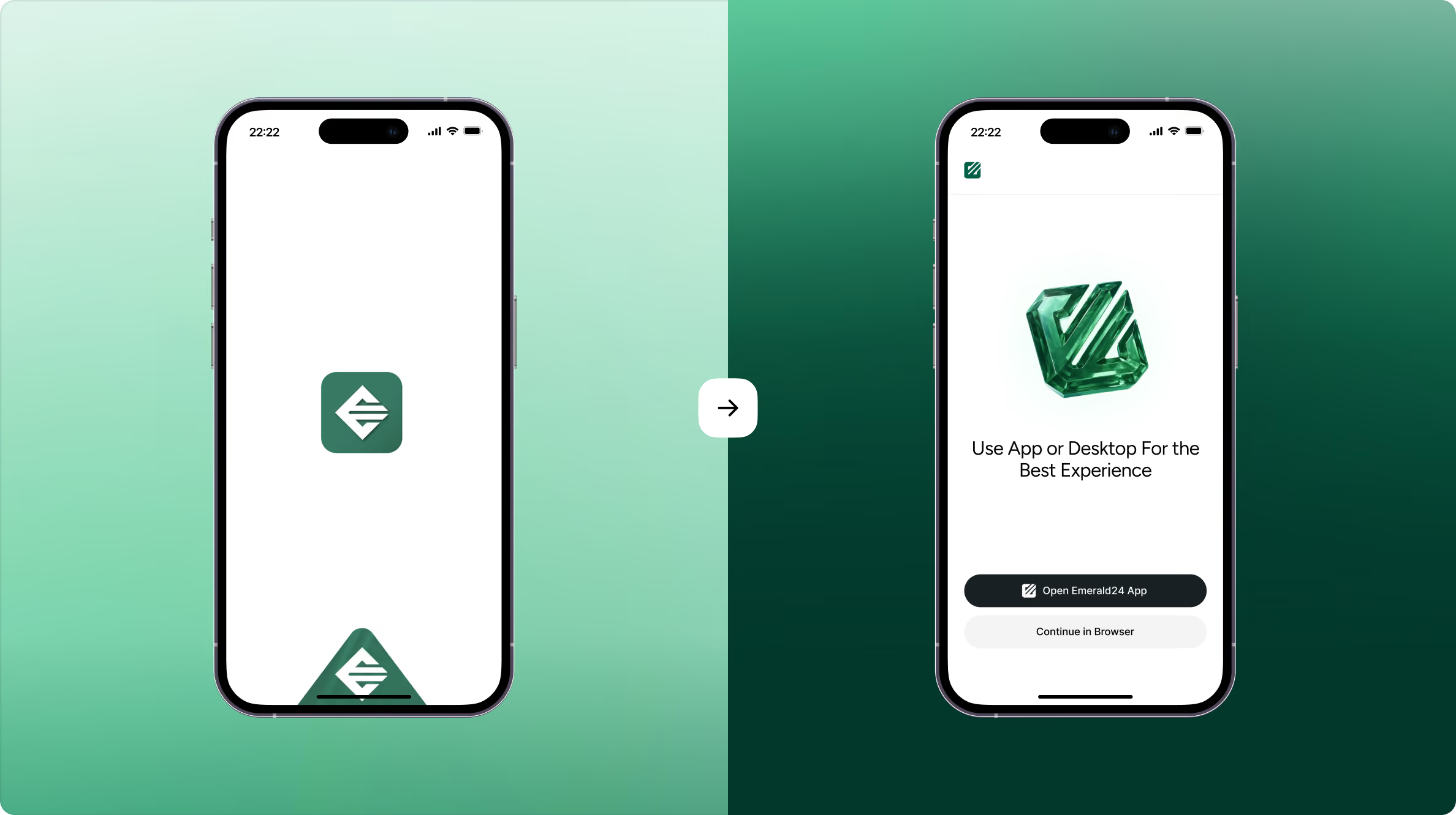
Emerald24 clients often start financial operations on web banking and complete them on mobile devices. To support this behavior, we designed app-centric interaction flows while preserving the existing authentication model, which uses SMS OTP and password verification.
At key interaction points, users receive a clear option to continue the process in the mobile app.
This creates a predictable transition between channels and reduces friction when switching devices.
The outcome is a cross-platform experience in which web and mobile banking operate as a single, integrated system rather than as separate products.

Feature prioritization for different user roles
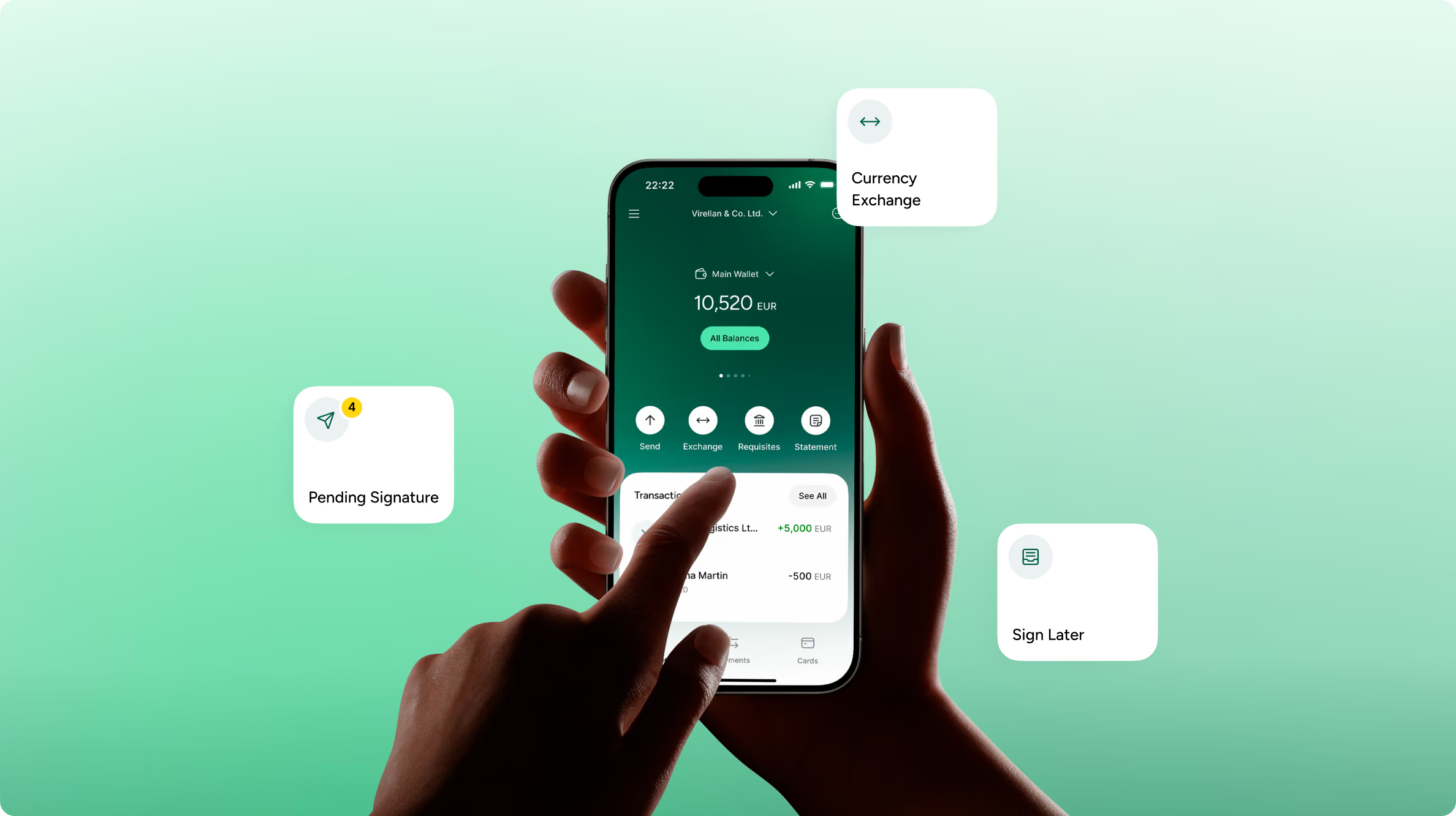
Emerald’s product serves several user groups with different responsibilities. A finance manager, business owner, and ops specialist interact with the platform in different ways.
We structured the banking app by separating features into three levels: must-have, should-have, and nice-to-have. Each feature was then mapped to real usage frequency (daily, weekly, or occasional) across the three primary roles.
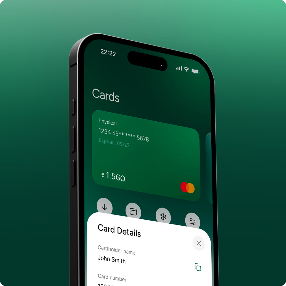
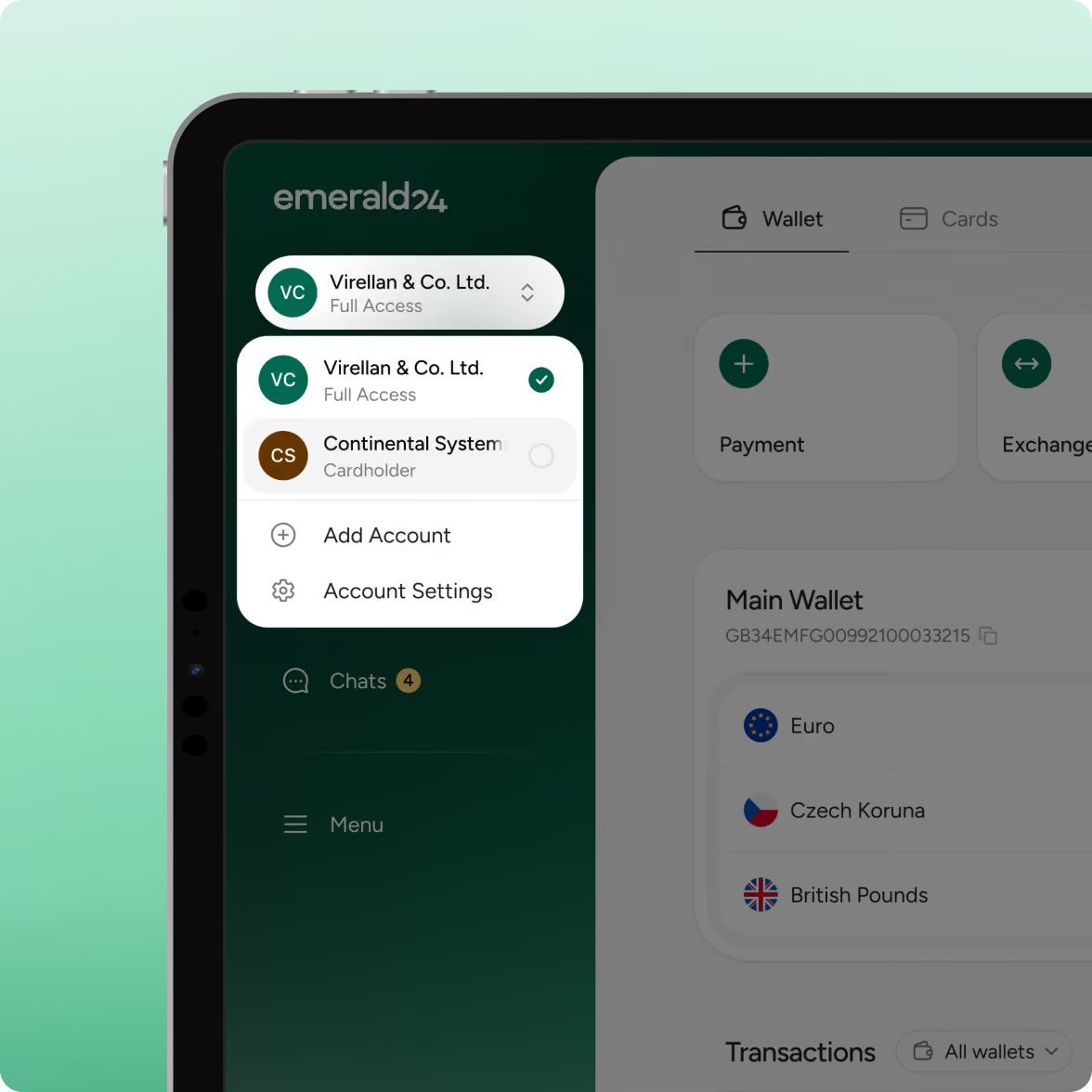
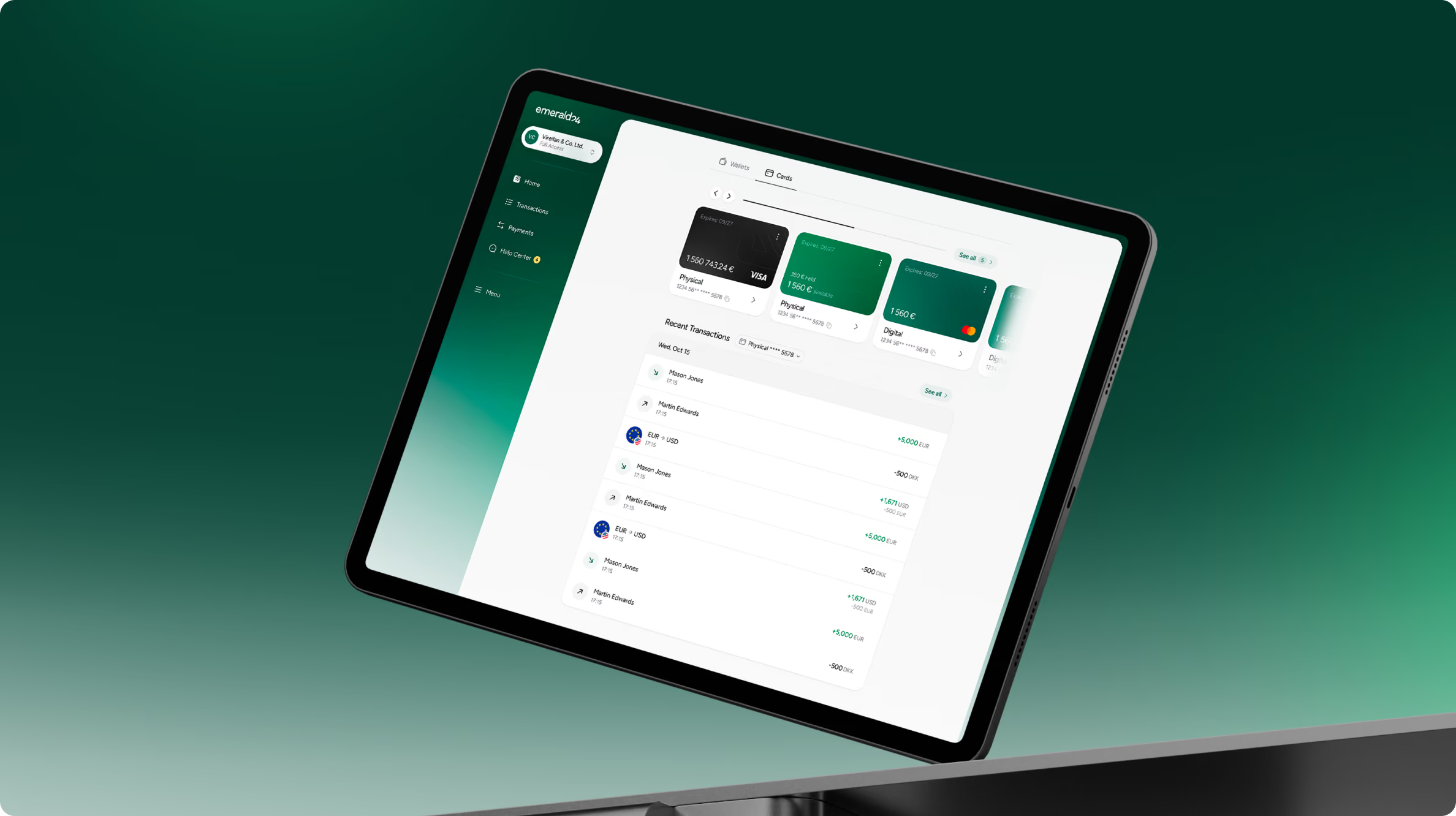
This allowed us to design a UI where high-frequency financial actions remain immediately visible, while secondary tools are placed deeper — in sections like “Settings,” “Profile,” or “Advanced.”
Refreshed fintech brand identity without a full rebranding
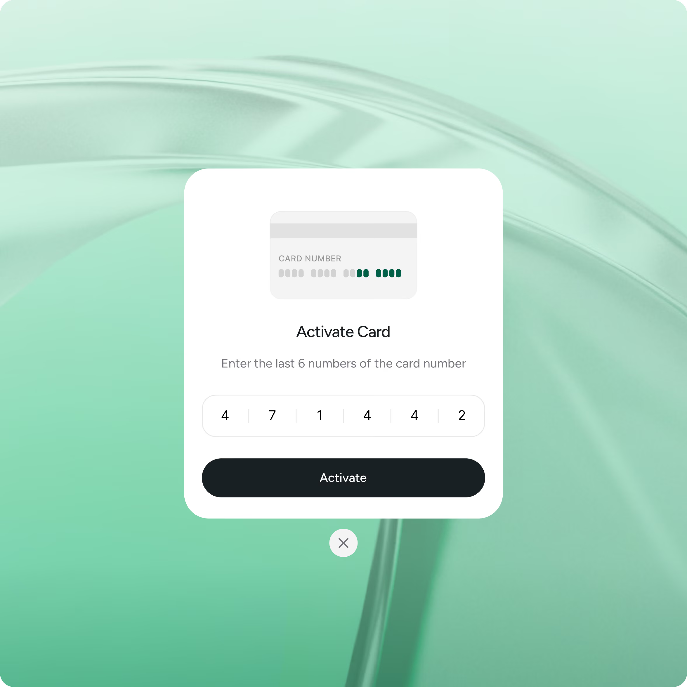
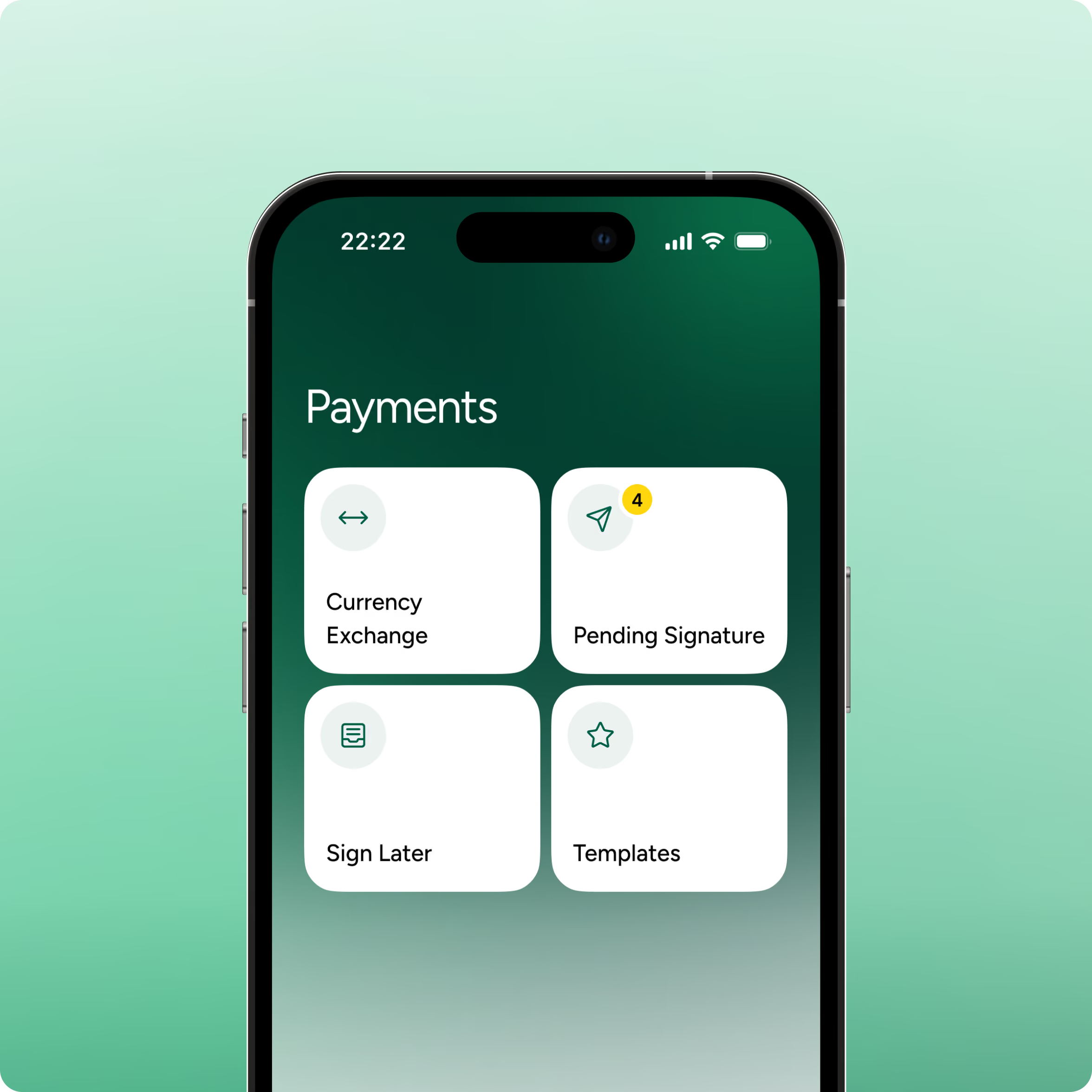
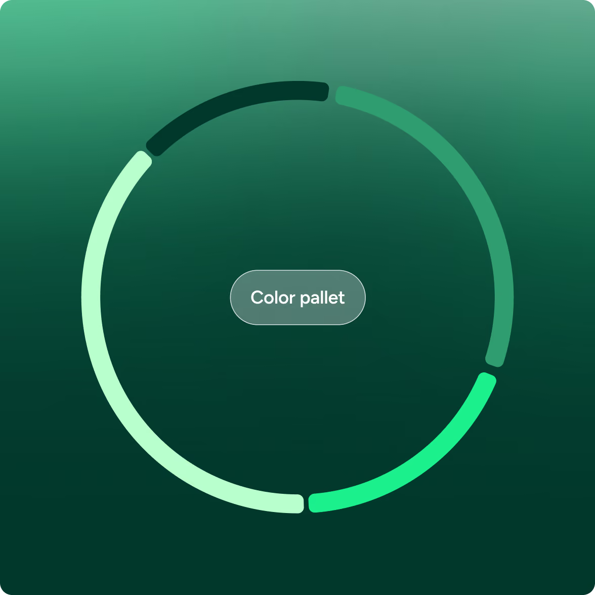
The refreshed identity introduced glass textures, a green gradient, and glass-style illustrations. We used these elements selectively, keeping the interface clear and avoiding a decorative treatment that could get in the way of everyday banking tasks.
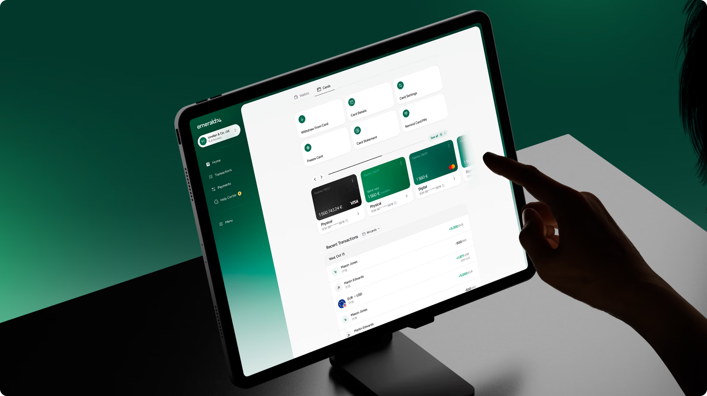
The gradient became a key element of the design system, while 3D glass icons were reserved for specific contexts where they added meaning. This gave the brand a more current visual language without changing the overall character of the product.
The result stayed close to what the client wanted: a modern identity that still feels professional and works across the banking experience.
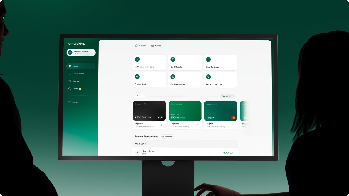
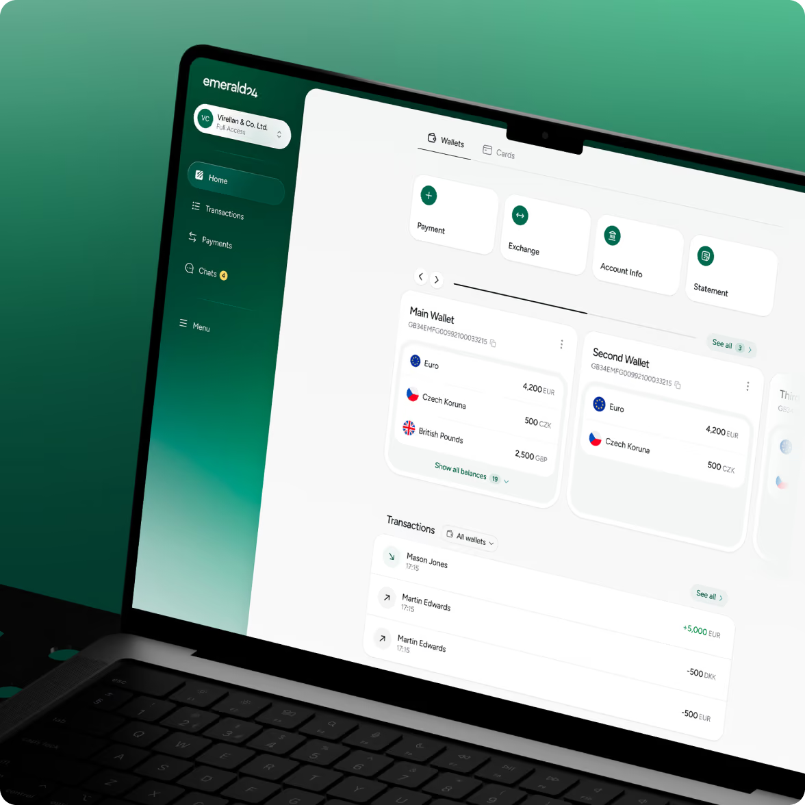
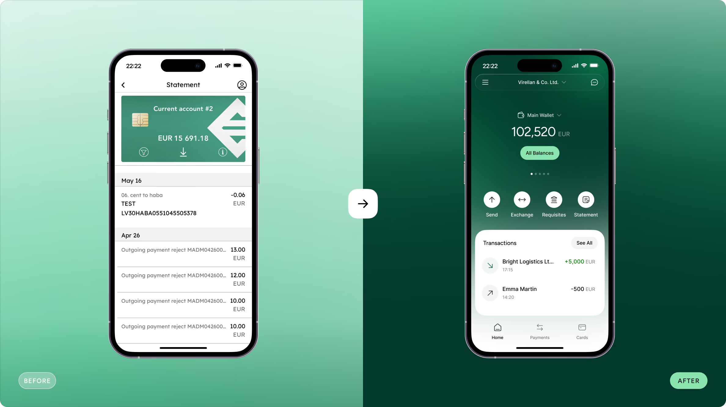
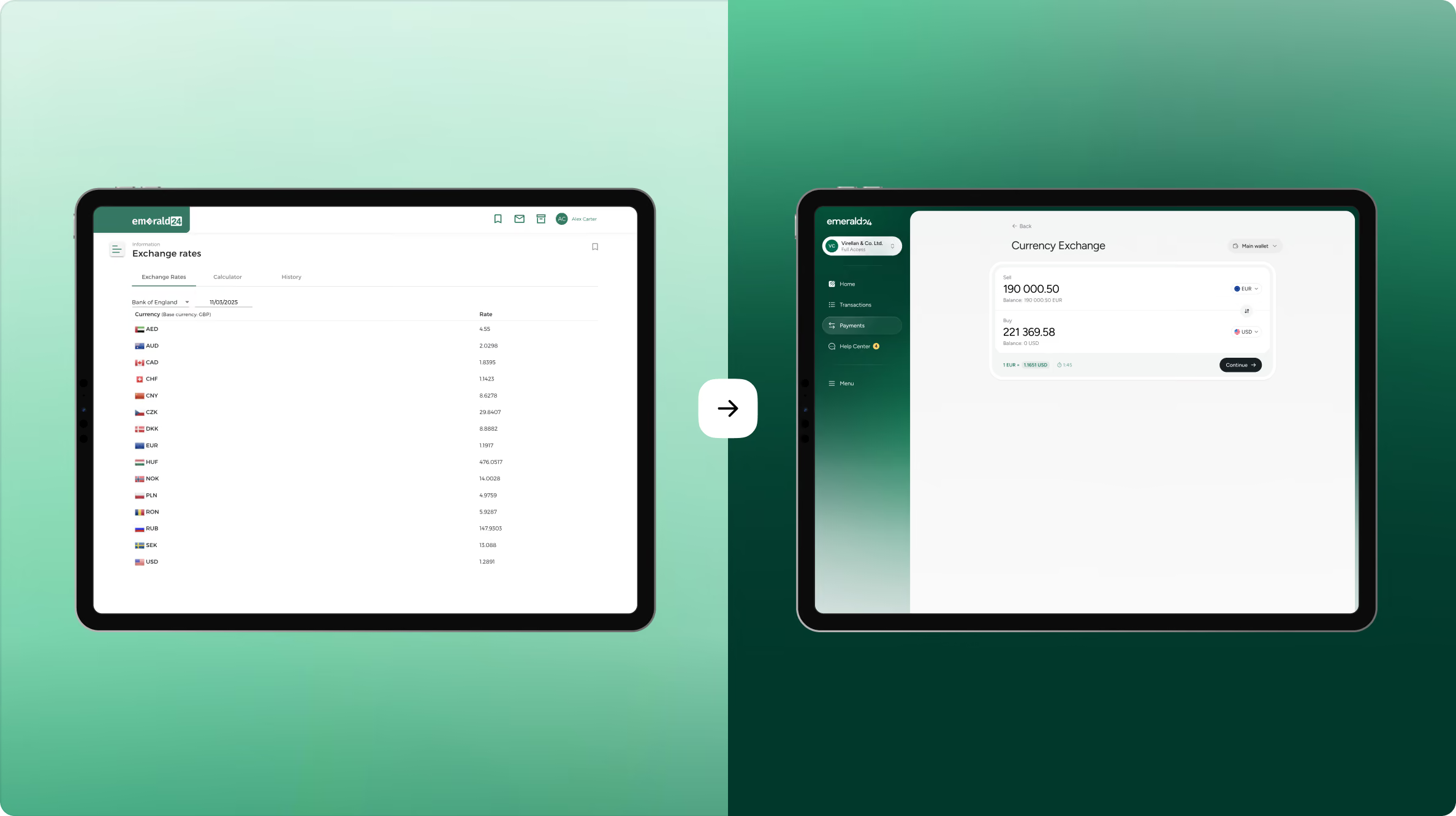
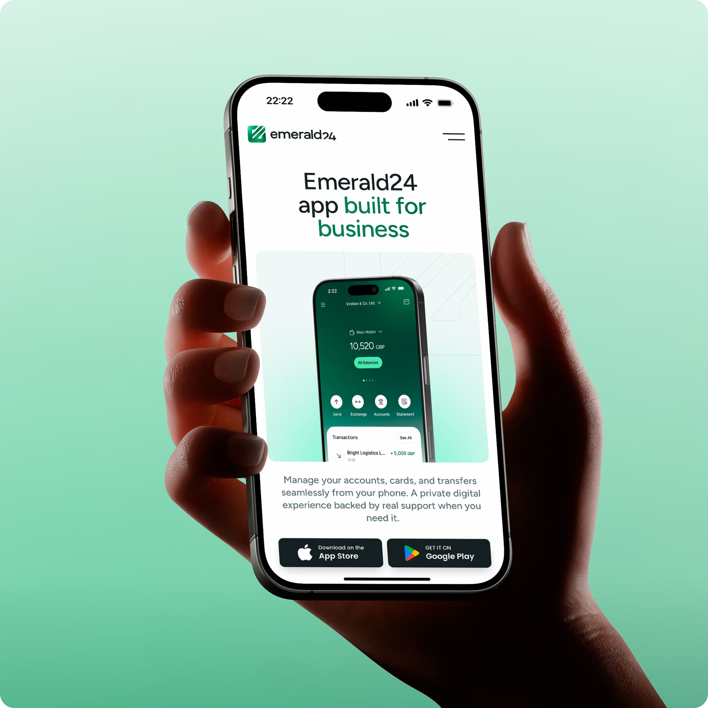
Updated virtual payment app home screen for power users without overwhelming everyone else
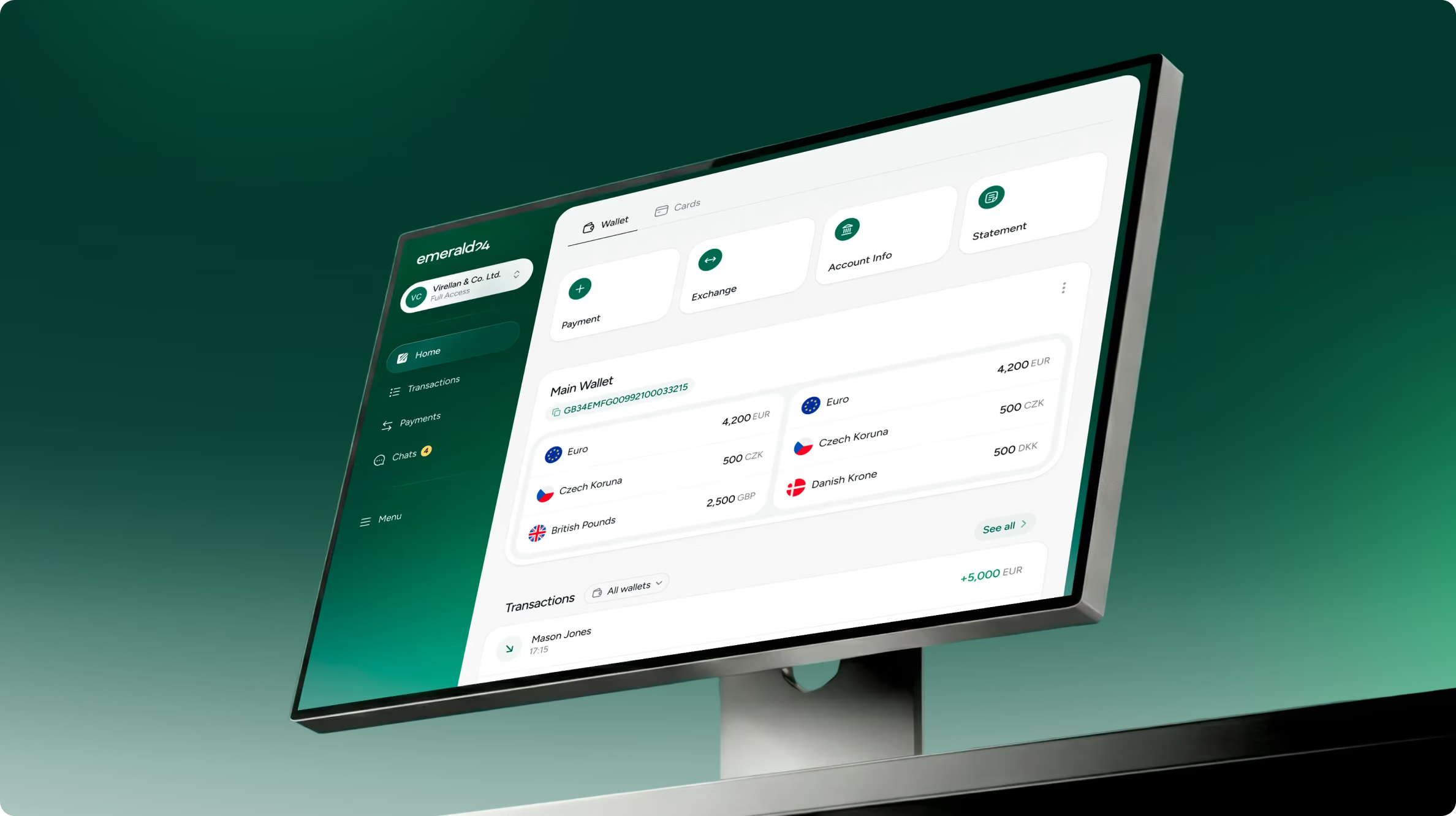
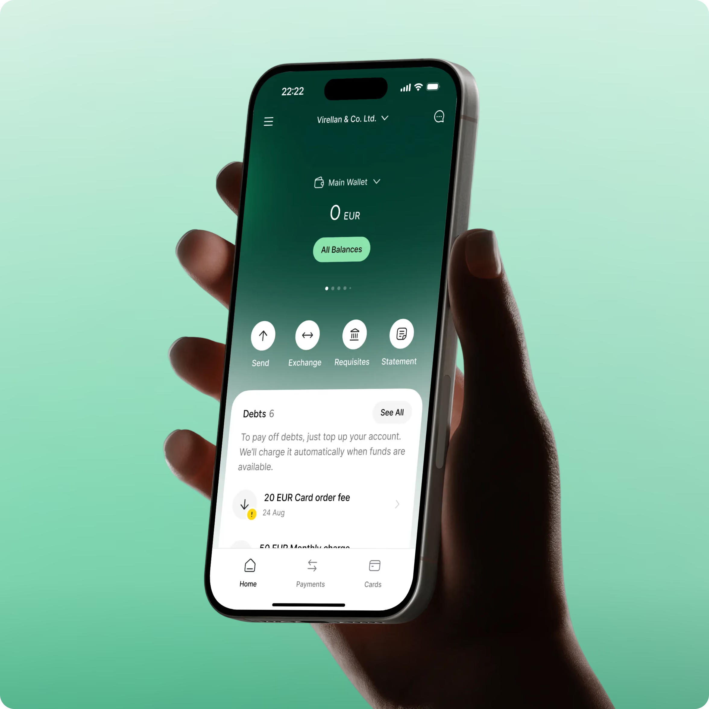
The home screen needed to bring multiple wallets, currencies, and business accounts into one view without making the interface harder to scan. We explored different layouts to increase the amount of information available while keeping the hierarchy clear.
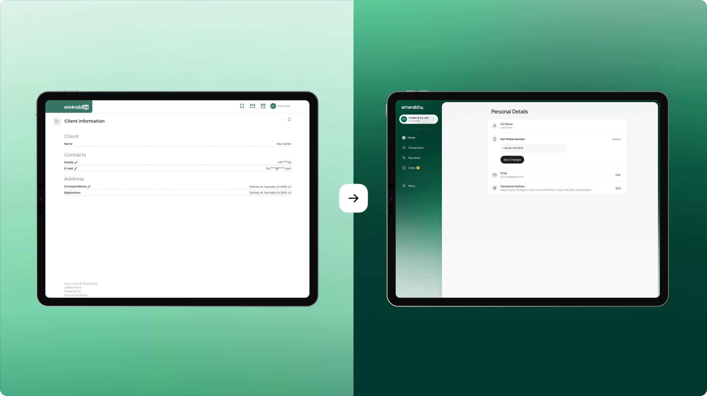
On desktop, we introduced a modular structure with a separate sidebar and workspace, supported by five reusable patterns that work across different contexts. This gave the interface a consistent structure even when users were working with large amounts of financial data.
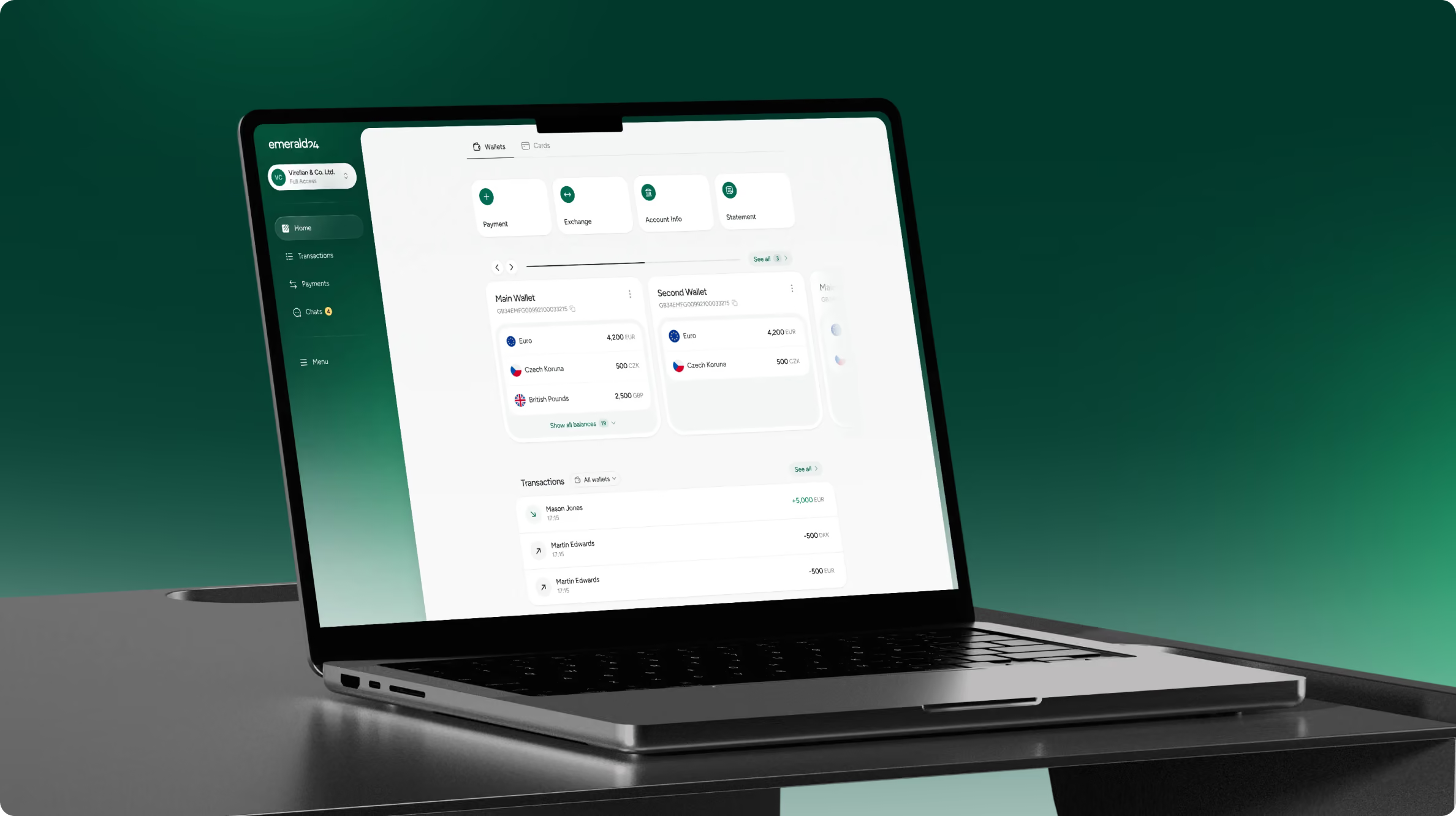
The main challenge was serving two very different user needs. Accountants needed quick access to detailed financial information, while business owners needed a simpler overview.
We kept the default view focused and moved the more detailed accountant-focused views behind a “See all” entry point. Power users could reach the depth they needed without making the main screen harder to use for everyone else.
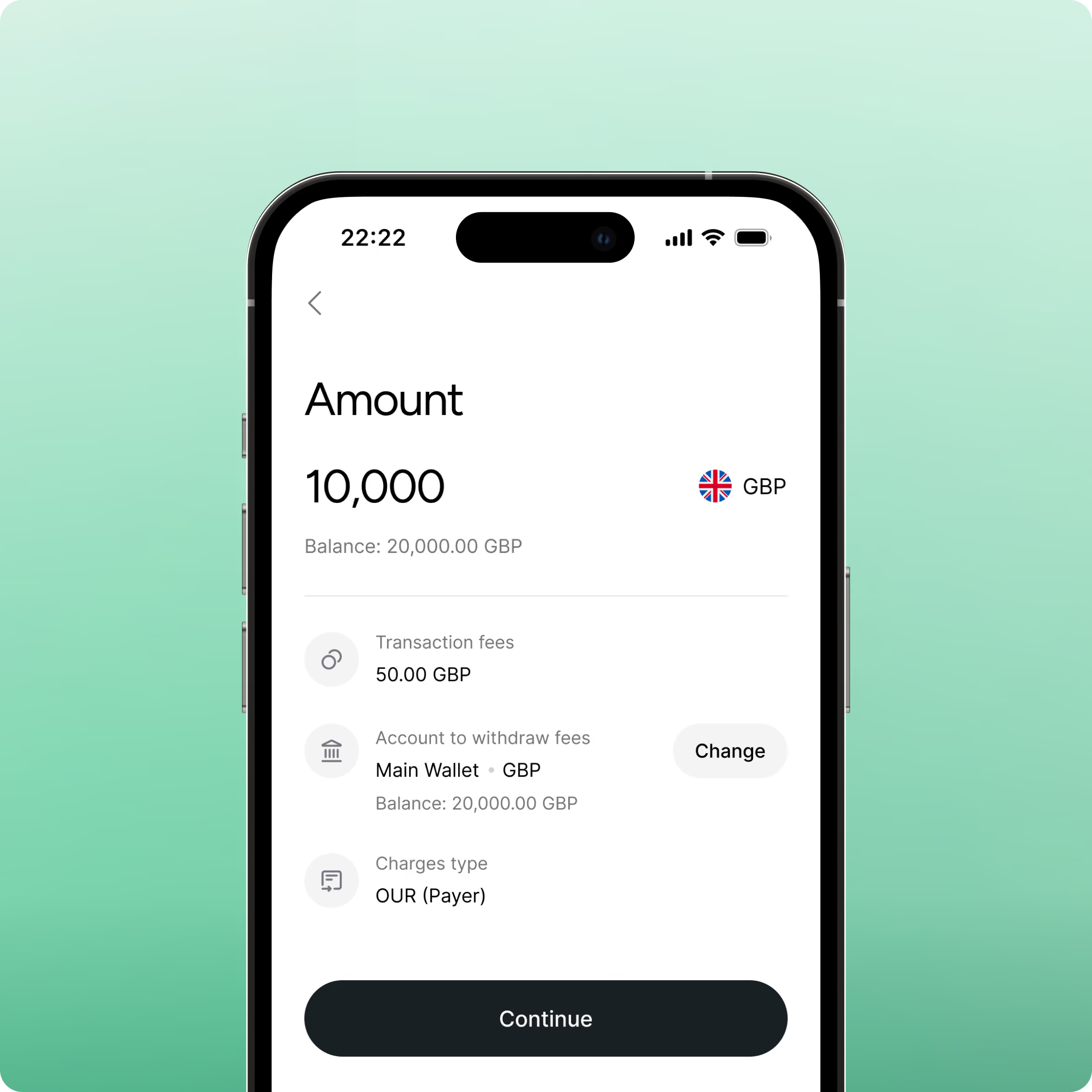
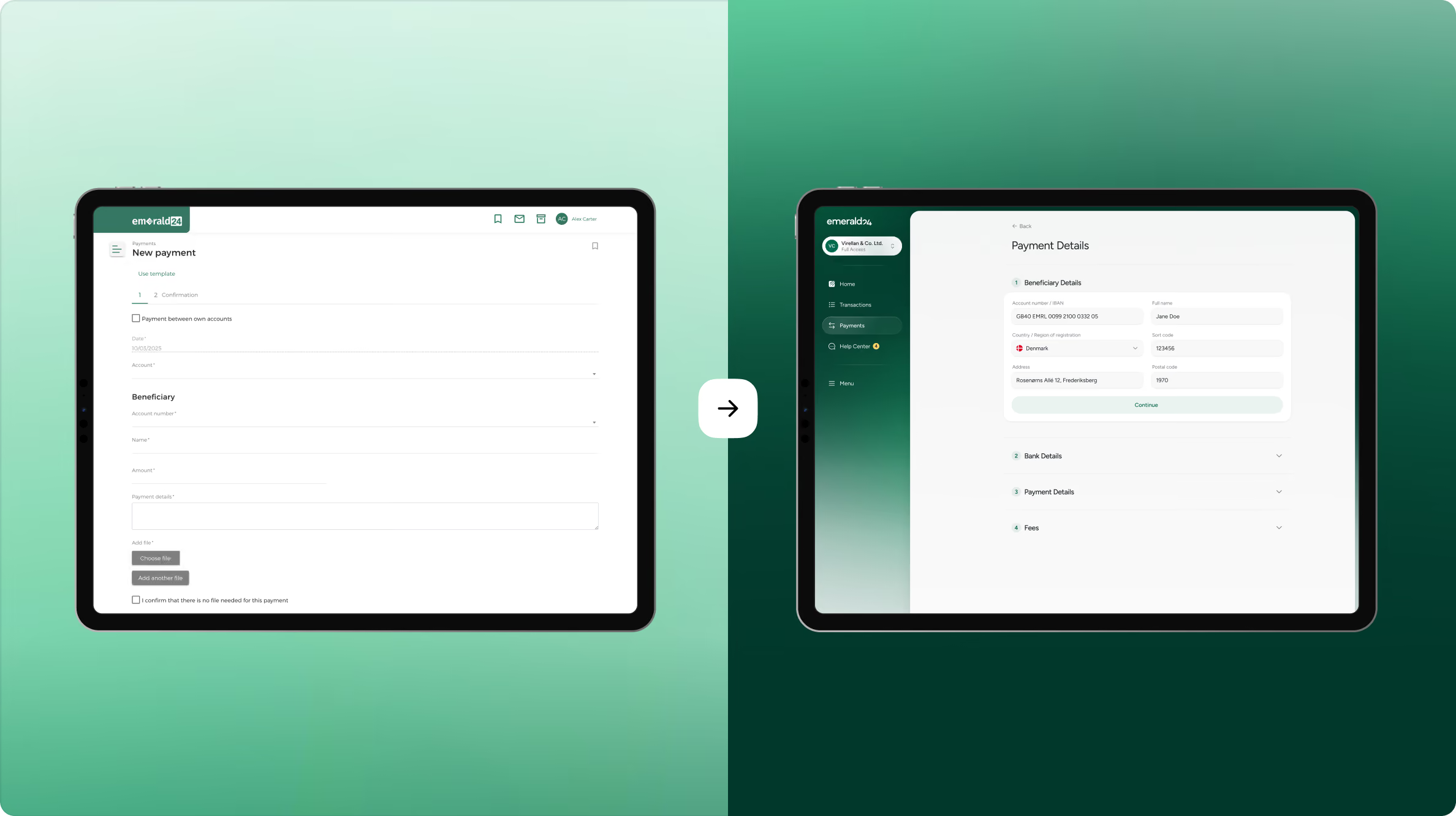
Redesigned legacy payment form
Emerald’s previous payment forms were long and difficult to work through. We broke them into smaller steps, using familiar patterns from e-commerce flows, with each step focused on one part of the payment.
Users can still review their previous inputs without leaving the flow. Their completed information stays accessible in a compact view, while the current step remains the main focus.
This makes the form easier to navigate without taking control away from the user.
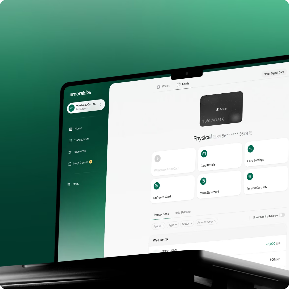
Batch payment approvals for business banking
Many Emerald24 clients log in specifically to approve several payments at once.
Previously, each transaction required a separate signing action. We introduced batch signing so users can select multiple payments and approve them in a single confirmation.
Key actions such as sign, reject, and review details remain visible throughout the process.
This change reduced repetitive steps and made daily financial operations faster.
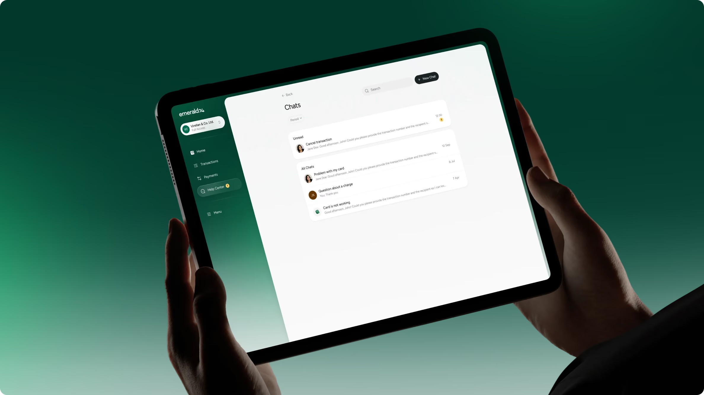
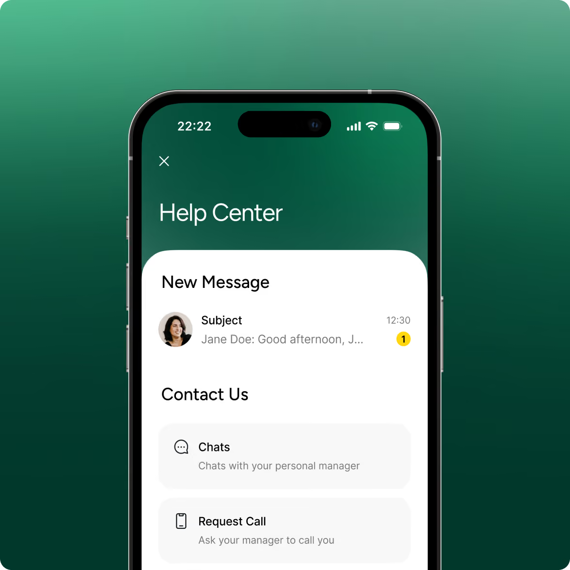
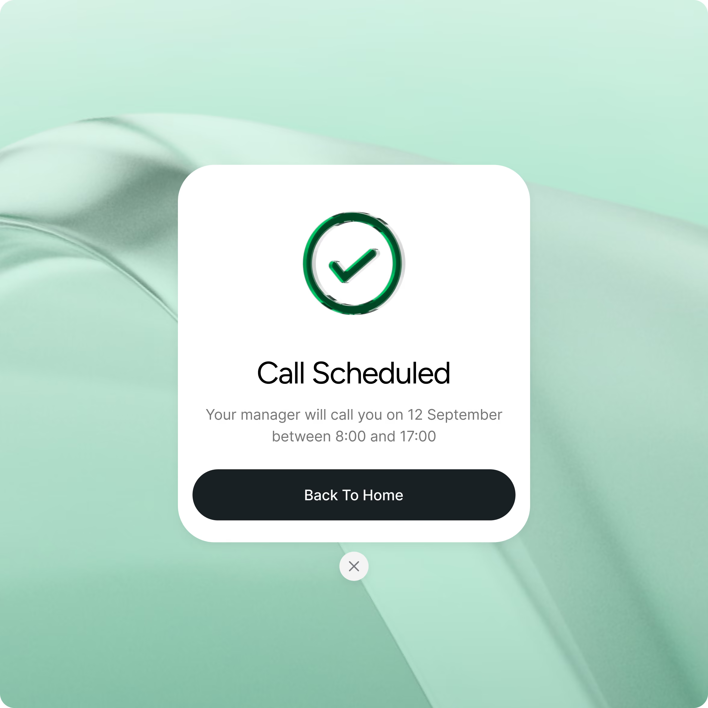
Issue-based customer support system
Customer support previously relied on long message threads that mixed multiple topics.
We reorganized support around real issue conversations. Each request opens a dedicated thread while the internal processing logic remains the same.
Users can now track the status of individual requests without scanning long histories. For internal teams, this structure improves traceability and speeds up resolution.



.webp)

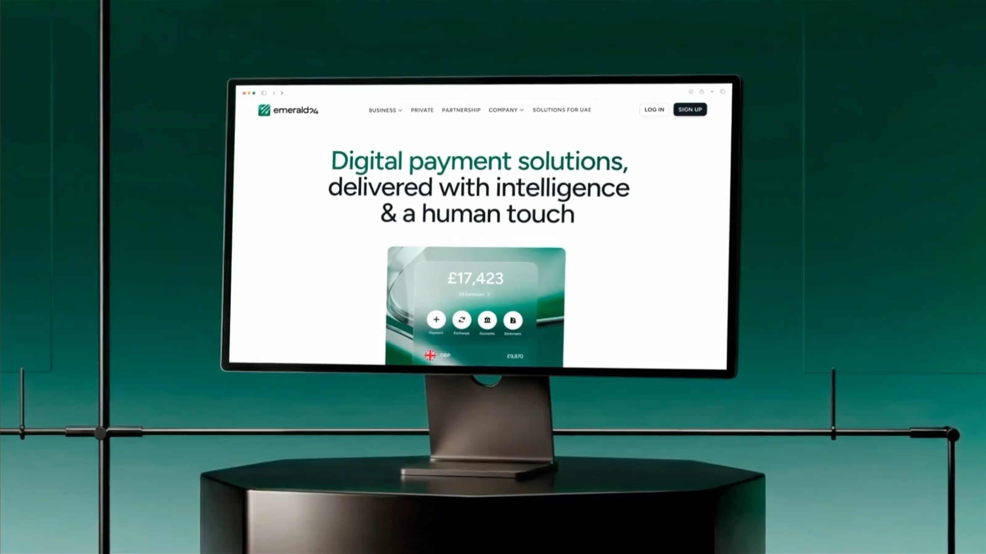
Website redesign & development for digital payment provider
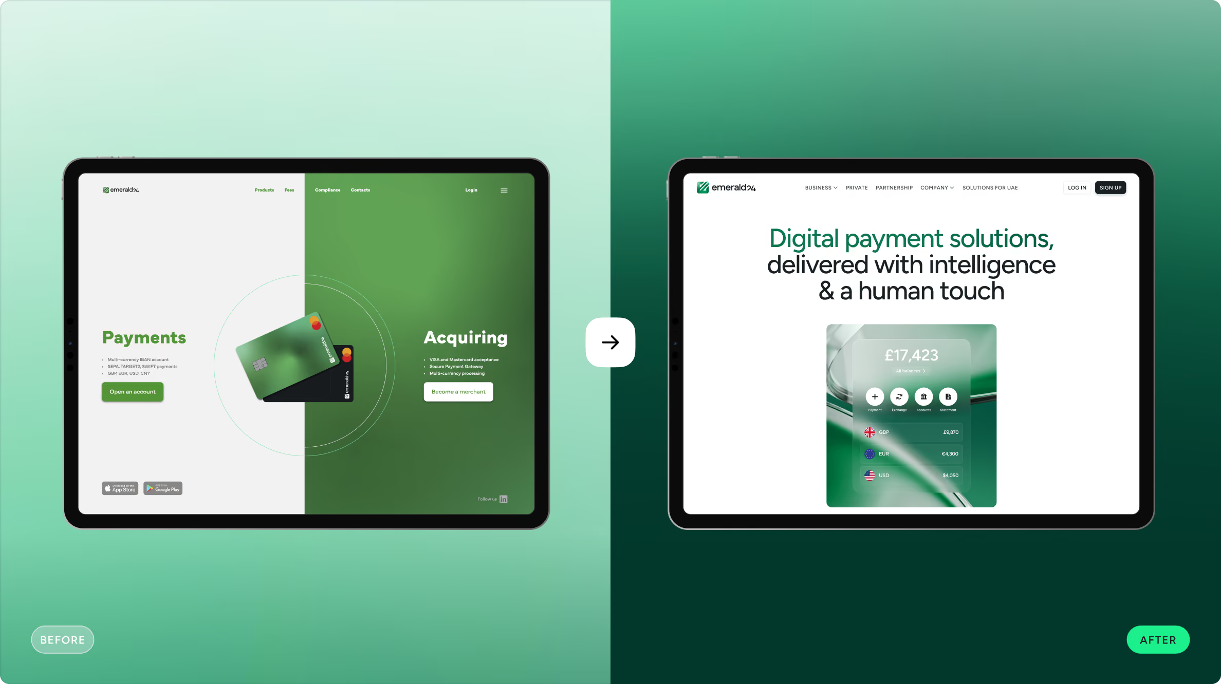
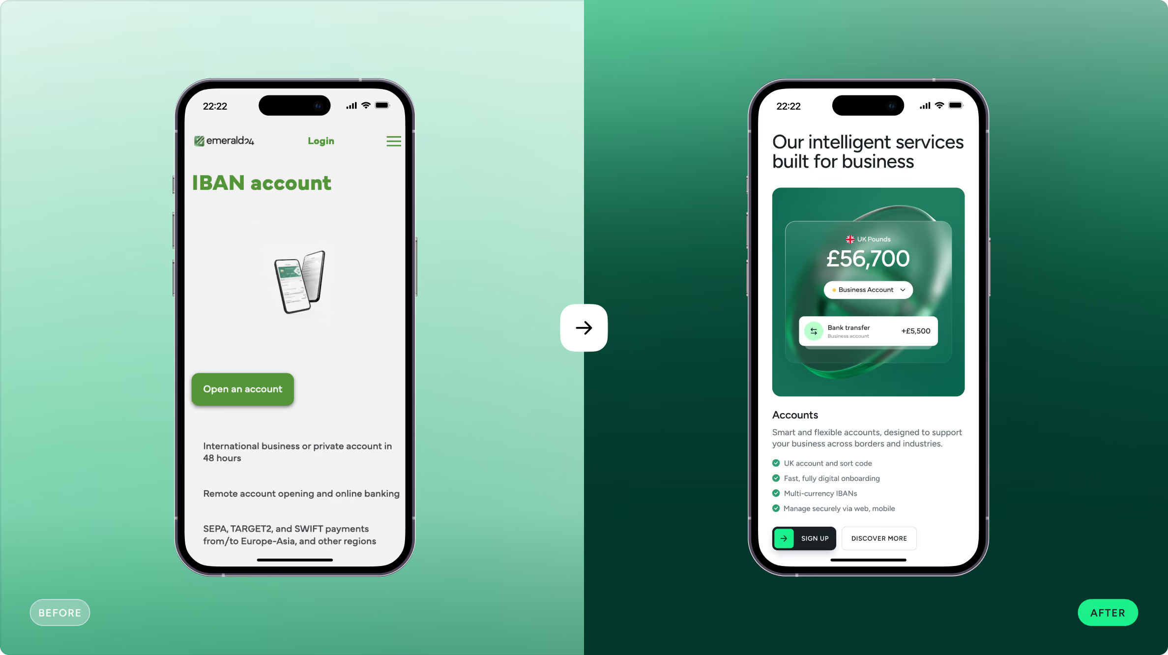
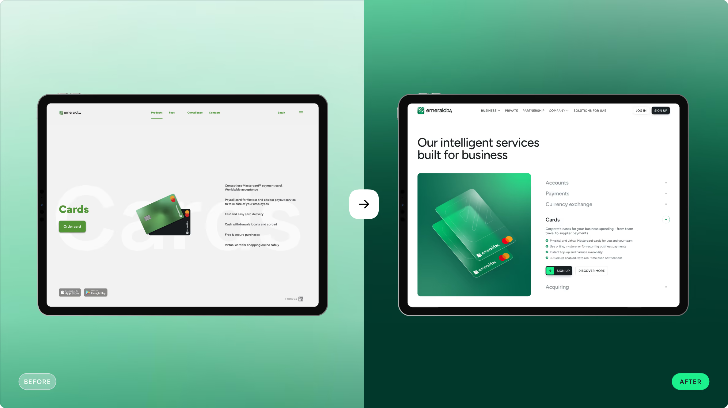
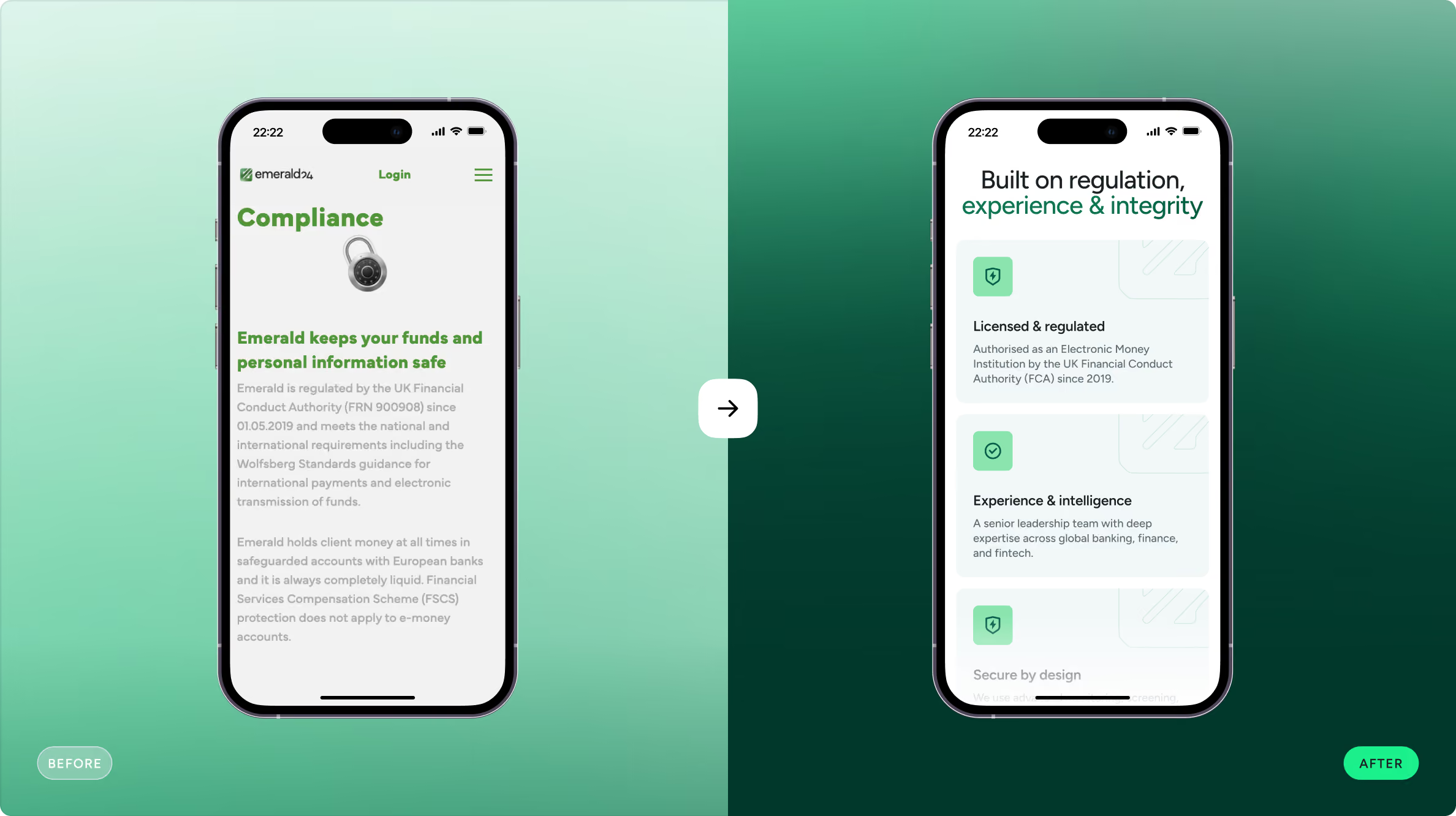
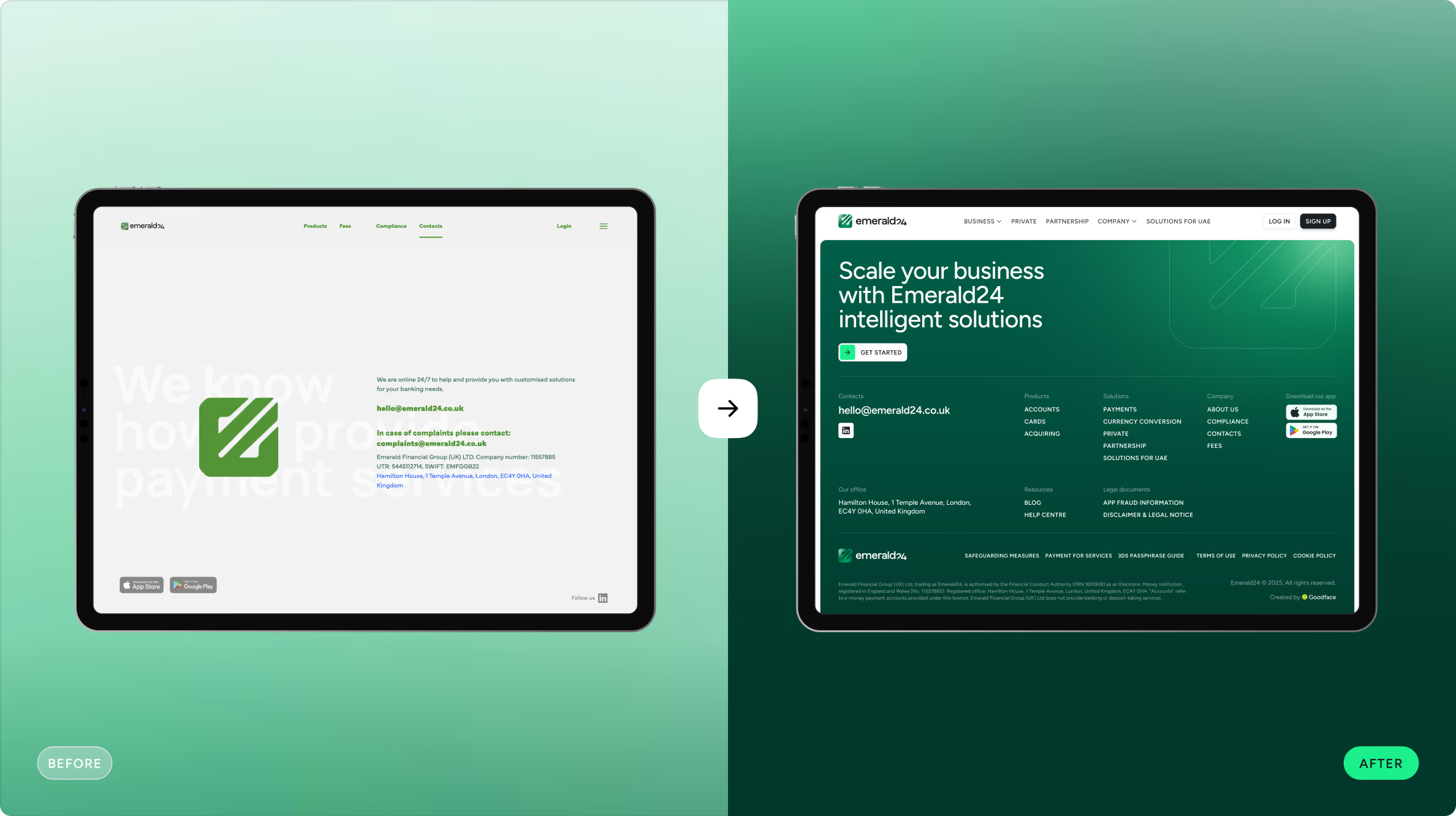
Emerald24 had expanded its product ecosystem, but the website still reflected an earlier stage of the company. It presented only part of the platform’s capabilities and lacked a consistent visual language across pages.
We approached the website as a communication layer that clearly explains the product, its services, and customer experience in banking.
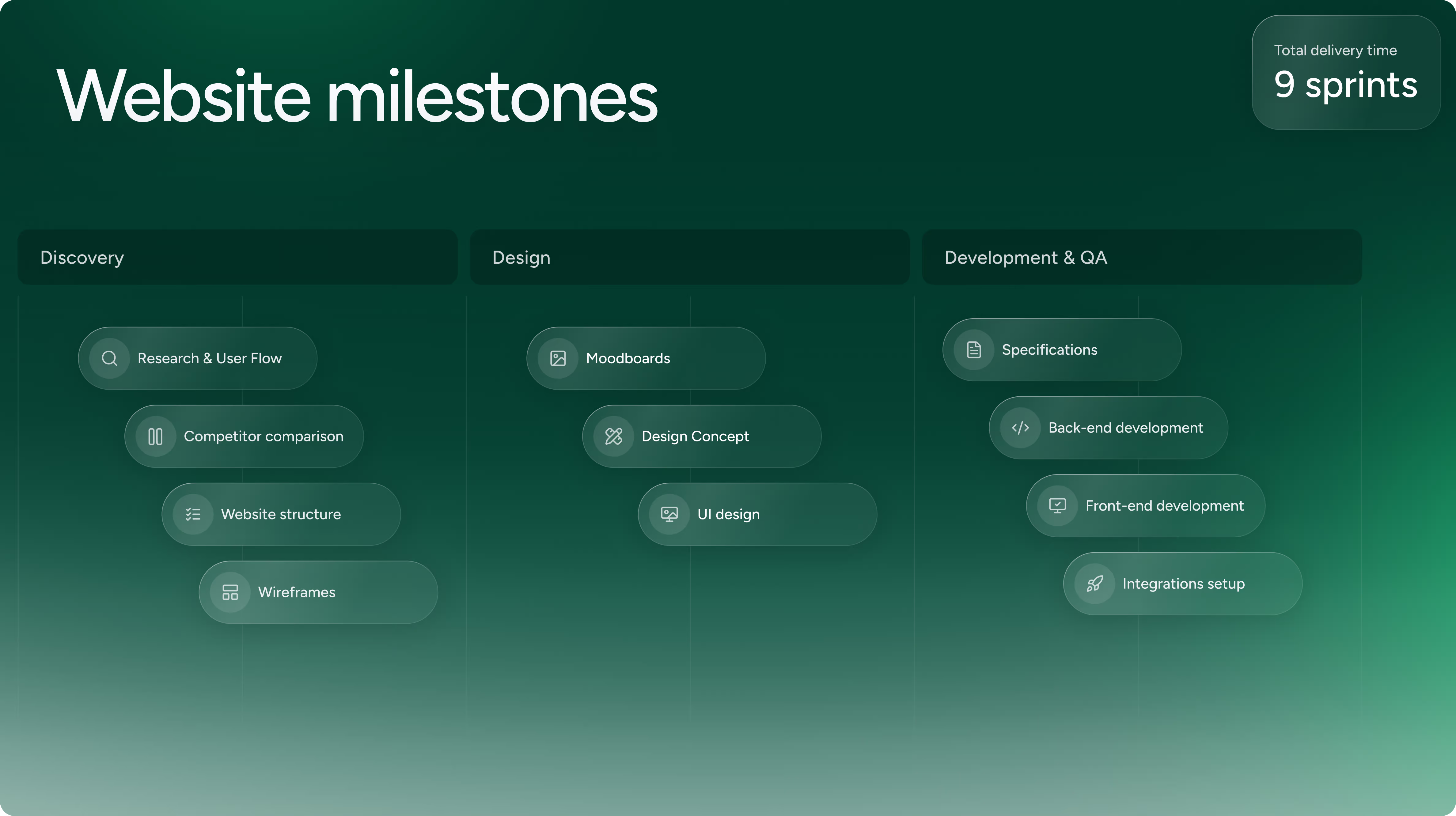
We rethought the website structure
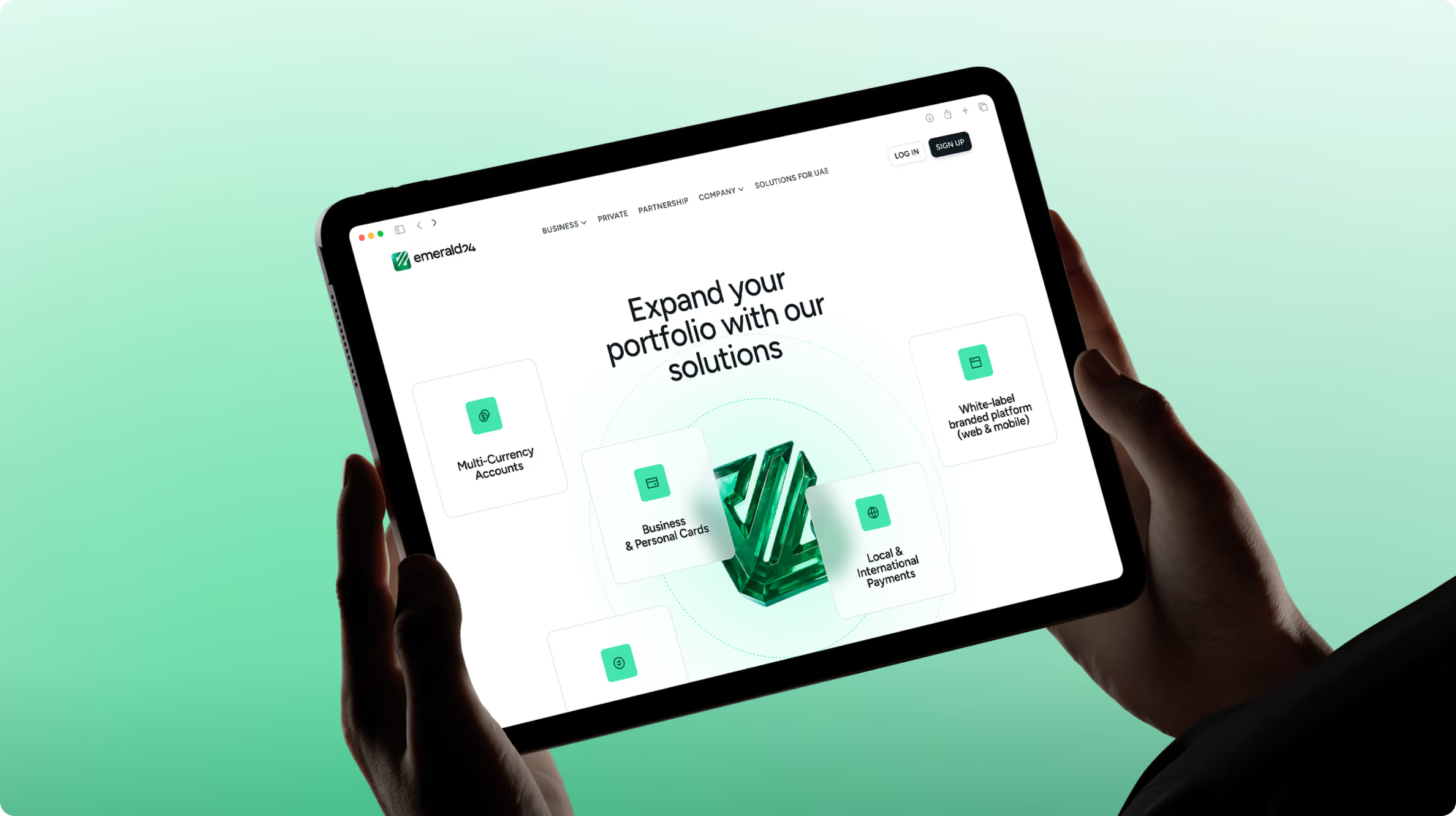
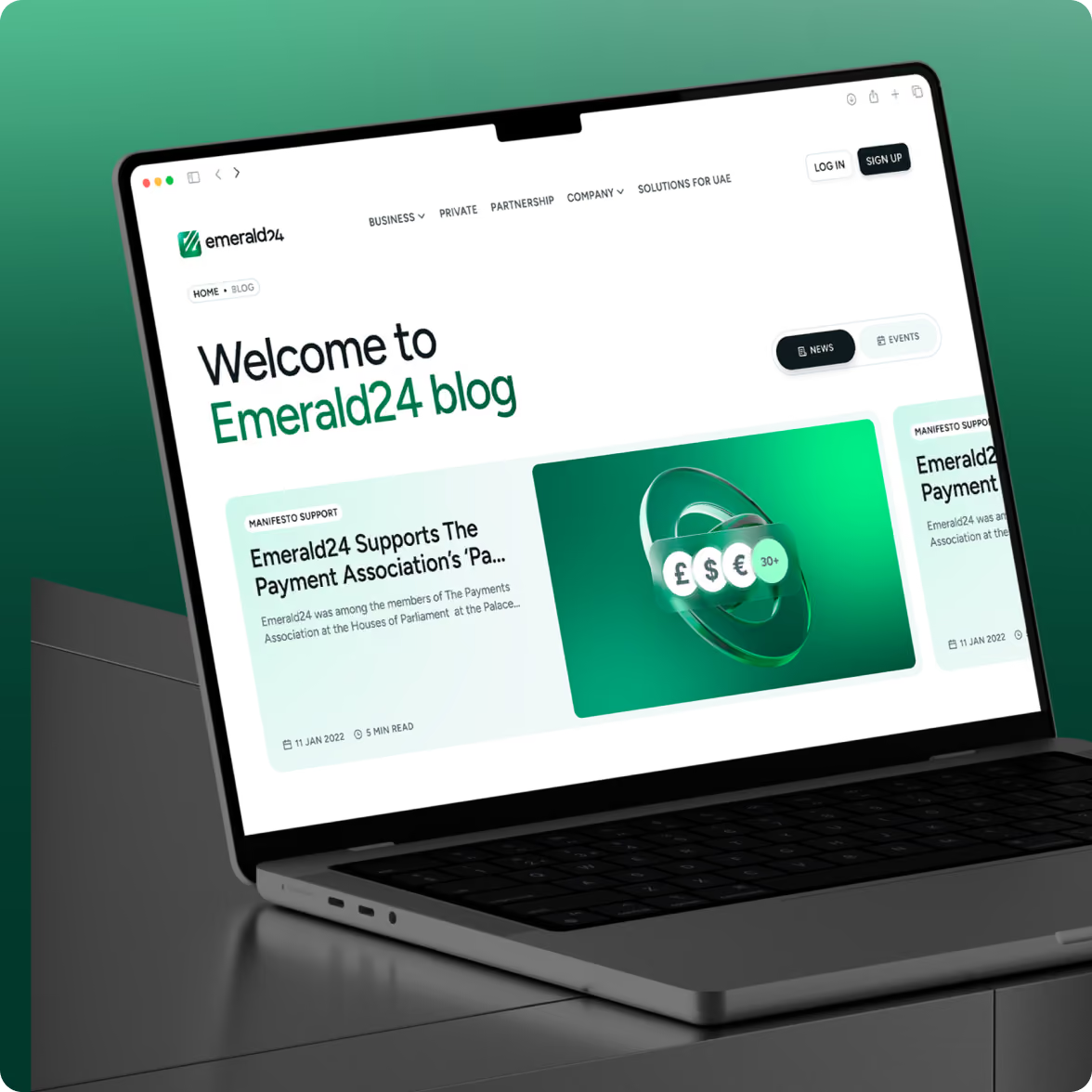
We restructured Emerald24’s website to make its full range of financial products easier to understand and navigate. The content and navigation now reflect how different audiences use the website, with product pages designed to serve corporate clients, partners, and end users.
The new structure connects the website more closely to the fintech product, giving each service a clearer place within the wider offering. Visitors can find the information relevant to them without having to work through Emerald’s internal product structure.
Unified visual identity that links product and brand experience
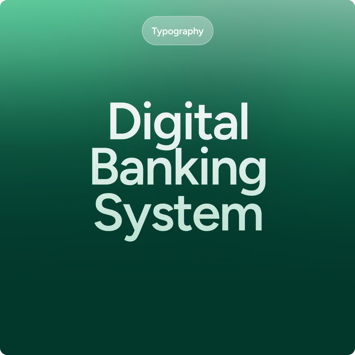
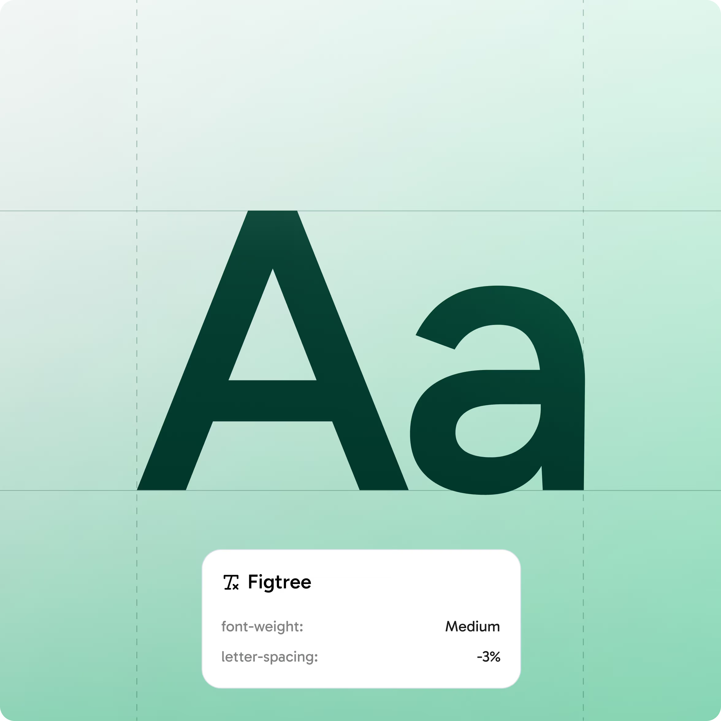
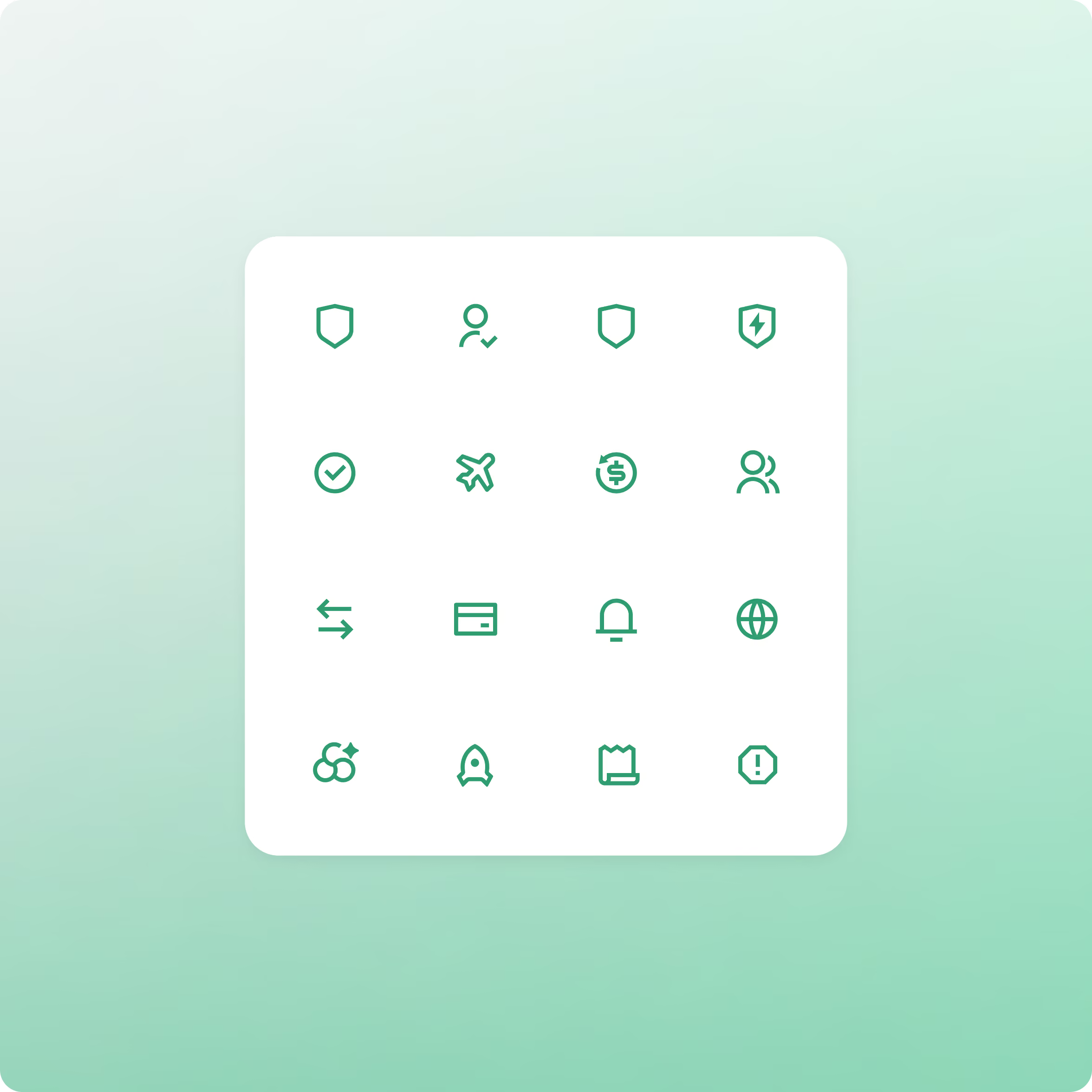
We developed the visual identity alongside the fintech product, using the UI as a reference for how the brand experience needs to be felt. This helped us build a visual system that could move between the corporate website and the product without creating two separate experiences.
Colour, typography, shapes, and graphic elements were defined with both contexts in mind. The same principles now carry from the website into the banking interface, giving Emerald24 a clearer visual identity while keeping the product focused on the tasks customers use it for every day.
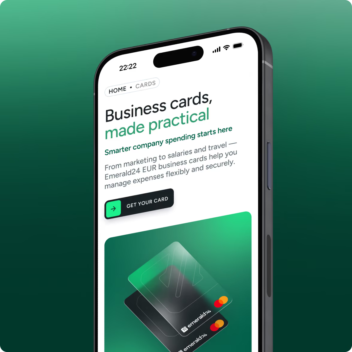
Custom payment platform pages for specific regional users
We created dedicated pages for different regional audiences, adapting the content and product information to the needs of each market.
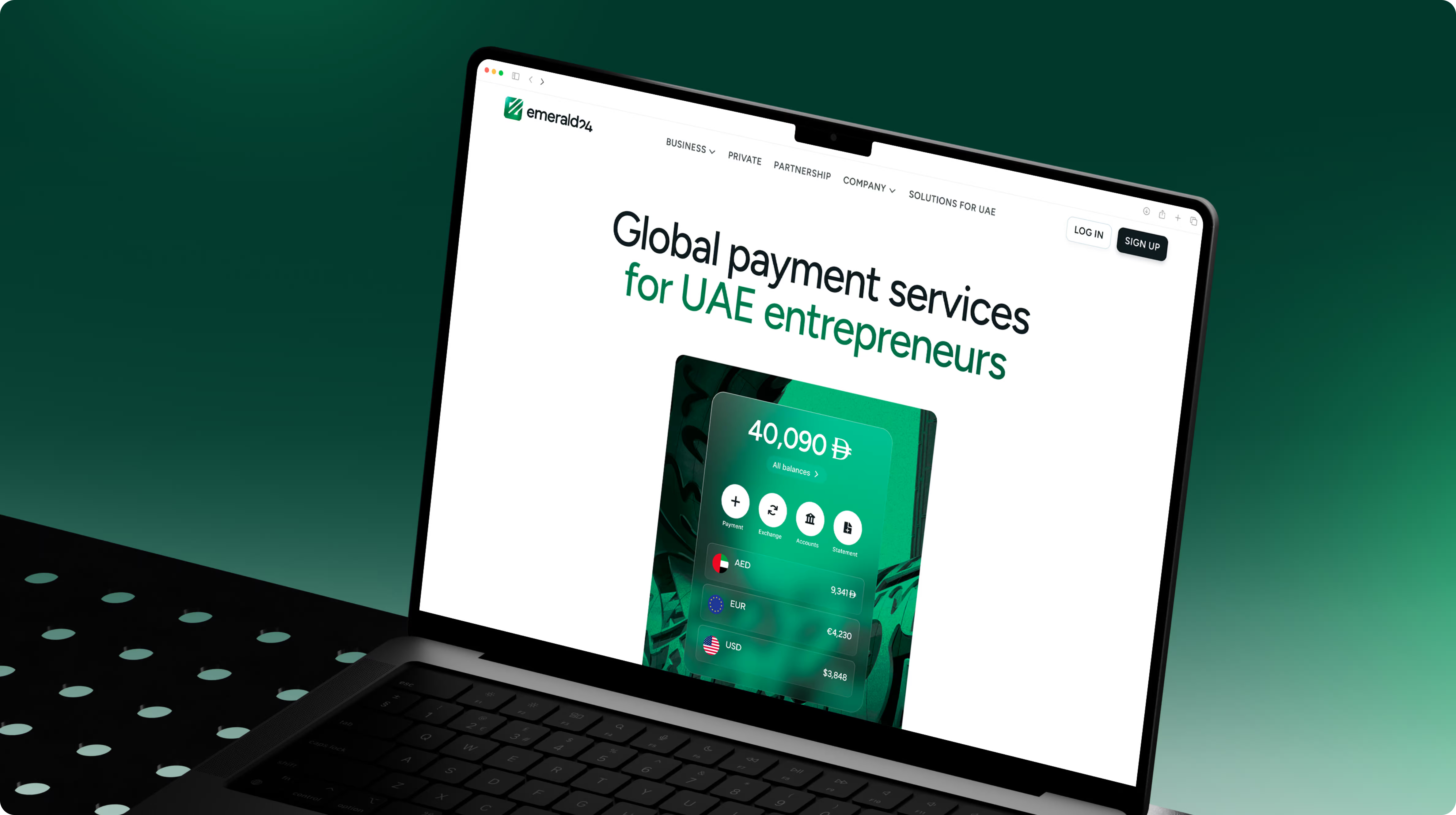
Instead of sending every visitor through the same generic product journey, the pages give users a clearer path to the services and payment options relevant to their region.
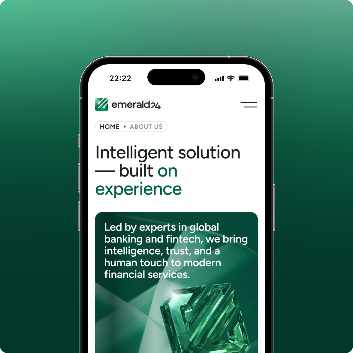
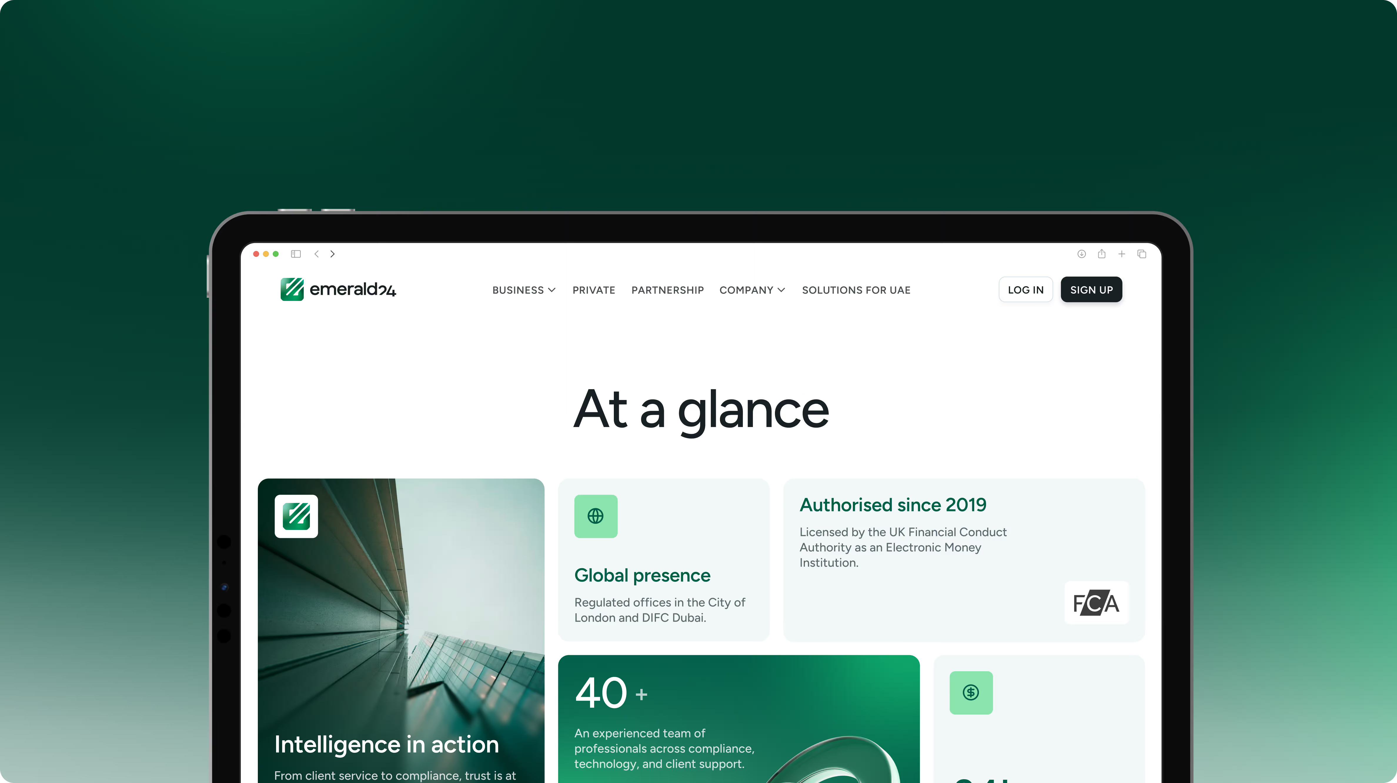
Redesigned banking product & service web pages to reveal Emerald24 solutions clearly to fintech operators
The pages follow a consistent content structure while giving each product enough space to explain its specific use cases and capabilities. This makes the website easier to navigate and gives potential clients a simpler way to evaluate Emerald24’s offering.
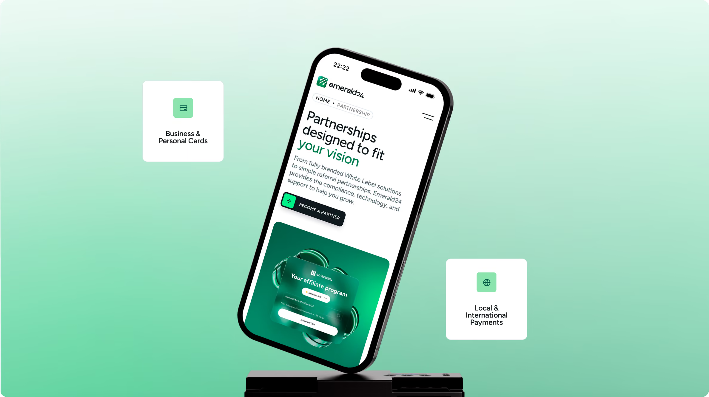
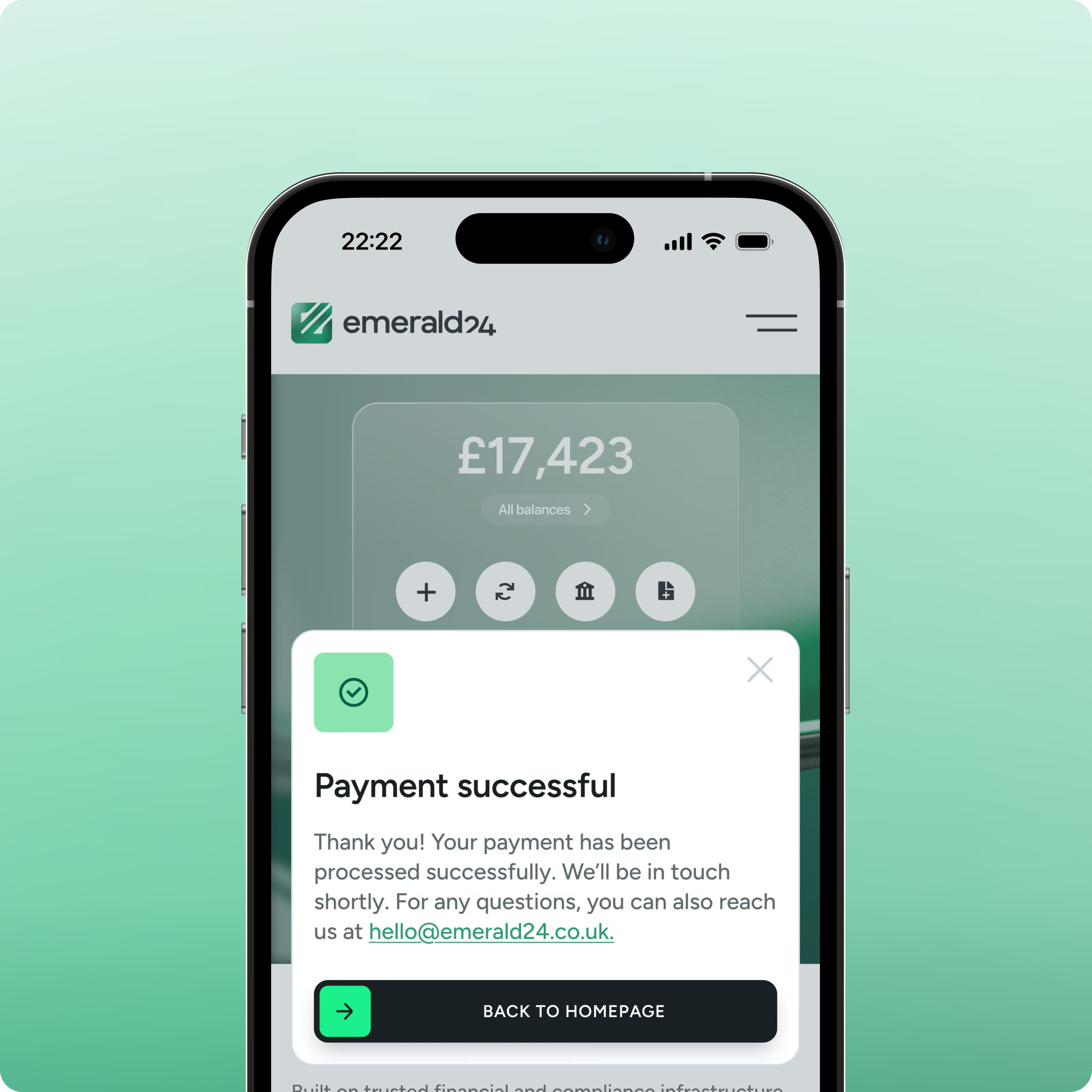
A digital banking ecosystem built for growth
Emerald24 now has a unified digital experience across web and mobile, with clearer flows for onboarding and account management.
Users can move between platforms without having to relearn key tasks, while the redesigned onboarding breaks the application into clearer steps and keeps compliance requirements visible throughout the process.
The corporate website now reflects the breadth of Emerald24’s services and follows the same visual direction as the digital banking product, giving customers and partners a convenient platform view.
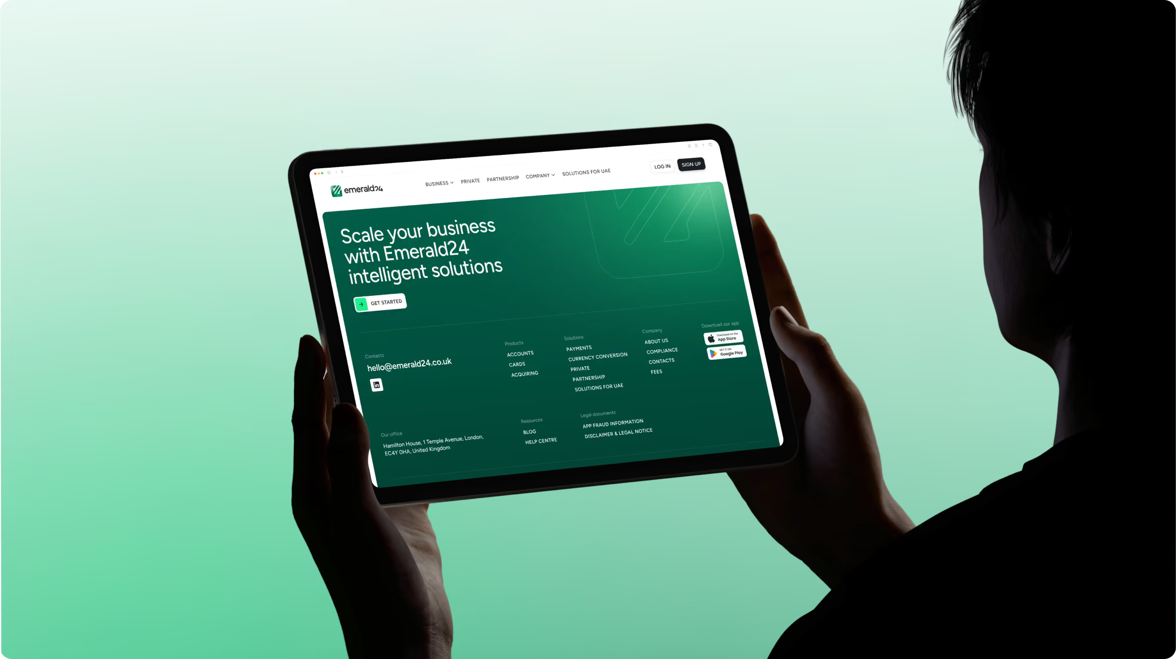
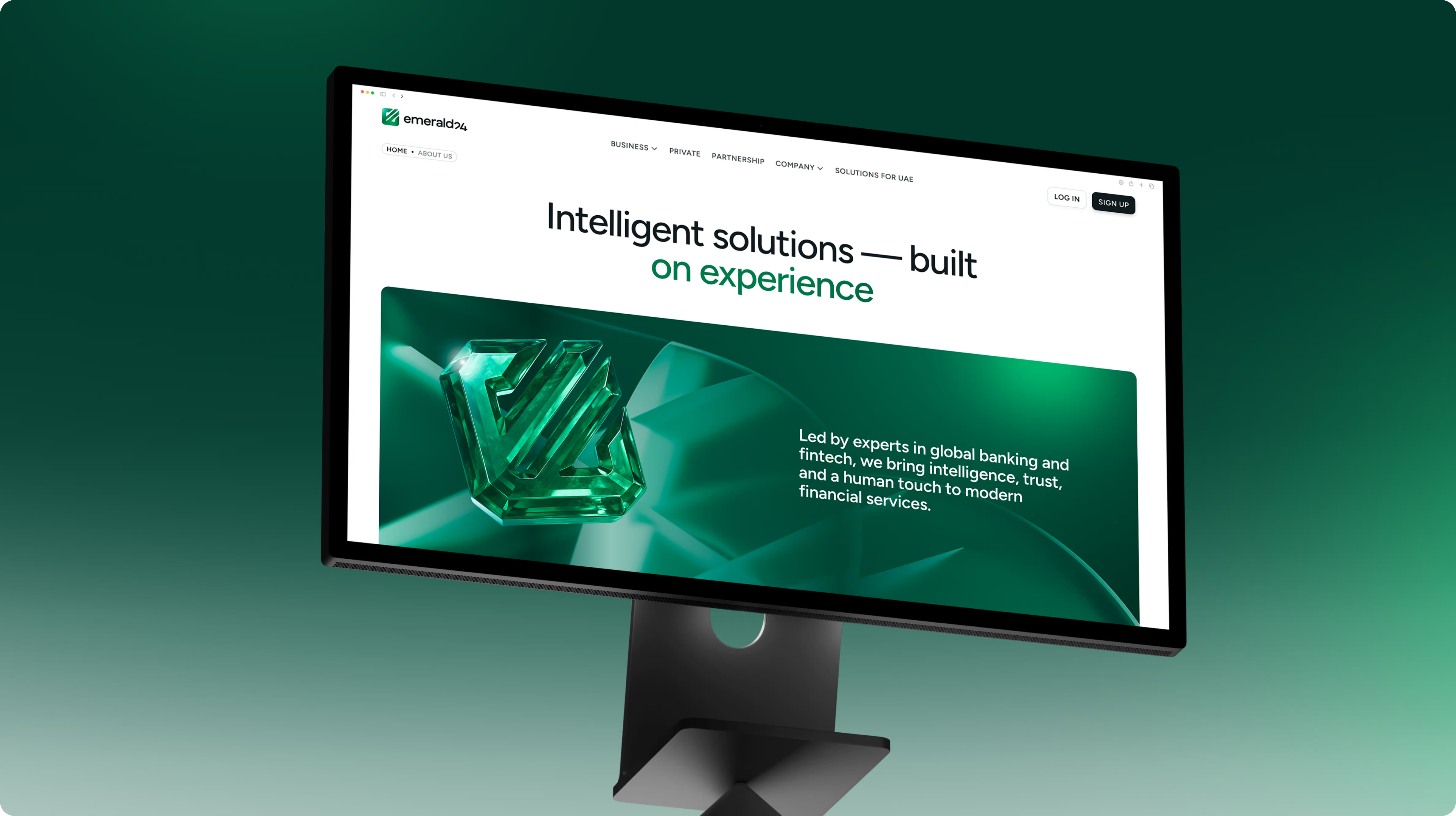
Emerald24 by Goodface – London Design Awards Gold Winner
So far, we've created a new logo and comprehensive design system for the bank with an exhaustive brand book, launched a cutting-edge website, and crafted user-friendly web interfaces.

Want to start a project with us?

Your request has been sent and will contact you soon by this email yourmail@mail.com

Let's discuss your upcoming project on a call

We usually reply within 1 hour during working hours: 9:00–20:00 (GMT+3)



.avif)