











FinUp.
Virtual card provider product design & Webflow development services

FinUp helps individuals and companies manage online spend through unlimited virtual cards funded with fiat and crypto. The product brings card issuing, digital money management, and spend tracking into one experience.
The company had a working product and an established presence in its home market. The next step was to present FinUp as a fintech ready to compete beyond that market.
FinUp needed its brand to catch up with the business
We worked across the parts of the experience that shape how a new customer encounters FinUp: the visual identity, payment cards, product interface, and website.
The existing design language gave us a starting point, without discarding anything. We kept the elements that could carry recognition forward, then introduced a stronger visual system around them. The same logic carried through the cards and digital experience, so the product did not feel like a collection of separate touchpoints.
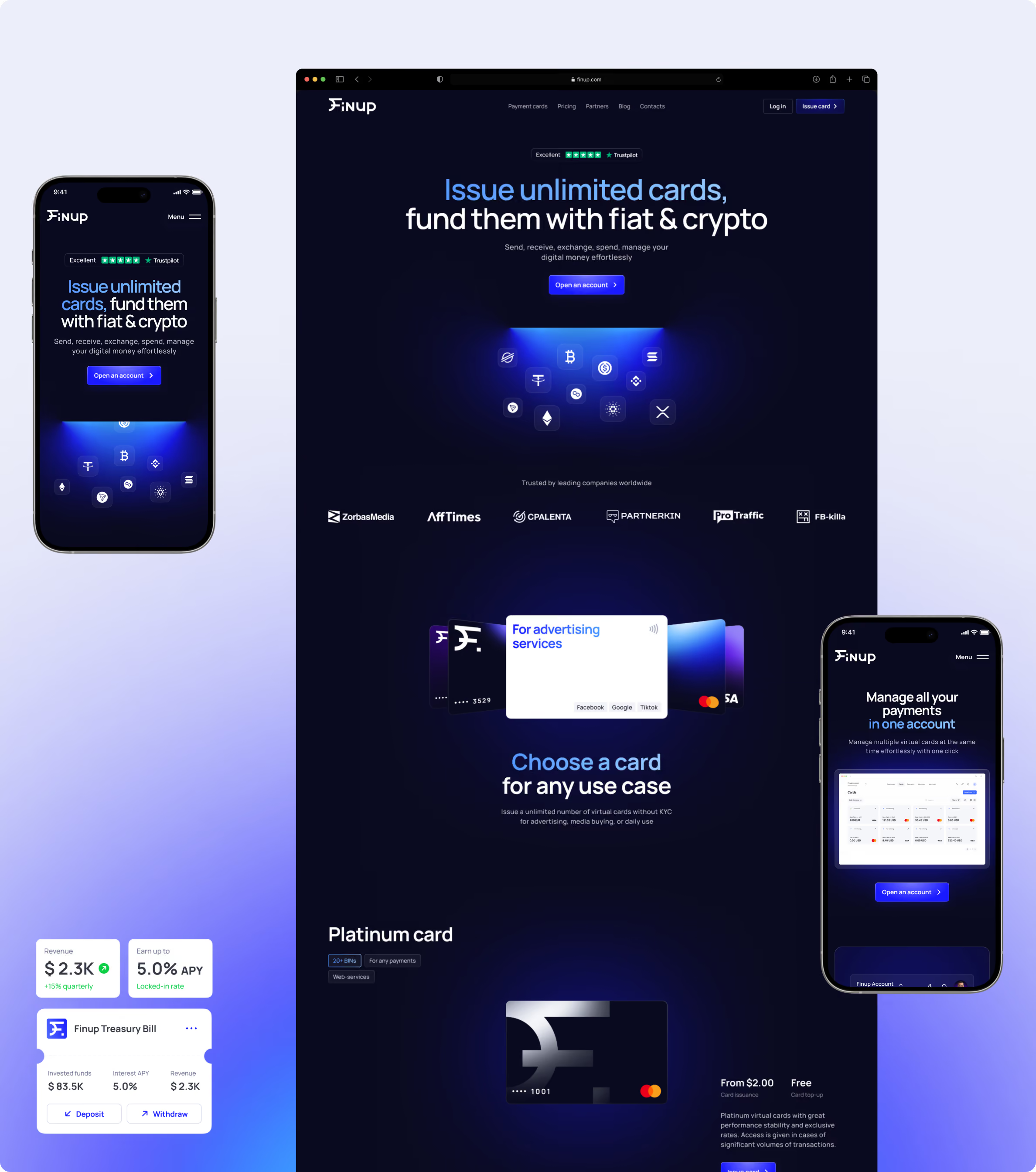
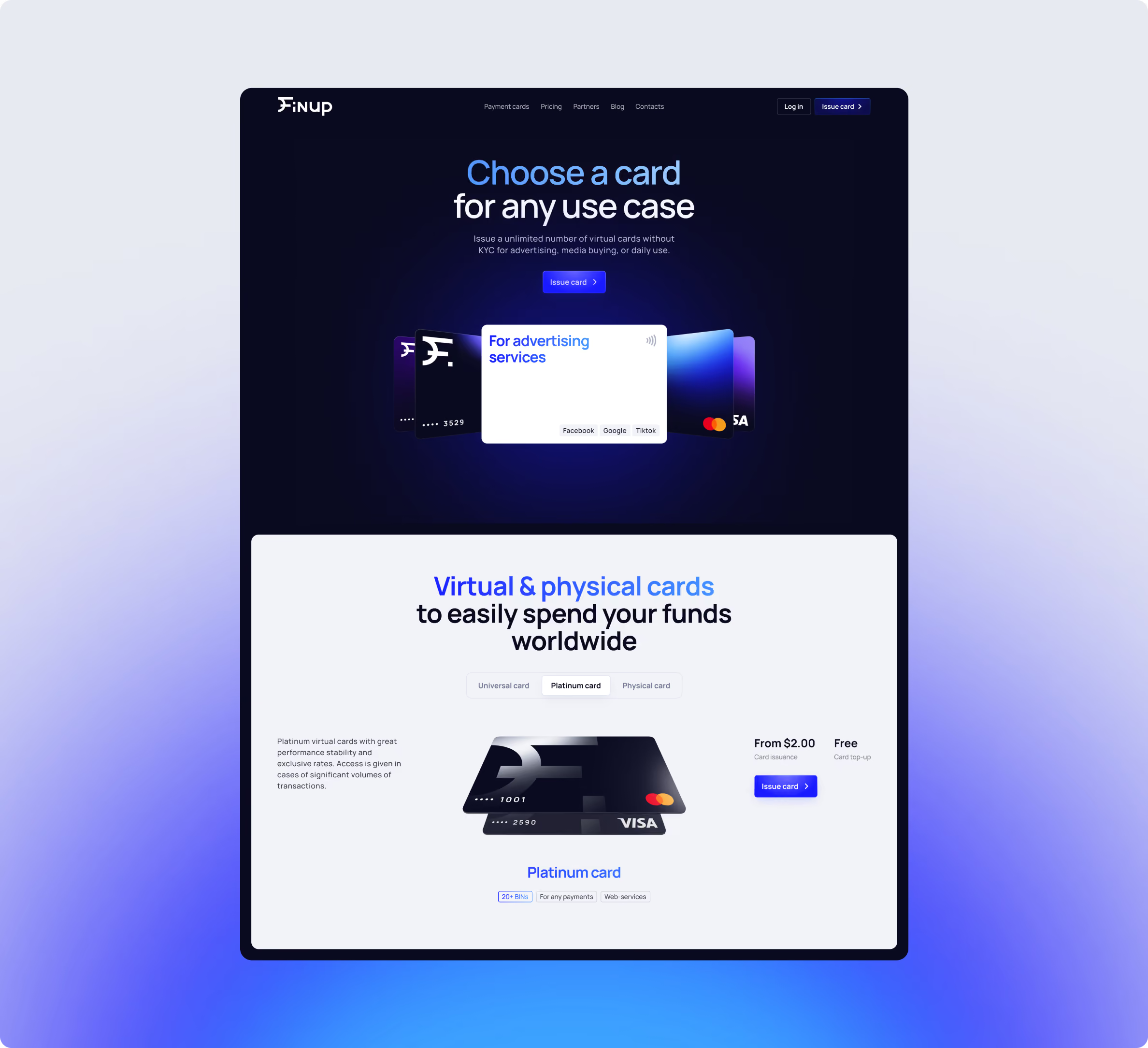
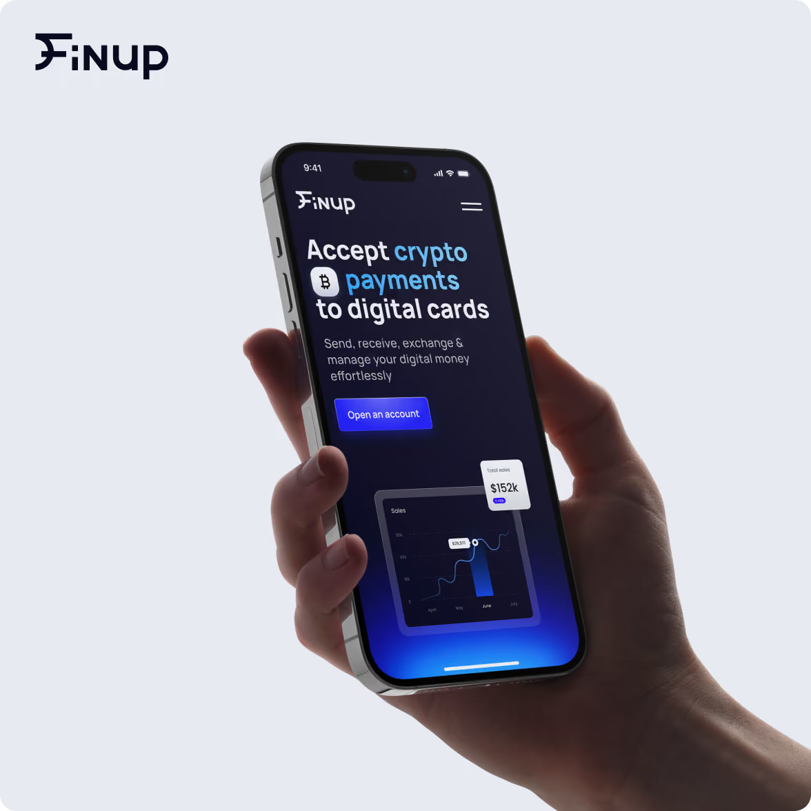
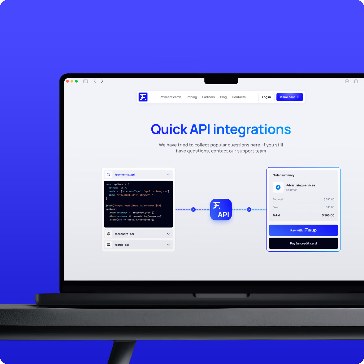
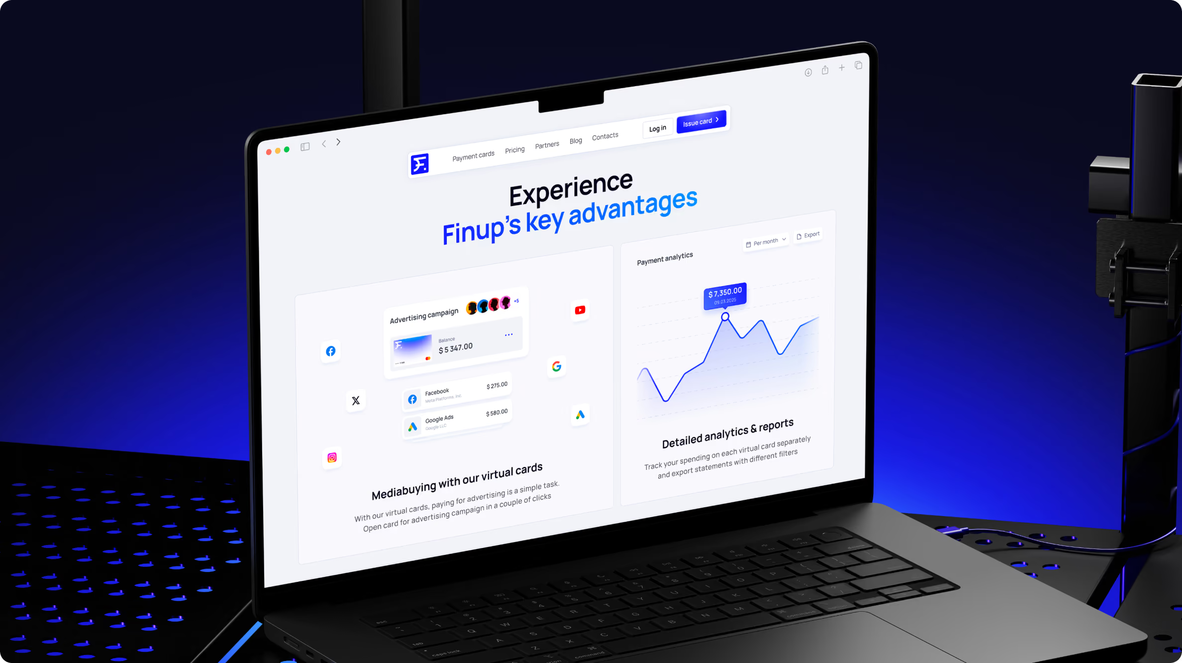
For the website, the priority was product clarity. Instead of leading with a list of features, we used the interface and visual content to show what customers can actually do with FinUp — issue cards, manage digital money, and track spending across fiat and crypto.
That gave the brand and website the same job: make the product easier to understand and position FinUp more strongly as it moves into new markets.






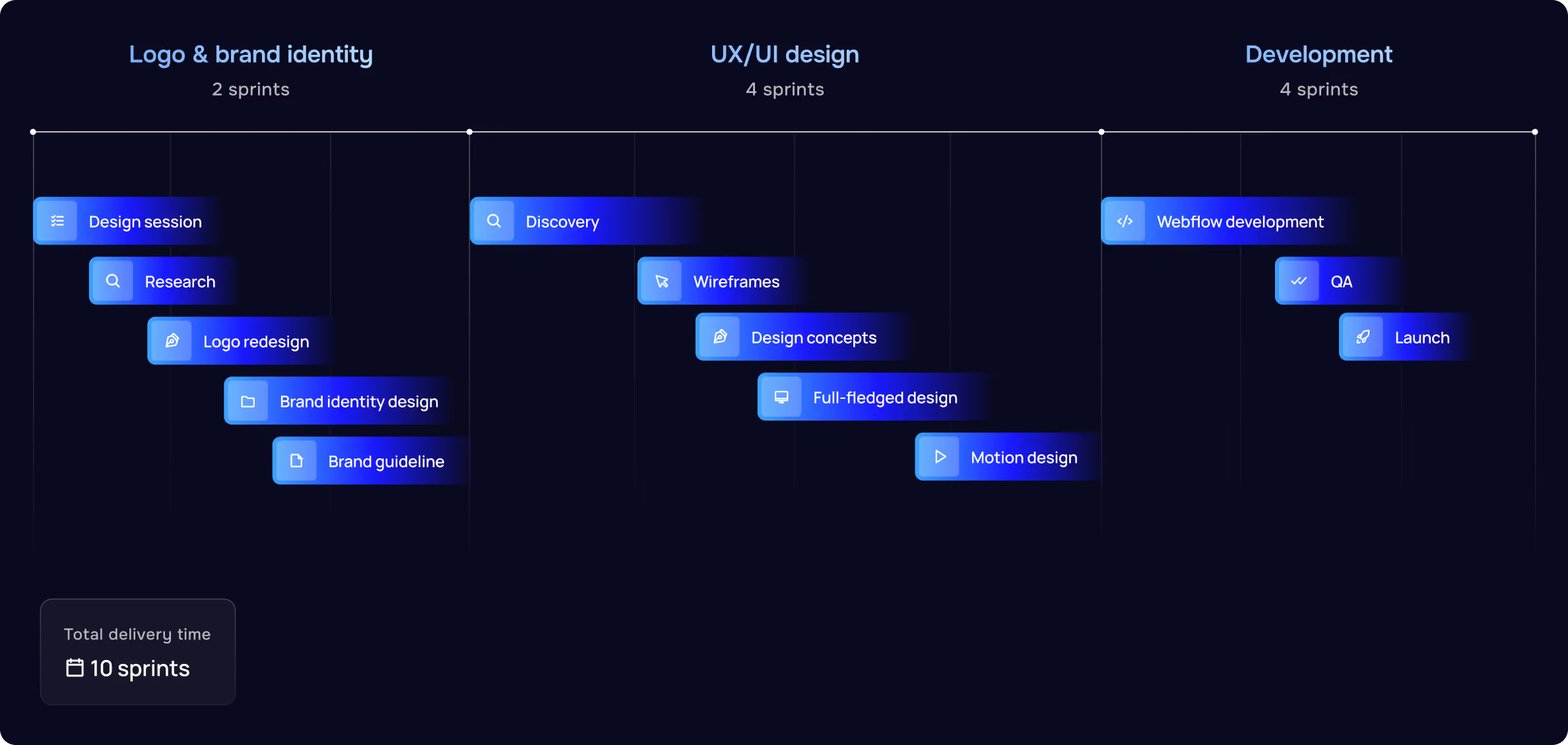
Virtual card provider visual identity redesign
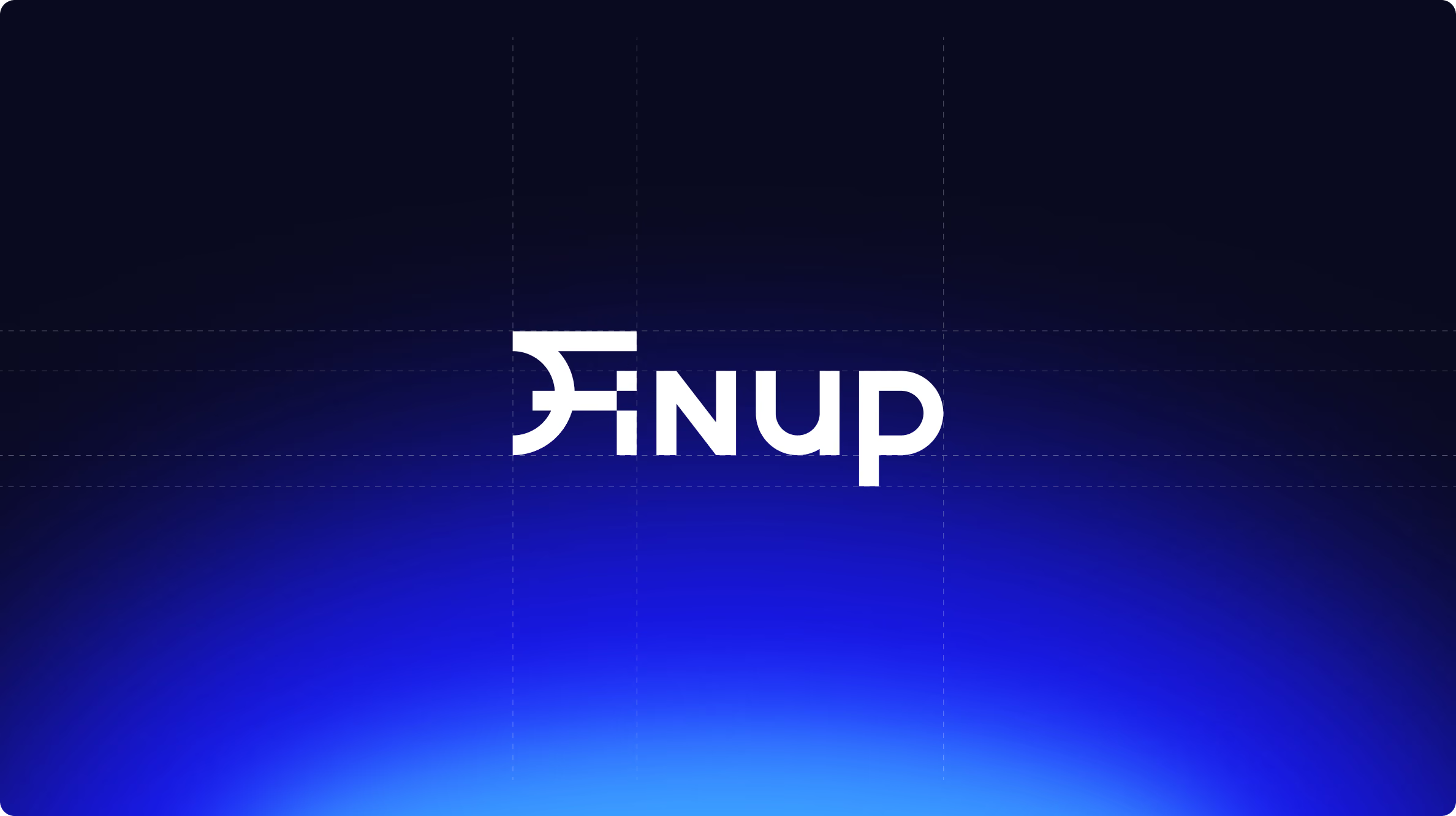
The logo became one of the first places to establish the new direction.
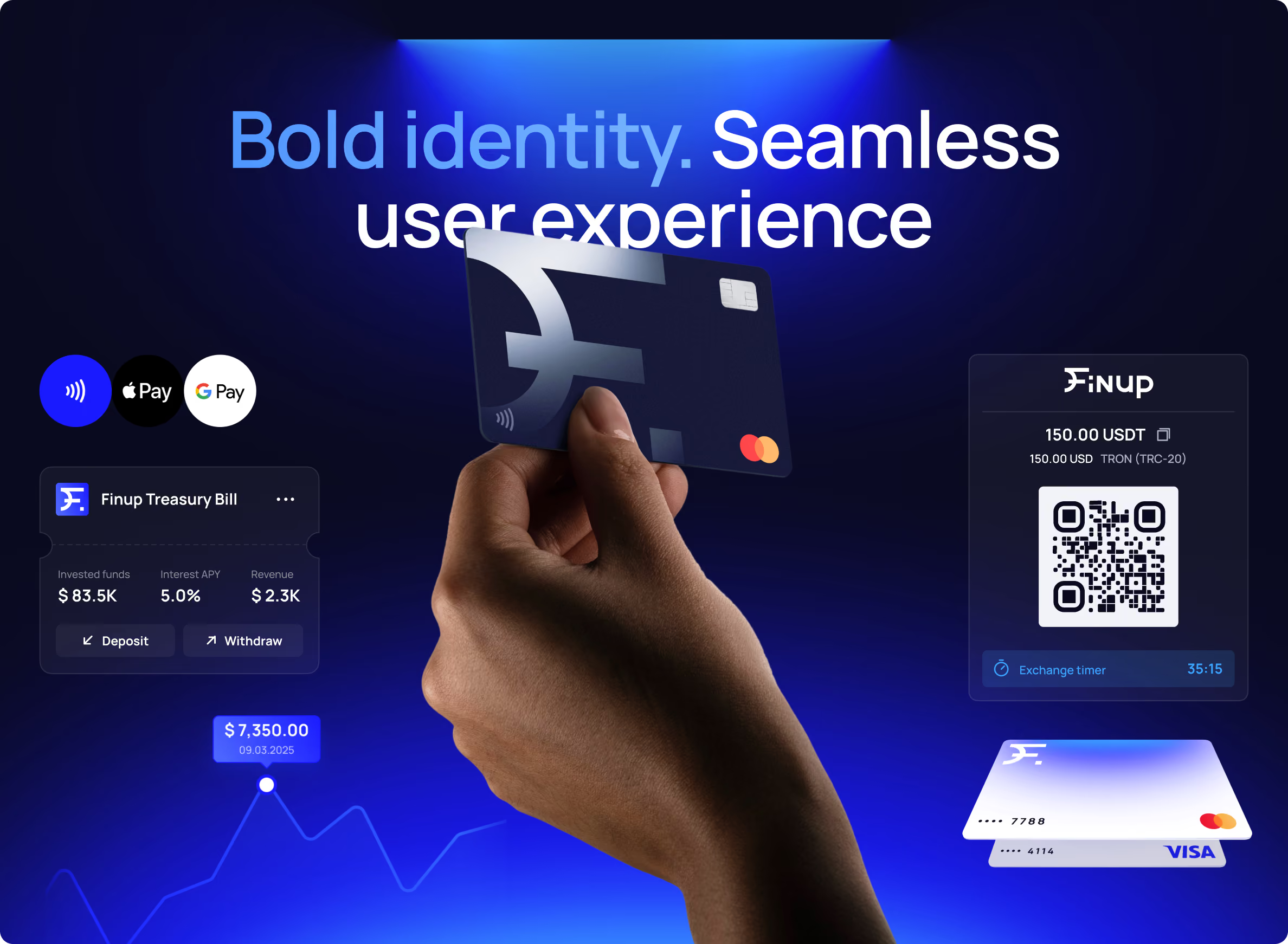
We developed a custom typographic mark with sharp, forward-leaning forms inspired by currency symbols. Around it, we built a tech-focused visual system using a restrained palette and radial gradients that evoke trust and connect the effortless experience with financial power.
The aim was to give FinUp a recognizable visual language without losing the accessibility expected from a financial product. The identity needed enough character to stand apart in a crowded category, while still leaving room for the product to remain the focus.
Clearer positioning for commercial traction
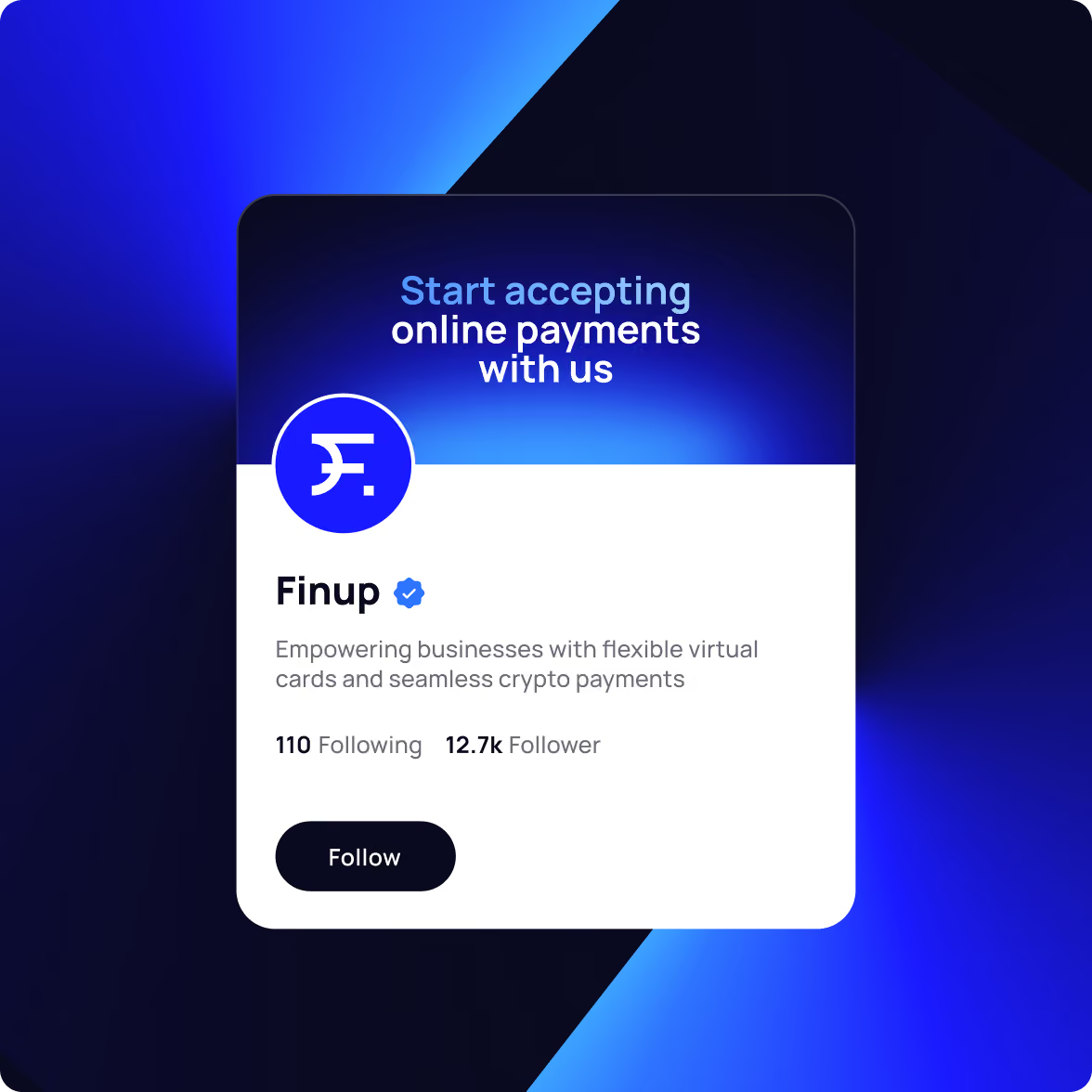
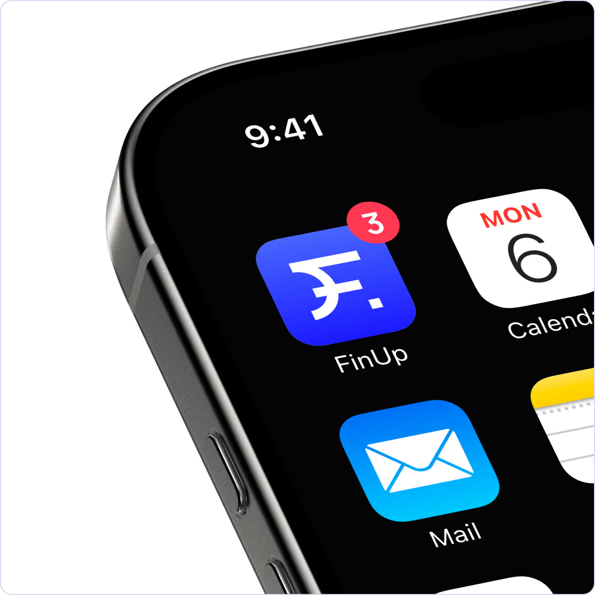
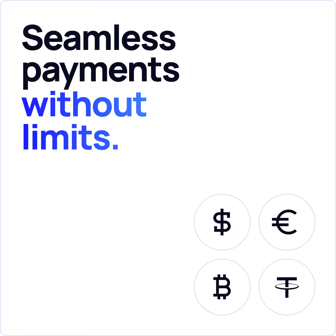
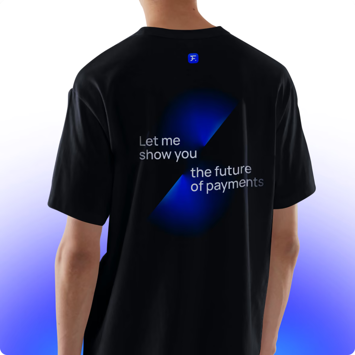
The identity extended beyond the website into social templates, merch, and other offline materials.
That consistency is indeed vital when a company is entering new markets. People encounter the brand in different places before they ever use the product, and each contributes to the positive first impression and memorable interaction.

Payment card design
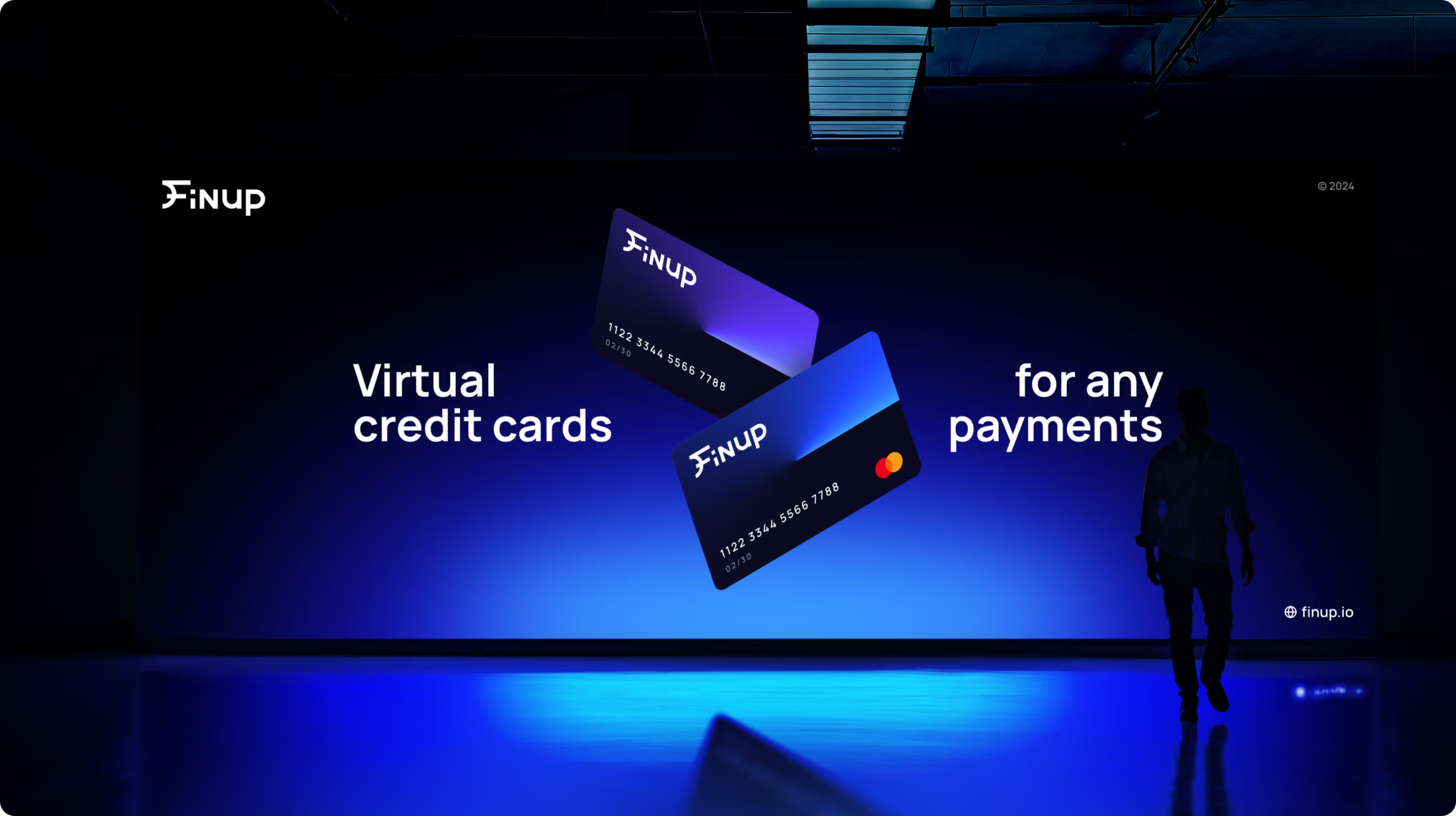
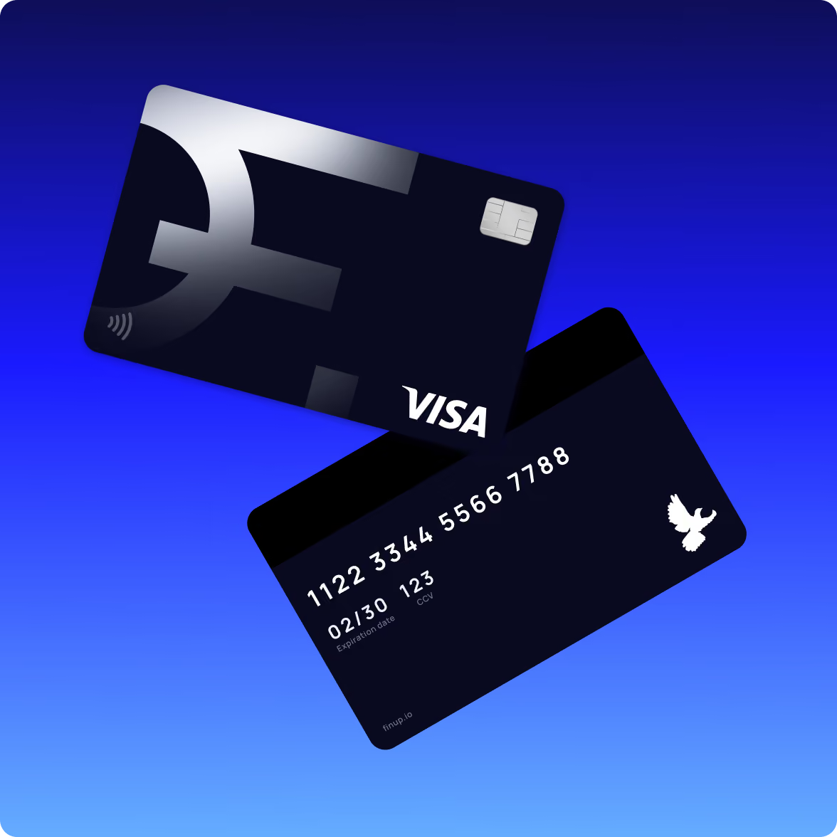
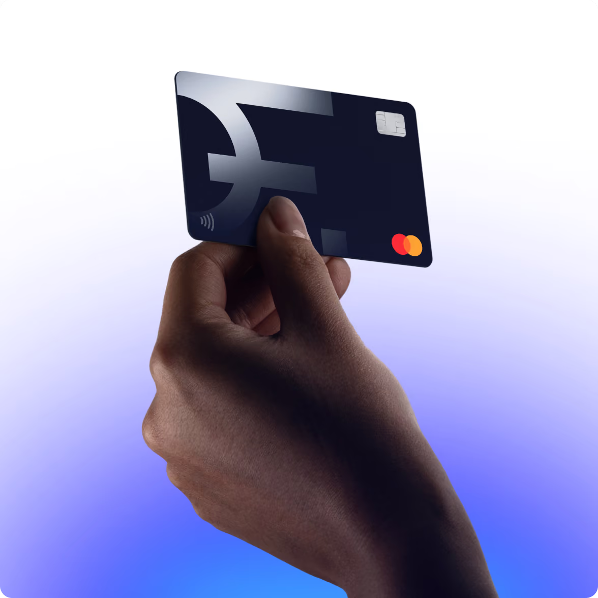
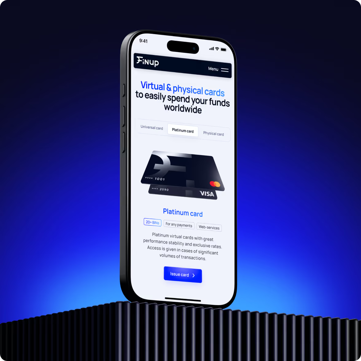
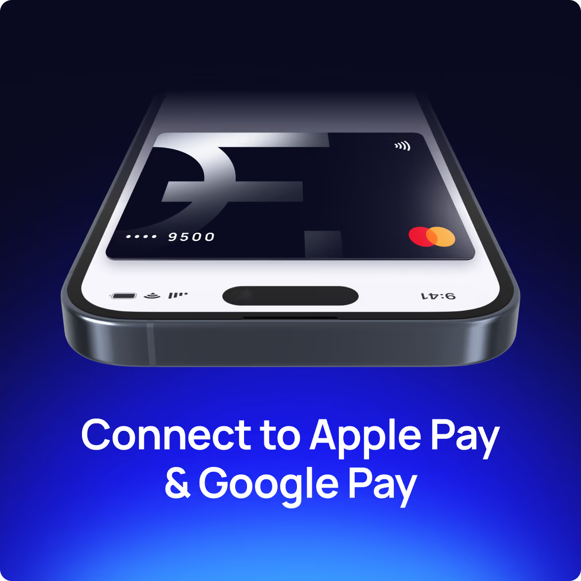
For a card product, the physical card is part of the brand experience. We designed the payment cards as an extension of the wider identity, carrying the same visual logic into a physical object.
The goal was simple: the card in a customer's wallet and the product on their screen should feel like parts of the same service. That continuity is quiet, and it's exactly what makes a fintech feel real to a first-time user.
Show the product instead of describing it
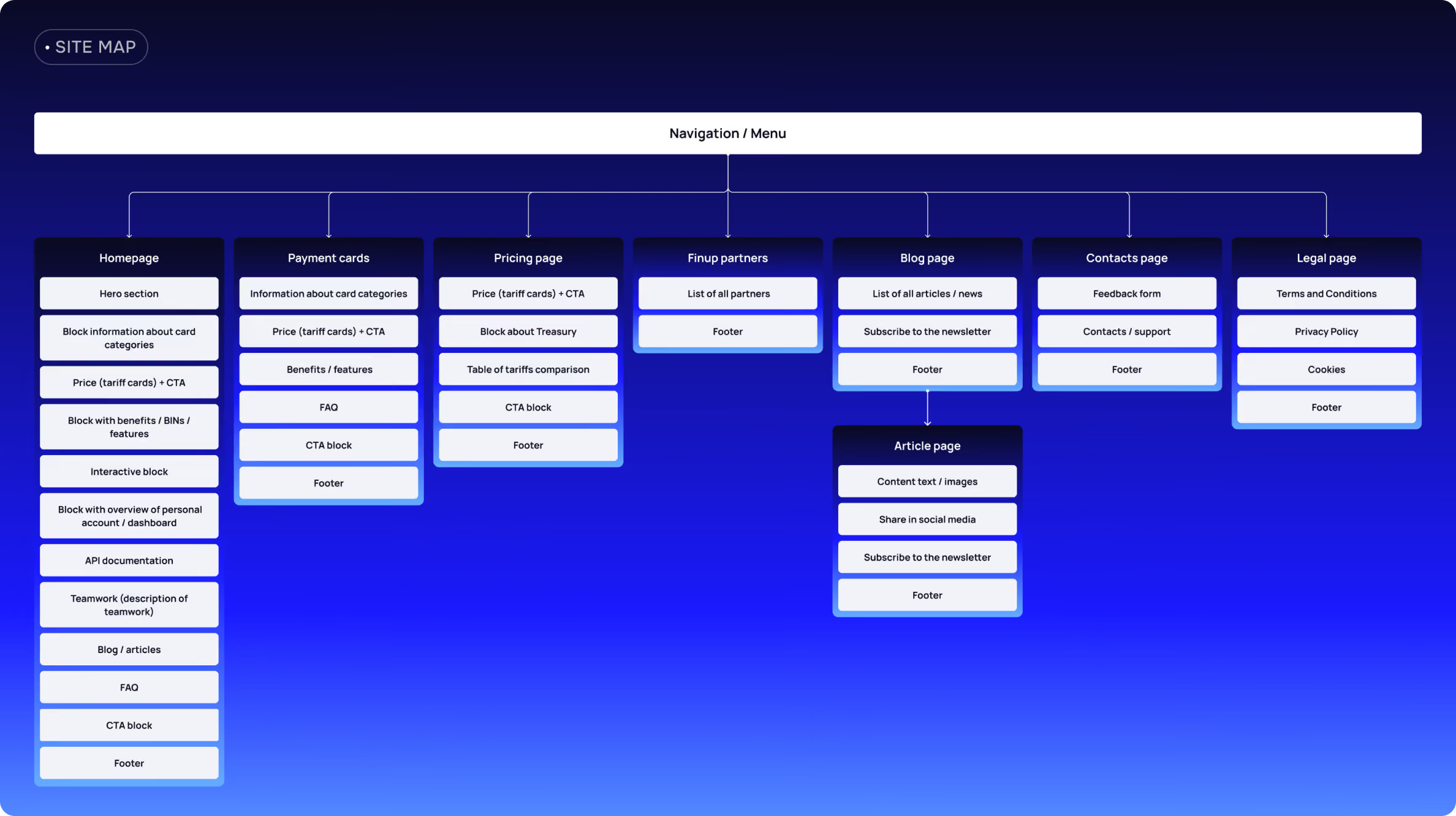
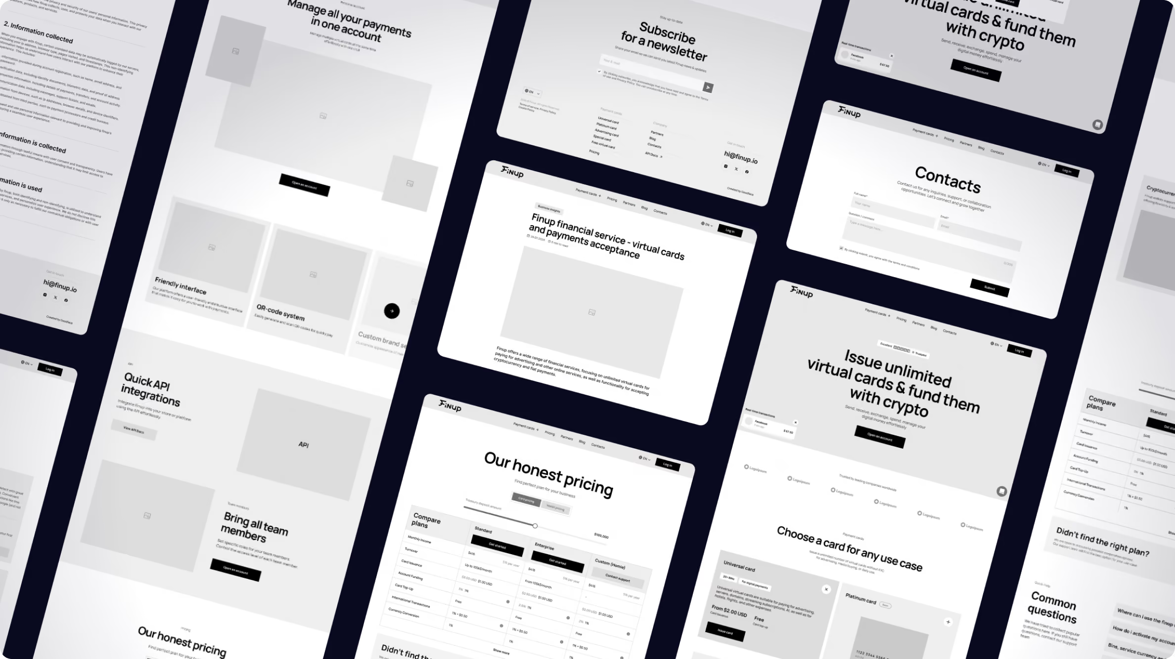
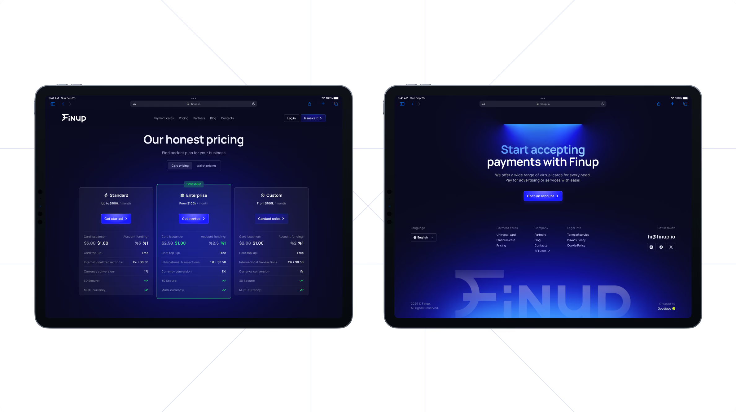
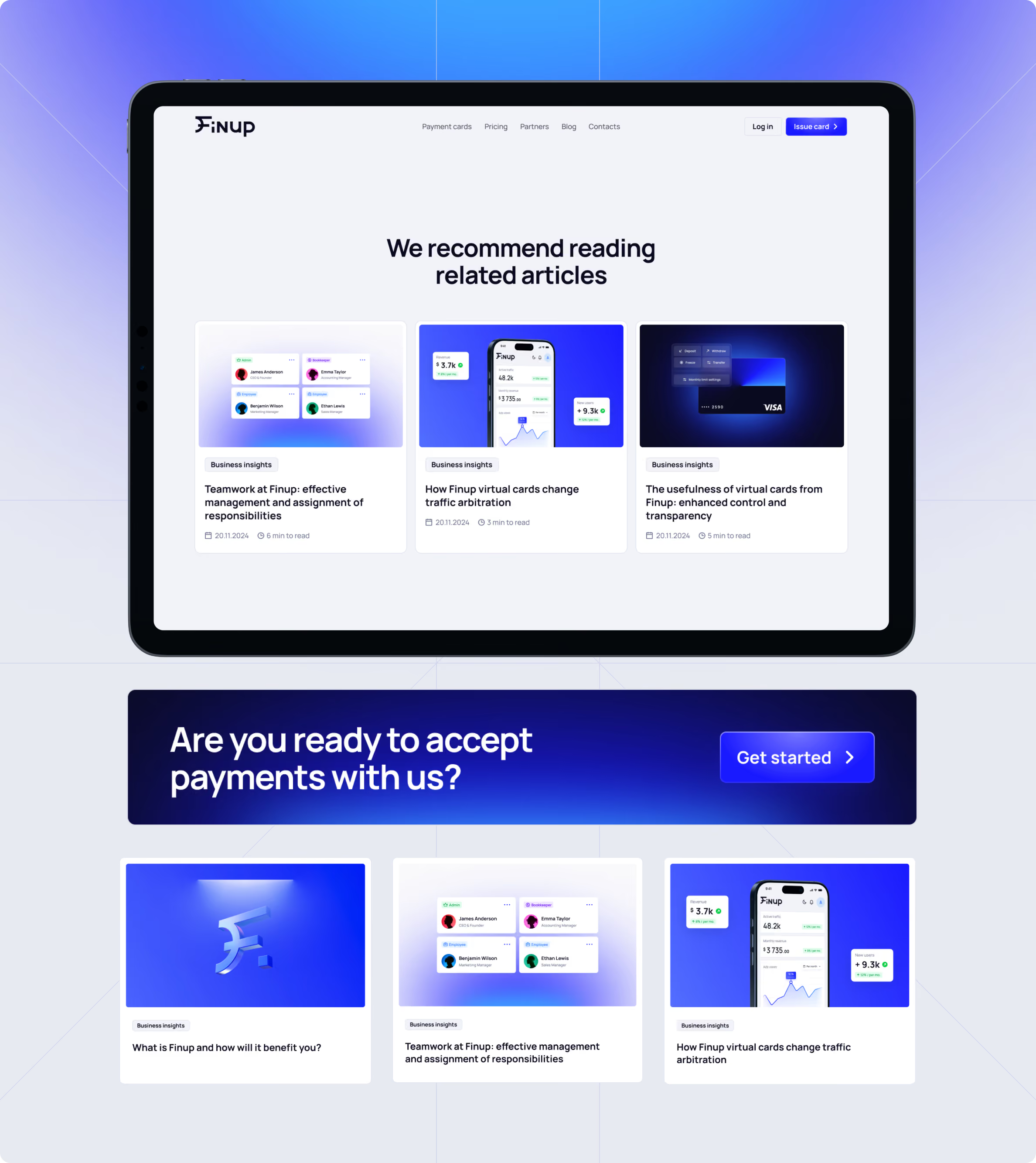
It's dark-mode-first, with 3D product visuals and custom animation that show the product working instead of describing it. Navigation lets people explore what unlimited cards actually do, follow how usage is tracked, and understand the crypto-and-fiat model without wading through jargon. We built in a blog, giving FinUp its own space to publish on spending, card strategy, and the questions its audience already searches — the kind of content that compounds into search visibility over time.


Webflow development
We built the website in Webflow, so FinUp's team could manage content and make changes without depending on engineers for each update.
For a company entering a new stage of growth, that flexibility matters. Messaging, campaigns, product information, and content rarely stay fixed after launch. The website needs to accommodate those changes without turning every adjustment into another development task.
A stronger foundation for FinUp's next market
FinUp left the project with a renewed brand identity, a payment card system, and a website that presents the product with more clarity and a stronger visual point of view. The work brought the main customer-facing touchpoints into one system: the brand establishes the identity, the cards carry it into the physical experience, and the website explains the product and its use cases.
Recognized across the industry
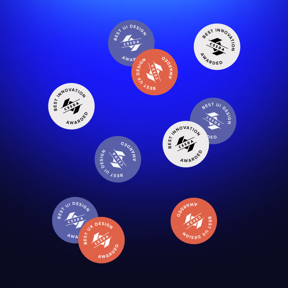
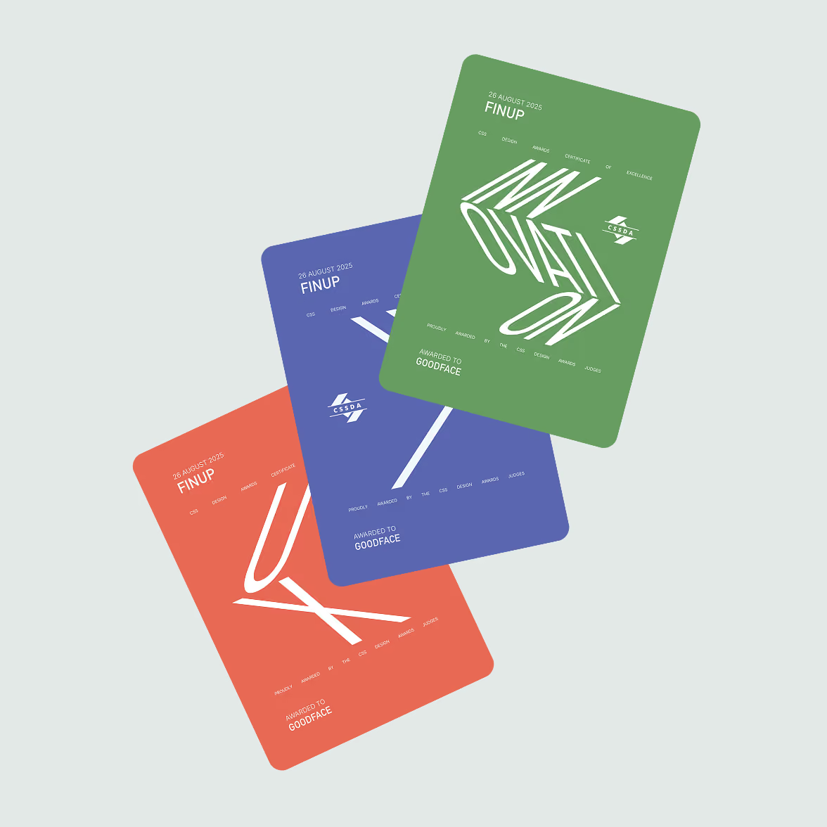
The website also received nominations across Best UI, Best UX, and Best Innovation at the CSSDA. For a fintech moving beyond its original market, that combination matters. The company needs a brand people can recognize, a product they can understand, and a digital presence that gives the two a consistent place to meet.
Define the boundary between evolution and reinvention earlier
Projects that evolve an existing brand carry a particular tension. The team has to protect what already works while creating enough change for the new direction to be visible.
For FinUp, that meant spending time deciding which parts of the existing system still represented the company and which no longer matched where it wanted to go.
On a similar project, we'd formalize those decisions earlier. A clear keep/change framework at the start would give the creative process a tighter boundary and reduce the number of decisions that need to be revisited later.
Your brand has to explain where the business is going
A FinTech entering new markets is asking customers to trust a company they may not know yet. The product has to do the real work, but the brand and website shape the first judgment about whether that product belongs in the market at all.
That makes consistency more important than visual novelty. The identity, product interface, payment cards, and website should reinforce the same position and make the business easier to understand from the first interaction.
So before redesigning the brand, ask a more useful question: what does the current experience tell a new market about the company you are becoming?
If the answer still describes the old business, the work is bigger than a new logo. The brand, product, and website need to move in the same direction.
Want to start a project with us?
Your request has been sent and will contact you soon by this email yourmail@mail.com
Let's discuss your upcoming project on a call
We usually reply within 1 hour during working hours: 9:00–20:00 (GMT+3)