













LaFinteca.
FinTech branding and payment platform design for LATAM
LaFinteca helps businesses enter the Latin American market by selecting, integrating, and supporting payment solutions built around local requirements.
The company was expanding across LATAM and needed a digital presence that could support that expansion — from market-facing brand narrative to merchants’ usability inside the platform.
Goodface worked across the brand identity, website, and merchant account, with design and development continuing as LaFinteca expanded.
Enter a crowded market with something people can recognise
LaFinteca was entering the Latin American market and needed to secure a strong position against established players. Our research showed clear opportunities to stand out through design, making brand identity and platform usability critical to competing in the region.
There was no existing visual identity to build from, and the website had to explain a fairly complex offering without making the experience feel tech for the sake of it.
The merchant side had another job to do. Businesses using LaFinteca needed a clear way to work with payment data, analytics, and settlements once they were inside the platform.
The challenge was to build these experiences together — giving LaFinteca a distinct market presence while keeping the product practical.
Build a brand that can explain the product without looking like every other FinTech
We started by looking at the LATAM payment market and the visual patterns already common across the category. That research pointed to an opportunity: move away from the familiar approach of presenting FinTech through dashboards, interface fragments, and abstract technology imagery.
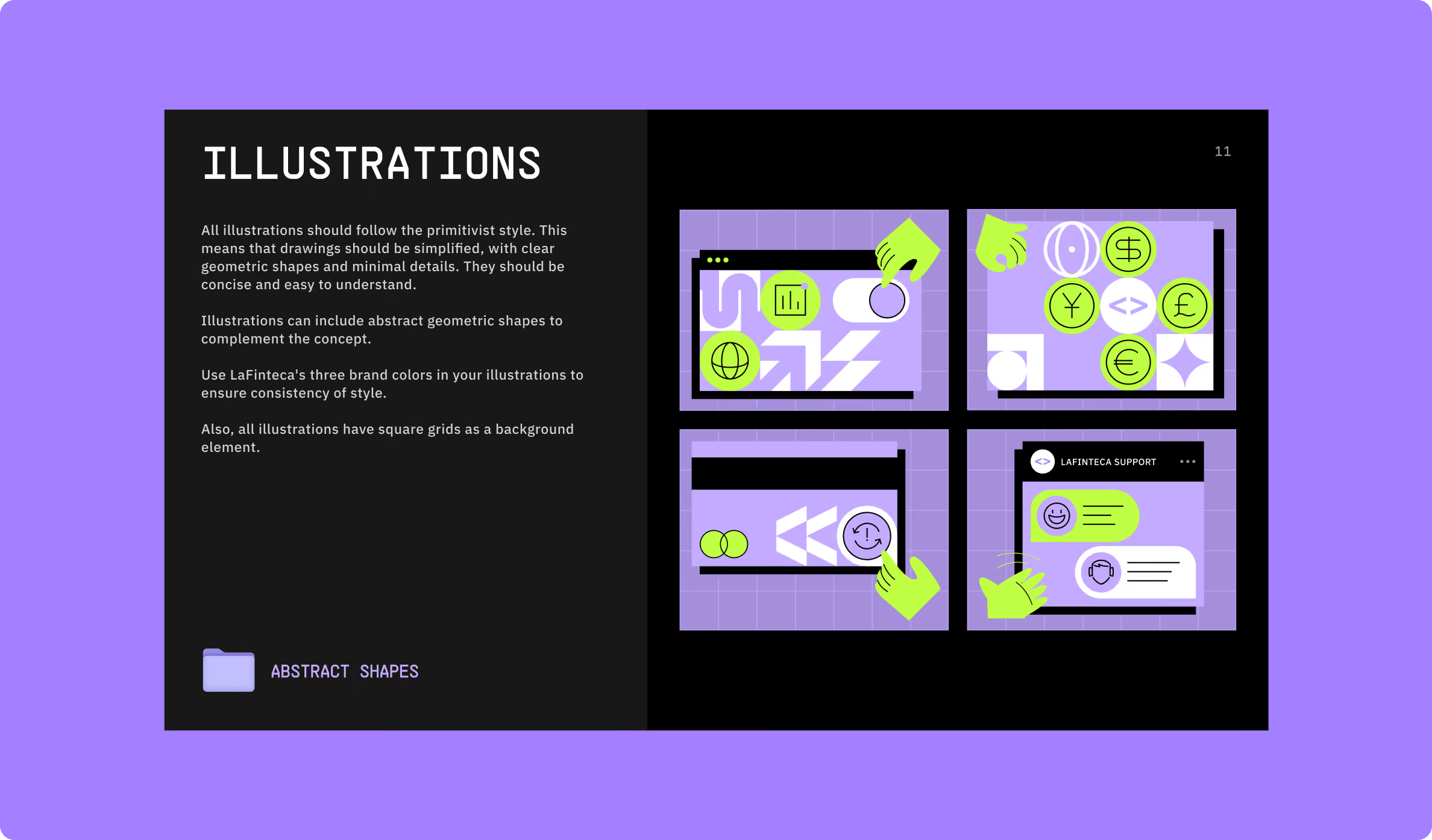
Custom illustration became the starting point for a different visual language. The brand identity, website, and merchant account could share the same system while each serving a different purpose.
The website focused on explaining the offering and supporting regional marketing. The merchant account carried the same visual direction into the product, where clarity and reliability mattered more than visual expression.
The result was a system that could work across both sides of the business — attracting attention in the market and supporting merchants once they came on board.




Give the FinTech brand its own visual language
The LATAM FinTech market had plenty of established visual conventions. Rather than adding another variation of the same interface-led aesthetic, we looked for a way to communicate LaFinteca through imagery and structure.
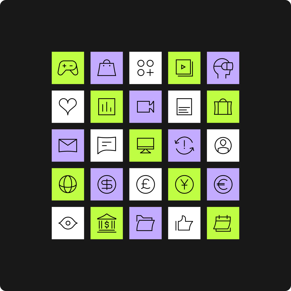
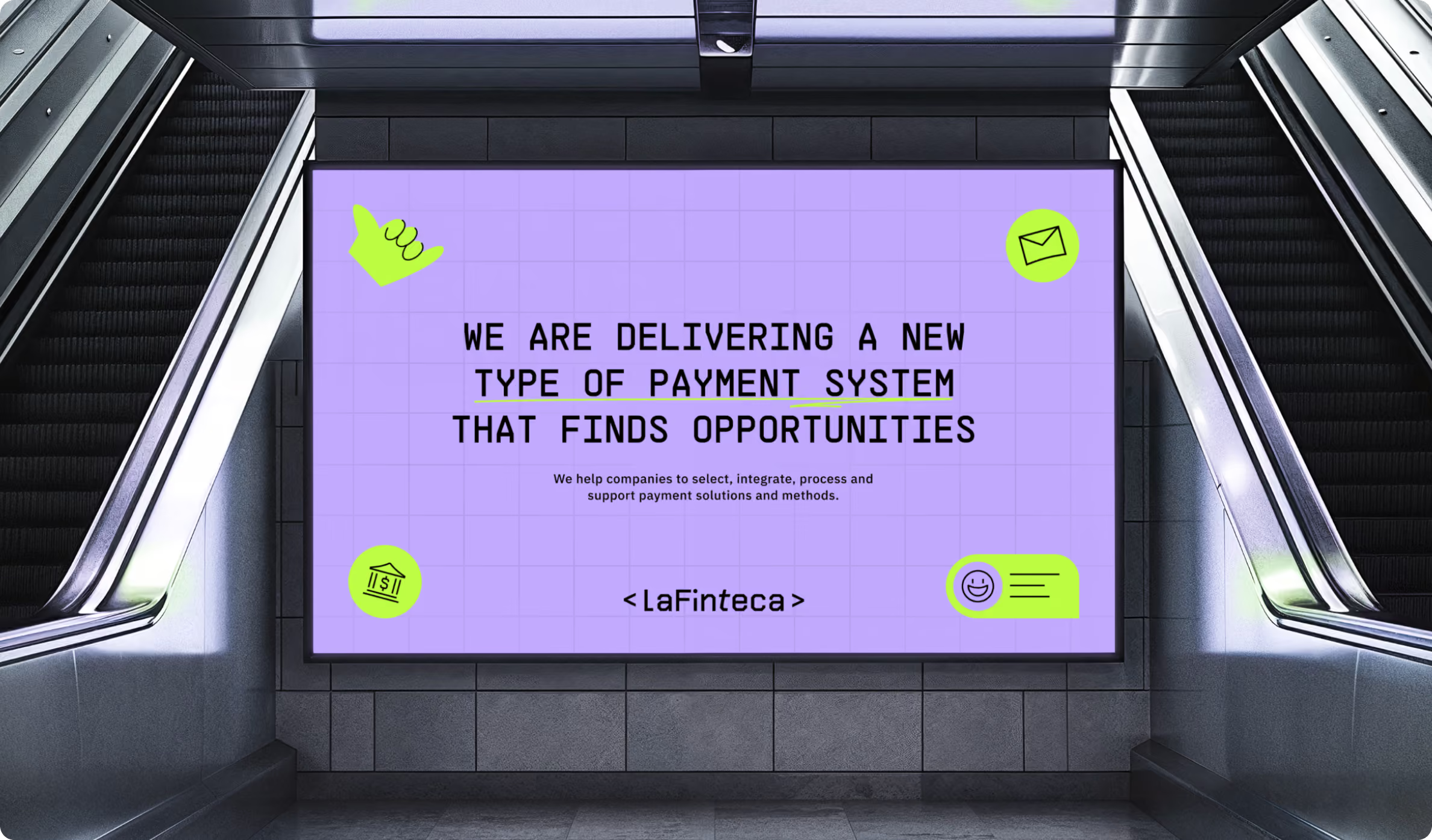
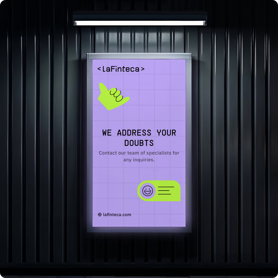
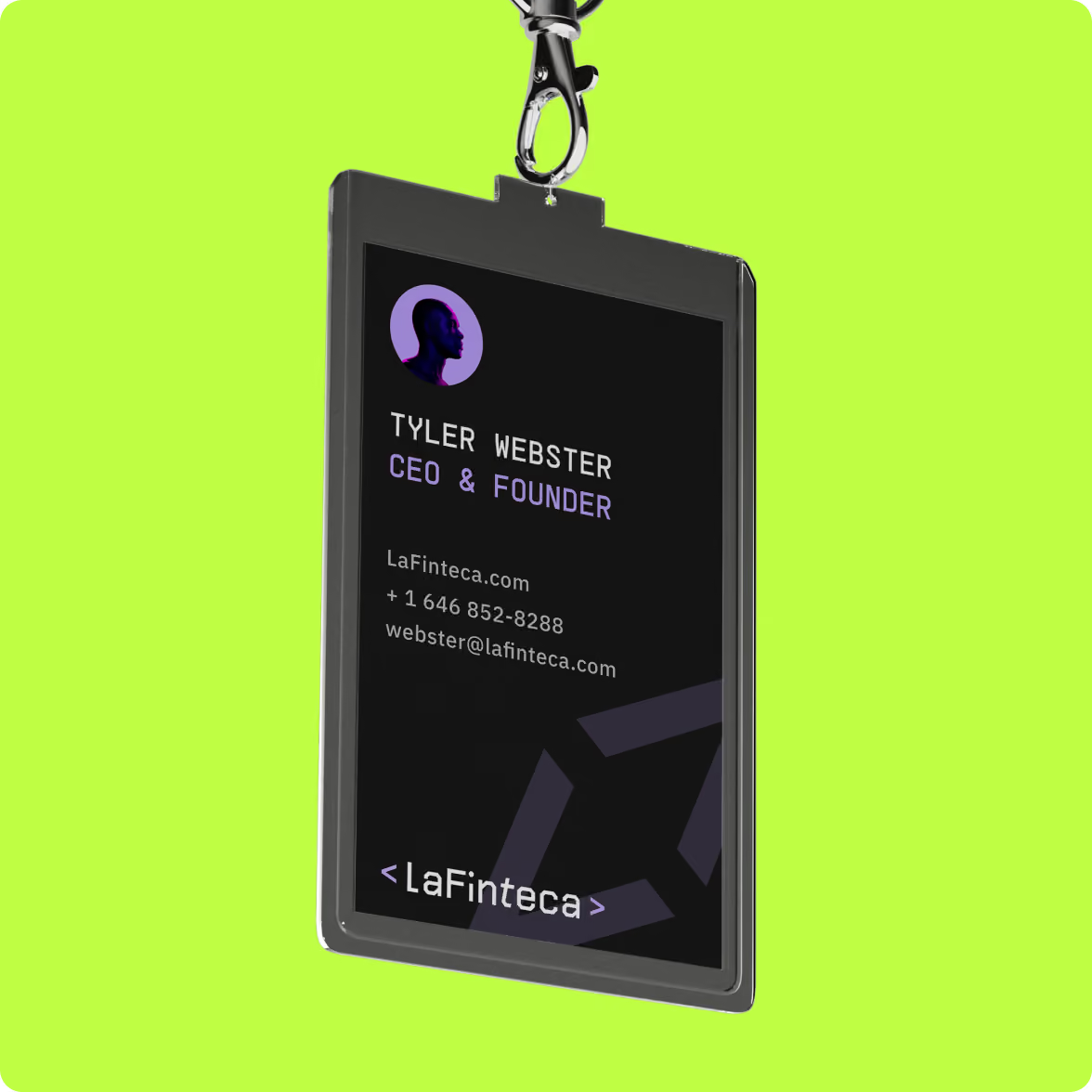
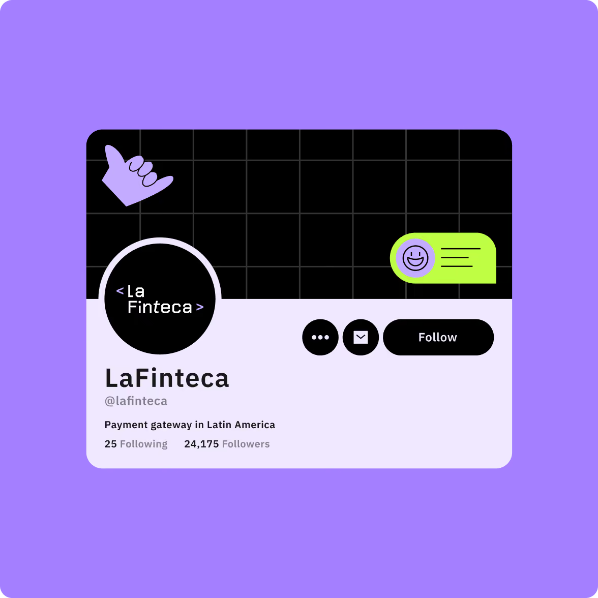
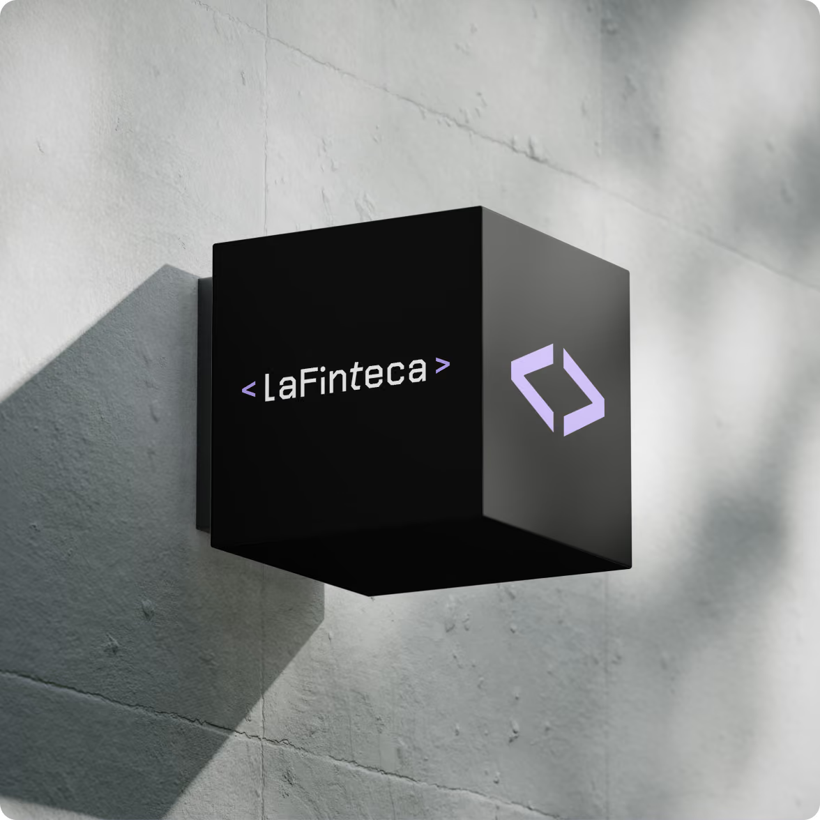
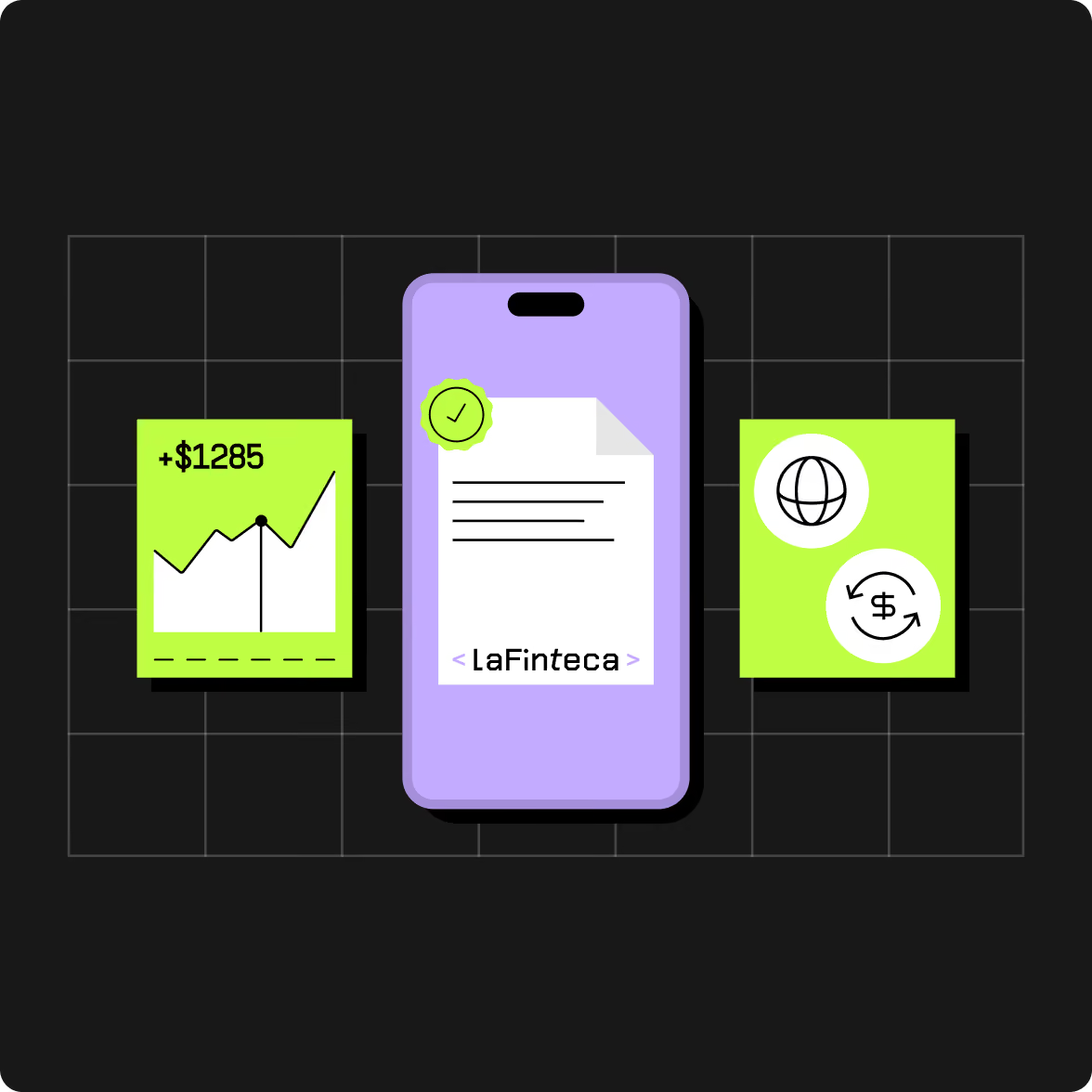
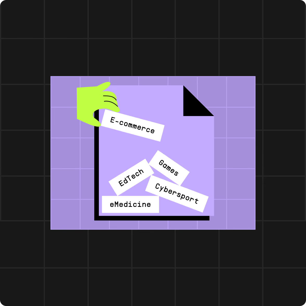
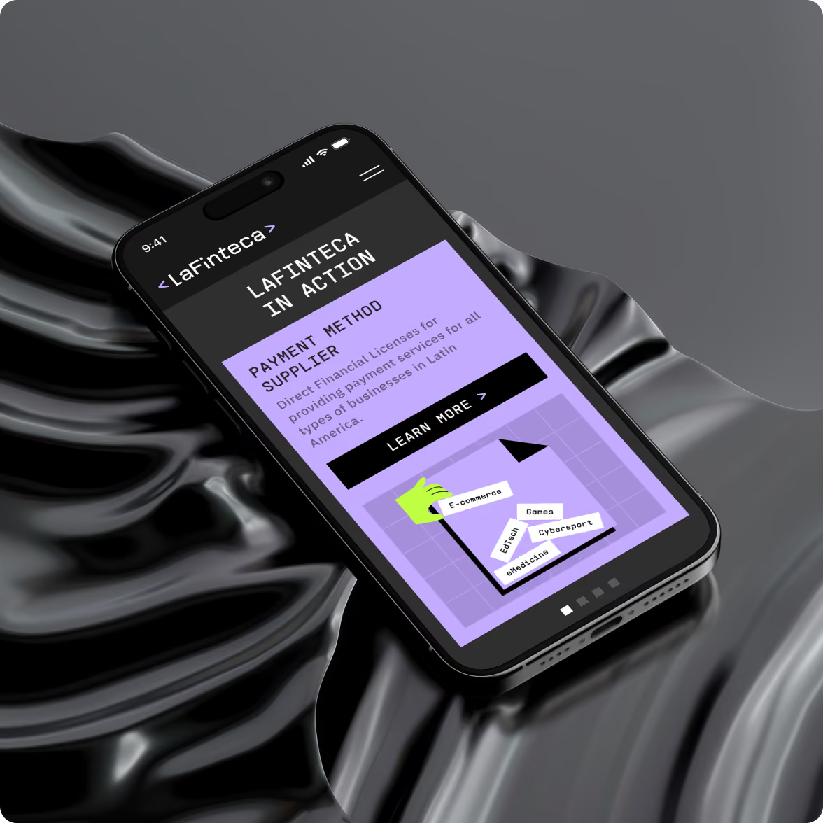
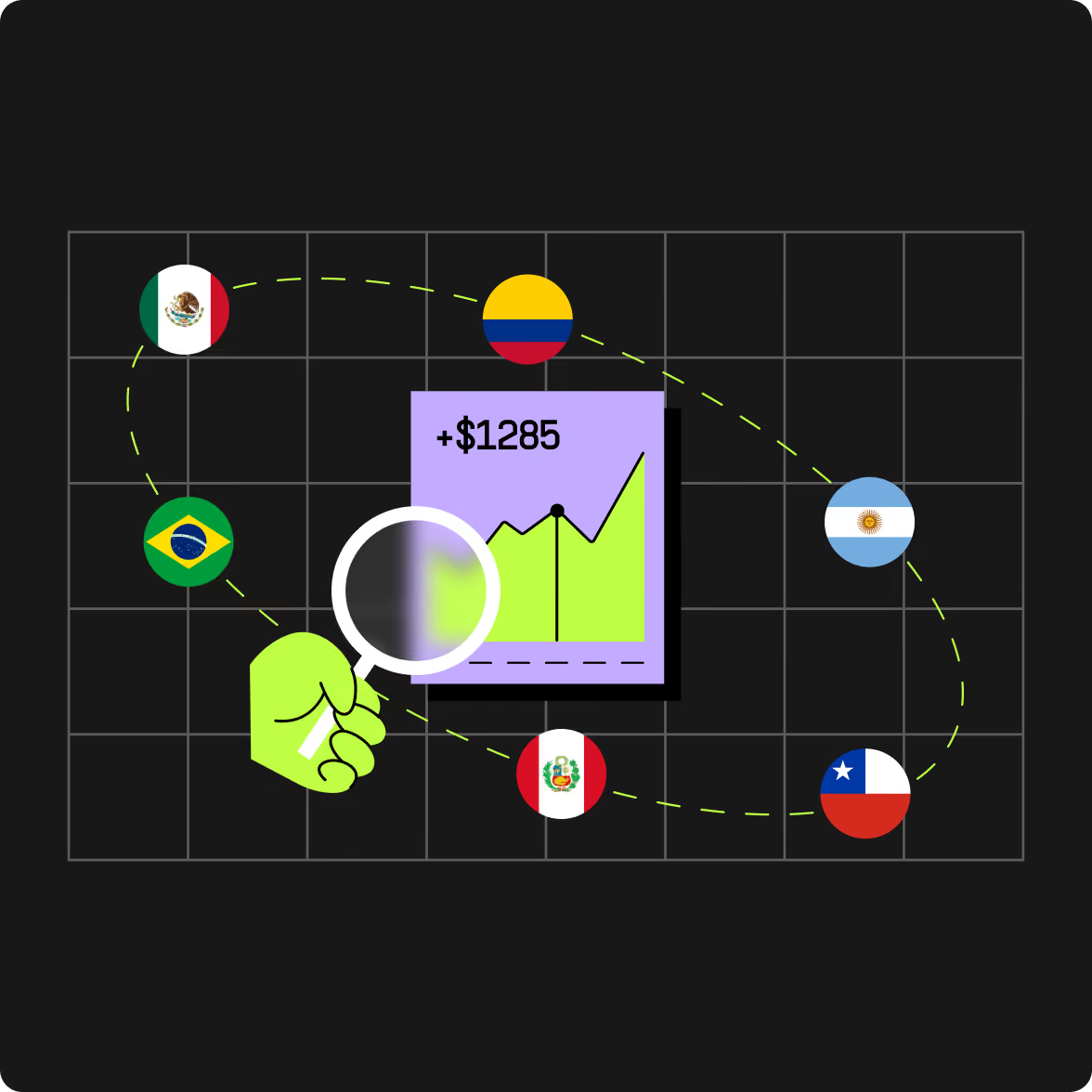
We developed the logo and visual identity first, then defined the system through colour, typography, and graphic elements. Custom illustrations became an important part of the identity, helping communicate the service without relying on dashboard screenshots or generic tech imagery.
The brand guidelines turned those decisions into a system the team could use across channels.
Explain a complex payment offering without overloading the page
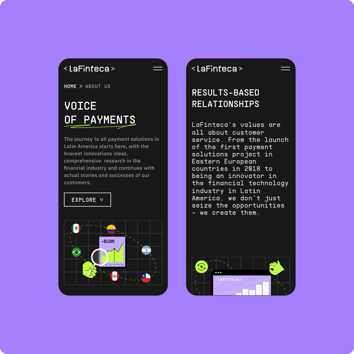
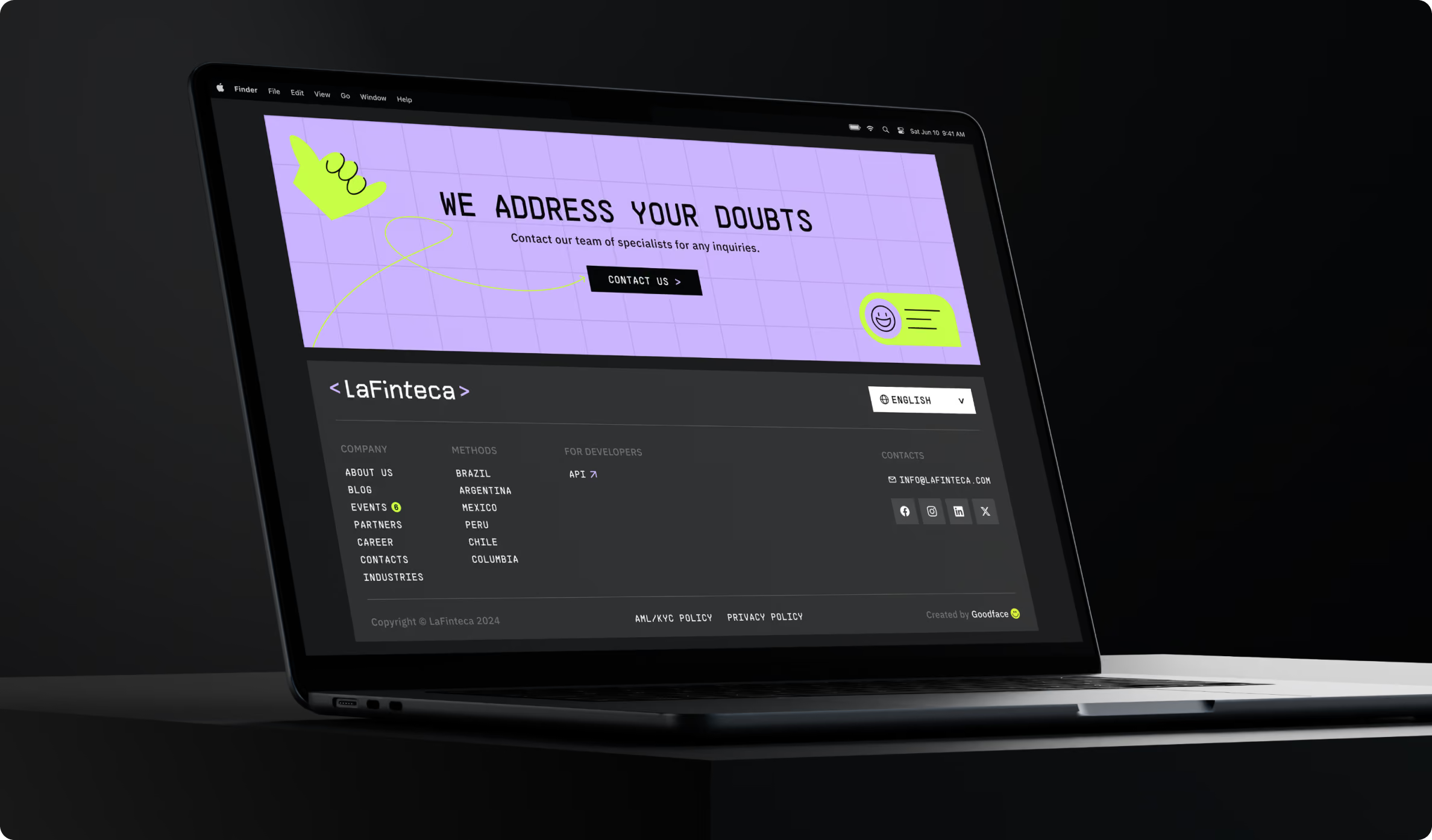
The website started with discovery. We mapped the information architecture, user flows, and page structure before moving into visual design.
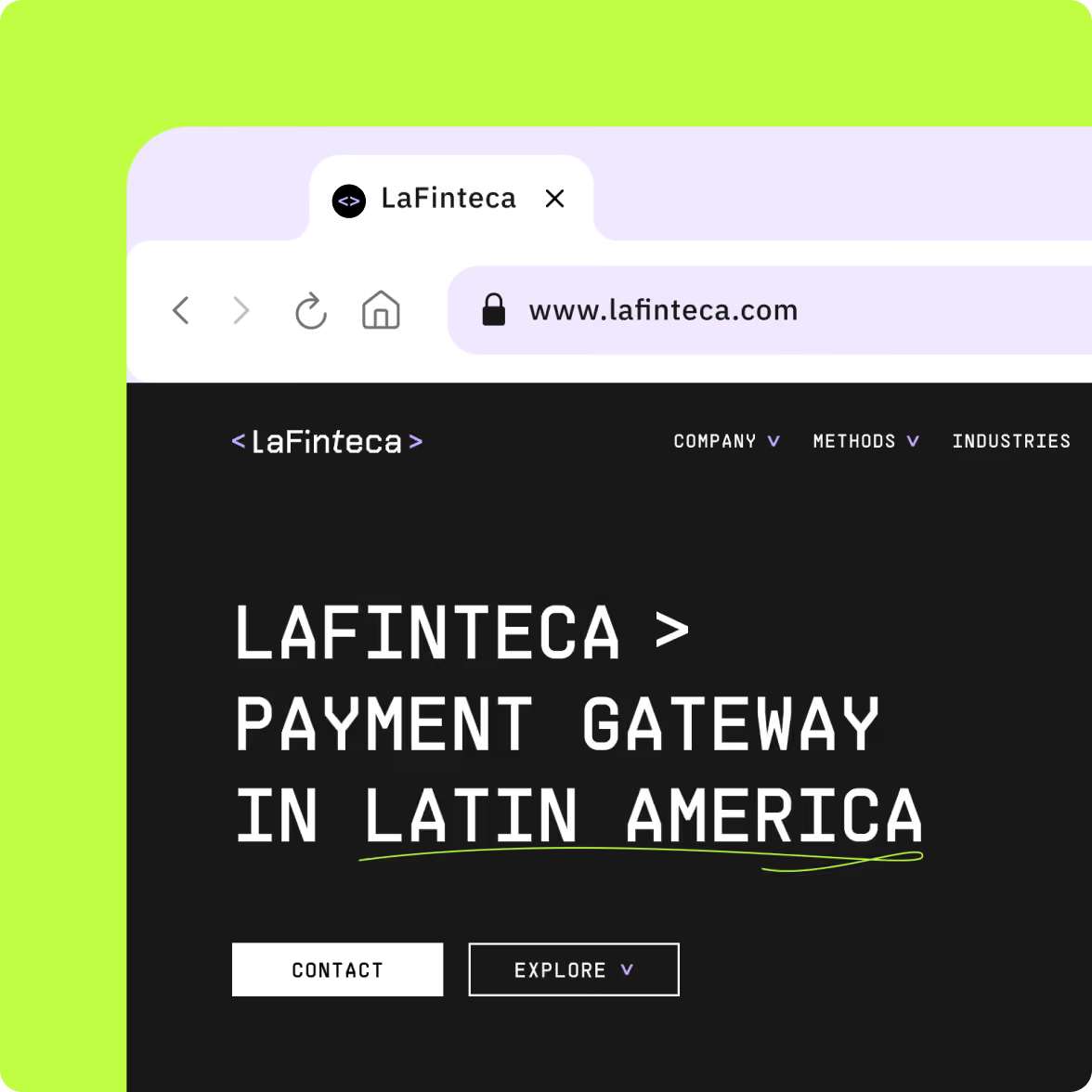
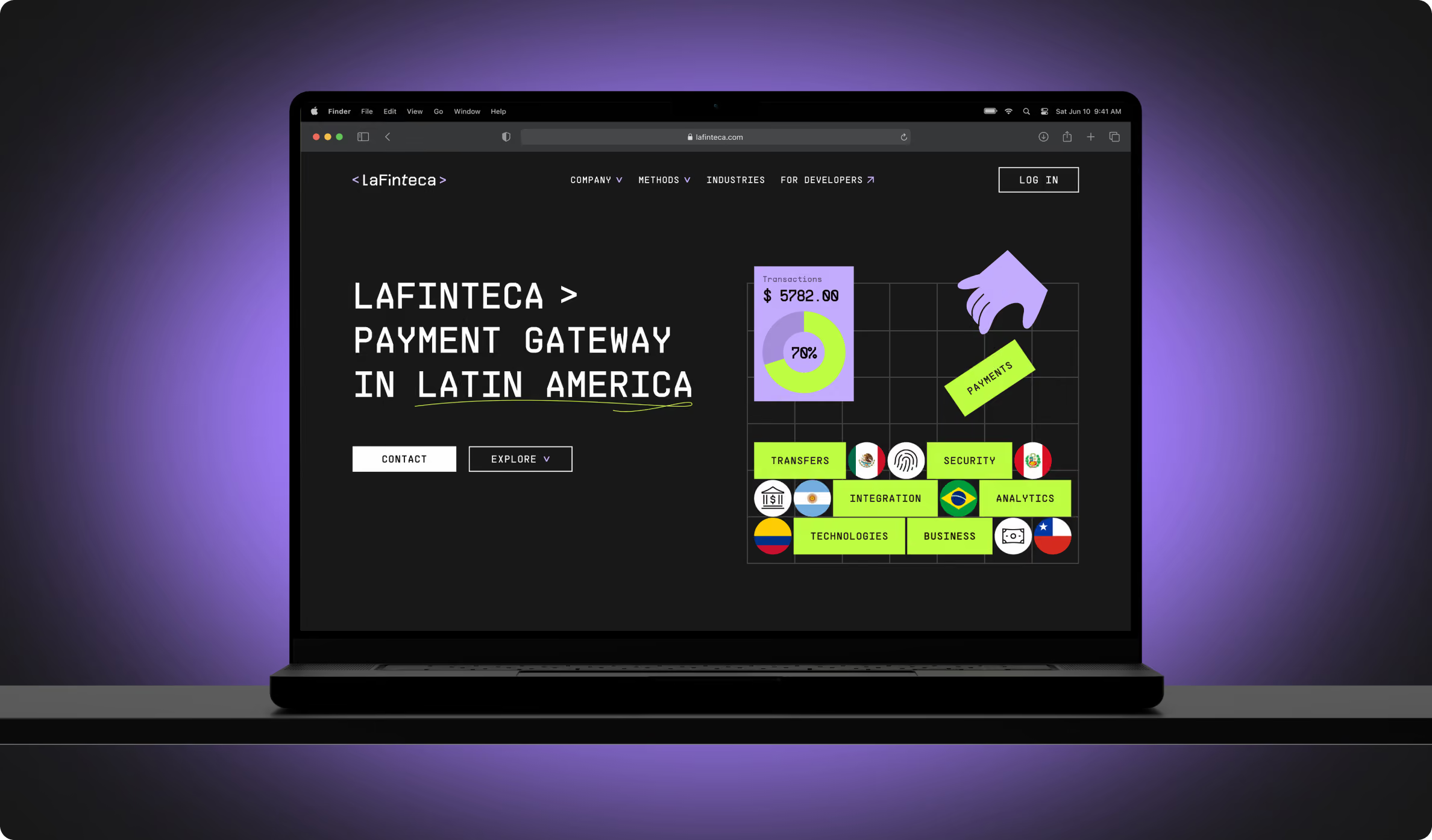
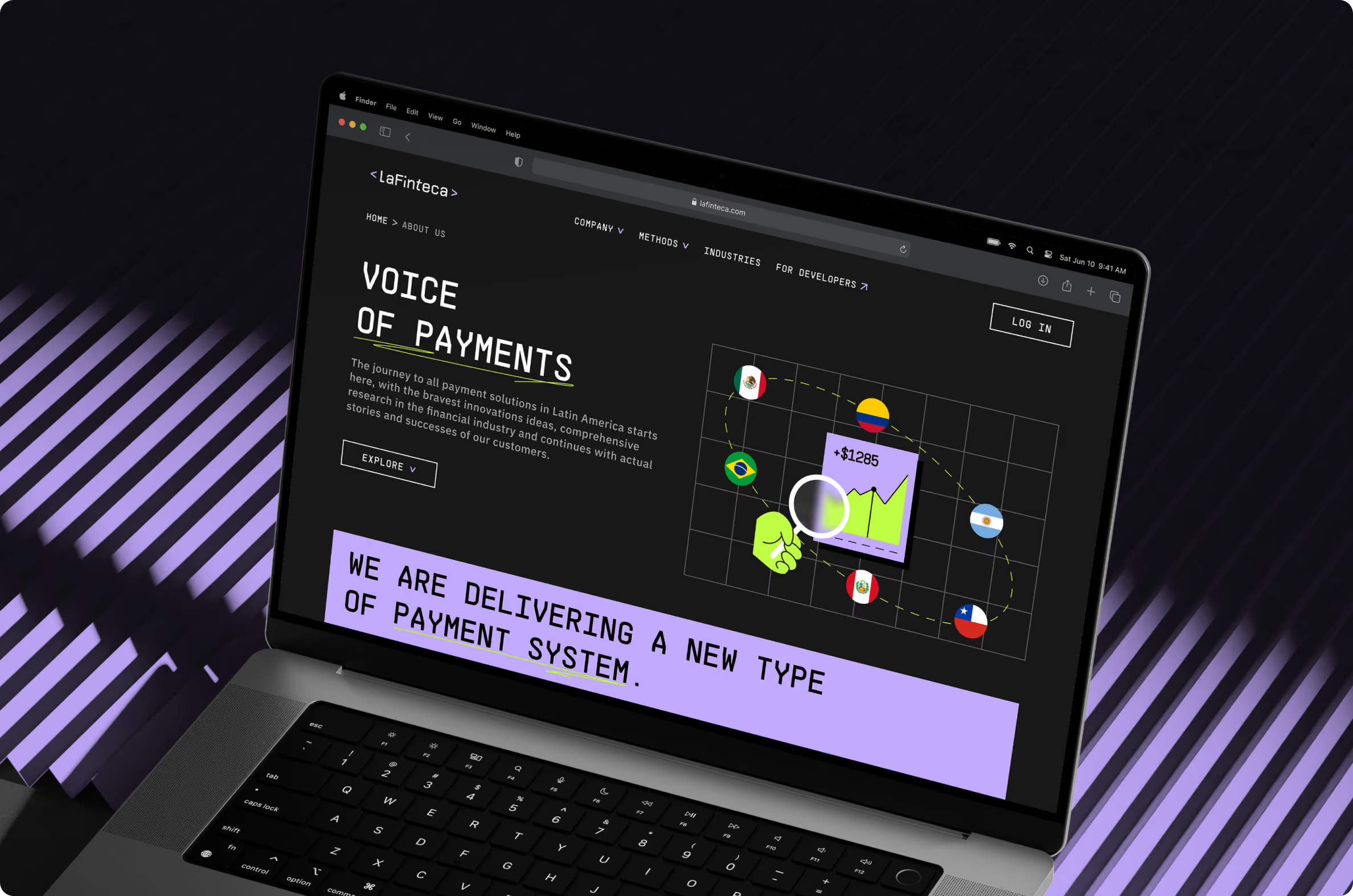
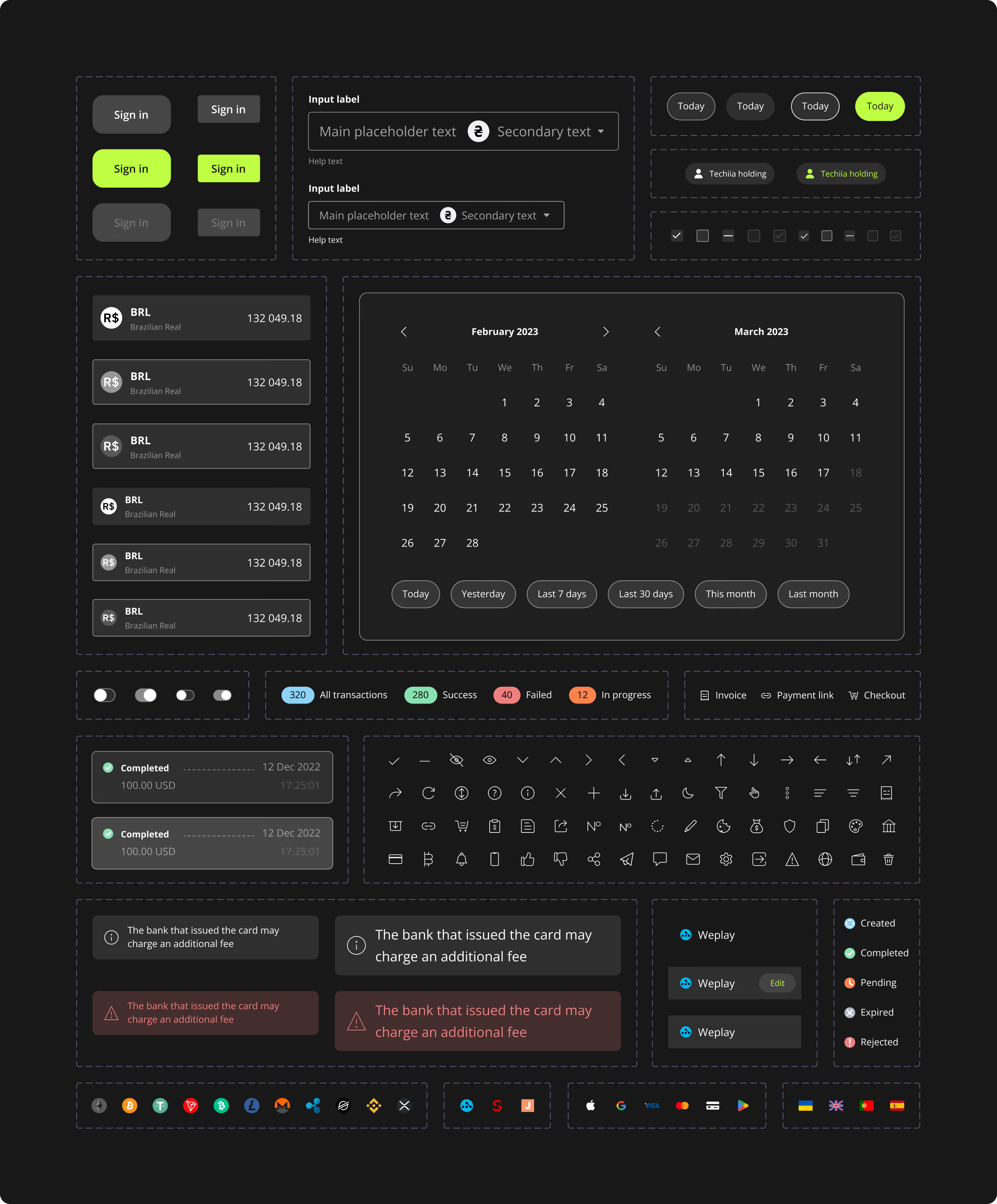
The interface uses geometric and monospaced typography to give the content a clear structure.
A dark base with neon green and light purple accents creates a distinct visual direction, while illustrations and motion give the pages more room to communicate the brand.
The design keeps the business’ tech character visible without making every part feel so techy.
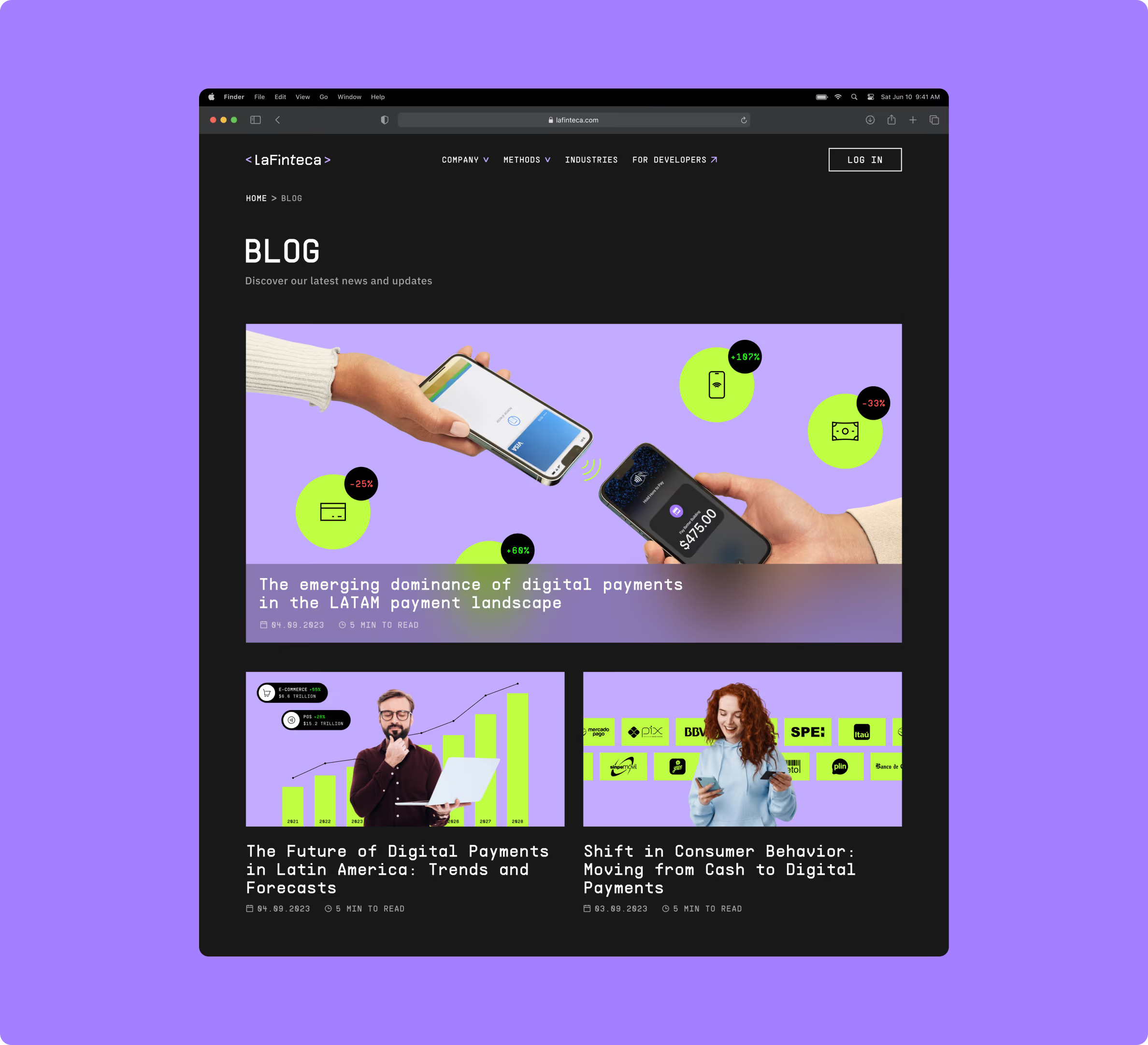
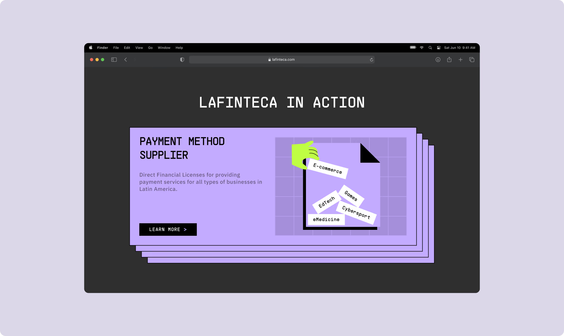
Give regional campaigns their own landing pages
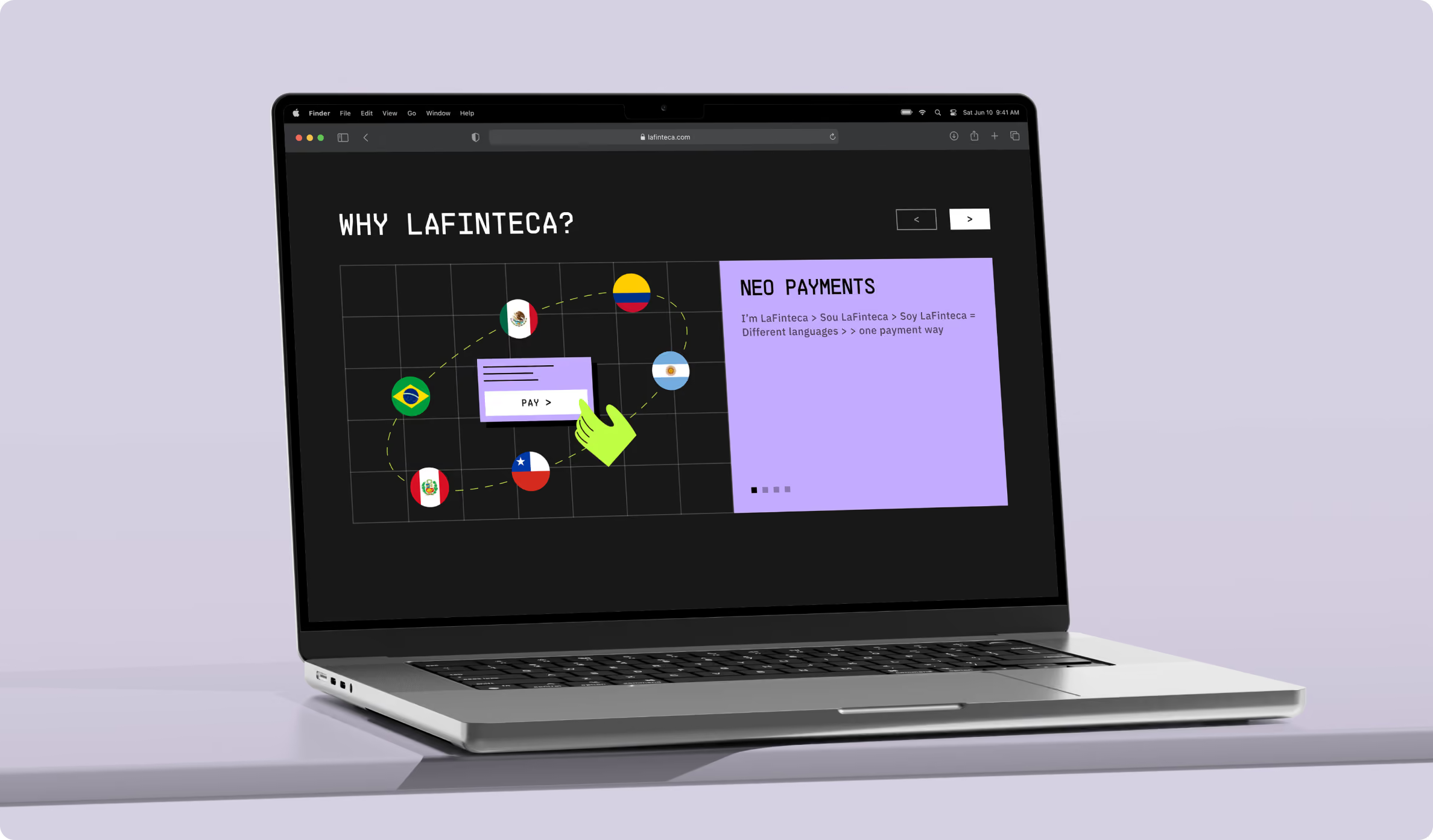
LaFinteca operates across different Latin American markets, so the website needed to support more than one generic product story.
We developed multiple landing pages for regional marketing campaigns. This gave the team dedicated spaces for different audiences and campaigns instead of showing every message
through the main website structure.
Build a website the team can keep working with
The development followed the structure established in design, with a focus on performance, content management, and interactive elements.
We built the frontend and backend, added motion and interactive behaviour, and integrated a CMS so LaFinteca’s team could update website content independently.
The site was also structured to support new landing pages as the company expanded its marketing activity across the region.
Carry the brand into the merchant experience
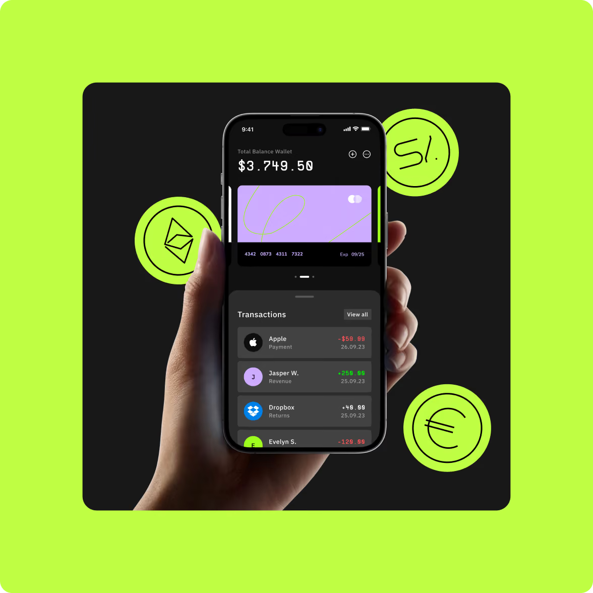
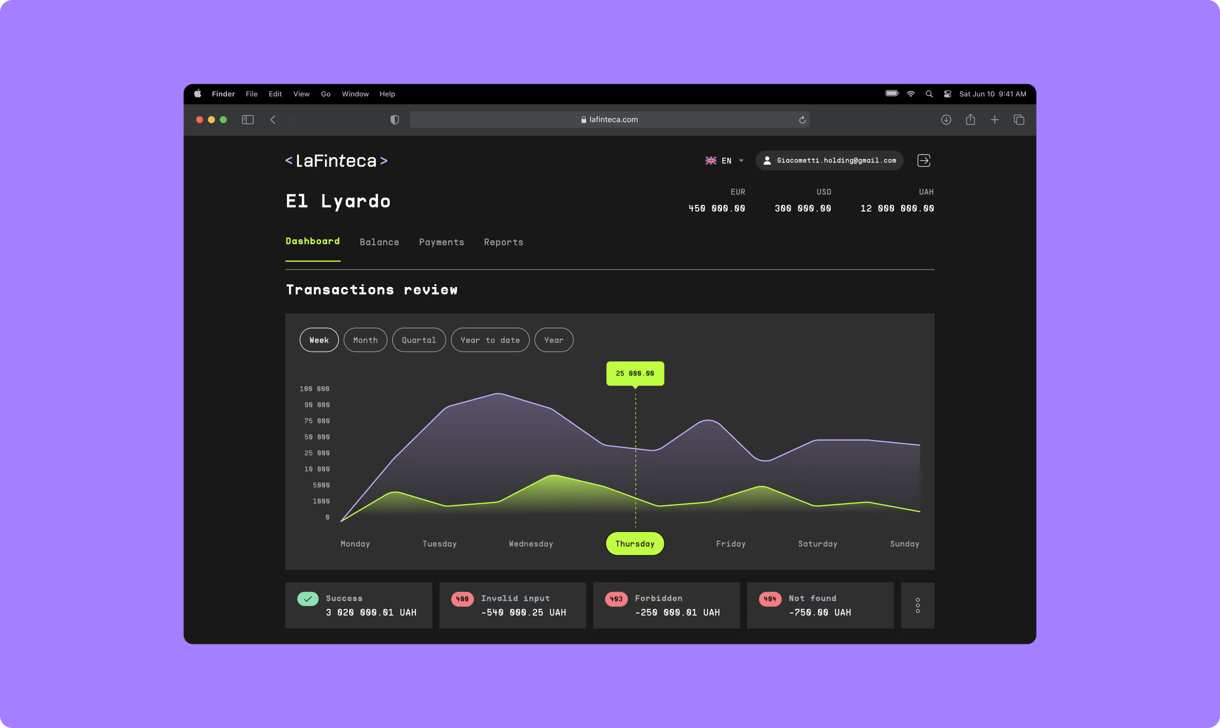
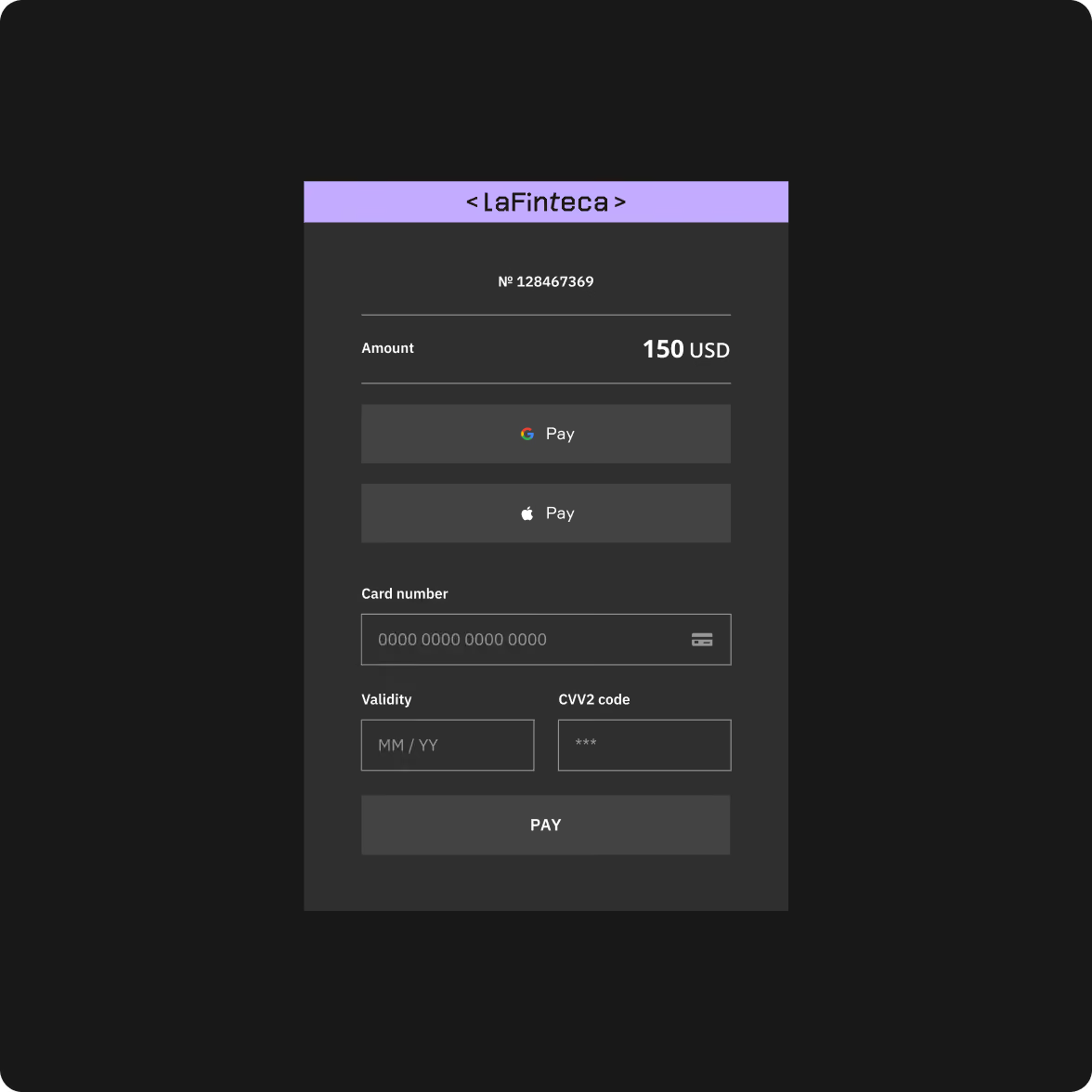
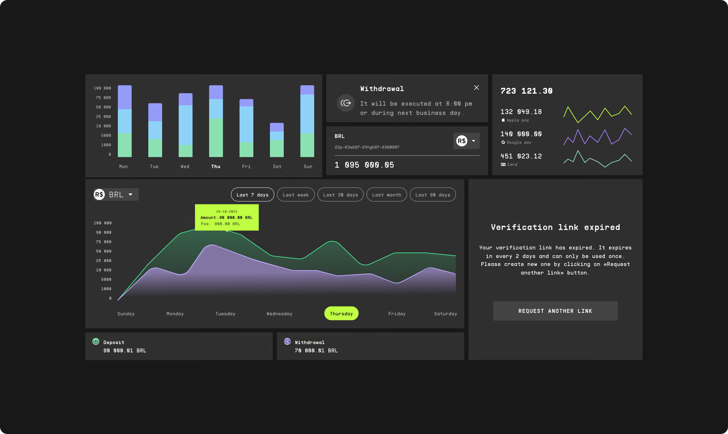
The merchant account needed a different balance from the marketing website. Here, visual character had to support tasks such as payment analytics and settlements rather than compete with them.
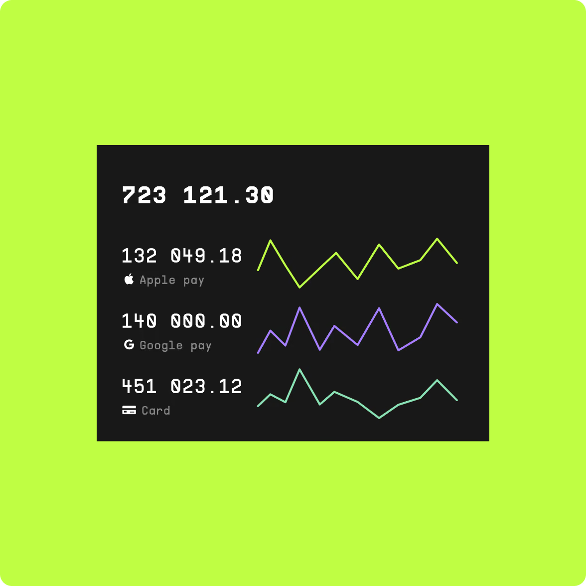
We carried the new visual system into the interface and structured the data around the information merchants need to work with regularly.
Dashboards and supporting screens were designed to make payment data easier to read and navigate, with clarity and reliability guiding the interface decisions.
A new digital foundation for LATAM expansion
LaFinteca launched with a new visual identity, website, and merchant account experience.
The website gives the company a distinctive way to present its payment offering and a structure that supports regional marketing campaigns. The merchant account carries the same visual system into a more functional environment built around payment analytics and settlements.
The collaboration has continued beyond the initial launch, with Goodface supporting LaFinteca across ongoing design and development as the company expands.
Keep the product moving as the market expands
LaFinteca and Goodface worked together through regular design and development sprints.
The scope continued to evolve as the company expanded, with new features, interface updates, and marketing needs entering the work over time.
That ongoing setup allowed the design and development work to respond to the business as it moved into new markets.
The first direction looked too much like FinTech
Our initial dashboard concepts followed familiar category patterns. They were functional, but they did little to give LaFinteca a recognisable visual voice.
We moved in a different direction: custom illustrations and more structured flows became the basis for the experience.
The change also clarified an important distinction. The brand could carry more personality, while the merchant tools needed to stay focused on the work users came there to do.
LaFinteca continues to expand across Latin America, adding payment providers and building new partnerships.
Goodface remains involved in the work, supporting the team with design and development across new marketing assets, interfaces, and other digital needs.
A crowded category doesn’t mean products should be the same
Payment products often communicate through the same visual shorthand: dashboards, interface fragments, abstract technology, and familiar FinTech colours.
That can make a product easier to recognise as “FinTech” — but harder to remember as a specific company.
LaFinteca took a different route. The product still needed to communicate trust and handle complex payment information, but the brand did not need to look like the interface behind it.
For FinTech companies entering a new market, that distinction matters. The product needs to work. The brand also needs to give customers something they can recognise before they start comparing features.
Want to start a project with us?

Your request has been sent and will contact you soon by this email yourmail@mail.com

Let's discuss your upcoming project on a call

We usually reply within 1 hour during working hours: 9:00–20:00 (GMT+3)


.avif)