













Corefy.
Multifunctional payment platform for online business
A new digital presence for a growing payment platform
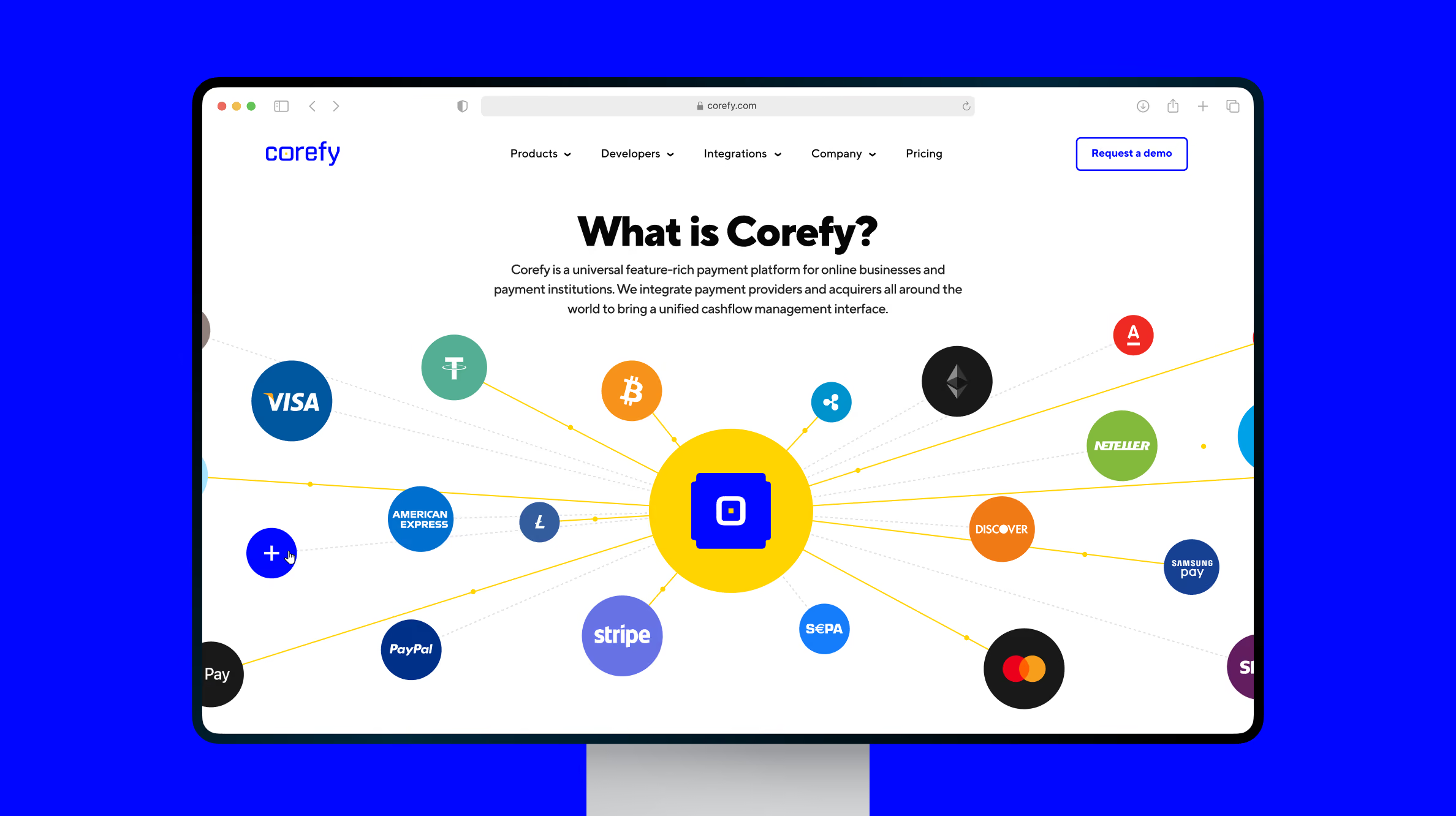
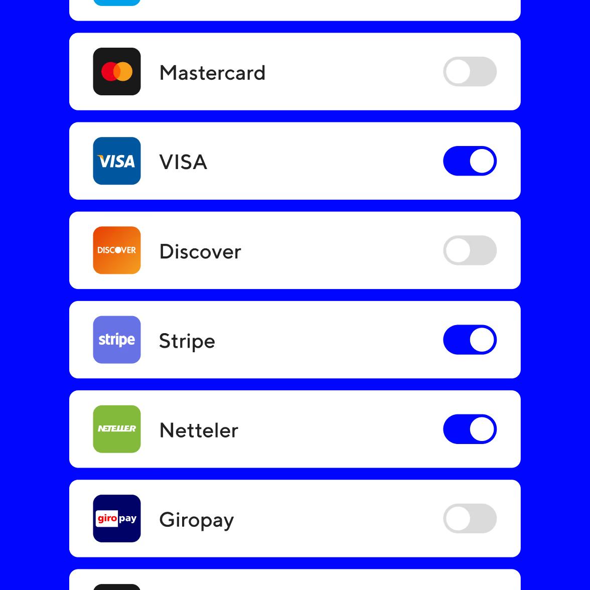
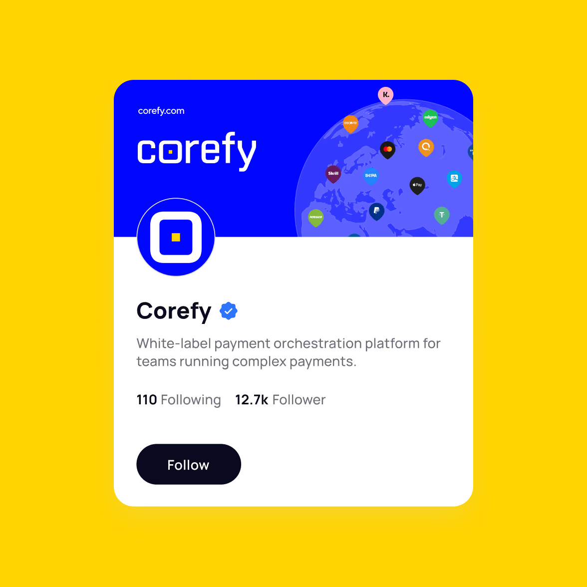
Corefy connects 650+ payment providers and supports 400+ payment methods, including traditional payment rails and cryptocurrencies. The platform helps online businesses and financial institutions accept payments and process settlements across markets and currencies.
Founded in Ukraine in 2018, Corefy is a payment orchestration platform serving businesses and financial institutions across local and international markets. Its offering covers payment acceptance, settlements, multiple currencies, and smart payment routing.
The company was also preparing a new round of marketing activity, with digital communication playing a larger role in how Corefy presented its products and capabilities.
Corefy had outgrown its website
Corefy was growing rapidly, but the website had not kept pace. Some of the company's products were missing, while the visual language no longer reflected the scale of the business.
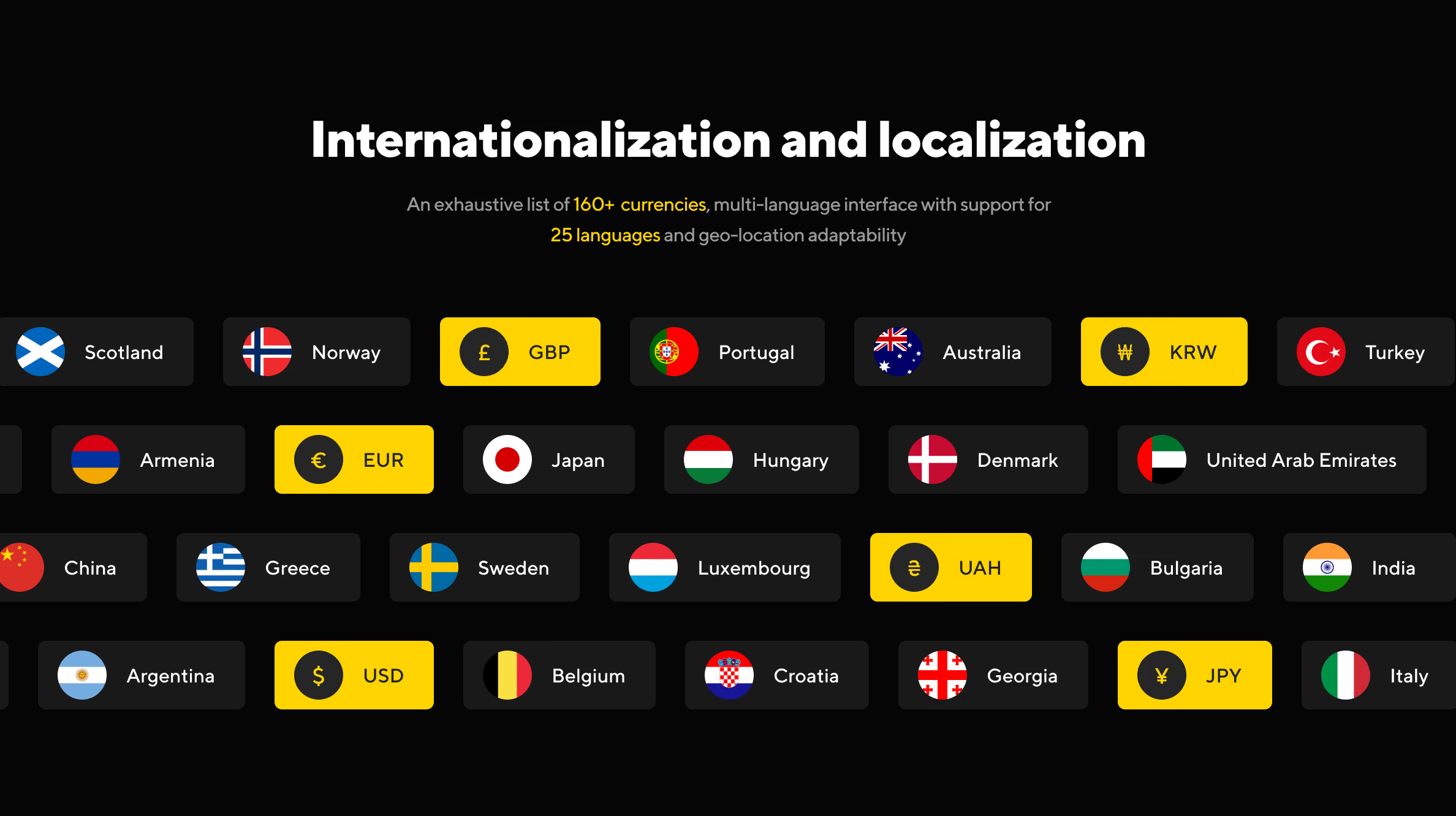
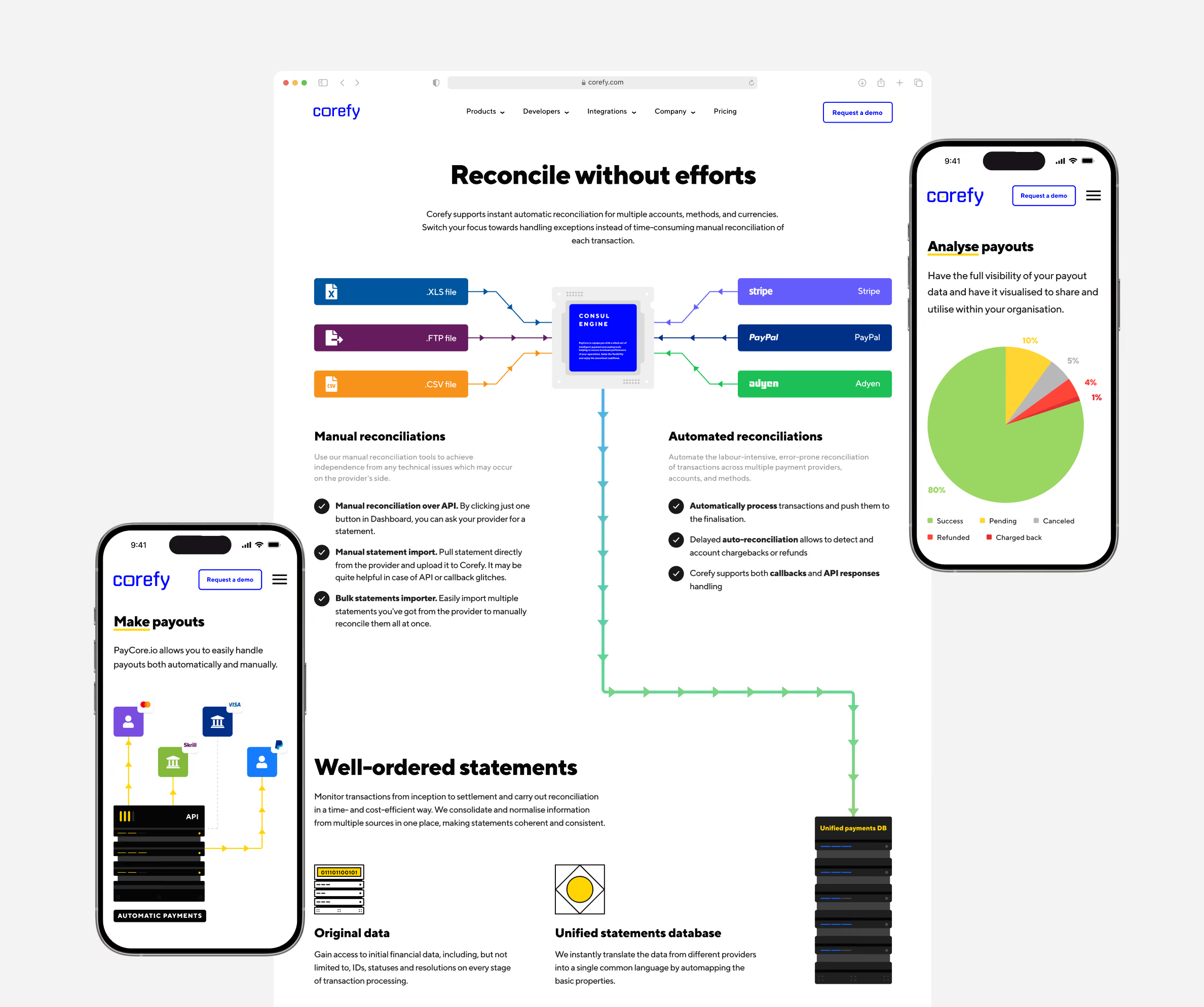
The website also had to communicate a product with a wide range of providers, payment methods, currencies, and payment flows. The existing visual approach made that information harder to present clearly.
The challenge was to give Corefy a website that could cover the full product offering, explain complex payment infrastructure clearly, and support the company's marketing activity.
Build the visual system around the product
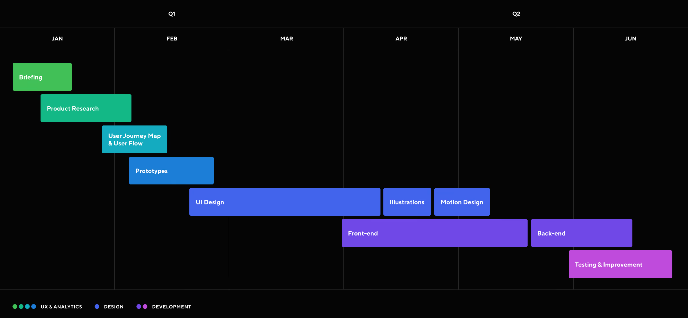
We developed the website in stages, starting with several key pages to establish the visual direction. Illustration and front-end development moved in parallel, so we could shape both as the website developed.
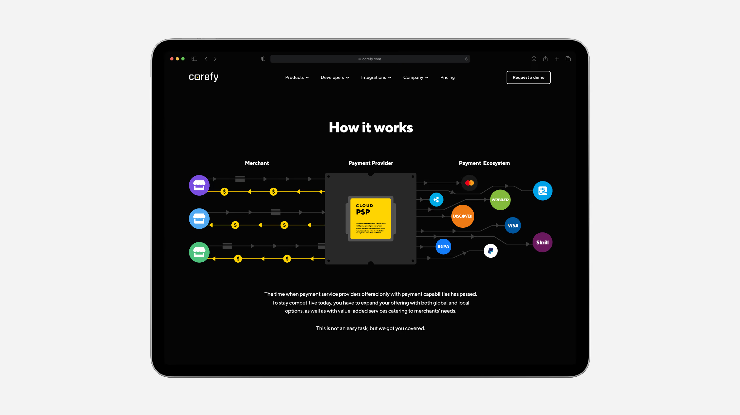
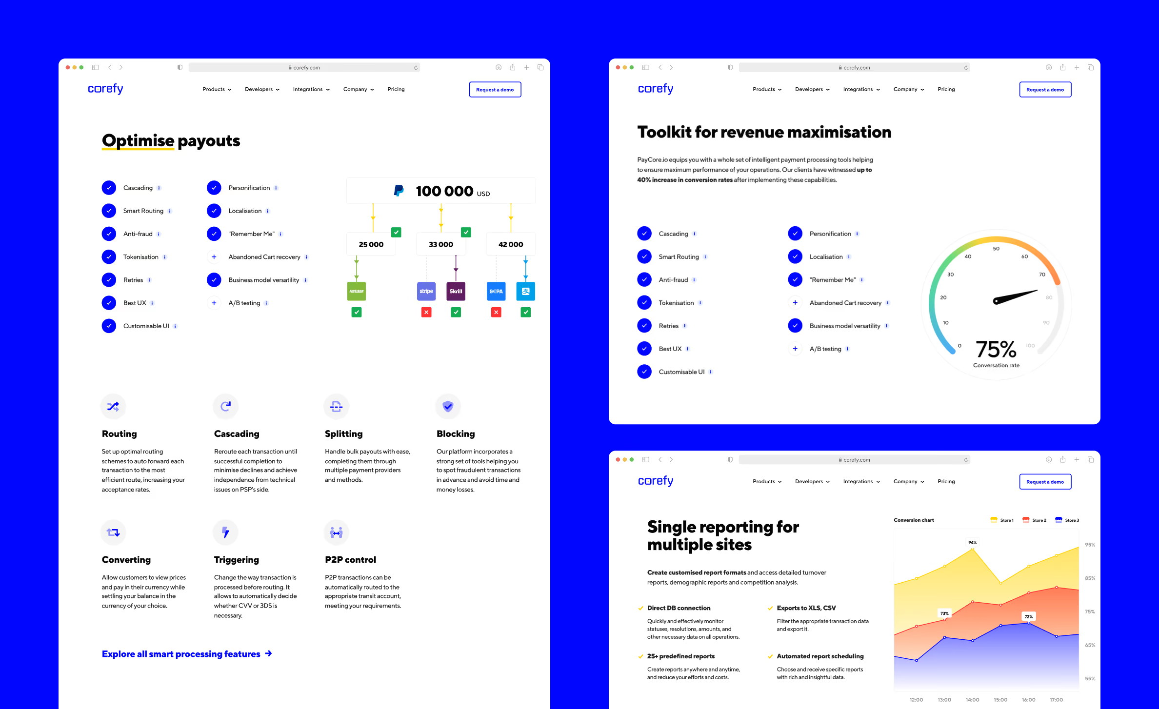
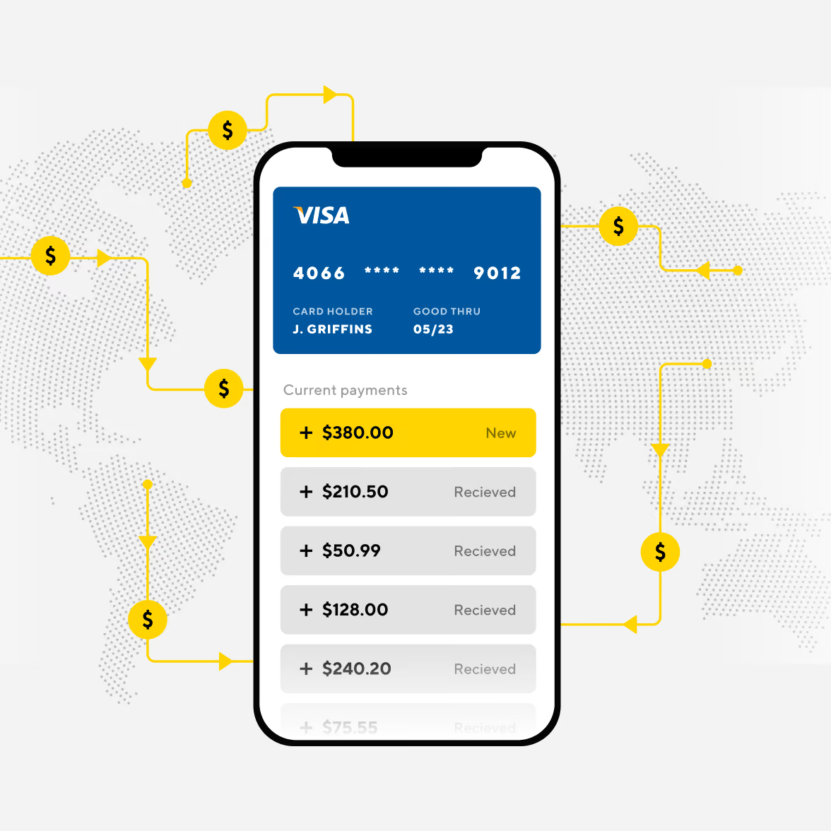
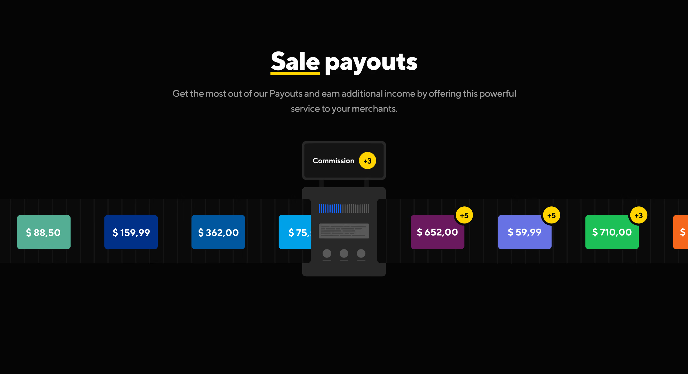
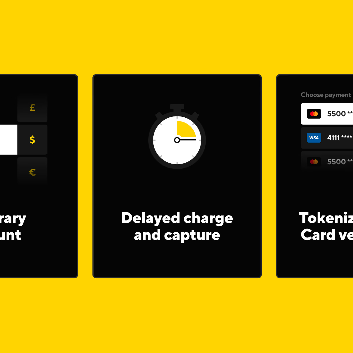
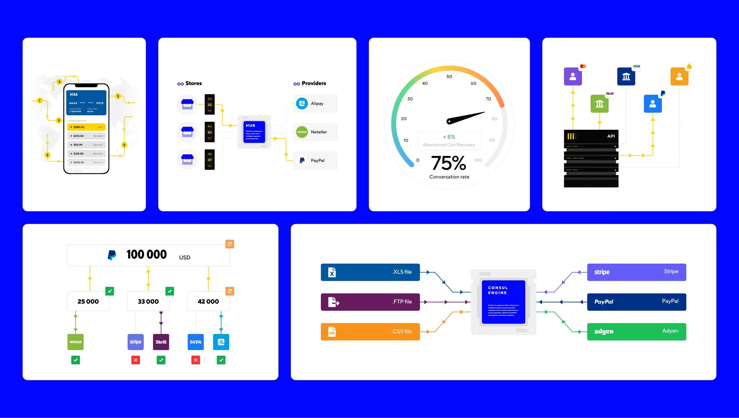
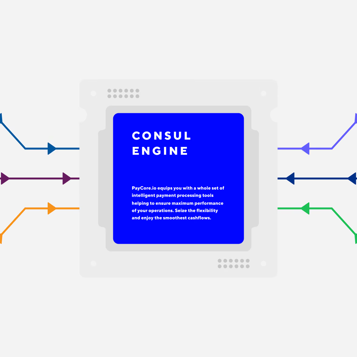
Infographics came first. They helped define how Corefy's products and payment flows would appear across the site. We then extended the same visual language to illustrations, animation, and page layouts across the 30+ page website.





Payment orchestration platform website design
Corefy had more to communicate than its previous website could comfortably handle. We therefore worked through the structure and visual language together.
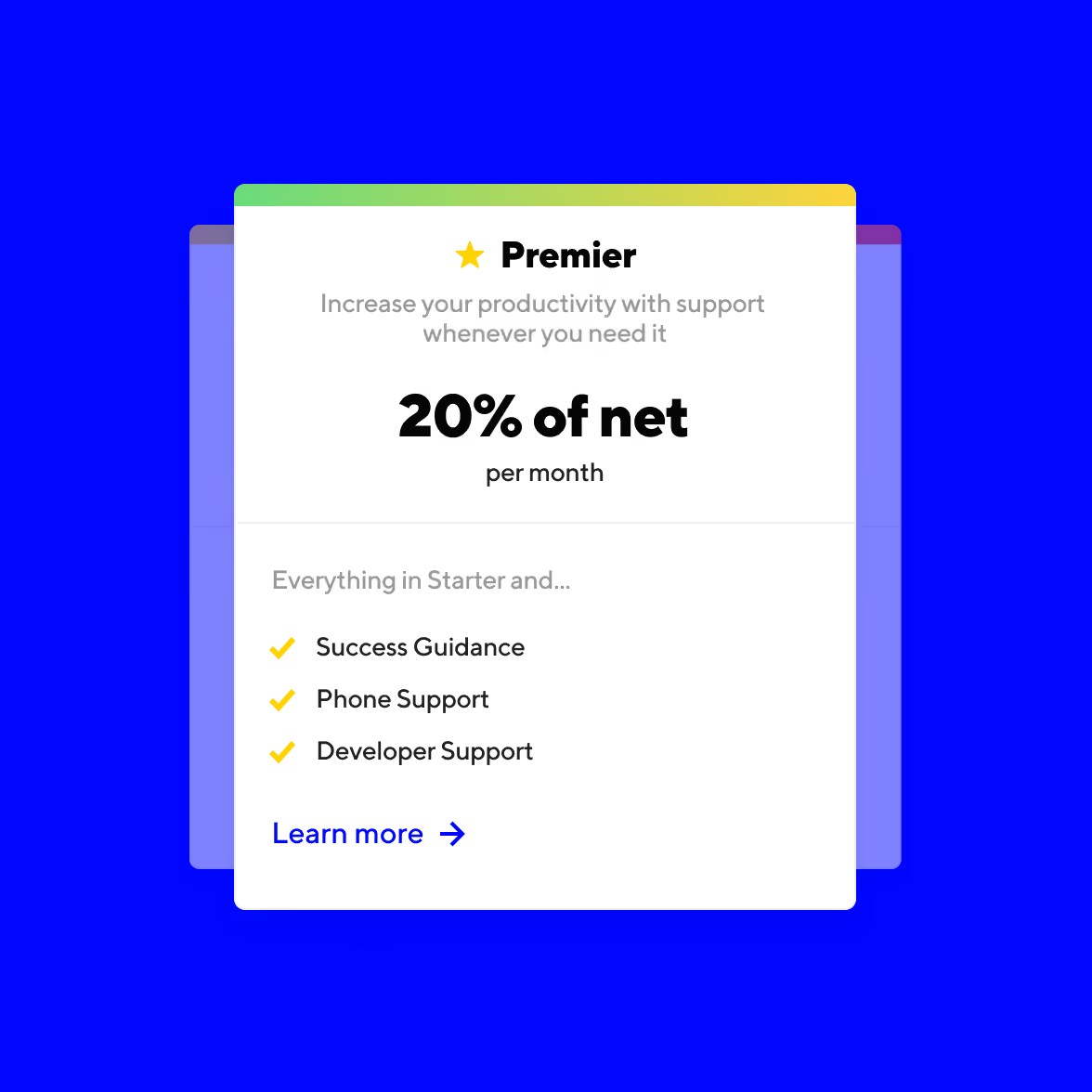
The first pages established the rules. We then carried those decisions across the rest of the site, building a consistent way to present products, processes, and supporting information.
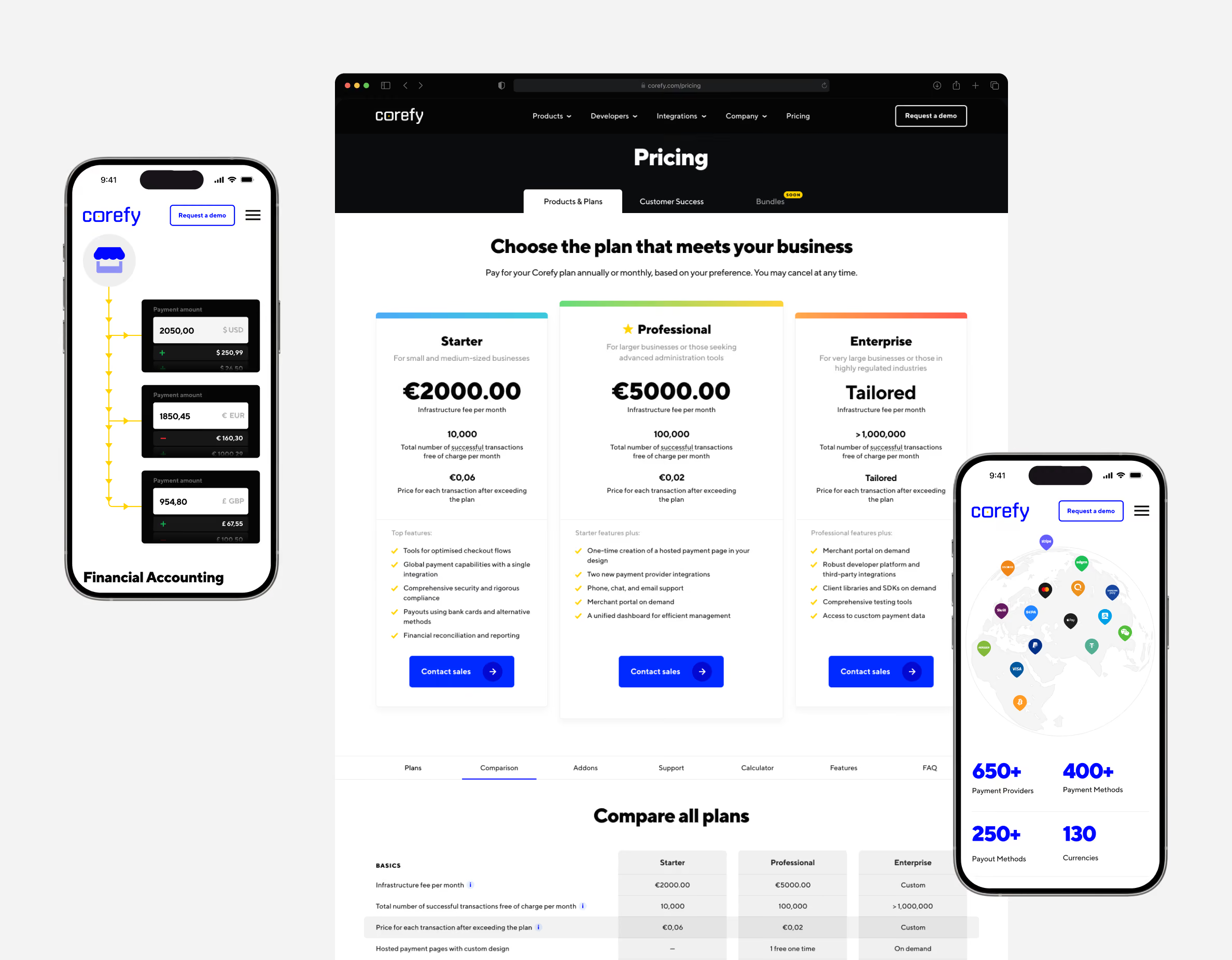
The final website covered 30+ pages. That scale also changed how we approached the design. Each new page had to fit the system rather than introduce another visual solution.
Payment platform website development
We developed the front end alongside the design. As the visual system changed, we could test it immediately in the browser and adjust the implementation with it.
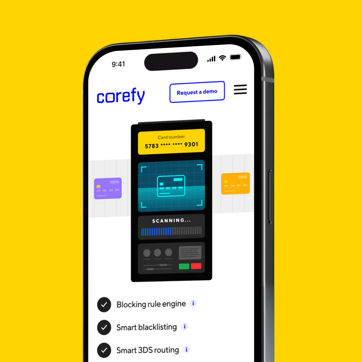
This approach was particularly useful for the illustrations and animations. We designed them with their final implementation in mind instead of treating development as a handoff at the end.
Magnetic Bank aimed to enter new countries and markets with new innovative and more accessible products, aiming to boost their standing in the FinTech world.
SEO & performance
The website combined a large number of pages with graphics and animation. Corefy's SEO team worked with us throughout development to keep performance in check.
We built the animations in front-end code rather than using video. Many pages reached 98–99 on Google PageSpeed, while the website averaged 85 on mobile and 90+ on desktop.
That let us keep the visual system without making every interaction dependent on heavy media.
Responsive design
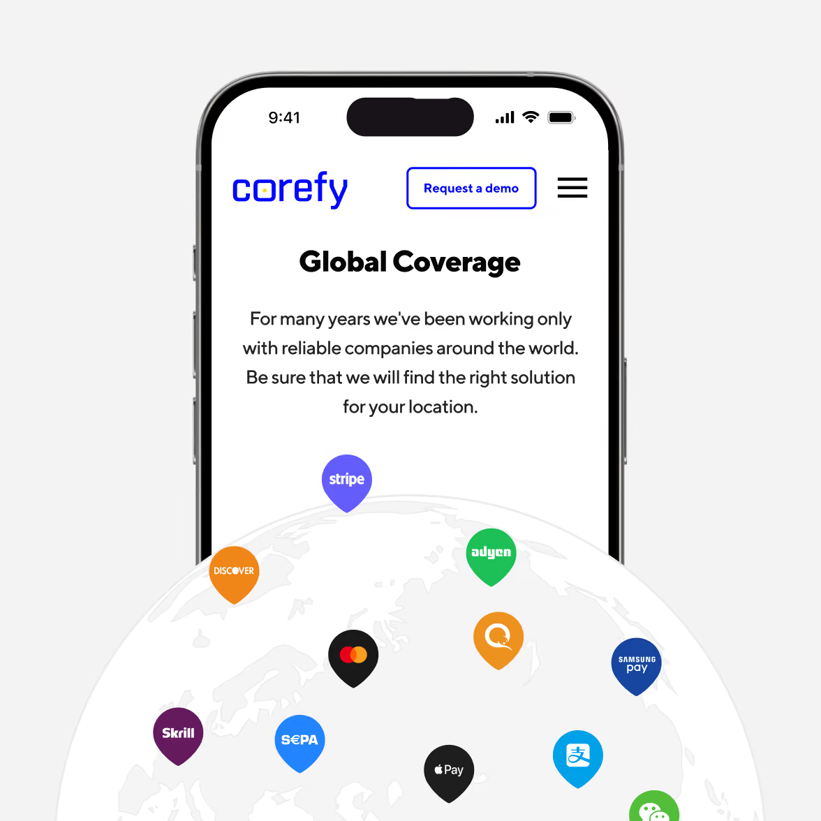
We designed the website for different screen sizes, with particular attention to mobile because it accounted for the largest share of traffic at the time.
The same components and visual rules carried through the responsive layouts, so the experience stayed connected across devices.
Build for the next page, too
Corefy was continuing to add products and services. We knew the website would keep changing after launch.
We therefore built a design system alongside the site, with reusable components and rules that the Corefy design team could use during the creation of new pages.
The system gave the team a way to extend the website without reopening the same design decisions every time.

Illustration
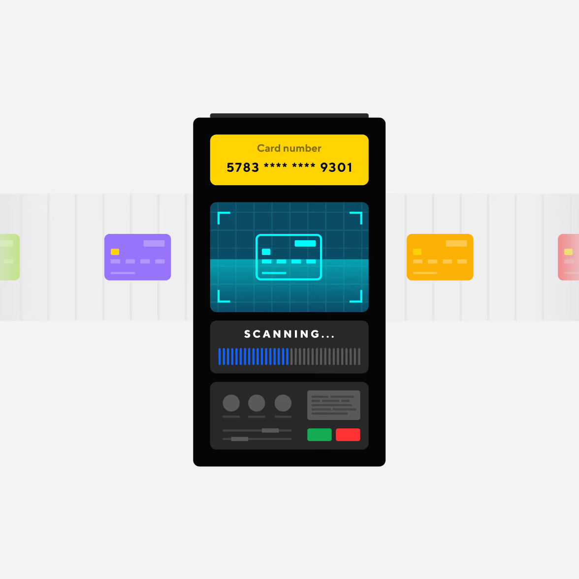
The previous illustration style explained Corefy’s complex product ecosystem, but eventually it complicated the interaction with it. The visuals were unscalable, much harder to produce, and limited in applying them to new content.
The client initially wanted to preserve that work. We understood why — the team had invested a lot in it. So we tested both directions.
The new approach gave Corefy a simpler illustration system that we could adapt across the website and extend as the product evolved.

Animation
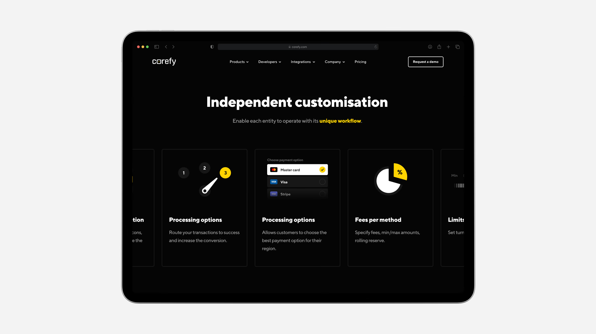
We added motion where it helped communicate the illustrations and processes more clearly.
Rather than treating animation as a separate layer, we built it into the front-end implementation. That kept the interaction tied to the same visual system and helped us control its impact on performance.
Take the system beyond the website
Corefy also needed the new visual direction to work in marketing and editorial materials.
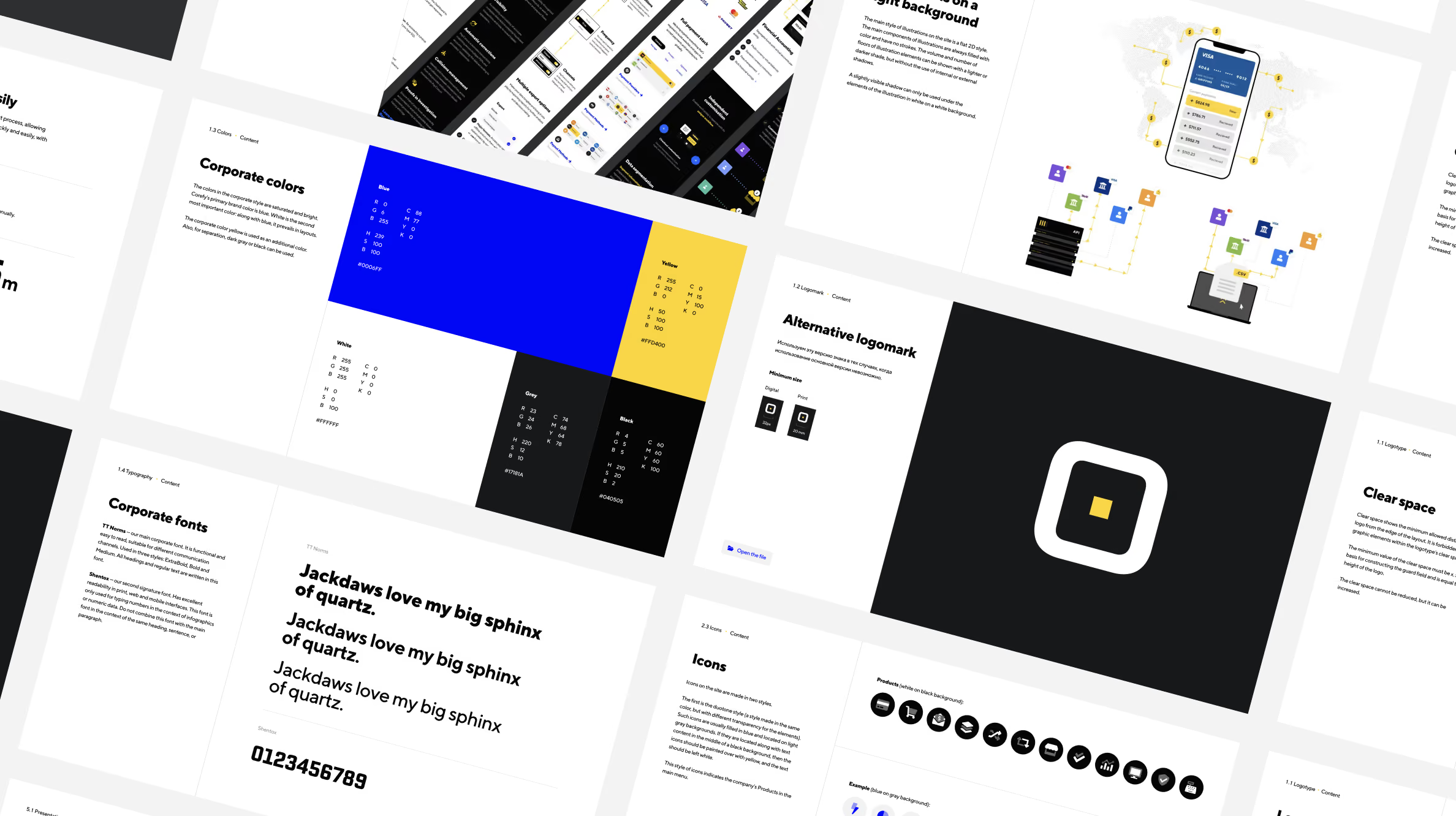
We created brand guidelines covering typography, colour, grids, presentation templates, and illustration rules for future content, including the blog.
The website became the first large application of the system. The guidelines gave the team a reference for everything that followed.
A website built for Corefy's next stage
We delivered a 30+ page website, a new visual system, a design system, and brand guidelines for Corefy's ongoing communication.
The new system gave the team a consistent way to present products, payment flows, and supporting content across the website. Corefy could also extend the site as new products and services appear.
The website averaged 85 on mobile and 90+ on desktop in Google PageSpeed, with some pages reaching 98–99. The project also took 1st place in the Web Awards in the Banking, Finance, Insurance category.
Goodface — a FinTech design and development agency
A payment infrastructure business can add new providers, payment methods, markets, and products faster than its website can absorb them. Without a shared system, every new piece of content creates another design decision.
Corefy's project shows the value of building that system alongside the website. We established the visual direction through the first pages, then turned it into reusable patterns that could support the rest of the site.
The same principle applies to the content itself. When product logic, visual language, and reusable components follow the same direction, teams can extend the website without starting over each time.
How easily can your team add the next product, market, or use case to the existing experience?
Want to start a project with us?

Your request has been sent and will contact you soon by this email yourmail@mail.com

Let's discuss your upcoming project on a call

We usually reply within 1 hour during working hours: 9:00–20:00 (GMT+3)



.avif)