













Sensus.
Website design and branding for a payment orchestration provider
Sensus provides white-label payment infrastructure for businesses managing complex payment processes.
The company already had a working product before partnering with Goodface. The next step was entering a new market with a unified brand and website that could explain the product clearly and give Sensus a distinct position among tech-led payment providers.
Goodface worked across the brand identity, corporate website, and design system to create a consistent foundation for the launch.
A working product still needs a reason to be remembered
Sensus had the product and technology in place. What it needed was a brand presence built for a new market and audience.
Payment infrastructure is a high-tech category, and many providers communicate through the same visual cues: dark interfaces, abstract technology, and infrastructure-first messaging. Sensus needed to communicate the depth of its product, giving people a simpler way into the brand.
That challenge extended beyond the website. The identity had to work across different market contexts, while the digital system needed enough structure to support the brand as it developed.
Make complex payment infrastructure easier to approach
We built the Sensus brand around a Smart & Simple concept: sophisticated technology behind a straightforward experience.
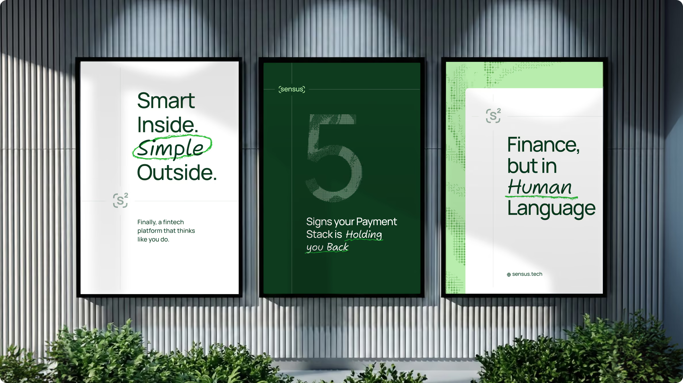
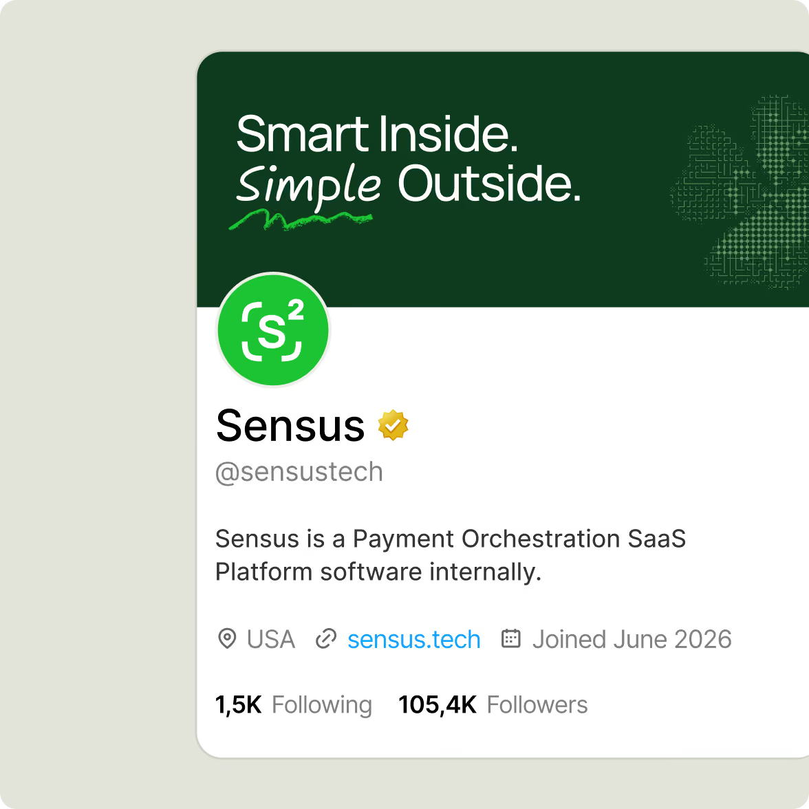
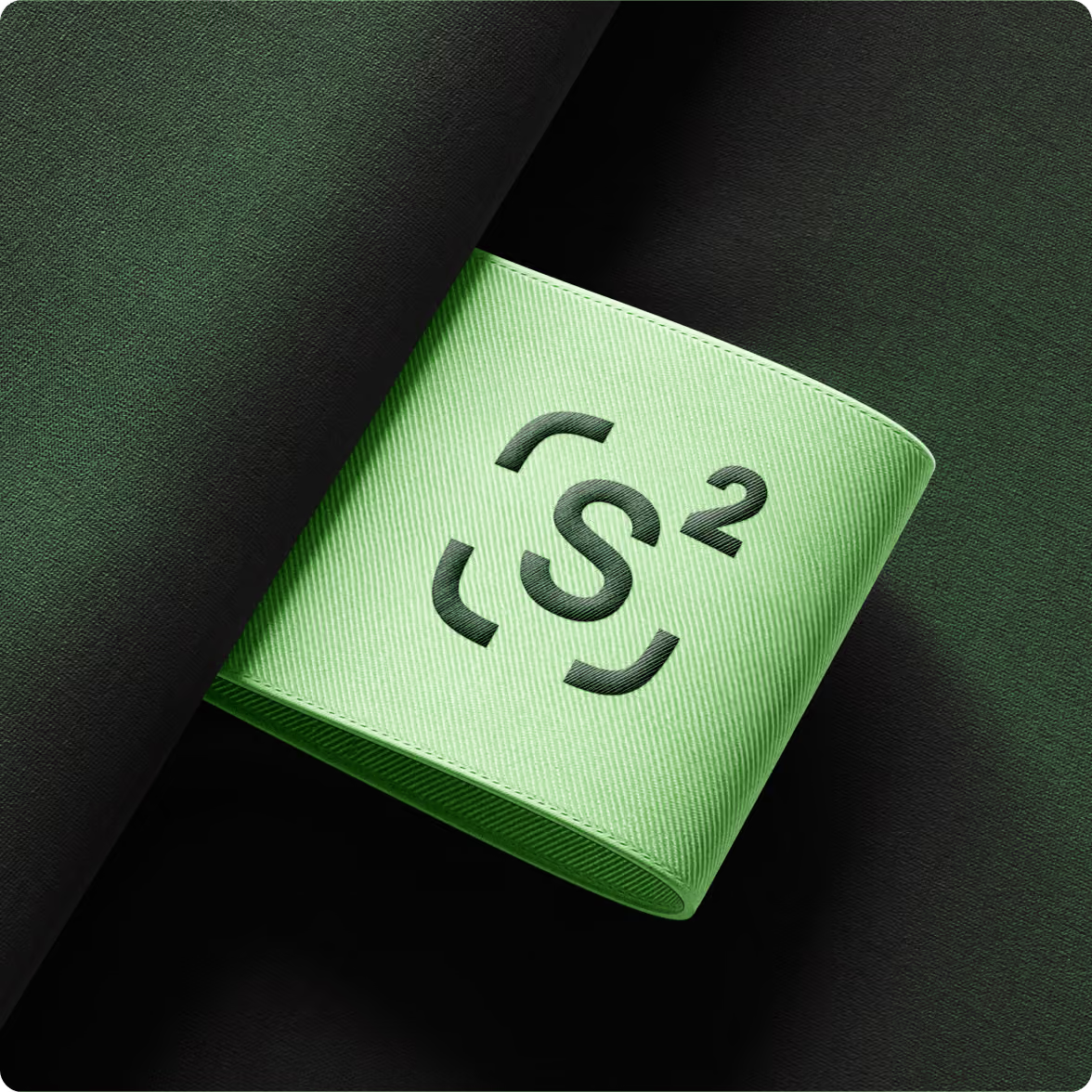
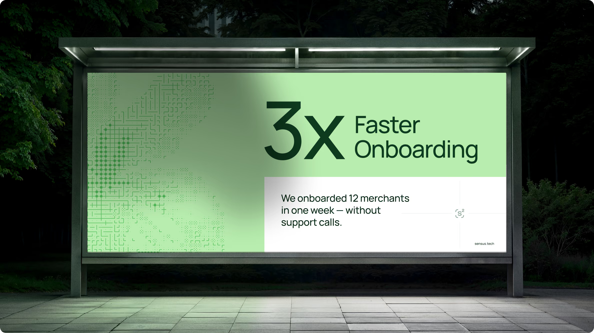
The visual identity uses natural colours, custom typography, subtle illustrations, and structured layouts to give the brand a more human character without moving it into lifestyle territory.
We implemented the same principles in the UX/UI and design system. The brand sets the tone; the website explains the product; the design system turns the decisions into rules the team applies.






Give a FinTech brand a more human footprint
The starting point was Smart & Simple — a way to reflect the depth of Sensus technology without making the brand feel distant or overly technical.
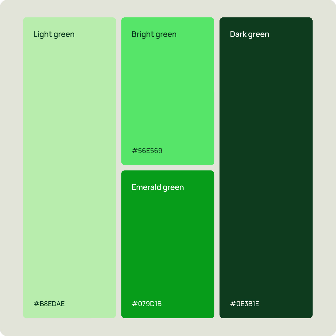
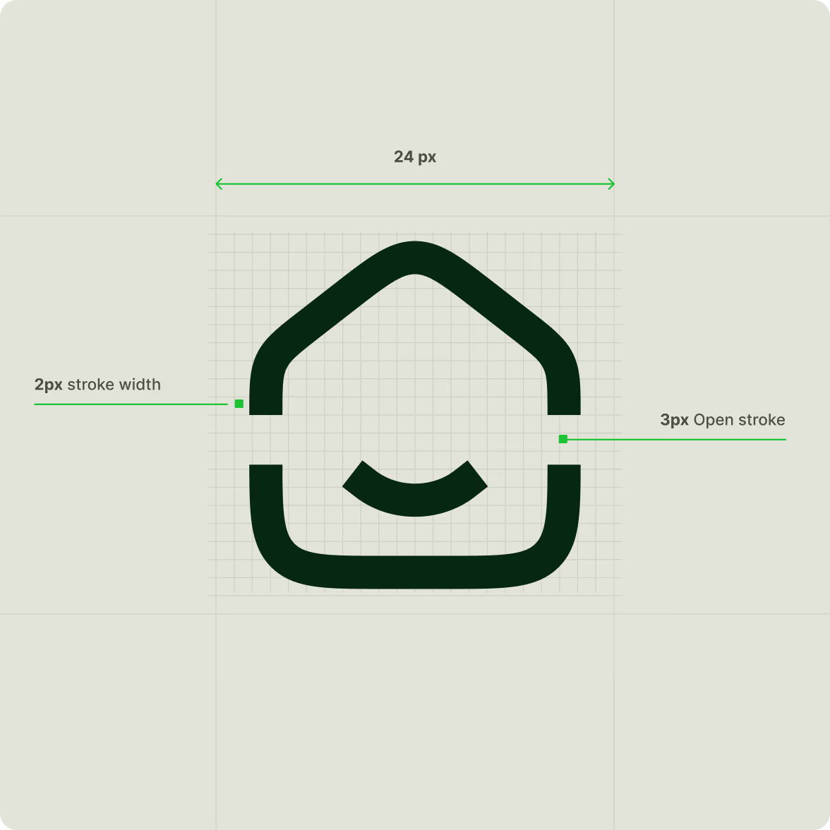
We developed the logo, typography, and colour palette around this idea. Natural colours and custom typography move away from the usual tech-first treatment, while still feeling appropriate for a B2B payment company.

Use natural illustration to make the brand less techie
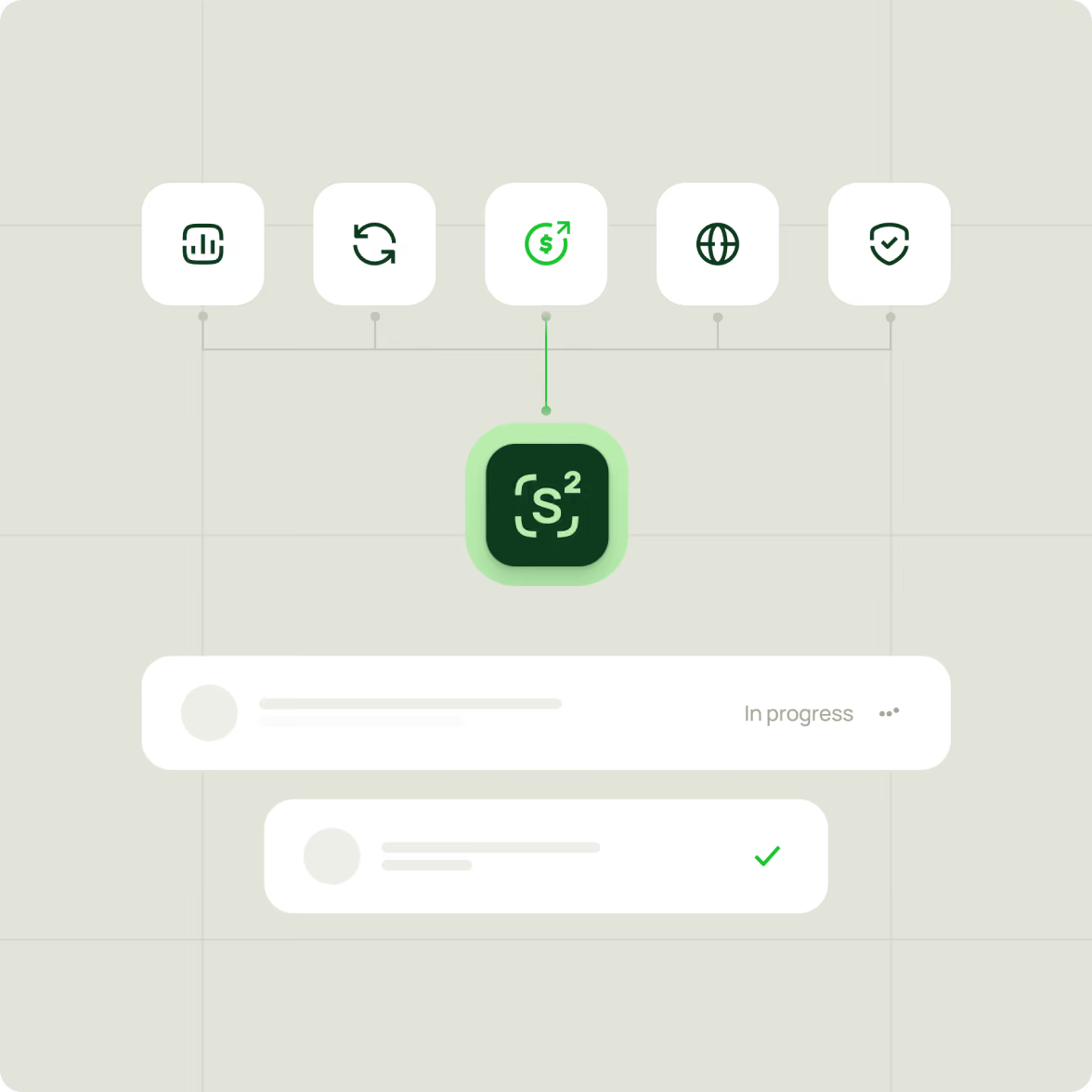
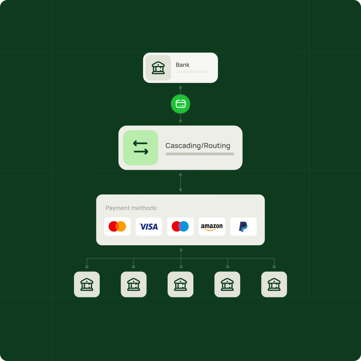
Custom illustrations became part of the visual language, adding a more human layer to the identity. We kept the approach subtle and structured to avoid something playful or lifestyle-led. The illustrations give Sensus another way to communicate ideas that would otherwise rely on interface screens or abstract technology graphics.

Turn the visual identity system into guidelines
Custom illustrations became part of the visual language, adding a more human layer to the identity. We kept the approach subtle and structured to avoid something playful or lifestyle-led. The illustrations give Sensus another way to communicate ideas that would otherwise rely on interface screens or abstract technology graphics.


Start with the product story
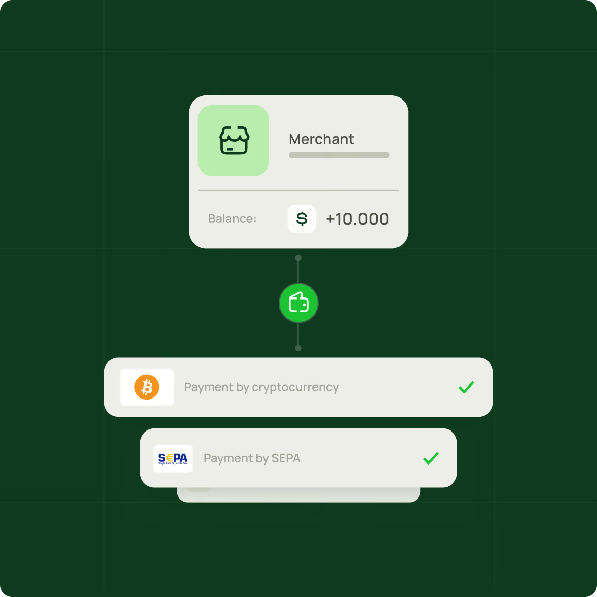
The website needed to explain a complex payment product without making visitors decode the technology first.
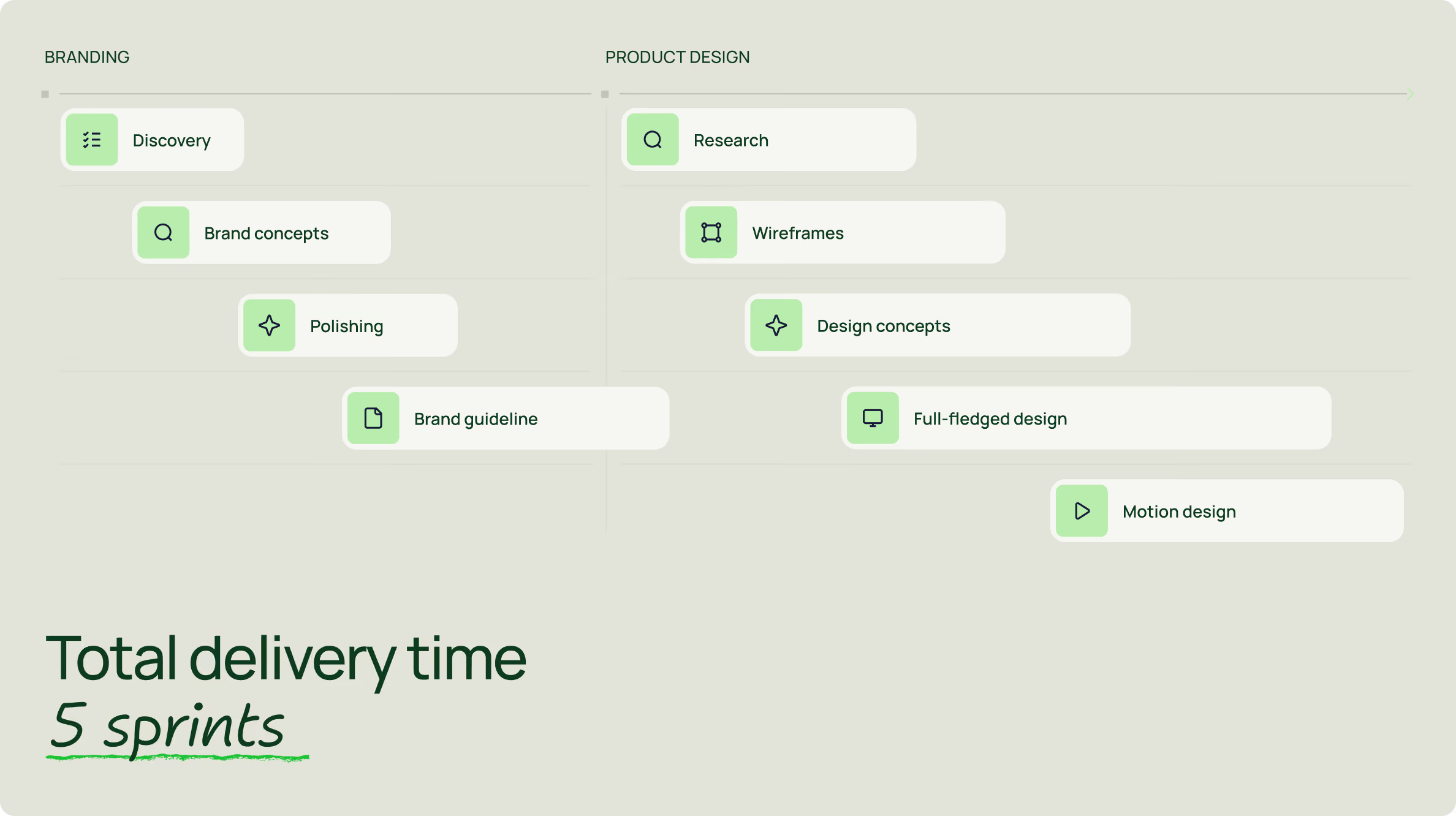
We started with discovery, research, and design strategy to define the structure around Sensus's new market goals.
The page hierarchy gives technical information enough space while keeping the overall experience easy to navigate. The website became the main place where the new brand and product story meet.
Give the interface a clear structure
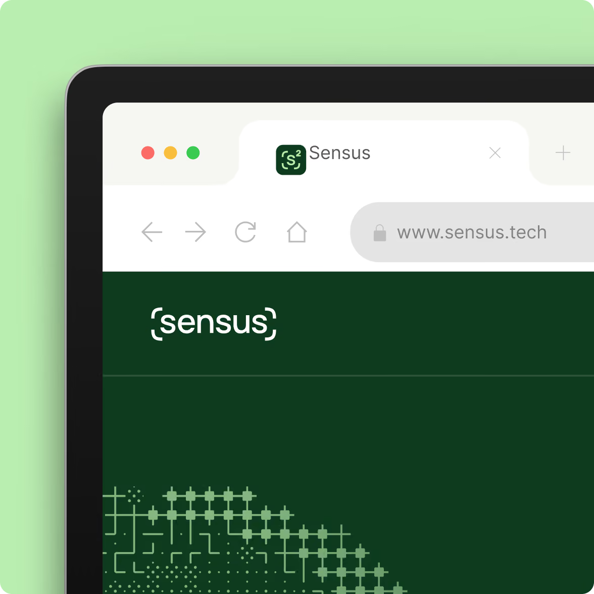
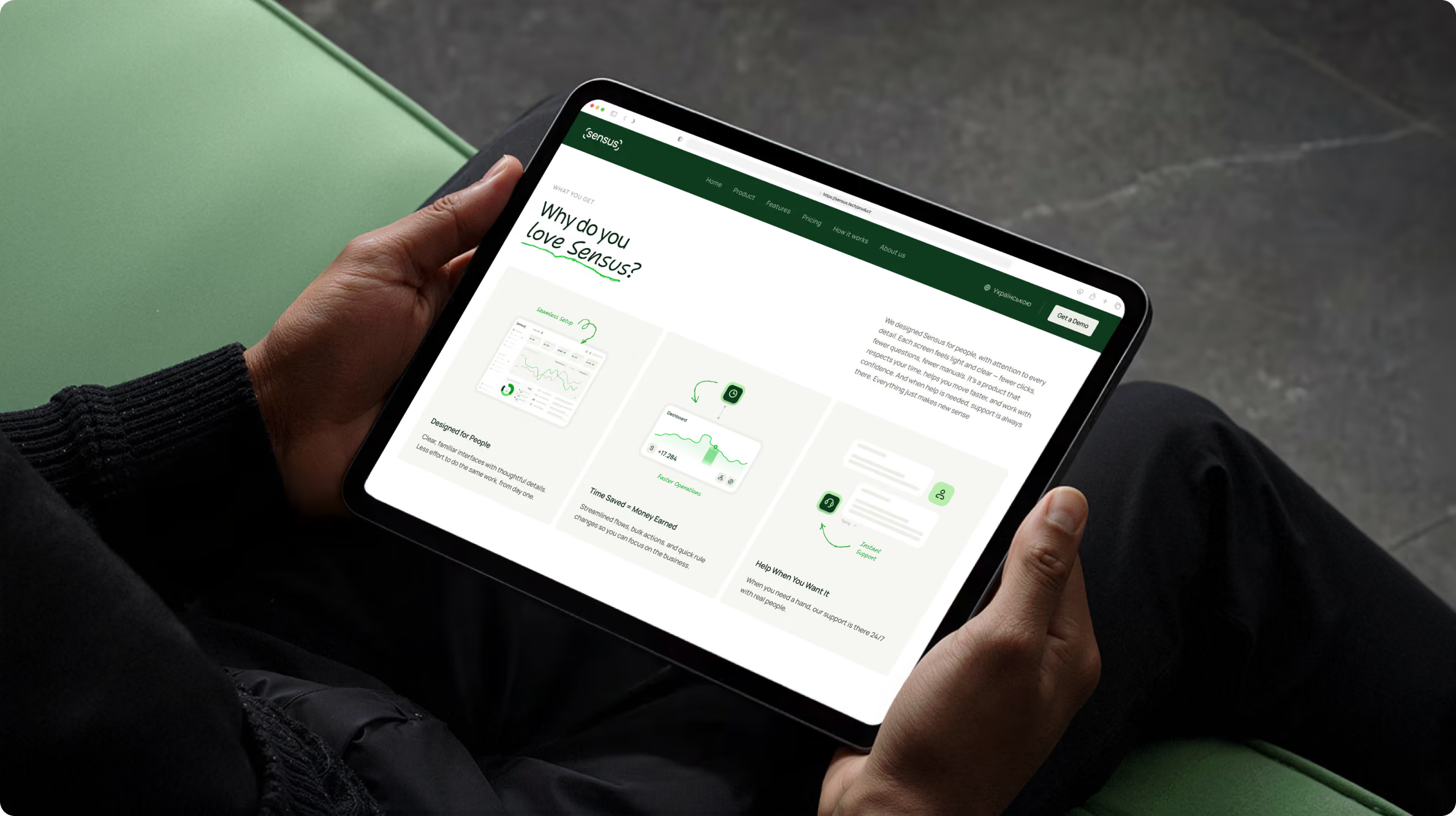
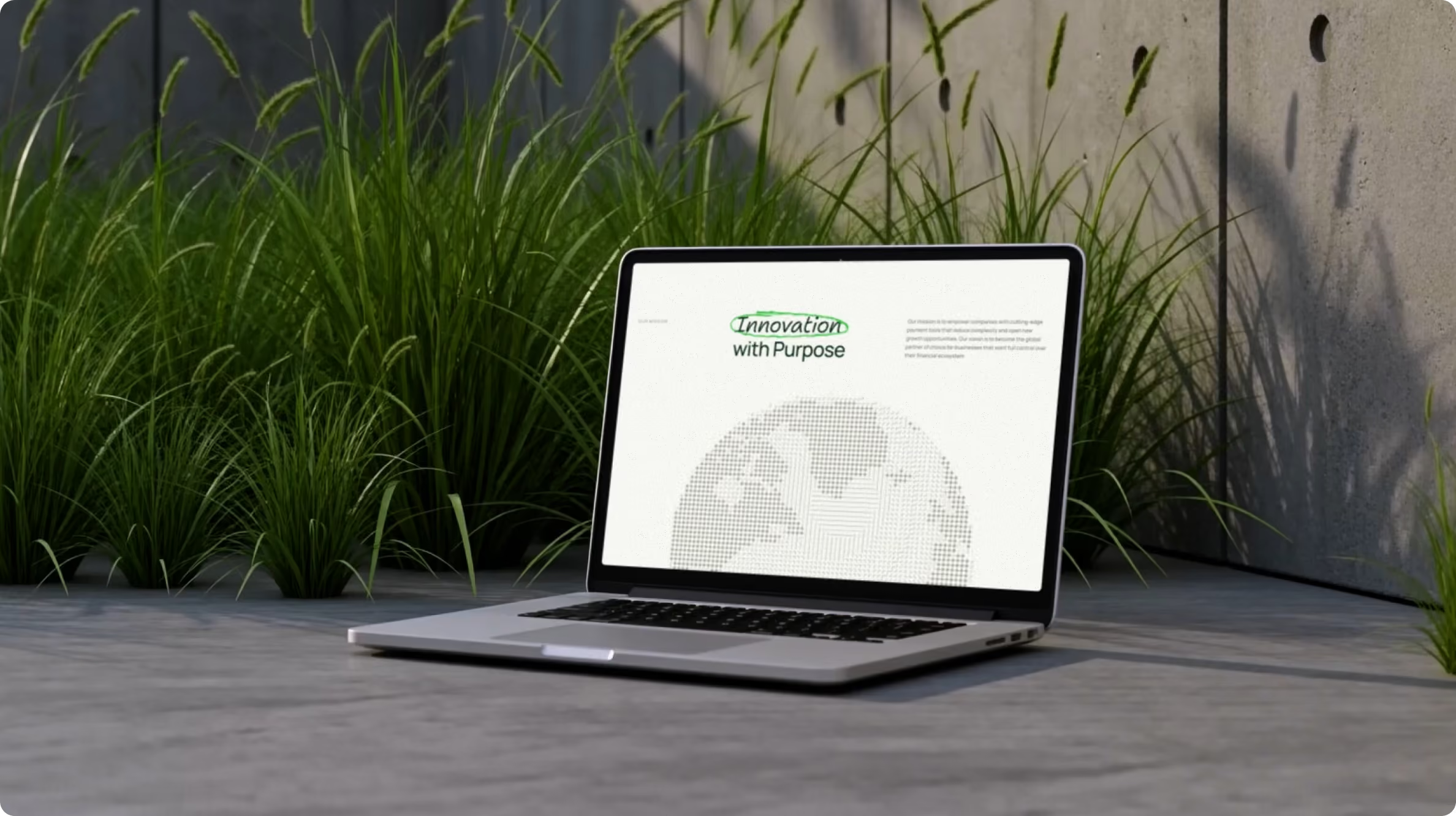
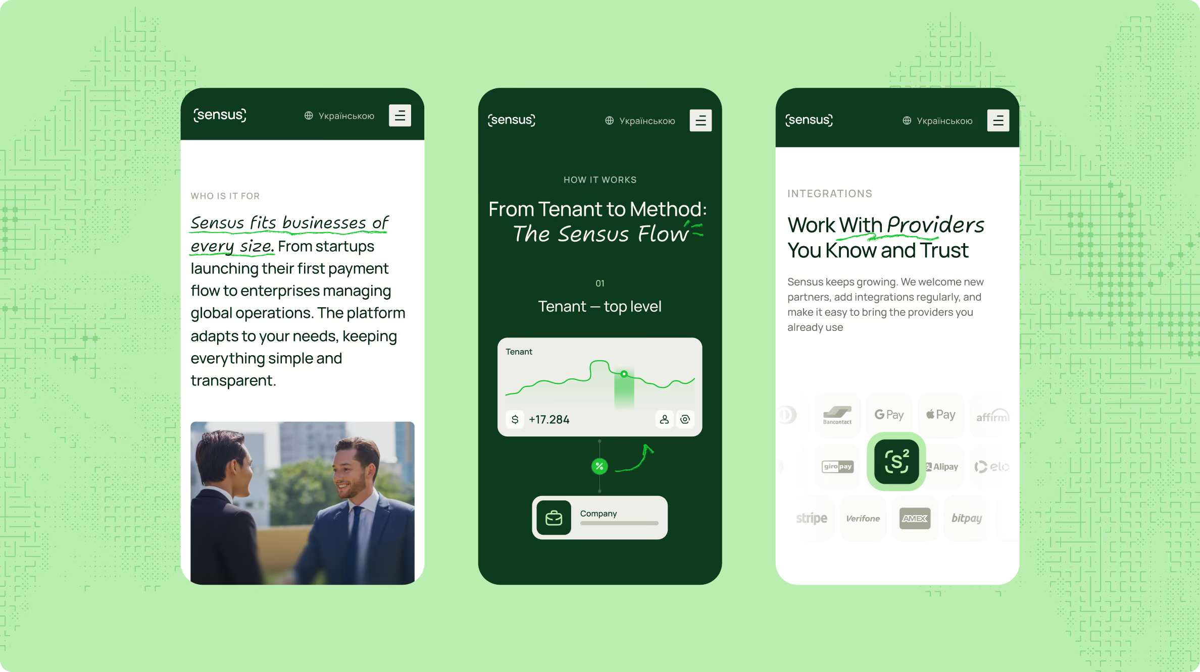
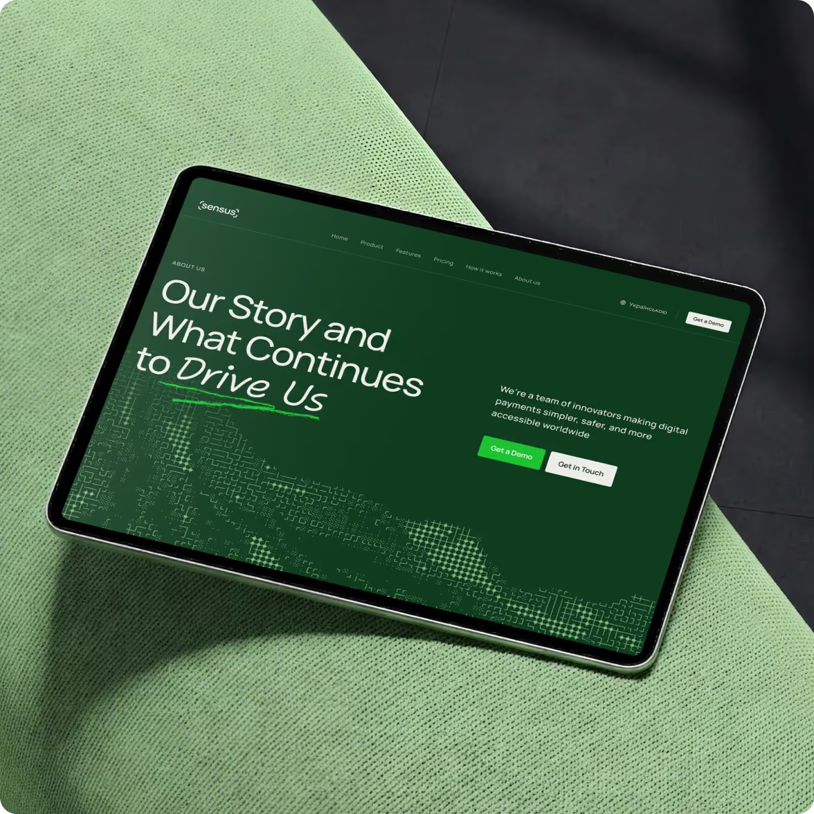
A Swiss-inspired grid creates the foundation for the website layouts. Custom visual patterns and original interface concepts then bring the Sensus identity into the digital experience.
Typography, spacing, graphic elements, and interface patterns work from the same set of decisions, so the visual language stays consistent from page to page.
Keep the experience working across devices
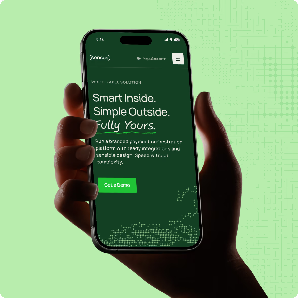
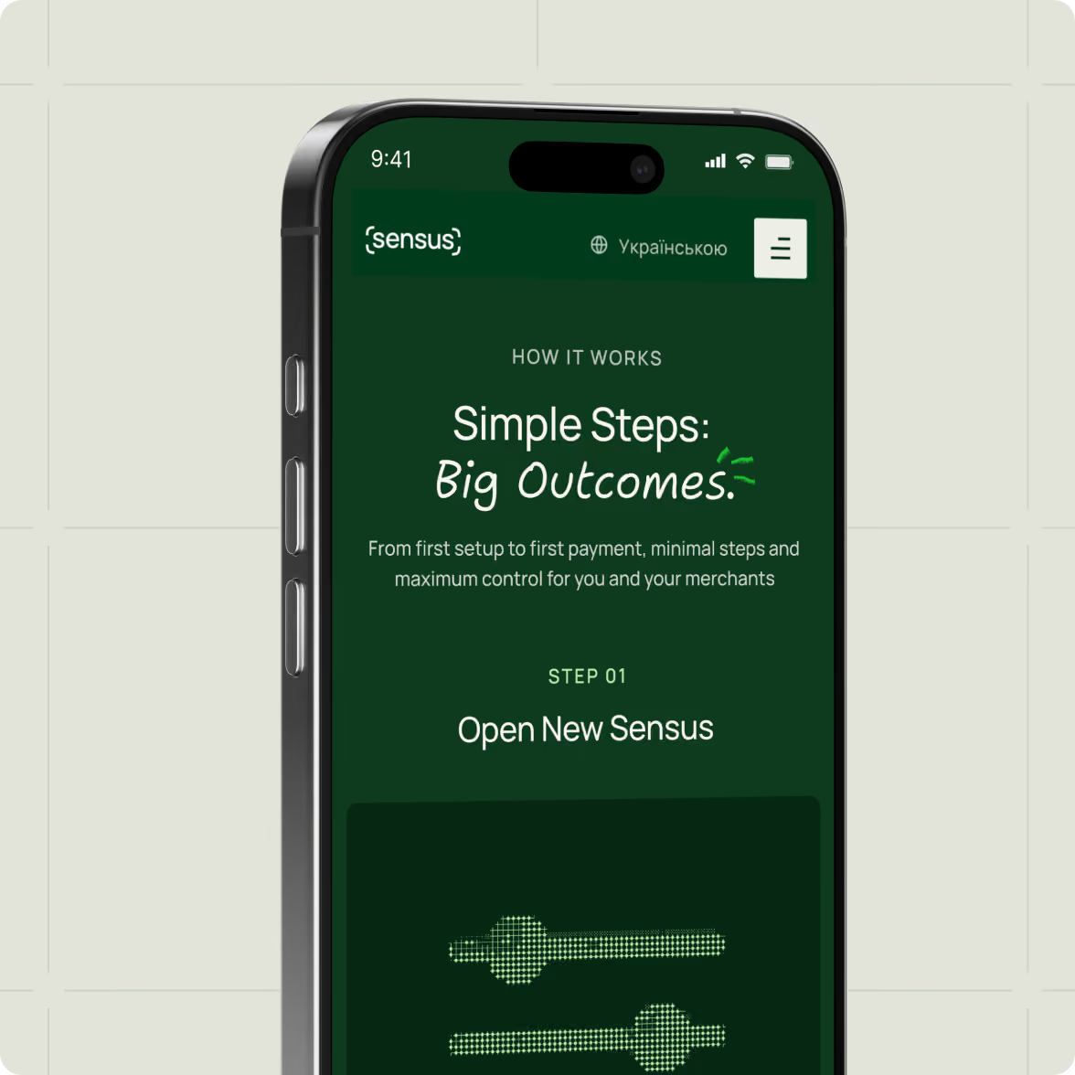
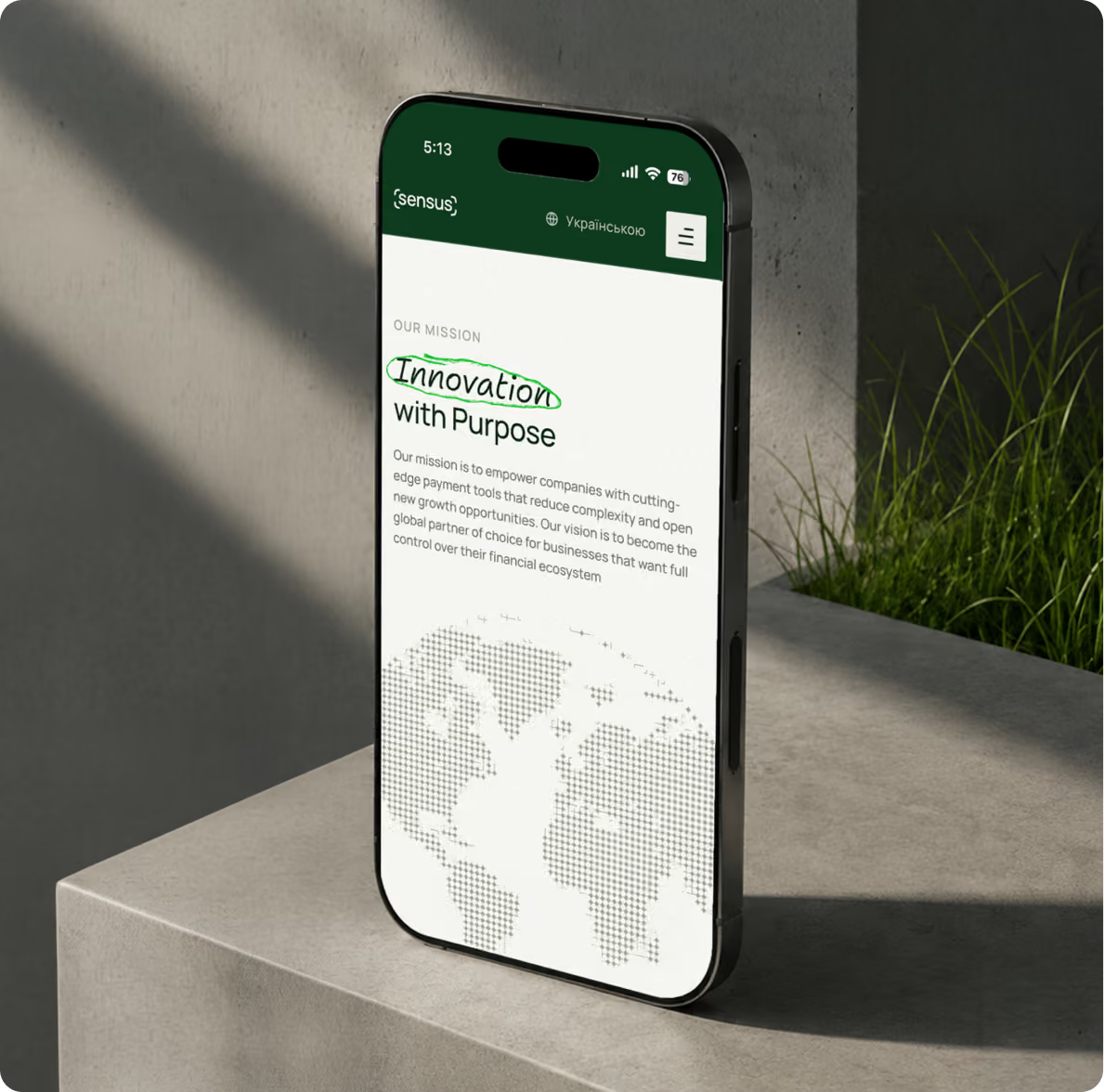
The responsive experience carries the same structure and visual language across different screen sizes. Rather than treating mobile as a reduced version of the desktop site, the layouts adapt to the available space while keeping the core hierarchy intact.
A new market presence for a payment orchestration platform
Sensus entered its new market with a new visual identity, corporate website, and design system built around Smart & Simple.
The identity gives a technical payment product a more approachable way to communicate. The website provides a structured space for explaining complex infrastructure, while the design system keeps visual and interface decisions aligned.
The foundation is now in place for Sensus to use the same brand language across its digital presence and broader market communications.
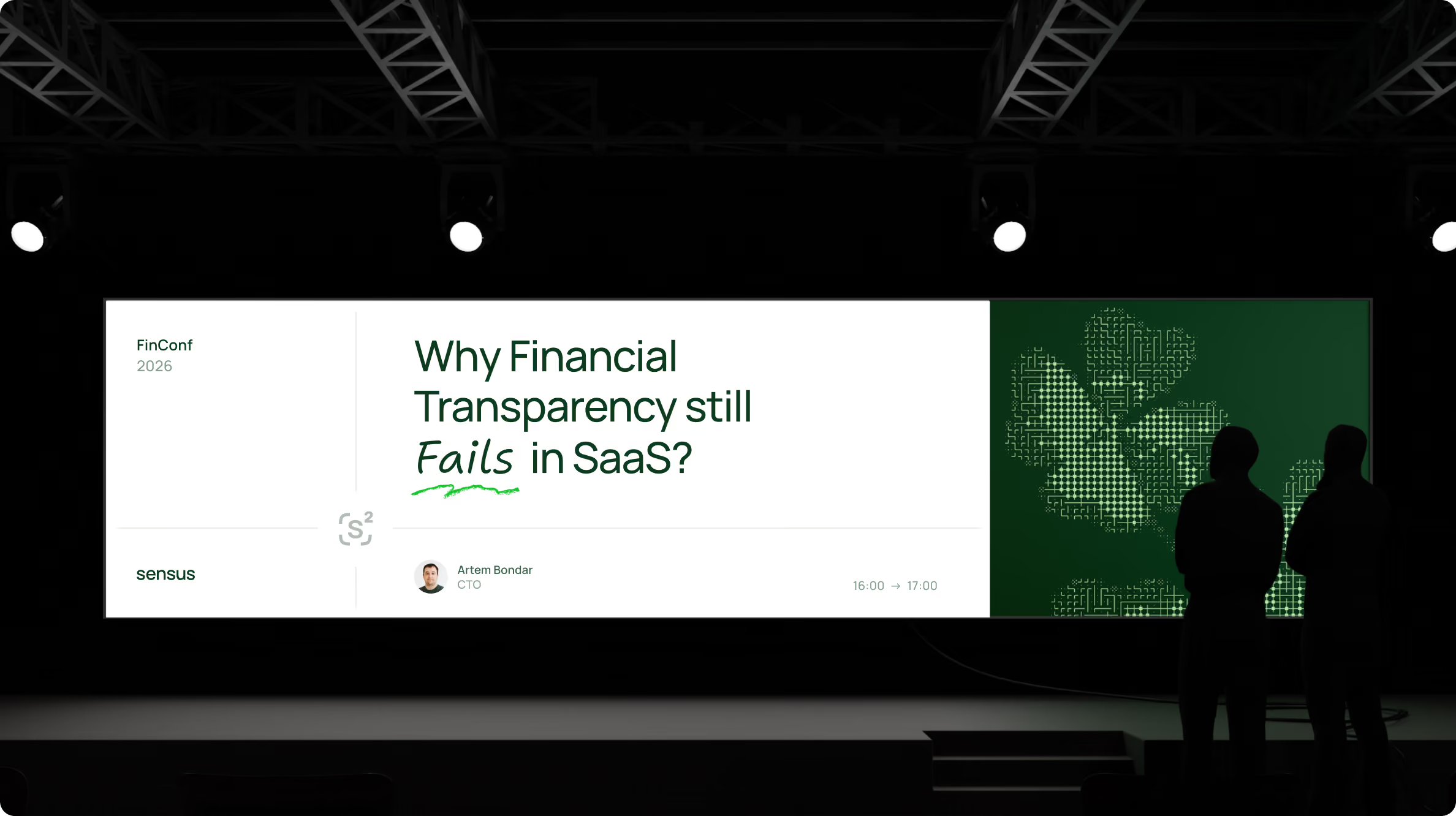
Complex products still need a simple entry point
Payment infrastructure can involve a lot of technical detail. Customers still need to understand the basic proposition quickly before they are ready to engage with the deeper parts of the product.
Sensus shows one way to handle that tension: let the brand create an accessible entry point, then let the website progressively introduce the sophistication behind the product.
The same principle applies when entering a new market. Before adding more information, make sure people can see where they are, what the product does, and why it matters for them atm.
Want to start a project with us?

Your request has been sent and will contact you soon by this email yourmail@mail.com

Let's discuss your upcoming project on a call

We usually reply within 1 hour during working hours: 9:00–20:00 (GMT+3)



.avif)