








.avif)
.avif)
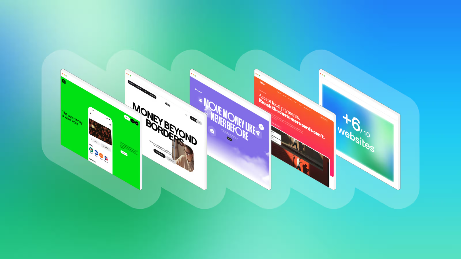
FinTech websites don’t have to follow the same visual formula to feel trustworthy. The strongest examples combine clear layout with a distinct visual language — through motion, typography, 3D, illustration, product UI, and a well-developed brand personality.
We looked at 10 FinTech websites that show different ways to stand out without making the experience harder to understand.
- Motion with a purpose — OpenDue and Mercuryo use movement to guide attention and make complex interfaces easier to follow.
- Let the product speak — Cash App puts UI and interaction ahead of long explanations.
- Build around one strong idea — Orbital turns its name into a recurring visual language, while MatrixPay builds its identity around 3D illustration.
- Borrow from outside FinTech — Klarna takes cues from retail and lifestyle, while Boku uses bold colour, mixed typography, and urban photo to create a warmer visual language.
- Make the familiar feel distinctive — Emerald24 shows how a clean, structured website can gain character through 3D, subtle motion, and a restrained interpretation of its name.
- Build a world of your own — Nyatwa combines bold typography, physical-looking UI, playful graphics, and local context to create a FinTech experience that feels closer to a lifestyle brand.
Intro
FinTech websites often confirm an unwritten rule: don't stray too far from the familiar.
Financial products deal with money, risk, and trust, so there is real pressure to build websites that look clear, serious, and convincing. The problem is that following the mainstream visual conventions makes absolutely diverse products look the same.
These eleven websites take a distinct route. Bold colours, unusual typography, motion, 3D, playful graphics, custom illustrations, and unexpected layouts—yet they keep that unique digital ambience.
This selection is a friendly reminder that being one of a kind is exactly what makes a site memorable.
At Goodface FinTech, we enjoy finding new ways to design financial products with strong personality, giving brands room to play without losing sight of the initial website's business role.
This is not an ordinary list of “the most creative” FinTech websites. It’s eleven ways to make a financial product feel different via design & branding that caught our designers' attention.
Let’s explore them! (Note: this is a list, not a ranking.)
1. OpenDue
When motion graphics are a part of the tone of voice
OpenDue builds its character through movement. Transitions, layouts, animation, and graphic design work as one visual system, so the page feels decorated composed. Elements enter, shift, and interplay, giving the UI a sense of rhythm as you move through it.
The graphic layer is as vital as the content:
- layouts create tension,
- motion controls the pace,
- animation gives otherwise static sections a little more life.
The entire website feels too far from a conventional FinTech homepage.
2. BOKU
FinTech with a non-standard typo
Boku steps away from the usual FinTech visual language without piling up the interface. Instead of the familiar cool and restrained palette, it uses warm orange as a strong brand cue, paired with an unexpected typographic contrast between serif and bold sans-serif.
The rest of the design stays deliberately simple:
- Clear hierarchy and structured layouts
- Simple illustrations that add character without clutter
- Urban lifestyle photography that feels candid and lived-in rather than polished and staged
- Micro-animations that add movement without taking over the page
Together, these elements give Boku a more human, contemporary feel while keeping the website clean and easy to scan. The visual language stands out precisely because it does not need to shout.
3. Klarna
More retail floor than banking vibe
Klarna treats finance through the lens of everyday life. Sticky animations, visual references to human routines, and a polished retail-like aesthetic make the website feel closer to a fashion brand, store, or cultural venue than a conventional financial product.
The movement keeps the page active, while the imagery and composition bring financial services into familiar physical contexts. Nothing about the experience asks the viewer to think “traditional FinTech” first. Klarna builds its own visual territory around shopping, people, movement, and everyday moments — and the website follows that same logic.
4. Emerald24
A light touch of emerald
Emerald24 keeps the visual language clean and composed, but gives it character through a few carefully chosen details. The custom 3D illustrations make complex financial concepts easier to grasp, while the structured layouts keep the experience easy to navigate.
The first screen catches the eye with an animation that expands across the frame, setting the tone without overwhelming the page.
Even the name gets a subtle visual treatment:
- soft gradients, glass-like elements, and small reflections echo the depth and shine of an emerald without turning the entire website into a literal gemstone theme.
The result feels polished and premium, but still restrained.
5. Mercuryo
Motion with a purpose
Mercuryo Spend uses motion to make the product easier to follow. As you scroll, animation brings individual screens into focus and moves between them like a story rather than a sequence of website sections. The transitions show how different parts of the product connect, making the interface itself a part of the explanation.
And this approach isn’t limited to the homepage:
- Internal pages apply the same willingness to play with movement and structure — on the About Us page, for example, horizontal scrolling shifts into a vertical flow, while unusual layouts and visual compositions keep the experience moving.
The visual language stays clean and minimal throughout. The animation does the talking, while the layout gives it room to breathe without any visual noise. Perfectly done.
6. Orbital
Design that stays in Orbit
Orbital makes its name part of the visual identity. Concentric circles move across the site like orbital paths, turning a simple idea into a recurring graphic element that gives the whole experience a consistent visual thread. The same shapes appear in different contexts, so the design feels connected from one section to the next rather than assembled page by page.
Even the gradients follow the concept without overplaying it:
- The footer uses atmospheric, planet-like colours to add depth and reinforce the orbital theme. It is a simple visual idea, but repeating it with enough discipline gives the site a special character.

7. Cash App
Let the product tell its story
Cash App keeps the copy remarkably light and lets the product carry the story. Instead of explaining every feature with blocks of text, the site puts the UI front and centre, using product screens, animation, and movement to show what the experience actually looks like. The layouts stay uncluttered, giving each interaction room to breathe. The navigation follows the same visual logic, so the website extends the product experience in a single marketing layer.
The consistency goes further. Product visuals follow the same brand and UI language users already associate with Cash App, while the social framing gives the financial product a place in everyday culture. Even safety and legal information is worked into the experience without turning the page into a wall of disclaimers. Nothing feels bolted on.
That level of restraint works because Cash App has something many FinTech brands are still trying to build: recognition and trust. The product doesn't need to introduce itself from scratch. It can simply show you how it works.
8. Immediate
A FinTech website with a different accent
Immediate takes a less familiar route to FinTech aesthetics. Its homepage refuses to present everything as a collection of standard product sections. Instead, it smoothly unfolds as a story, using structure, transitions, and animation to move the visitor from one idea to the next
Even the typography plays against expectations:
- The serif typeface gives the brand a tone more commonly associated with editorial, luxury, or cultural brands than financial technology;
- Motion adds pace;
- The page structure creates a narrative;
- Typography shifts the whole visual language away from the usual FinTech formula.
9. Nyatwa
A lifestyle poster on its mind
Nyatwa gives finance a distinctly physical and playful form. Huge uppercase headlines, changing background colours, poster-like sections, and playful word choices turn each part of the page into its own visual statement.
The UI refuses to stay inside the screen:
- UI elements appear as physical objects, while product visuals follow a simple rhythm of one product, one image, one sentence.
The local context matters too. References to Malawi, mobile money, the Malawian kwacha, and virtual USD cards root the experience in a specific place and everyday reality. It ends up looking less like a financial service explaining its features and more like a lifestyle brand building its own world.
10. Mollie
Making payments feel less financial
Mollie gives a broad payments platform a visual language that feels closer to modern commerce than traditional financial infrastructure. The homepage uses large type, generous whitespace, product visuals, and playful motion to move between payments, business accounts, capital, and other parts of the platform without making the experience feel heavy.
Summary
FinTech websites often look familiar for obvious reasons. Financial products involve money, risk, and trust, so clear structures and established visual conventions are essential.
A website doesn’t need to look unusual to serve well. But familiarity doesn’t have to mean sameness.
The websites on this list take very different approaches to building character. Some use motion to guide the eye and explain the product. Others make UI the primary visual language, turn 3D illustration into a recognizable signature, or build an entire experience around a simple brand idea.
Some borrow cues from retail, lifestyle, or editorial design. Others prove that restraint and consistency are enough when the underlying idea is strong.
A FinTech website needs to look like itself. This is the best way to show the values, product advantages, and true brand character.
.avif)

.avif)