












PayAtlas.
Payment directory product design and brand identity development


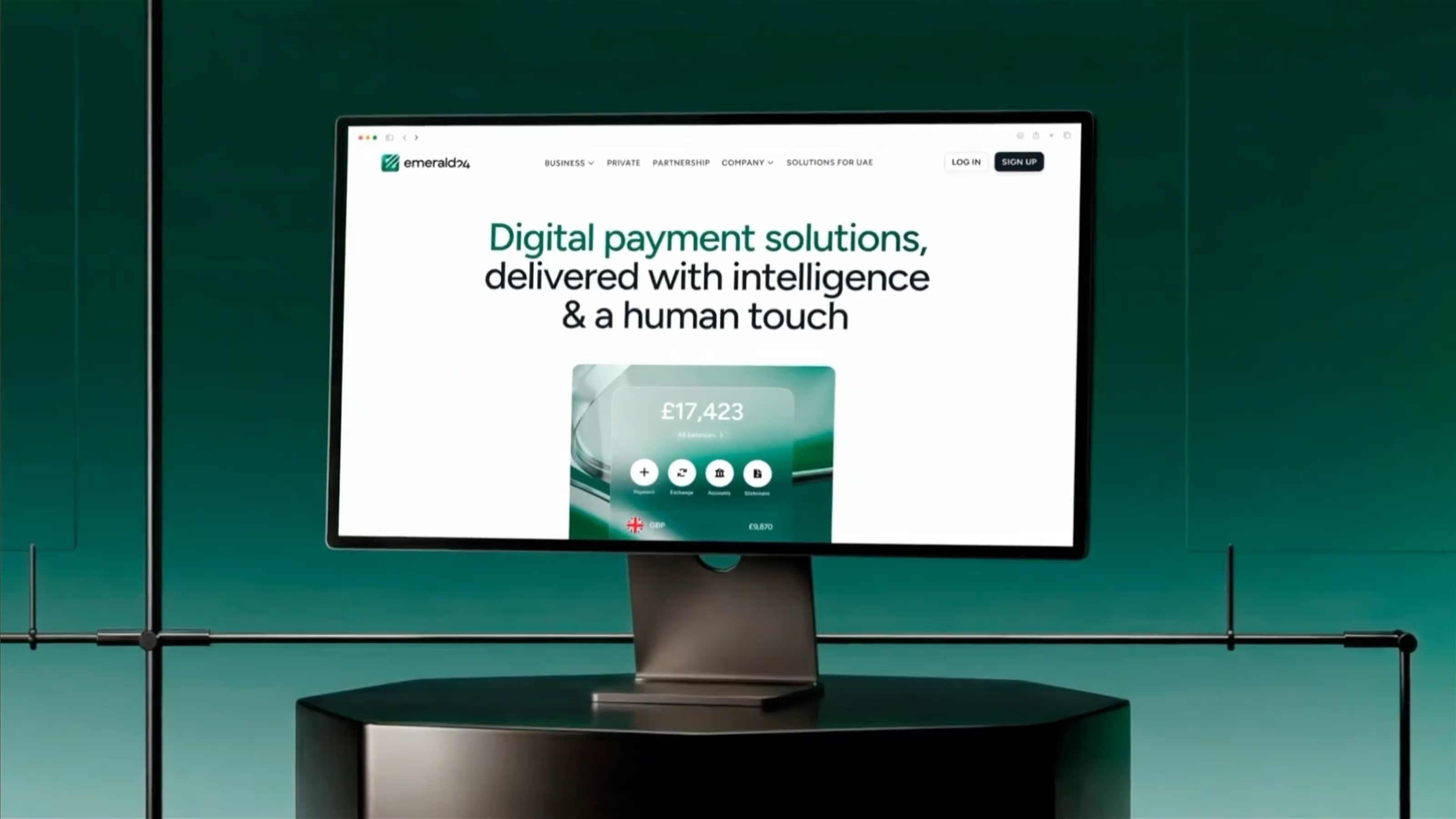
PayAtlas is a global platform that connects businesses with payment providers. It offers a searchable marketplace where companies compare options and select partners that fit their needs.
Goodface FinTech worked across the brand, website, and product experience — giving a new FinTech company the visual identity and marketing foundation it needed to launch.
A new product had to earn attention before it could help businesses choose
PayAtlas was entering the market with a new brand, website, and catalogue for finding payment providers without the established brand to lean on and no familiar product category to explain away the complexity.
The product had to do several jobs at once: stand apart from the usual FinTech visual language, turn website visits into applications, and help businesses choose a payment provider with confidence. Each part had to support the next.
And the product would keep growing. The design needed to accommodate more providers, content, and features without forcing the team to restart every time something shifts.
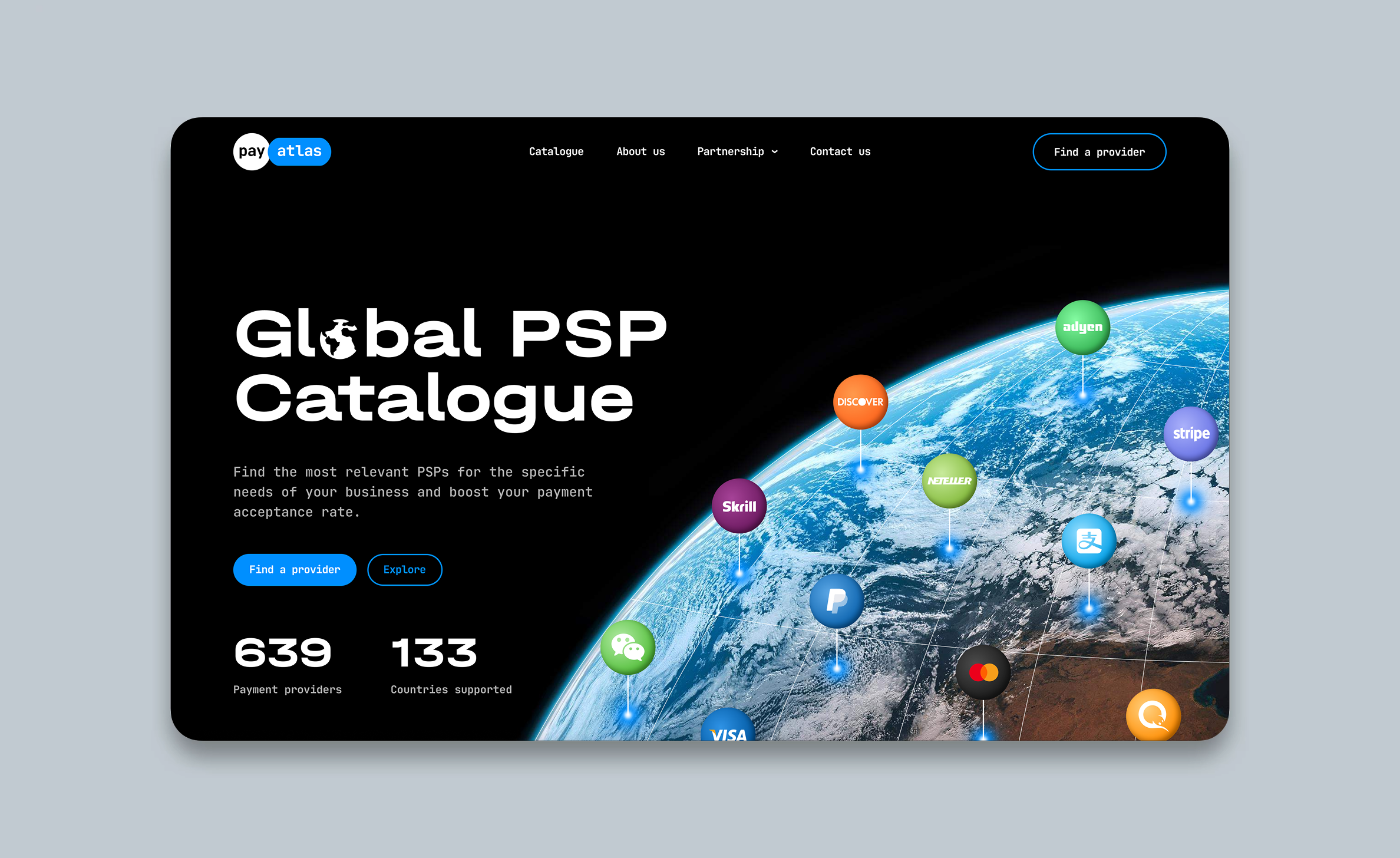
Build the FinTech brand and product around the same idea
PayAtlas needed a clear point of view from the start. We used navigation as the thread connecting the brand, website, and catalogue — a natural fit for a platform built to help businesses find their way through payment providers.
We explored three brand directions before choosing a simple, unconventional logo, applying the same logic to the digital experience. Custom illustrations and motion gave the brand movement, while the design system gave the website and directory a shared set of rules.






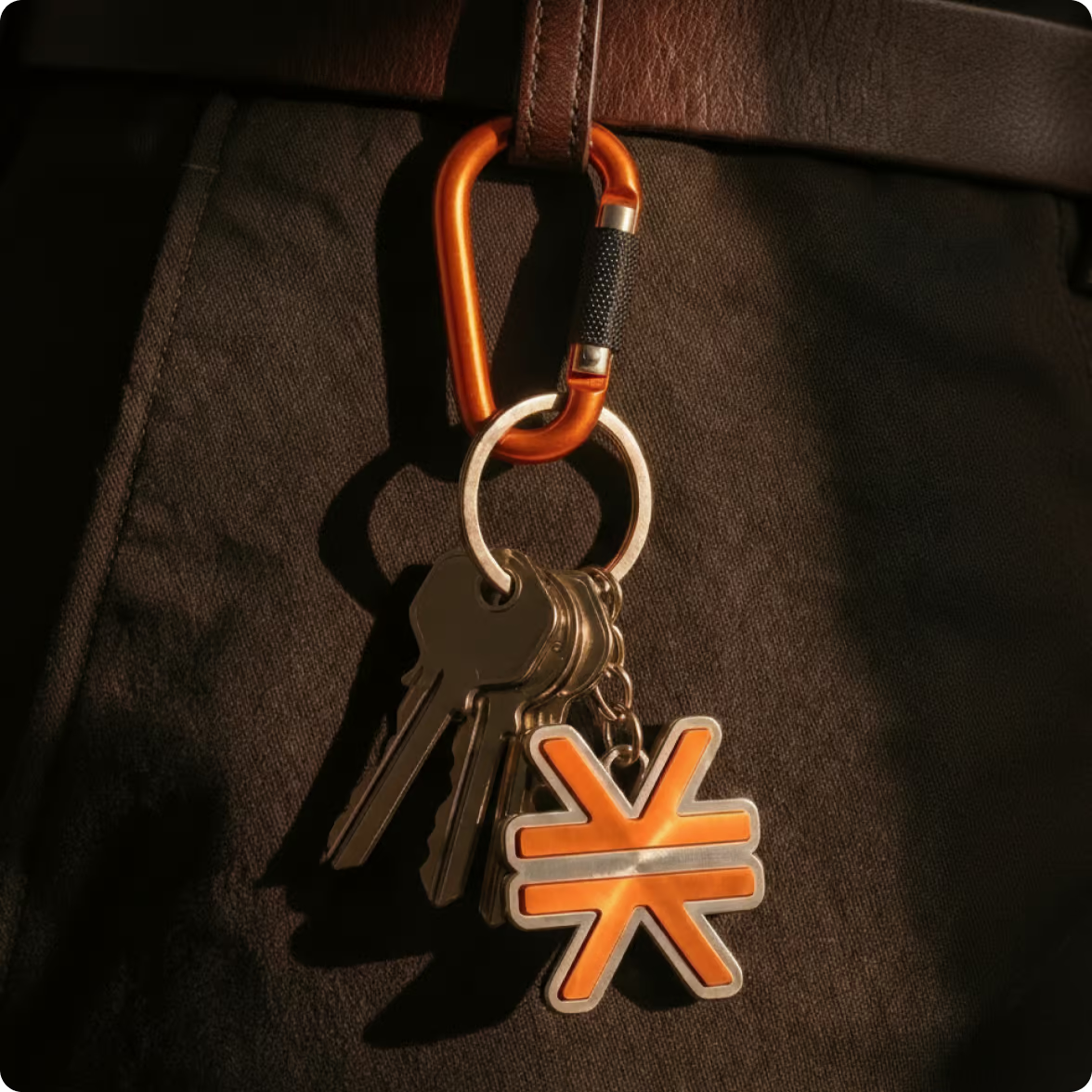
Keep the Stacks logo. Change surroundings.
We explored several directions for the Stacks Co logotype, including ideas inspired by Asian nature and tree symbolism. They connected with the ideas of asset growth and a growing ecosystem.
In the end, the original Stacks logo did the job better. Keeping it preserved recognition across the ecosystem and gave us a clear anchor for the rest of the identity.
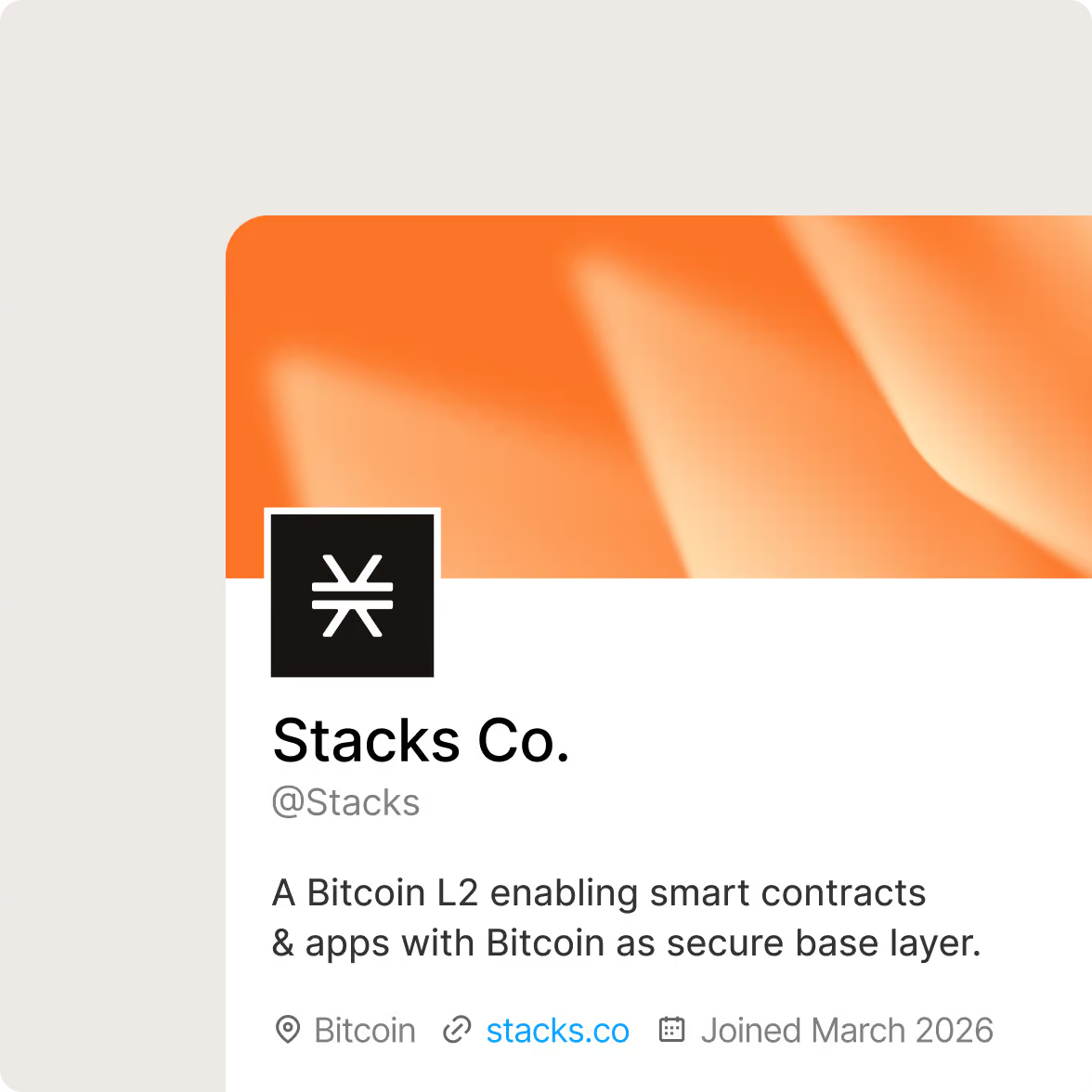
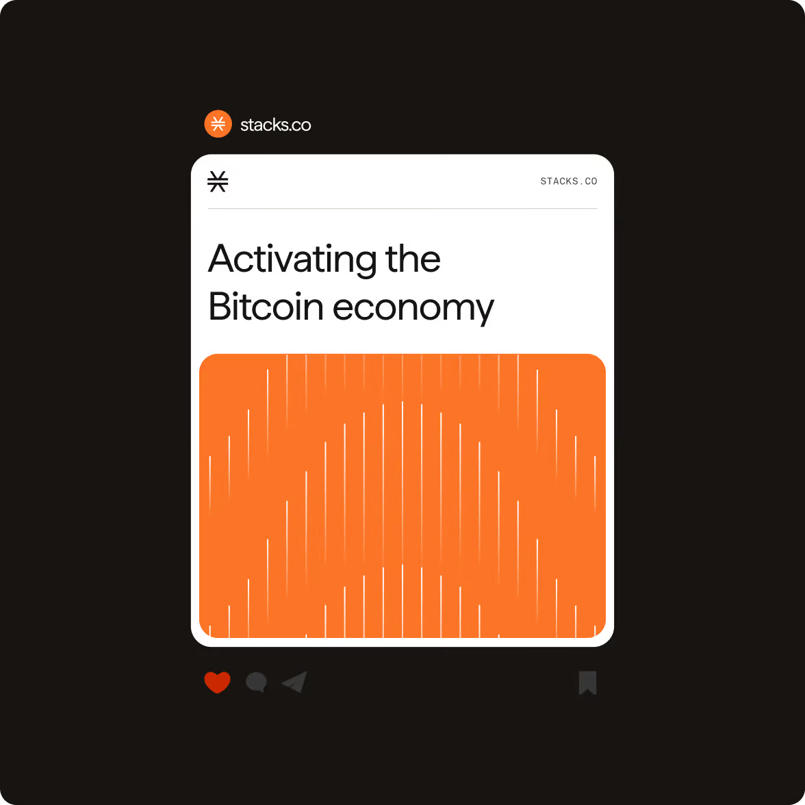
Give the visual system more rhythm
The old pattern language limited how much variation the brand could carry across different materials. We redesigned it around more movement and combinations.
The new patterns add rhythm without turning every application into a different visual style. They give the team more ways to build compositions while keeping the brand recognisable.
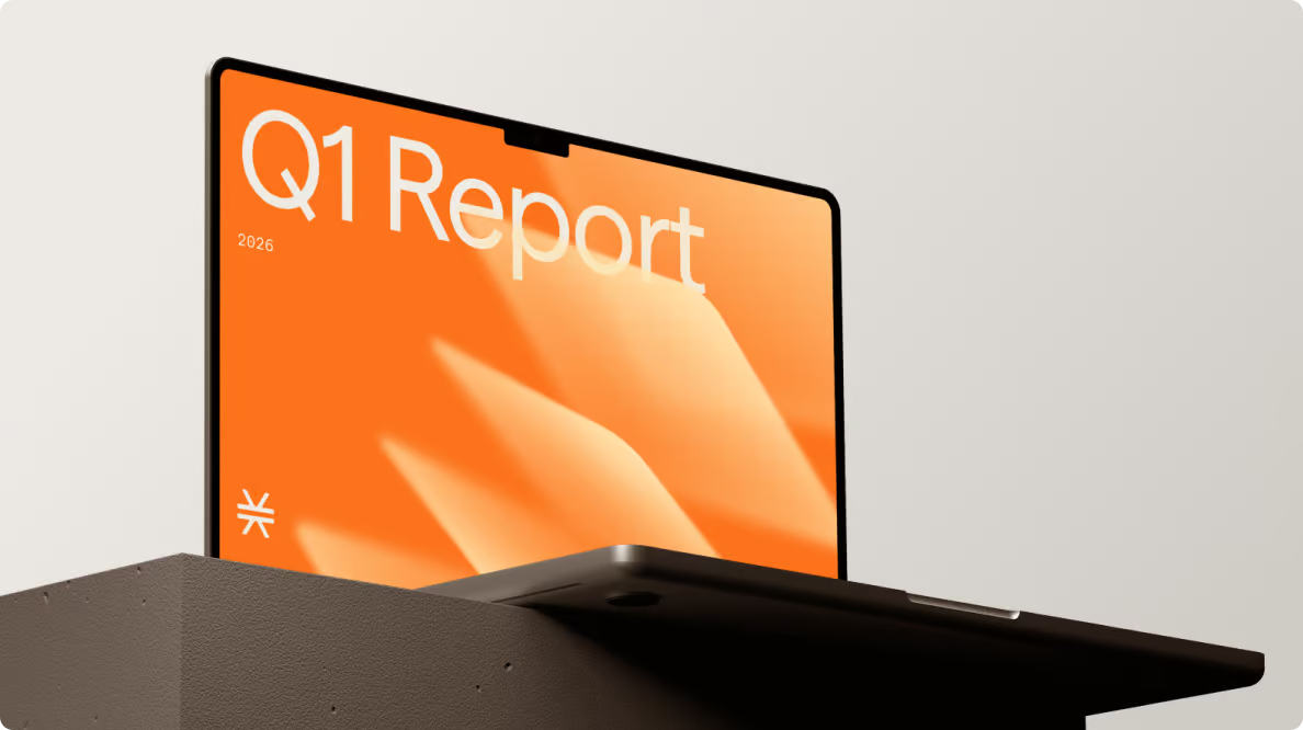
Make typography part of the identity
Typography does more than organise information. For Stacks Co, it became the main tool for shaping the brand's character.
We refined the font choices and usage rules to create clearer hierarchy and more consistent communication across formats. The result gives the identity a stronger typographic voice without adding unnecessary visual elements.
Let illustration show the brand’s Web3 spirit
Web3 products often rely on interfaces, abstract shapes, and technical diagrams to explain themselves. We took a different route with the illustration style.
The new illustrations added movement and personality while staying connected to the product’s tech nature. They give Stacks Co another visual language for marketing communication.
Put every visual decision in one guideline
The brand guidelines bring the updated identity together into a practical reference for the team.
We brought the decisions together in comprehensive brand guidelines covering typography, colour, patterns, illustrations, and iconography. The guide gives the Stacks Co team clear rules for creating and scaling sales & marketing assets across digital channels.
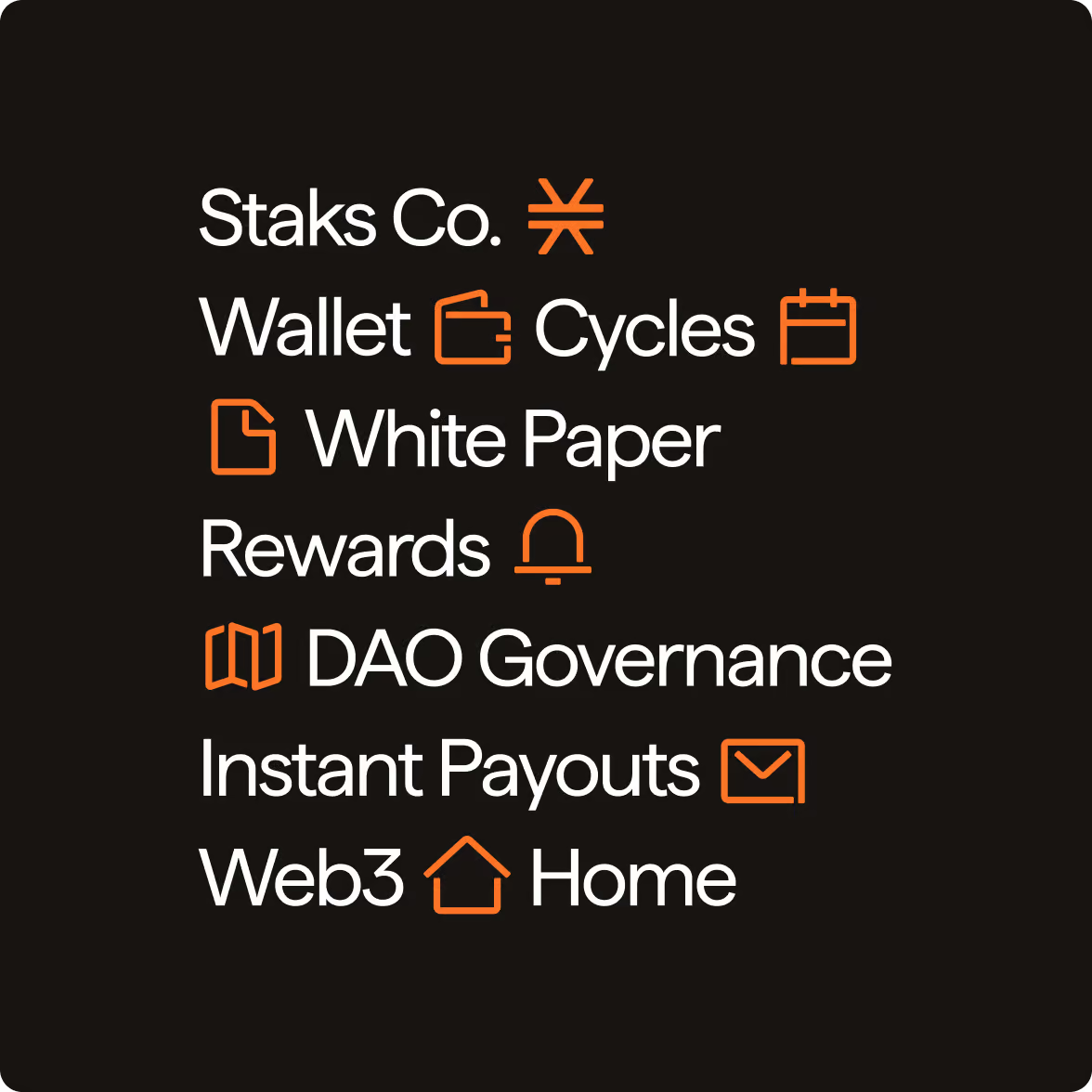
Build an icon language that belongs to the same system
We reworked the icons to match the new patterns, typography, and illustrations. That consistency matters when a brand uses graphics across many touchpoints. Each element can stand on its own, but the visual logic stays recognisable when they appear together.
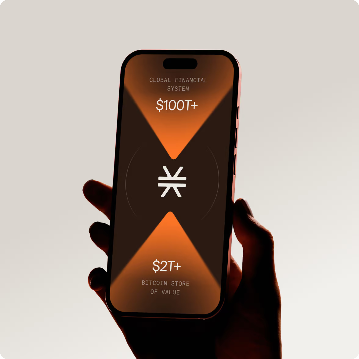

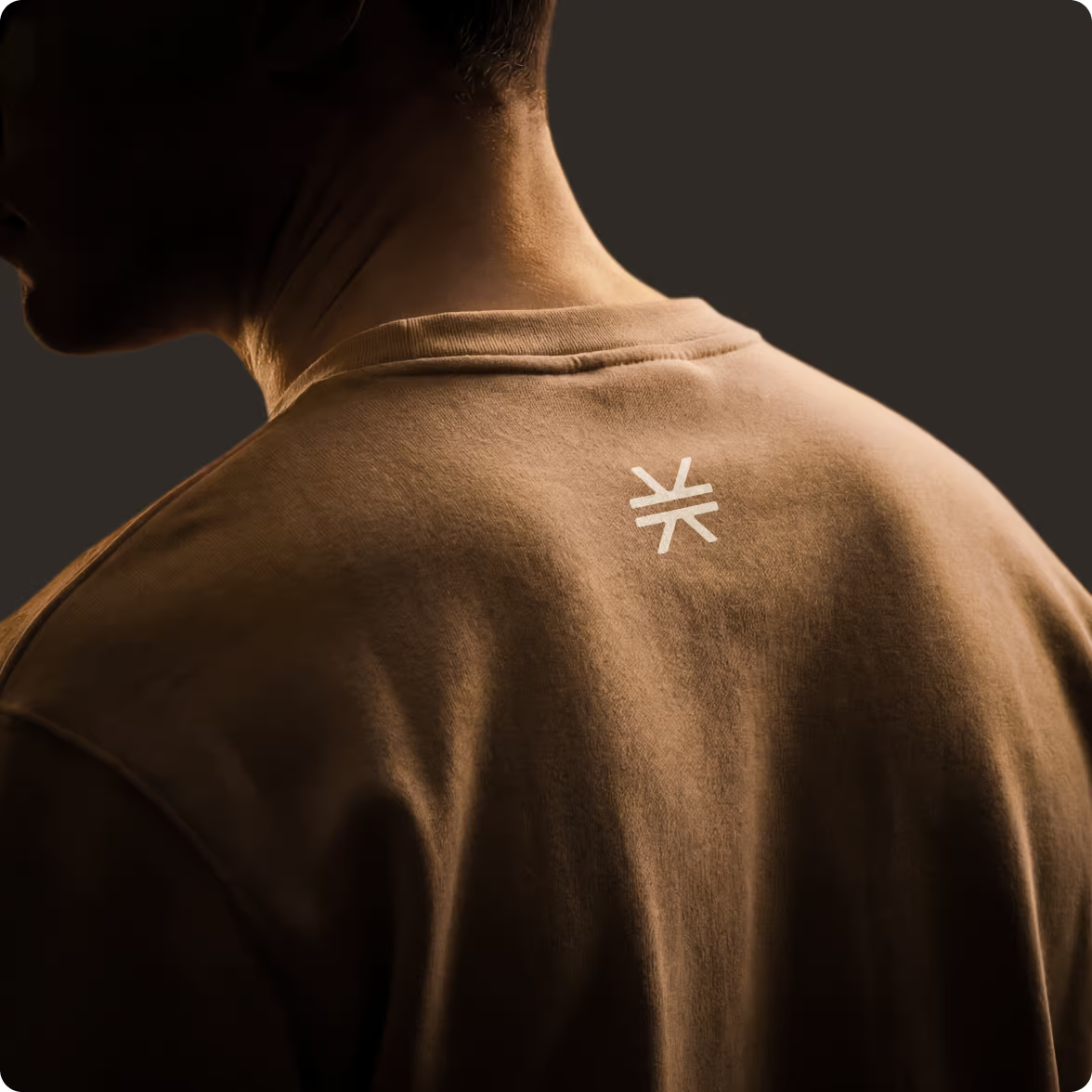
A refreshed brand system for Stacks Co
Stacks Co now has an updated identity and a clear set of guidelines for its external marketing communication.
We kept the original Stacks logo to build recognition across the wider HIRO ecosystem, then rebuilt the supporting visual system around it — from patterns and typography to illustrations and icons.
The new system gives Stacks Co a more expressive Web3 presence and a practical framework for creating consistent communication across digital channels.
Want to start a project with us?
Your request has been sent and will contact you soon by this email yourmail@mail.com
Let's discuss your upcoming project on a call
We usually reply within 1 hour during working hours: 9:00–20:00 (GMT+3)


.avif)