













PayOp.
Corporate website redesign for a global payment platform
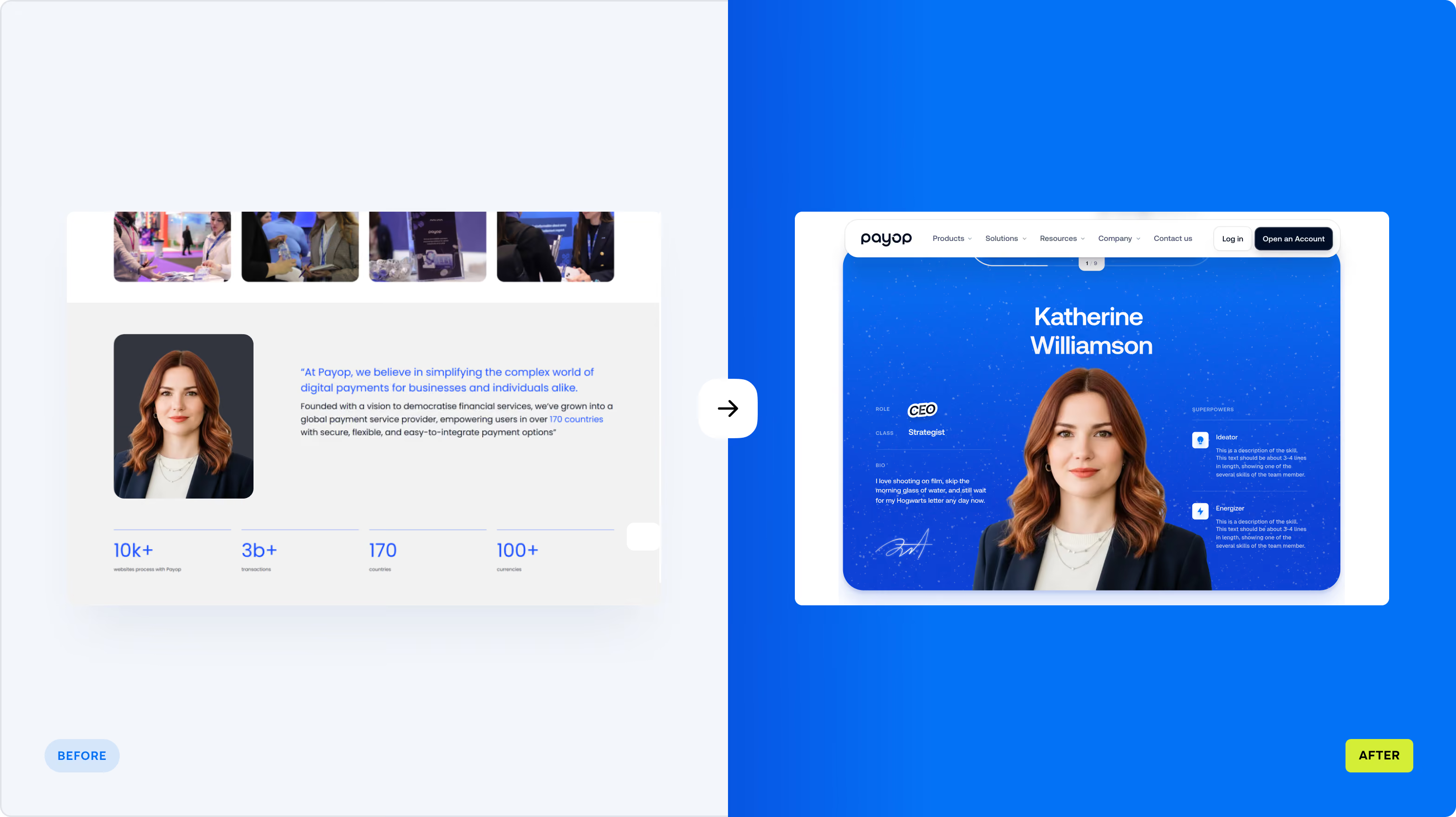
Payop is a global payment platform built for businesses operating across markets. It supports 170+ countries, 500+ payment methods, and 100+ currencies, with billions of transactions flowing through the system.
Challenge
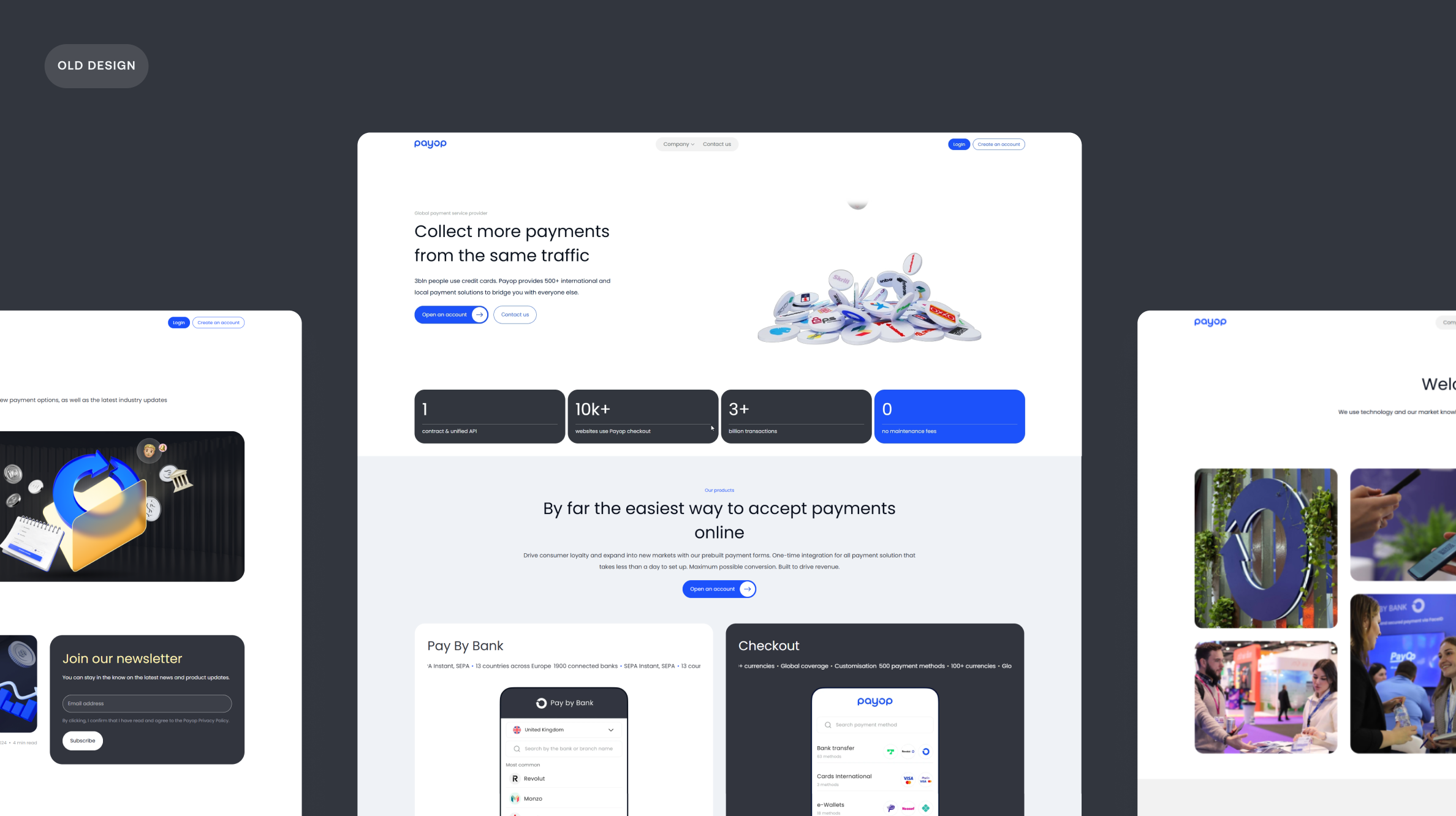
Payop was already operating at a scale most payment platforms would be proud of, but its digital presence didn’t make that scale immediately apparent.
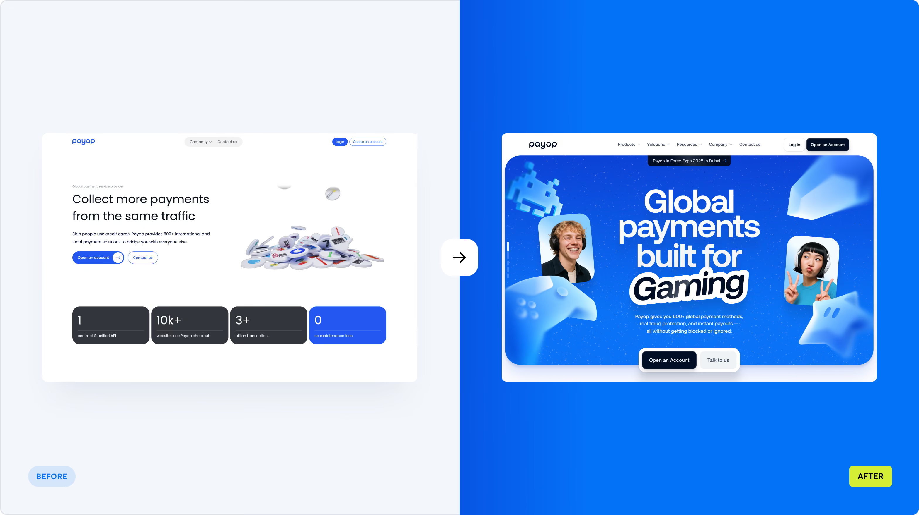
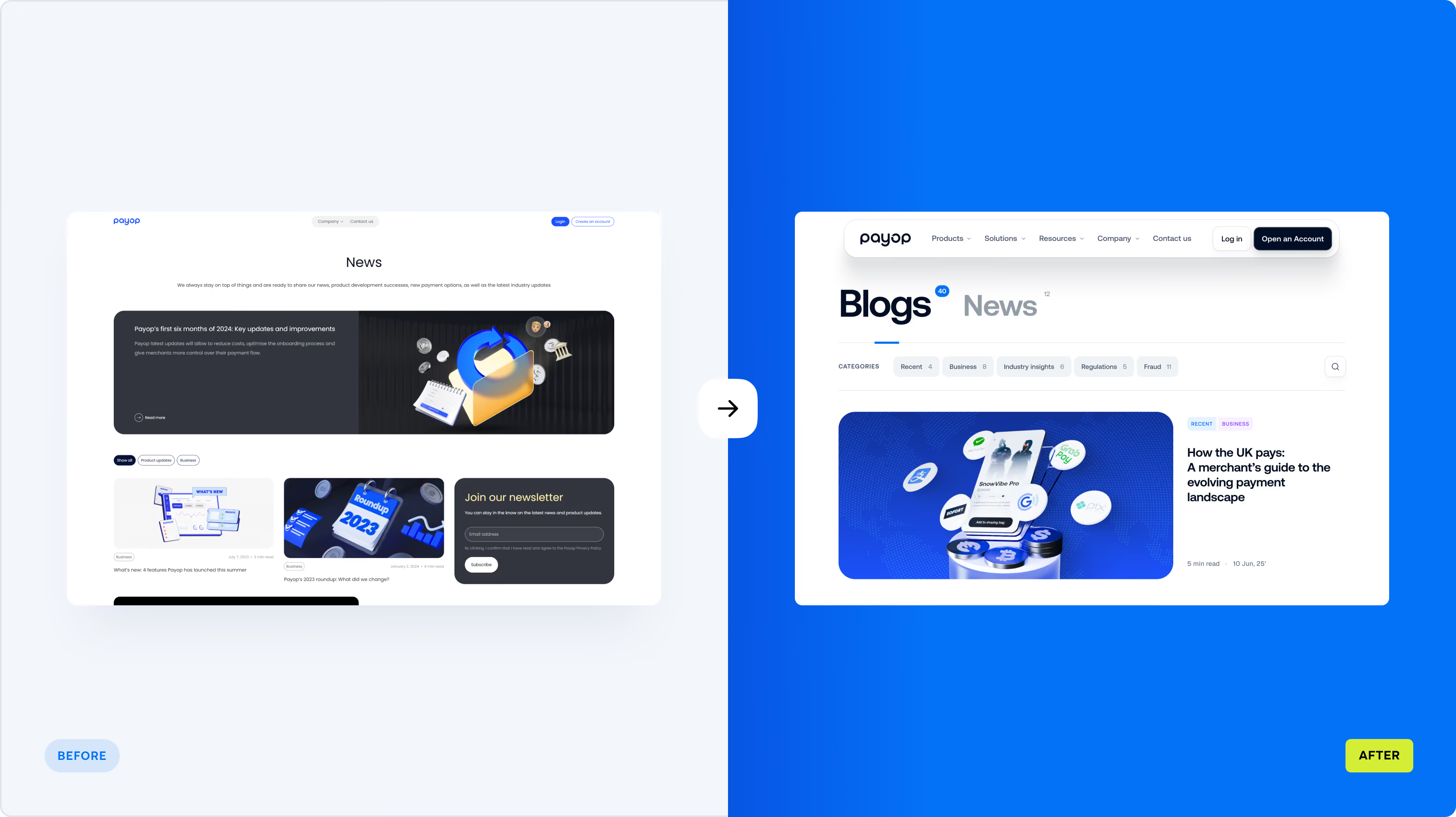
The website felt dated and undersized next to the business behind it. That gap mattered beyond perception: Payop was speaking to a broad international market, with gaming and e-sports among its key audiences, while its digital presence gave neither the product nor the brand enough room to make an impression.
The challenge was to bring the website up to the level of the business — without losing the energy that made Payop relevant to its audience.
Start with the product story, then build the experience around it
Payop had a lot to communicate. The first task was to decide what customers needed to understand — and in what order.
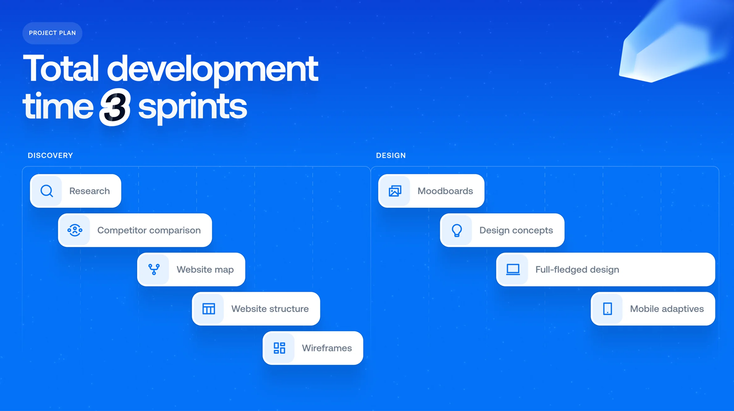
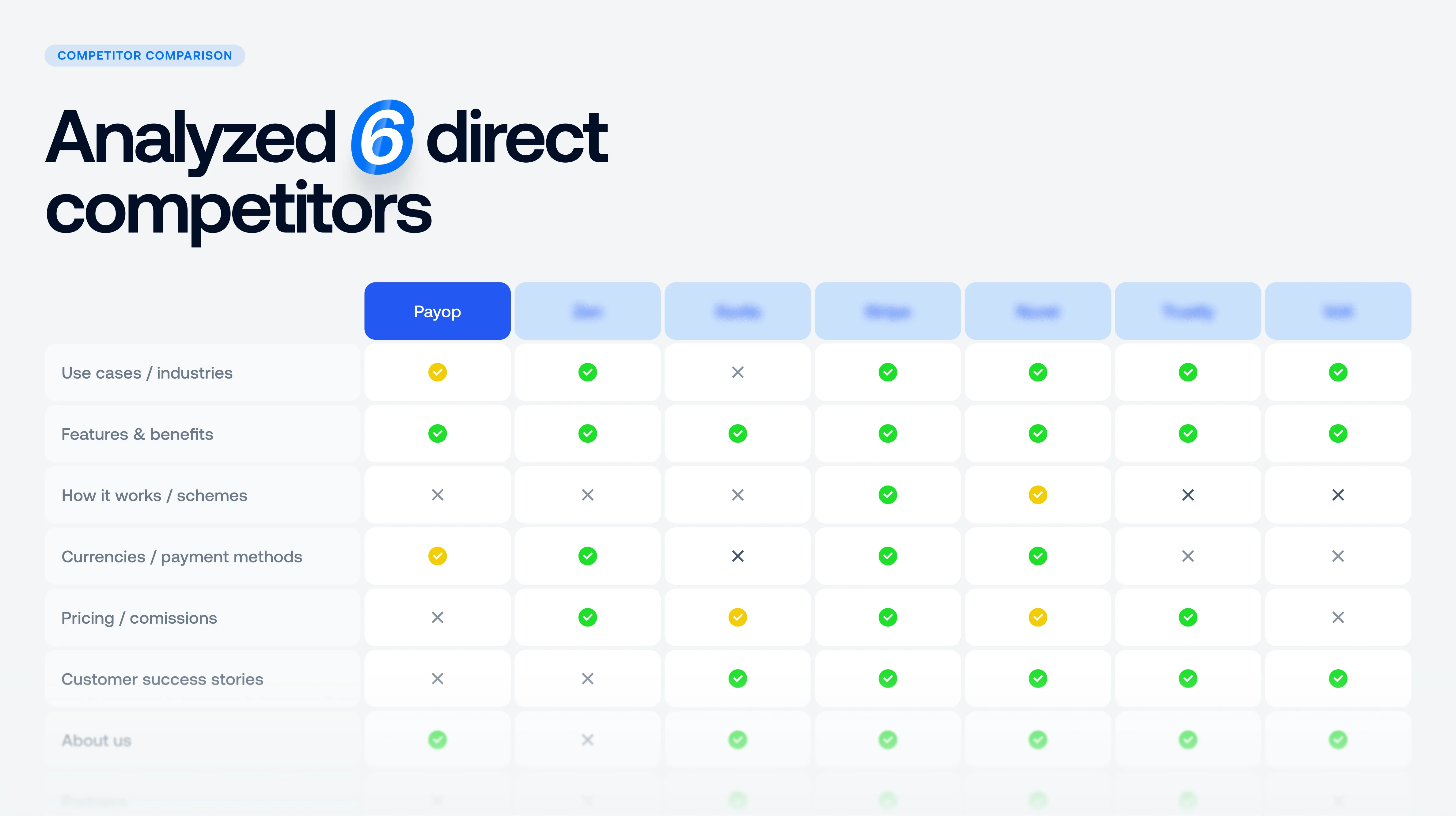
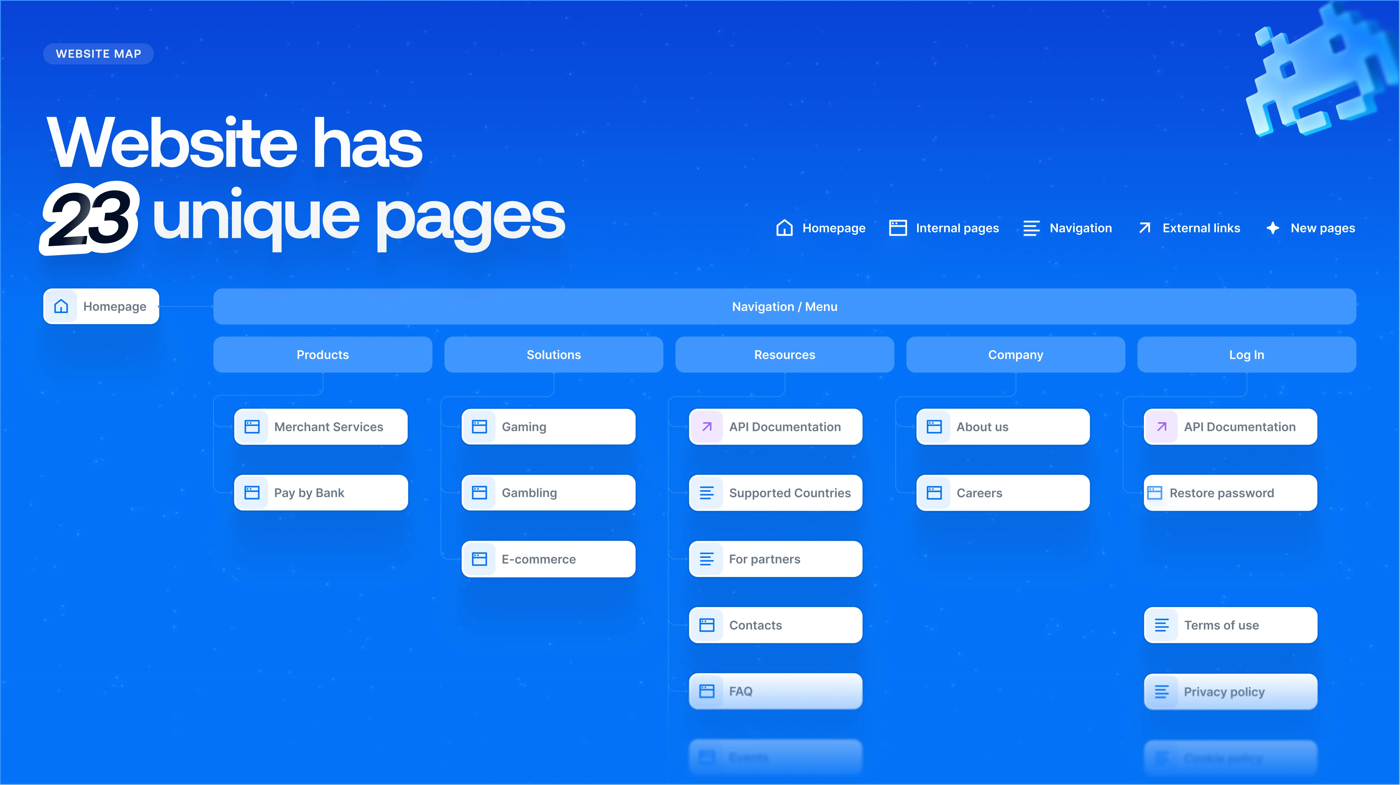
We mapped the market, competitors, and audience behaviour to define the core user flows, sitemap, and content hierarchy.
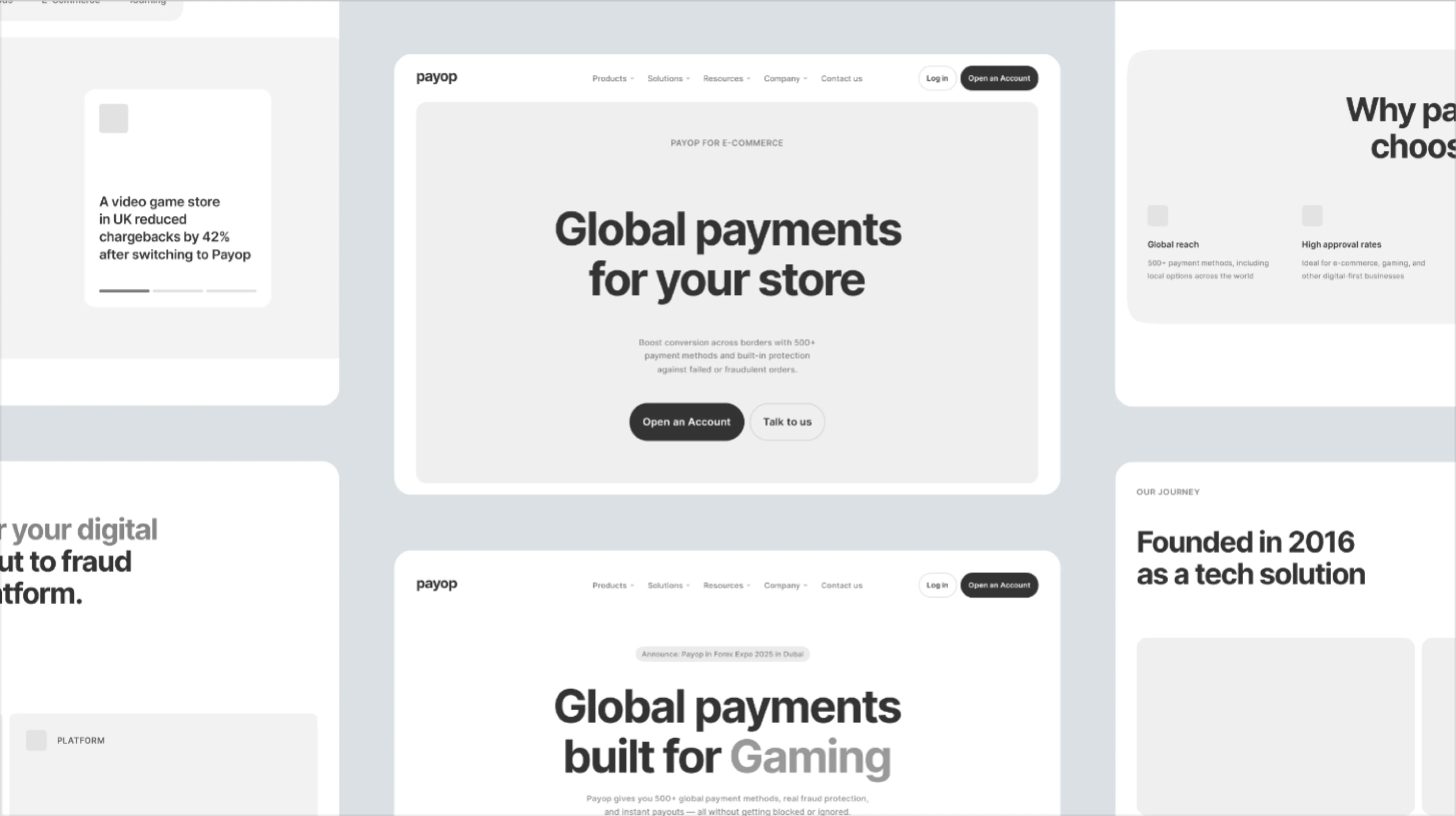
We tested wireframes for that structure before diving into visual design. From there, we built a visual system around two needs: making complex payment information easy to navigate and giving Payop a distinct presence in a crowded category.
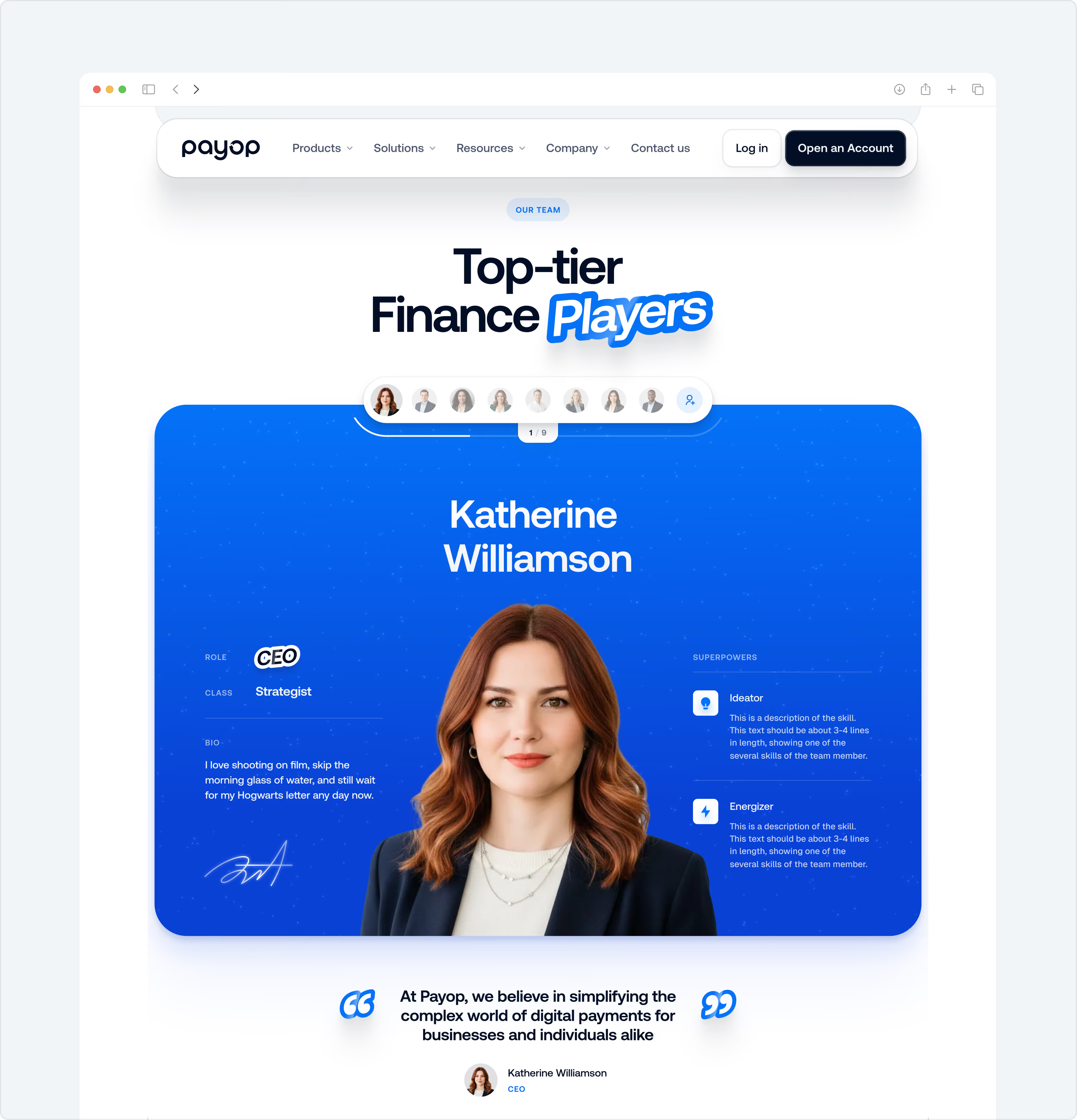
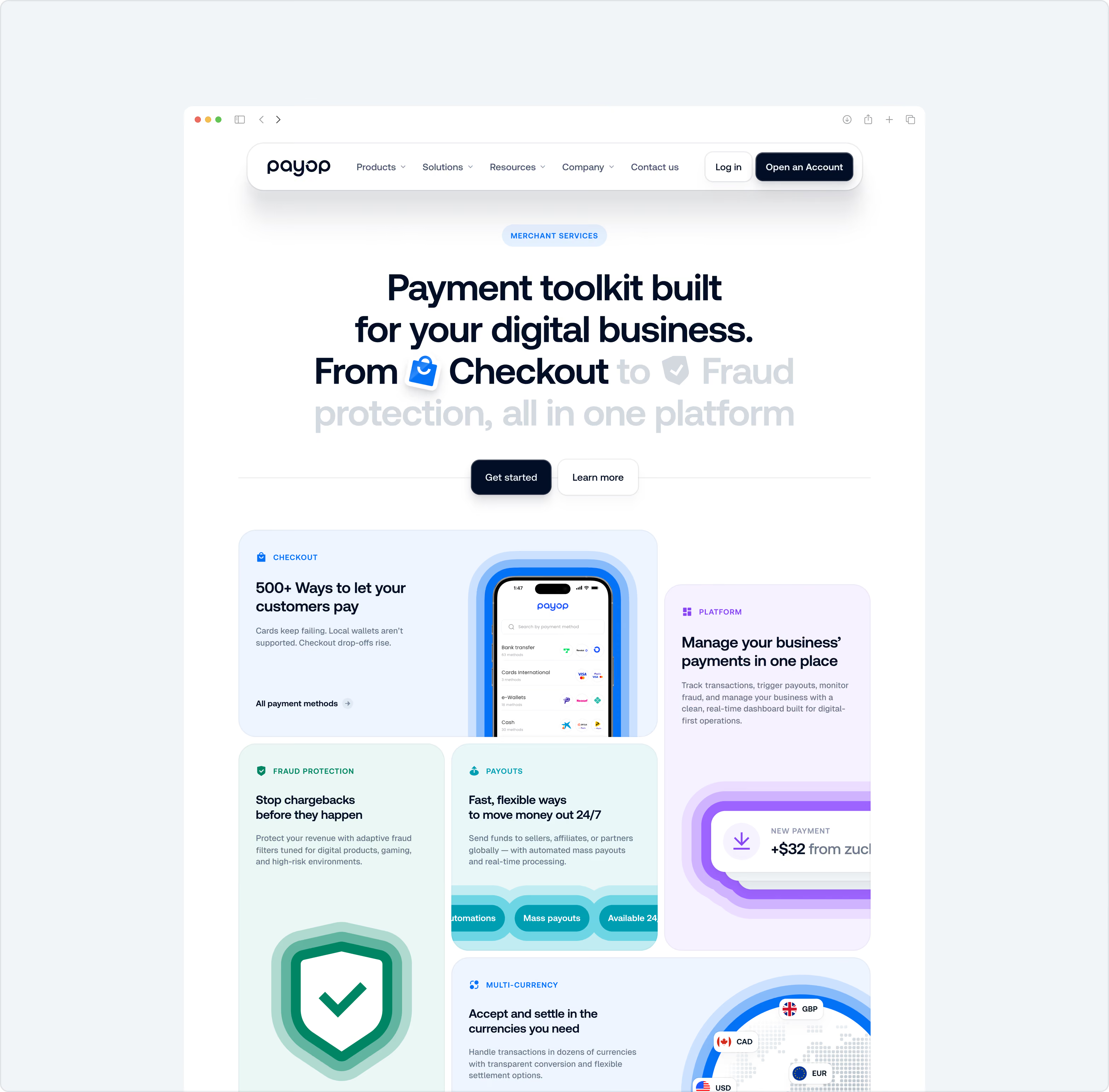
Bold colour, game-inspired UI, 3D elements, and crisp iconography added character without competing with the content. The structure carries the product story. The visual system makes it recognisably Payop.




Simplify a complex offering
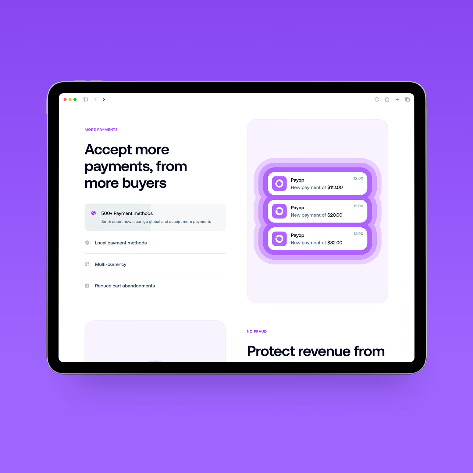
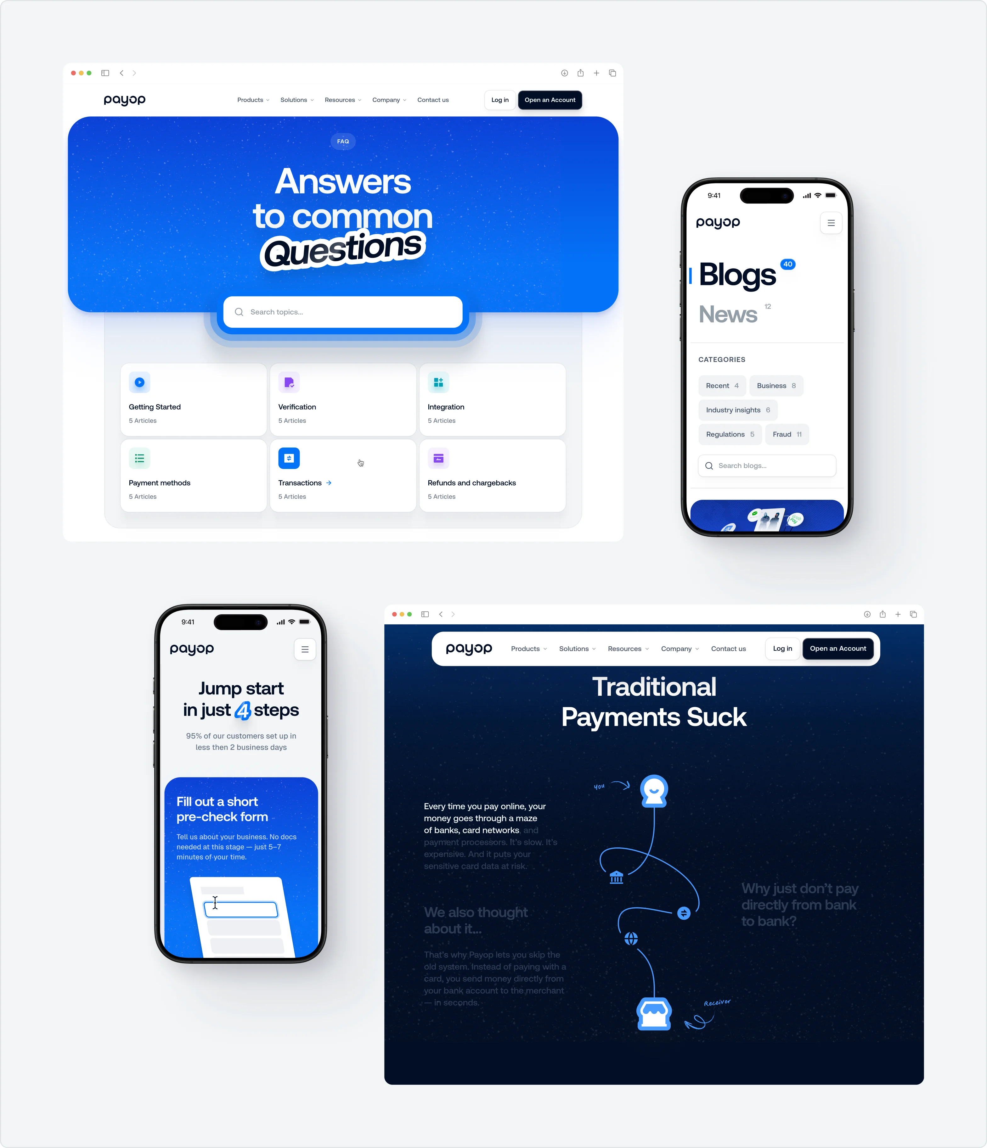
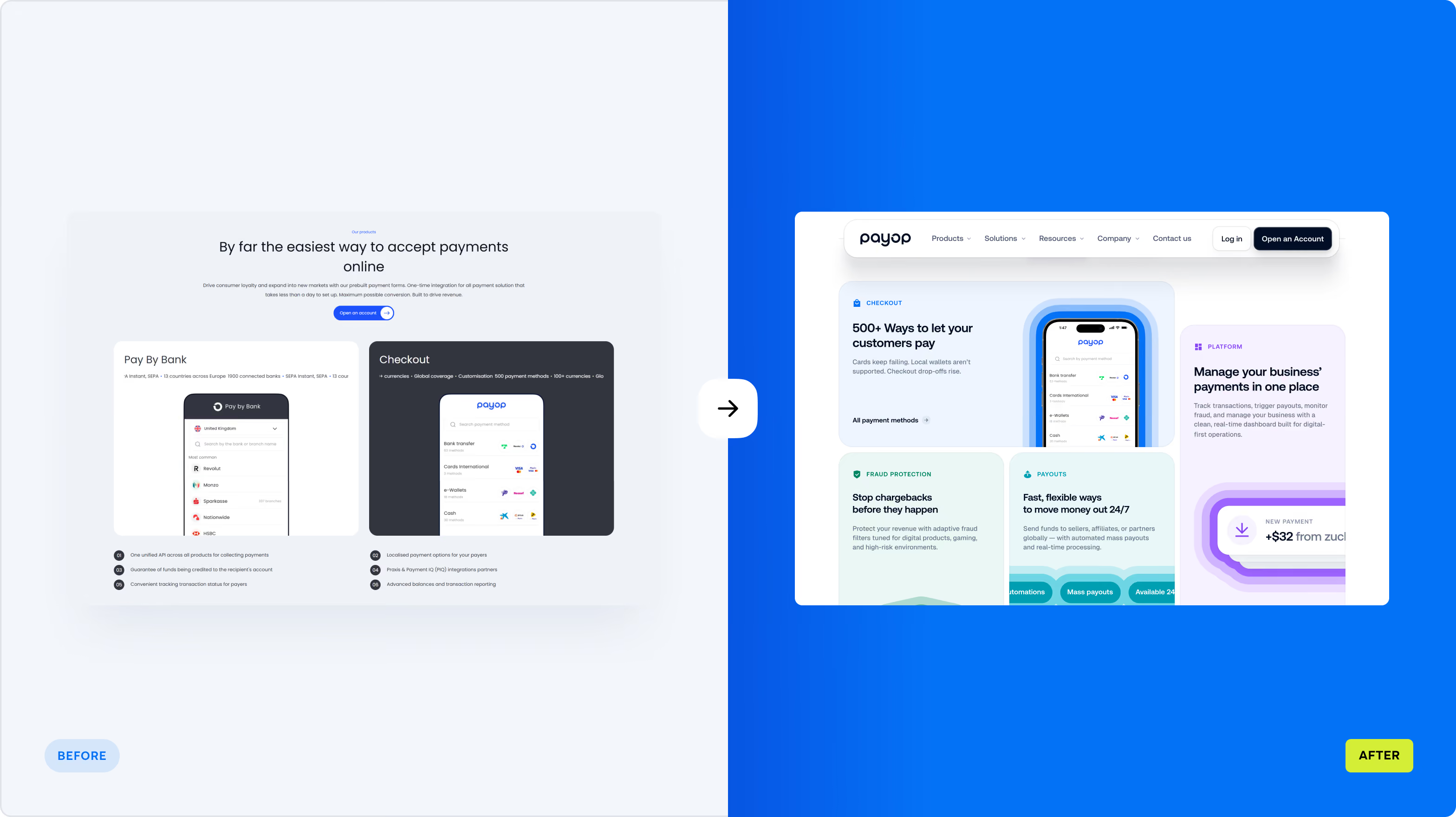
Payop brings together hundreds of payment methods, multiple currencies, and a wide range of capabilities. The website had to help prospective customers find what matters to their business without forcing them to navigate Payop’s internal product structure.
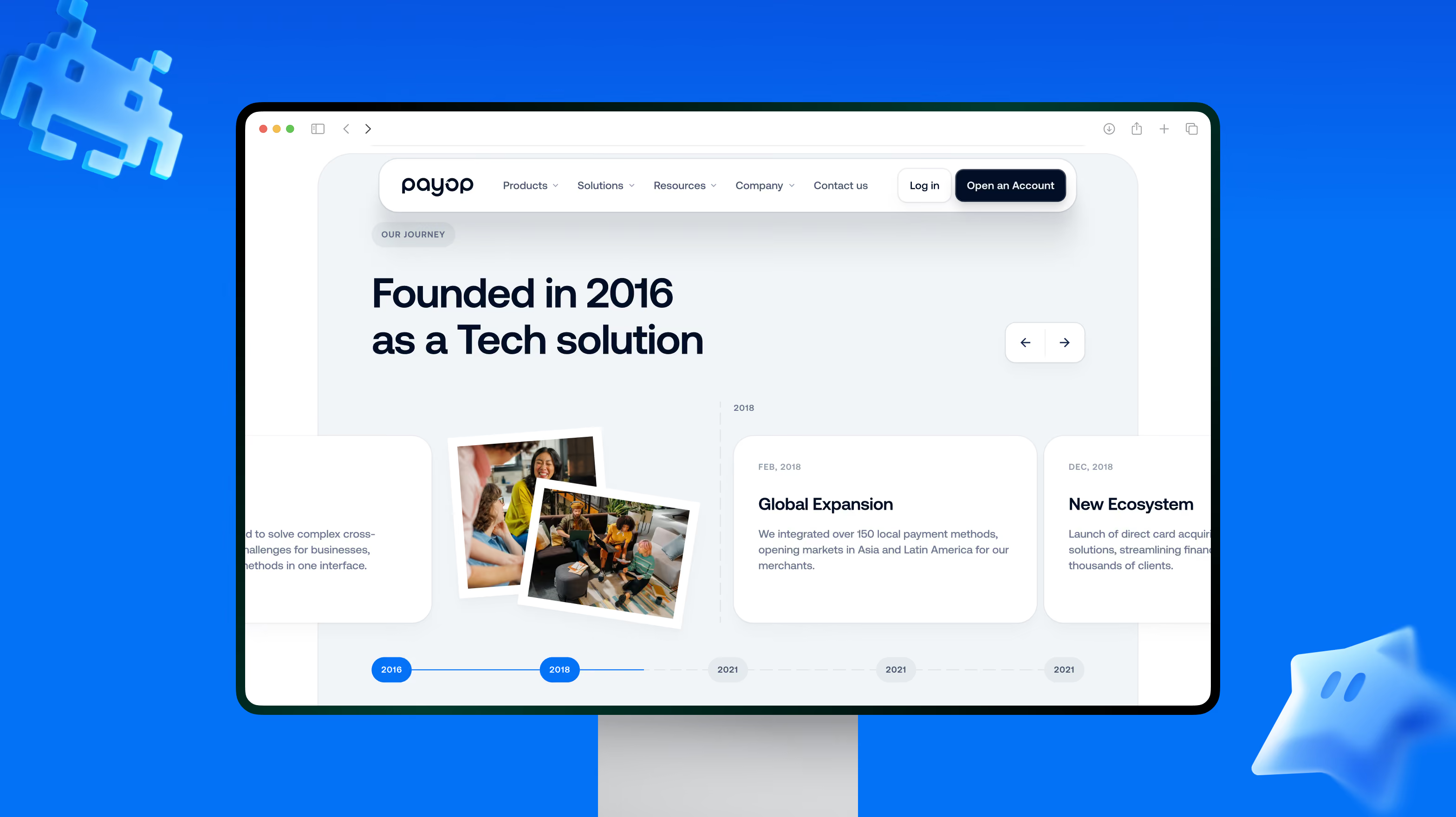
We used market and competitor research to map the key user flows and shape the sitemap and content hierarchy. Wireframes then let us test the structure before adding the visual layer.
The result is a clearer path through Payop’s offering, with the most relevant information surfaced at the right point in the journey.


Give the product a visual language with some edge
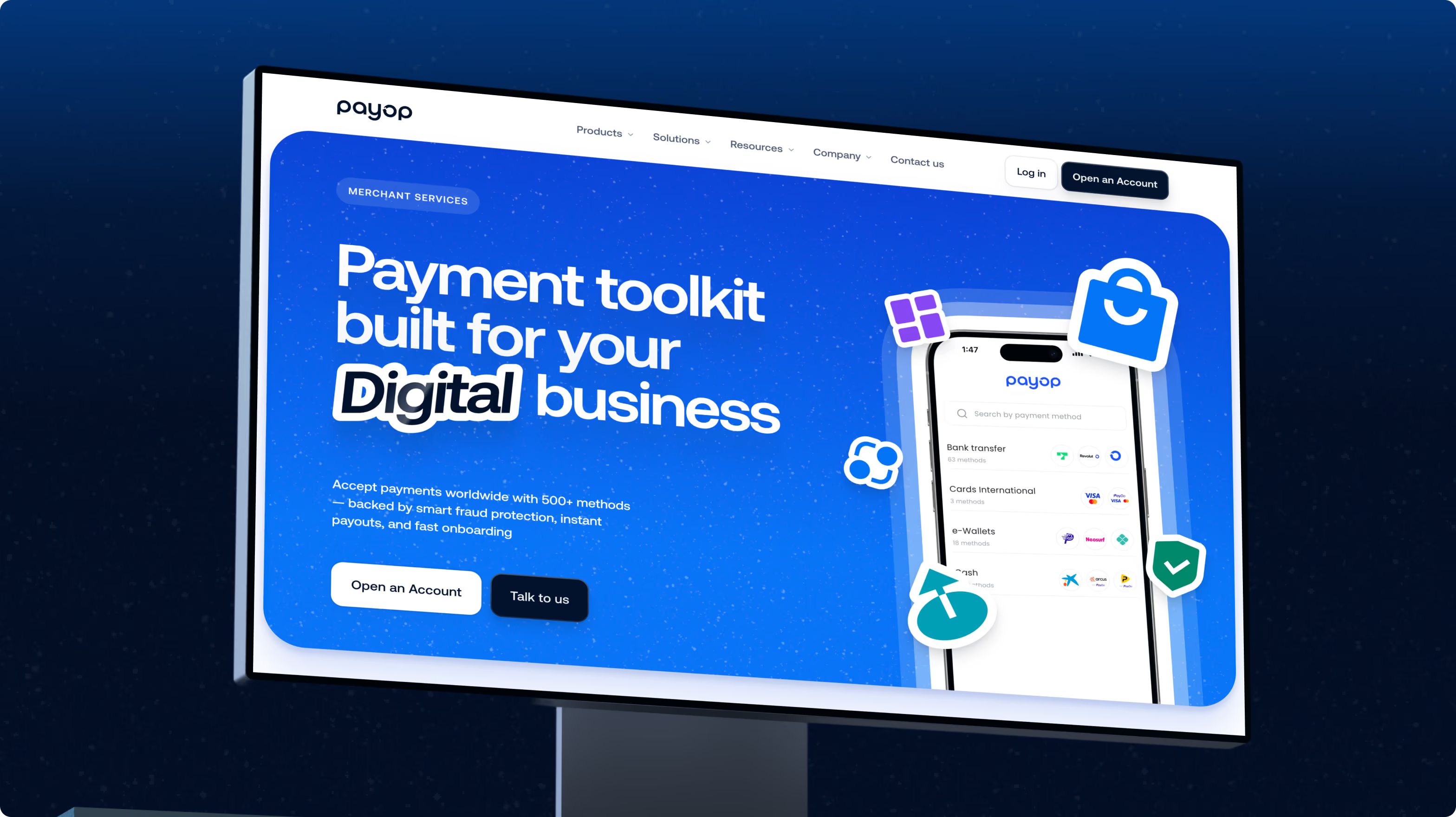
For Payop, a conventional FinTech aesthetic would have been a poor fit. Gaming and e-sports are part of its audience, so the visual language could be more expressive — borrowing cues from game UI while keeping the product at the centre.
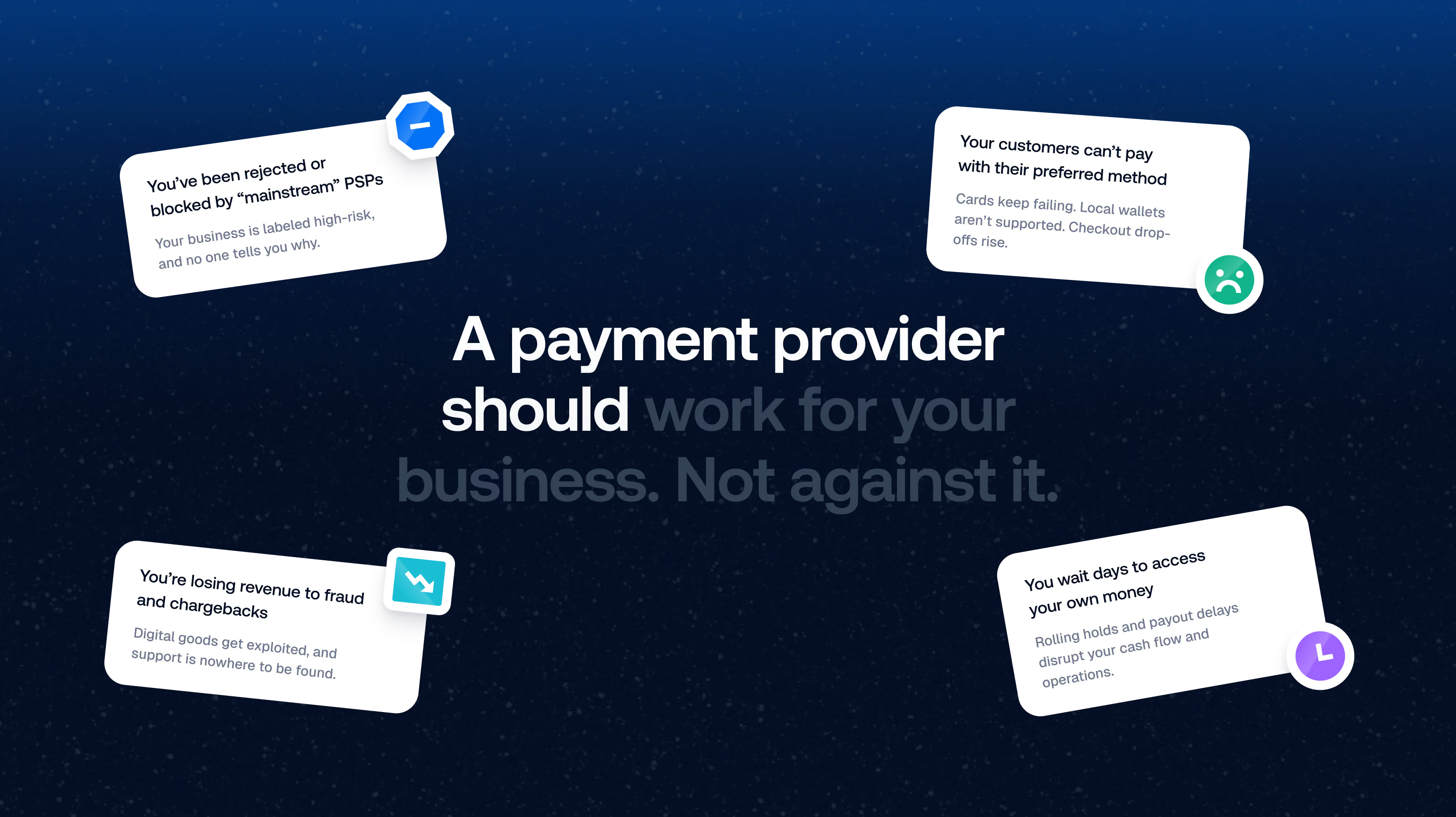
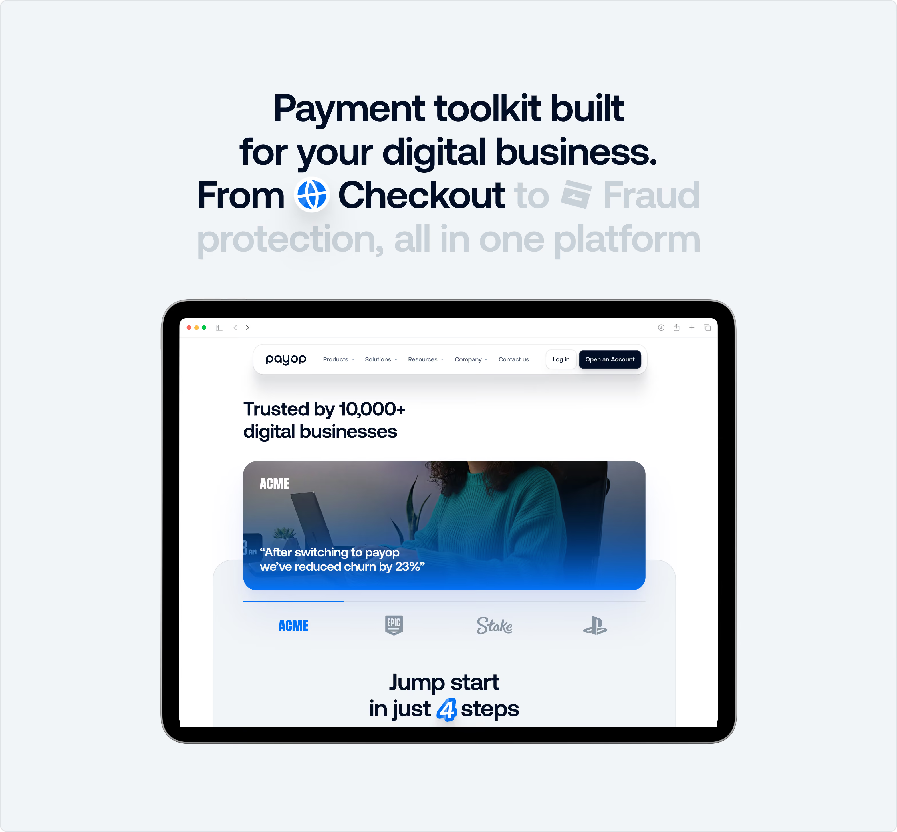
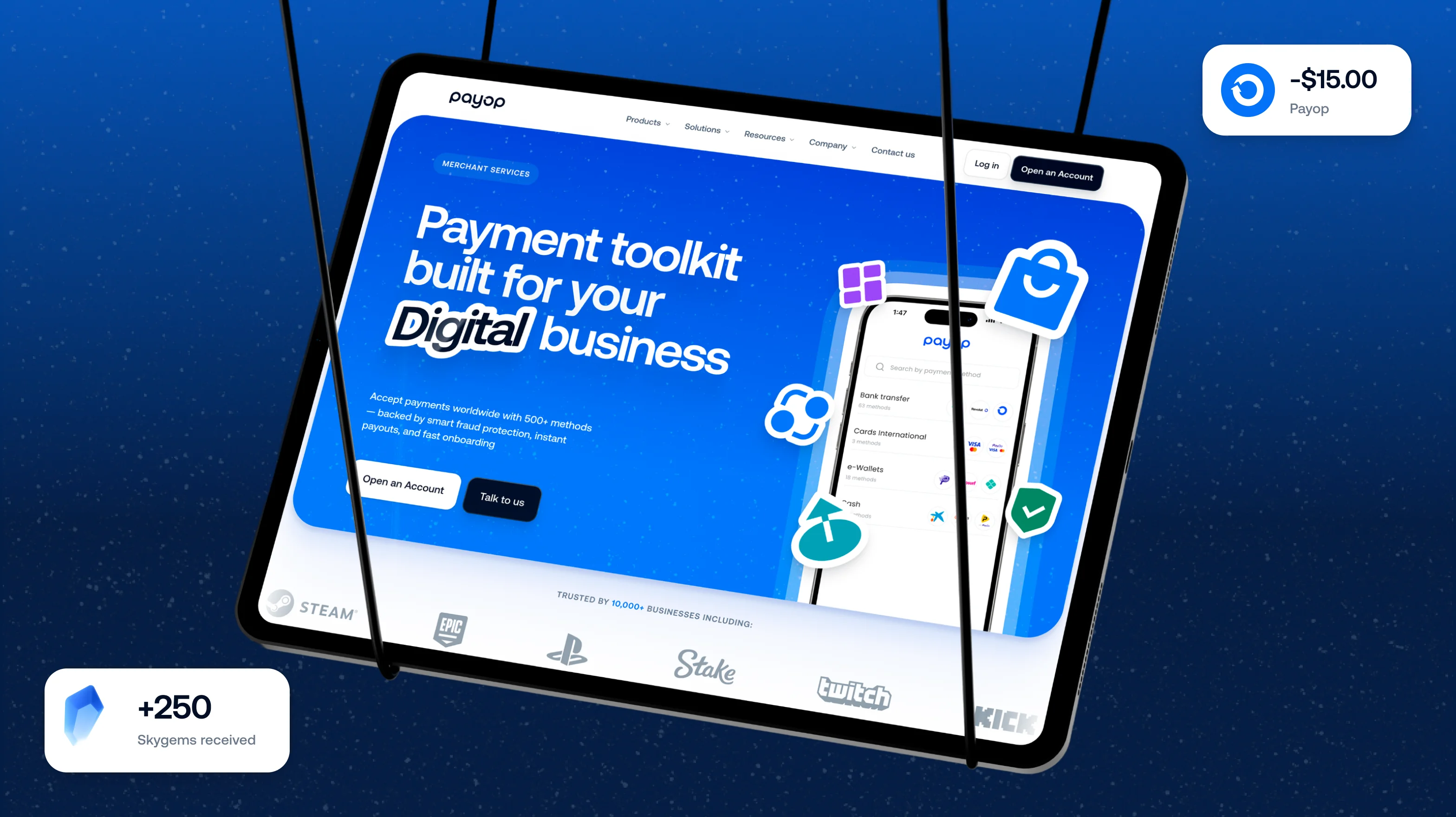
We introduced bold colour, 3D elements, and crisp geometric iconography to give the interface energy and character. Product information stays concise, with visual demonstrations doing part of the communication work.
The result is a FinTech website with more personality — expressive enough for its audience, focused enough for the product.
Give the new visual language a system to work with
A distinctive direction only helps if the team can apply it consistently.
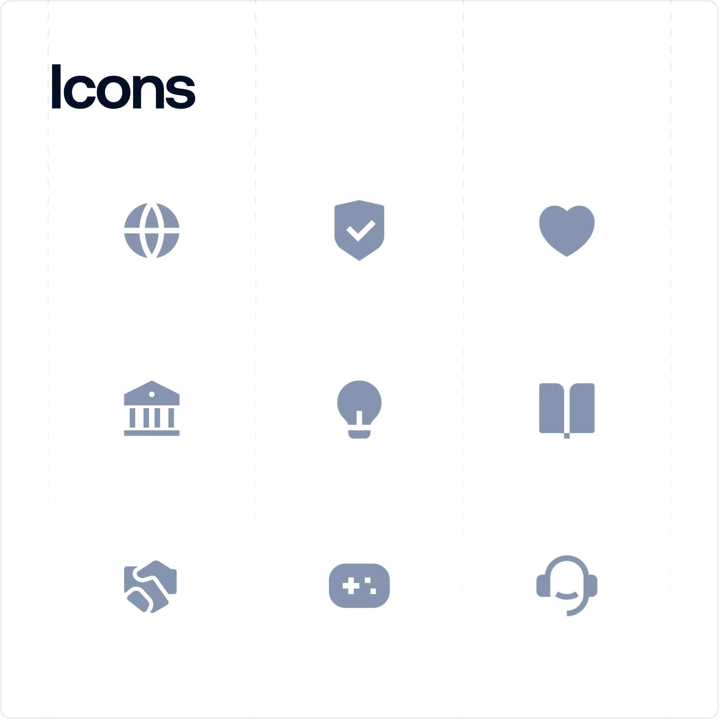
We brought the core decisions together in a UI kit covering typography, colour, iconography, 3D elements, and interface components. Flat, precise icons balance the softer 3D illustrations, while the underlying component system keeps the website connected.
That gives Payop a visual language that can extend across product pages and content without every new section becoming a separate design exercise.
Make the experience work at any screen size
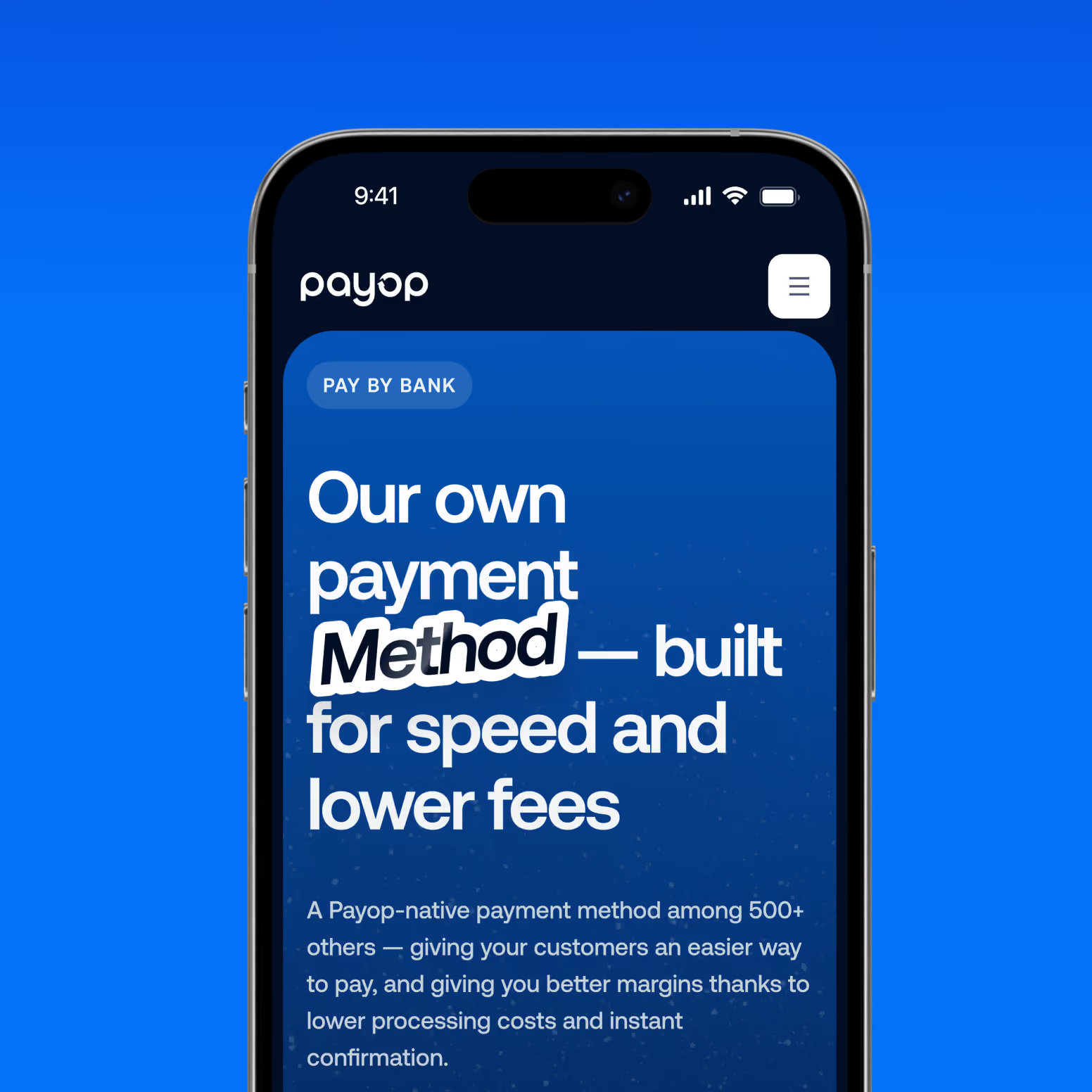
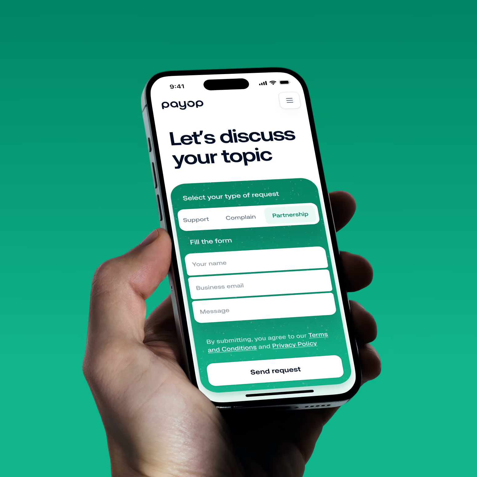
The mobile experience keeps the same information hierarchy while adapting content and interactions to the smaller screen.
We reordered sections by priority, kept key CTAs within reach, and gave each block enough space to stay readable. Rather than simply scaling down the desktop layout, we reworked the interface around actual mobile usability patterns.
The same content, priorities, and visual language carry through without compromising usability.
A clearer experience for a global payment platform
The redesign gave Payop a more structured way to present its broad payment offering and a visual system with more character.
The new information architecture helps visitors navigate Payop’s services and capabilities, while the visual direction creates a stronger connection with gaming and eSports communities.
Product breadth, clear navigation, and a distinctive visual language now work as one website experience.
Growth adds complexity faster than most websites can handle
New markets, payment methods, services, and customer segments all add another layer to the product story. At some point, the challenge shifts from how much information the website contains to how quickly a customer can make sense of it.
For teams working on a growing FinTech product, that makes information architecture part of the commercial experience. The structure determines what customers see first, what they understand, and where they go next.
Payop shows how much this can change when structure and visual communication merge: less effort spent decoding the offer, more room for the brand to make an impression.
Want to start a project with us?
Your request has been sent and will contact you soon by this email yourmail@mail.com
Let's discuss your upcoming project on a call
We usually reply within 1 hour during working hours: 9:00–20:00 (GMT+3)


.avif)