













Bill_Line.
Virtual payment system web app redesign & rebranding
Bill_line is a digital payment system for online stores, banks, gaming platforms, and other businesses that process online transactions.
Challenge
Bill_line’s clients came to the platform to process payments, manage accounts, and work with transaction data. Their expectations had already been shaped by modern FinTech products, where these tasks are easier to understand and navigate.
The gap showed up across the digital experience. The visual identity felt dated, the website made product information harder to find, and the personal account complicated everyday tasks.
Signups, reporting, account management, and analytics all needed clearer flows. The website also had to explain Bill_line’s capabilities and API integration without turning the homepage into a wall of product detail.
Project strategy
Start with the market before defining the solution
The project began with a workshop to define objectives and understand the client’s expectations. It also revealed an important gap: Bill_line did not yet have a finalized brand strategy to guide its market position.
That made research the first step. We analysed competitors in the payment systems market to understand the category, identify differentiation opportunities, and define a brand identity direction.
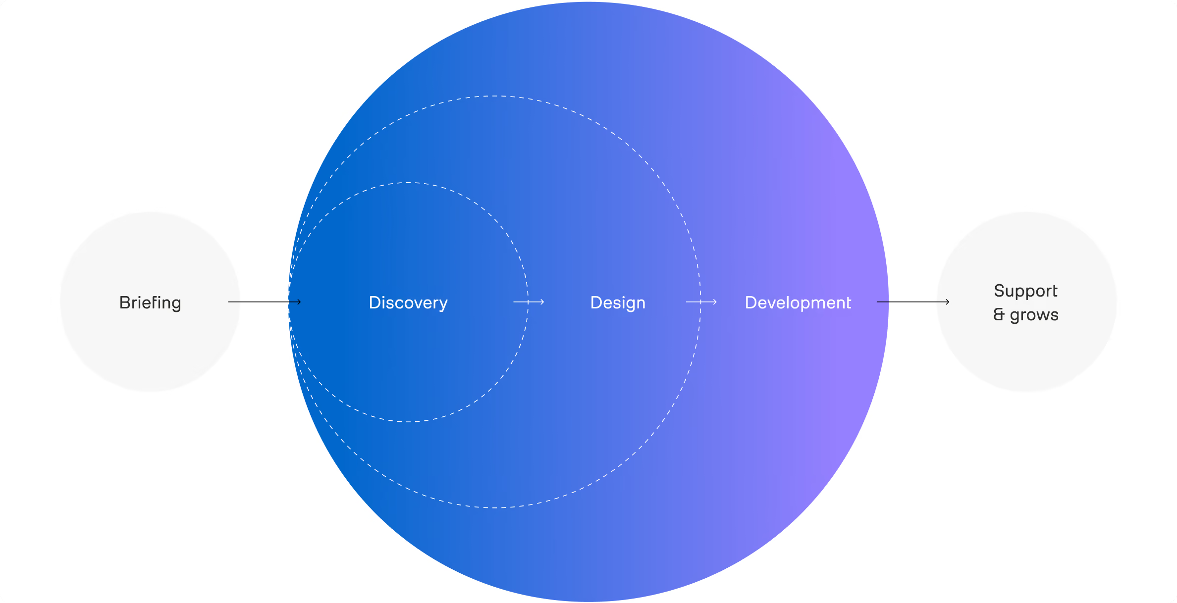
From there, the project moved through five stages:
01 — Brand direction
Competitor research and identity concept development based on potential customers’ needs.
02 — Brand identity
Logo and visual identity built around the chosen concept.
03 — UX architecture
Wireframes and website structure, agreed before visual design.
04 — Website design & development
UI design followed by frontend and backend implementation.
05 — Merchant account
Rethinking and redesigning the account around Bill_line’s users.
Fix the experience from first impression to daily use
Bill_line had issues at both ends of the customer journey. The brand and website needed to communicate the product more clearly, while the personal account and dashboard needed to make everyday payment tasks easier.
So the work covered the full experience: a simpler identity, a more focused website, and product flows built around registration, reporting, account management, and analytics.
We also separated product education from the homepage, moving product-specific info and API information to dedicated pages, giving each part of the website a clearer job.





Logo & visual identity
Simplify the identity without making it generic
The company's logo was too cumbersome: an overflow of elements, a three-dimensional drawing. We analyzed the payment systems market and found that the strongest players favour simple, font-based logos.
Make the logo move
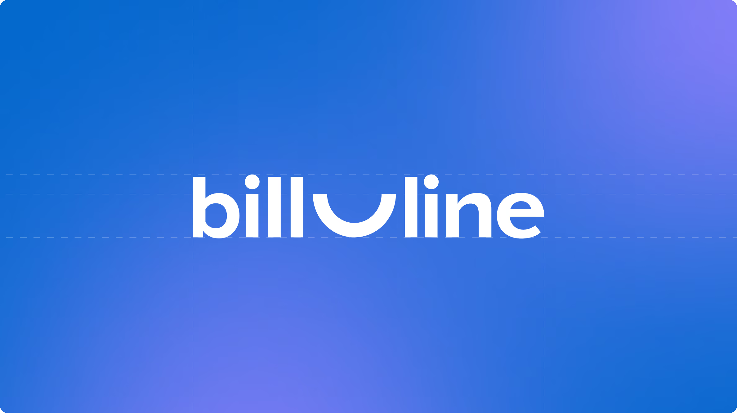
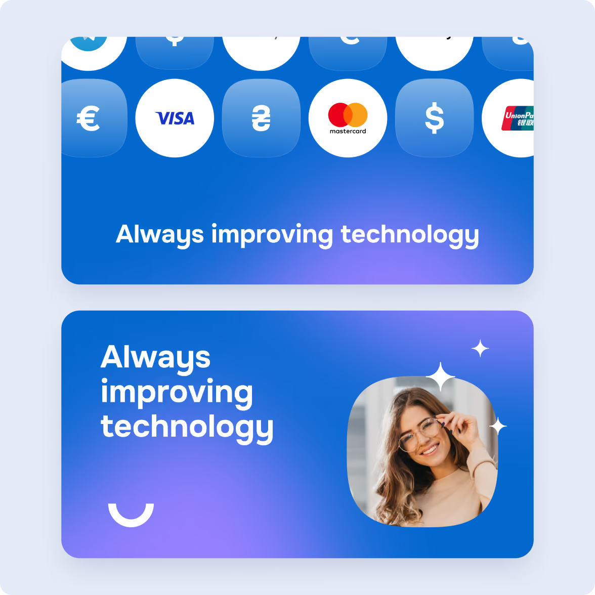
The new Bill_line logo uses a simple line as its core element. In its static form, the line stays straight and becomes part of the wordmark.
Building on this idea, we developed a logo around the company name and a simple line element. In its static form, the line stays straight.
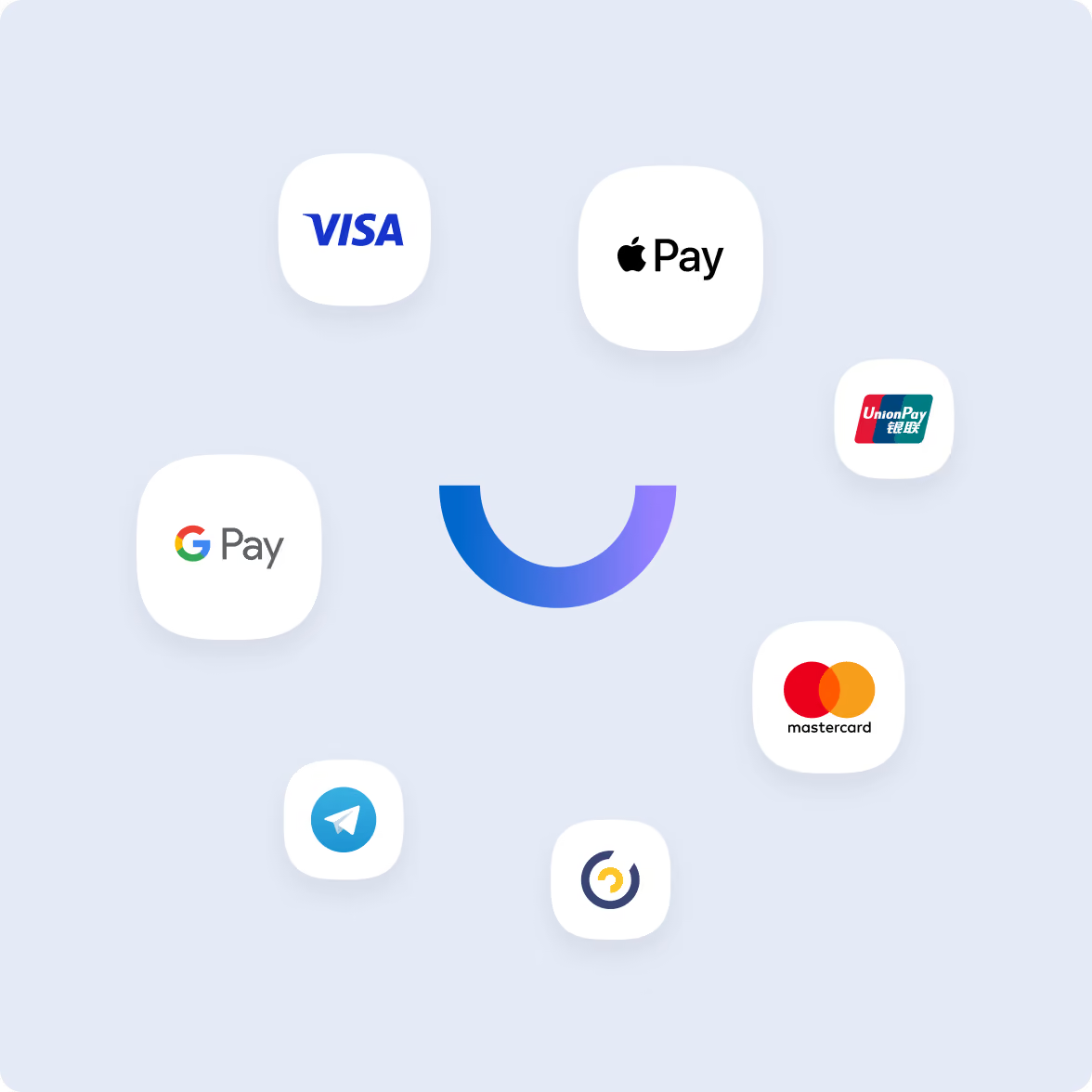
Through motion, it curves into a smile, reflecting Bill_line’s positioning around client care. The result is a simple identity that works across different formats and remains recognisable at a glance.
Website redesign
Give product information somewhere to go
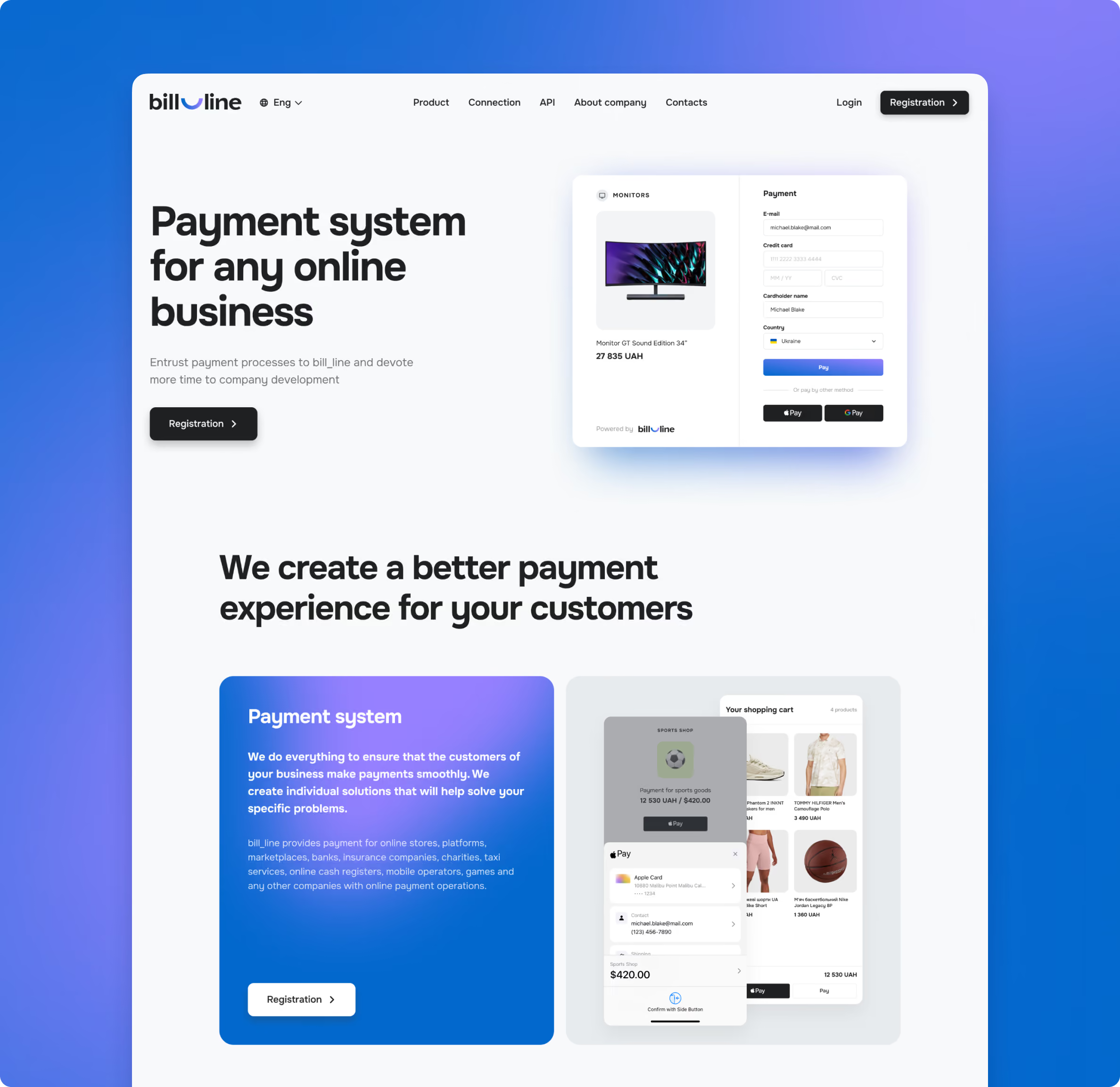
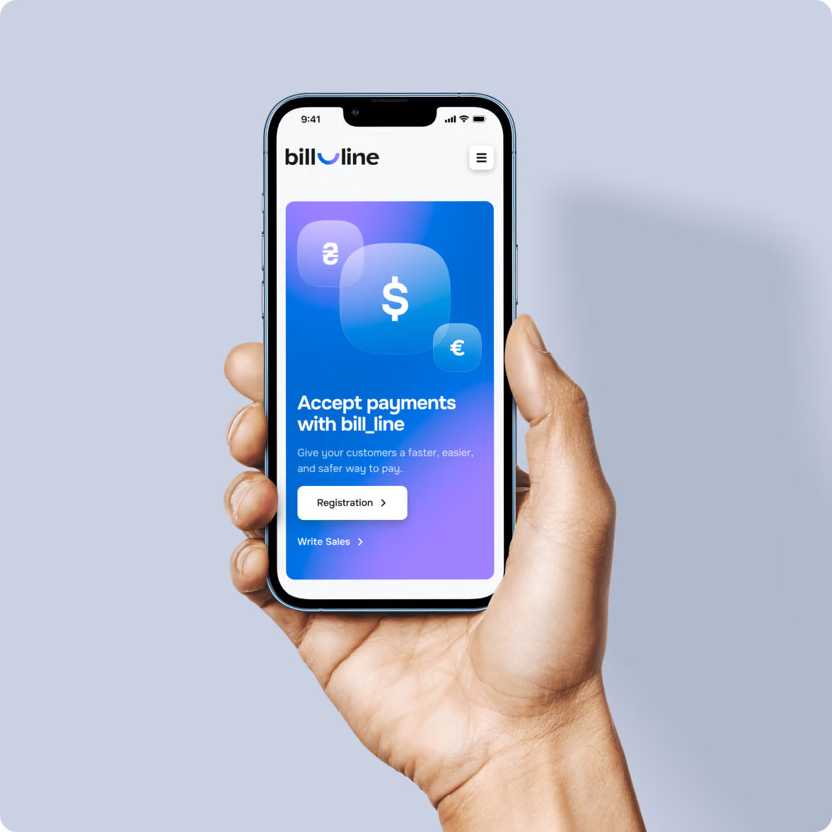
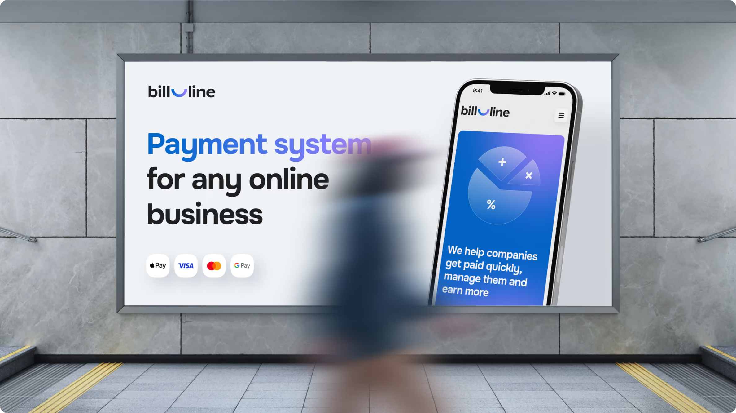
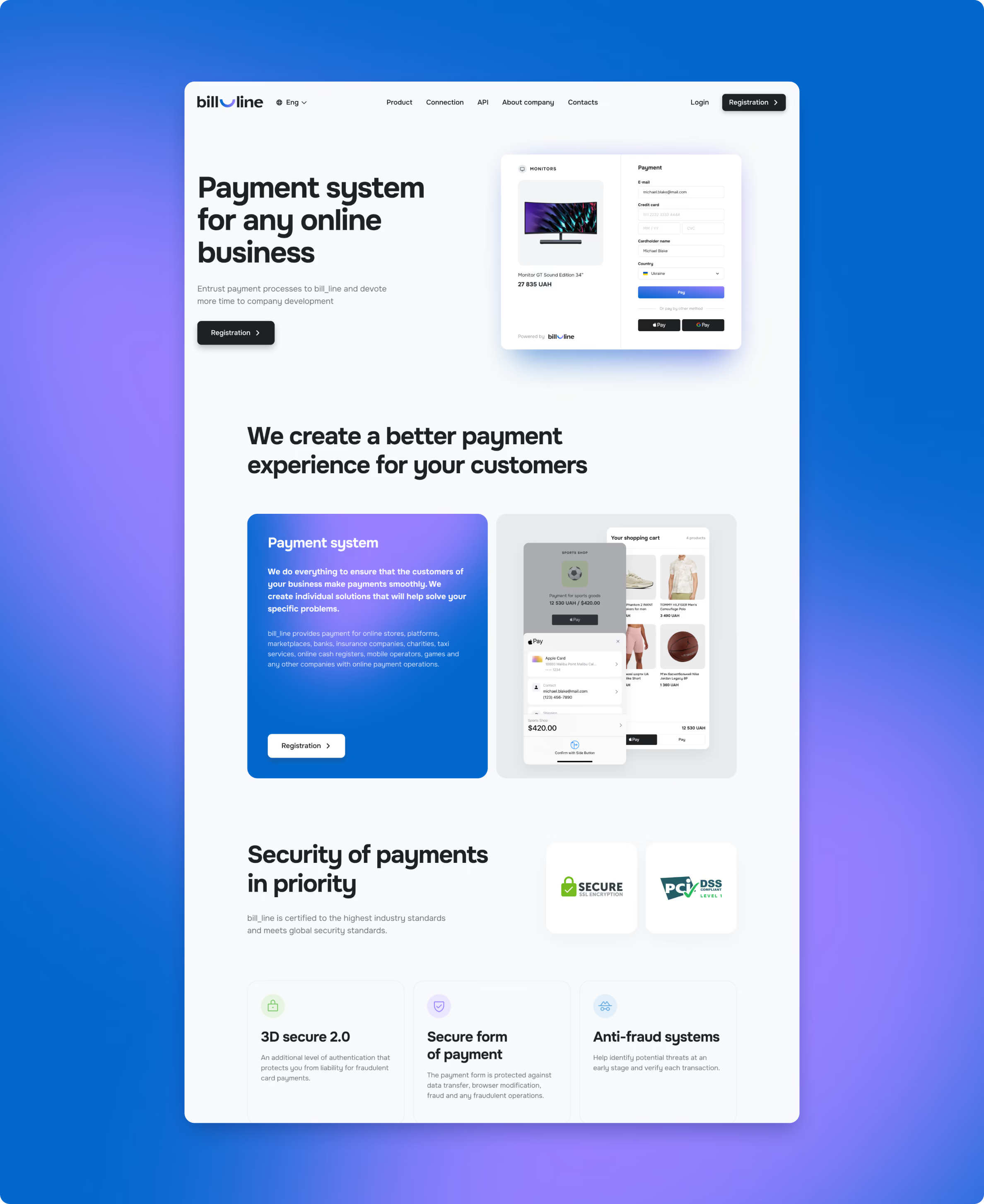
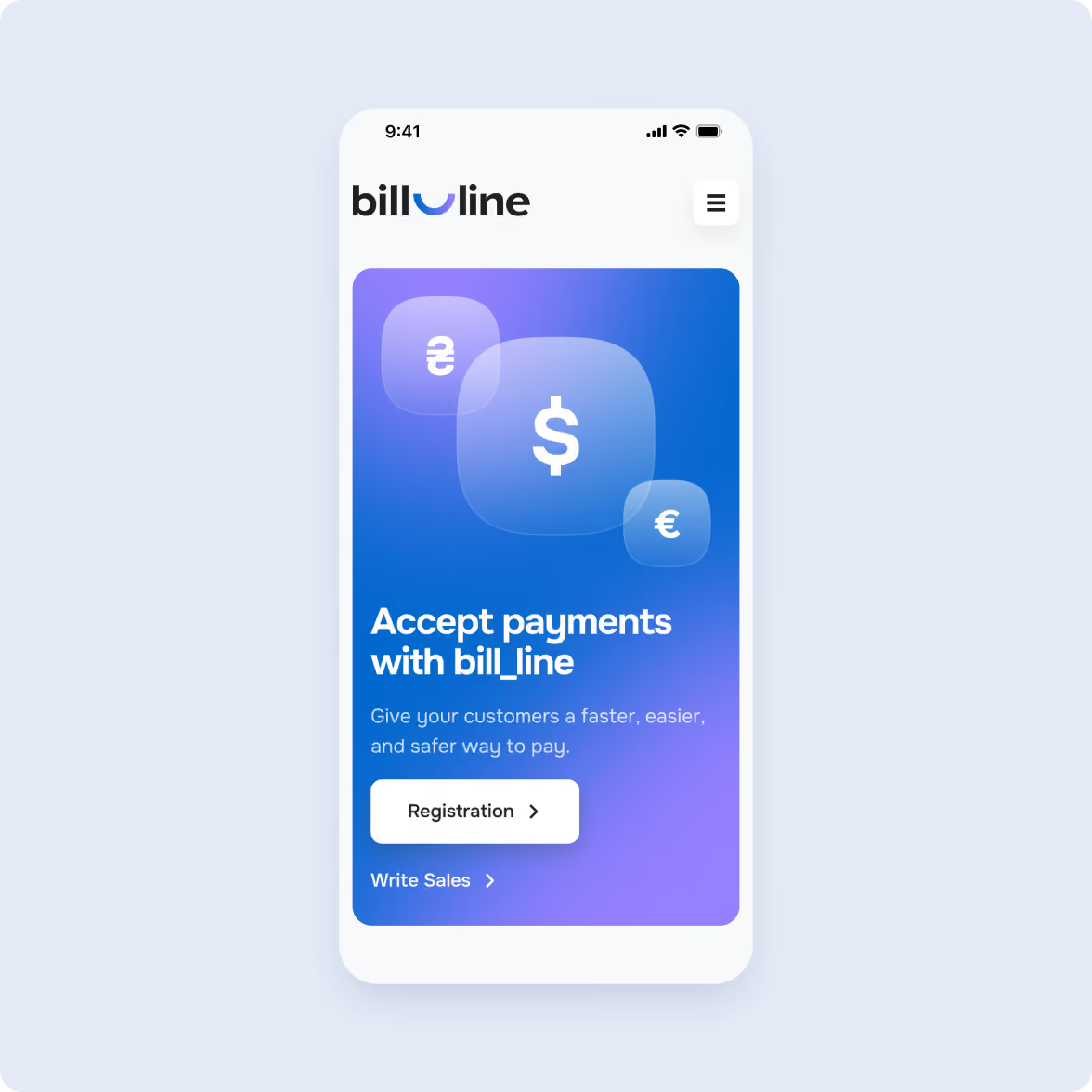
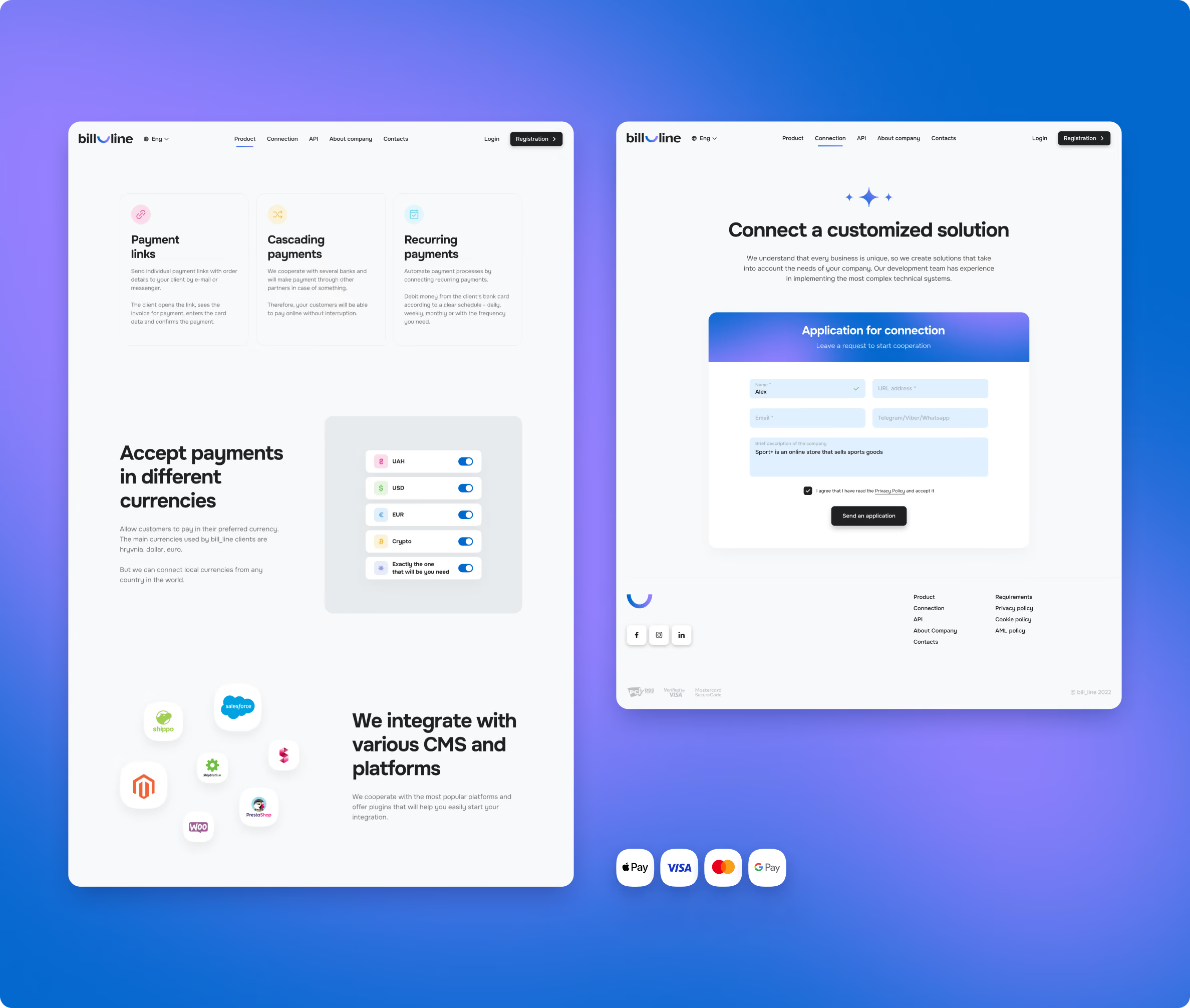
The new website extends the updated identity through colour, typography, layout, and motion. We initially packed the homepage with product information. It quickly became clear that visitors needed a faster way to understand Bill_line before getting into the details.
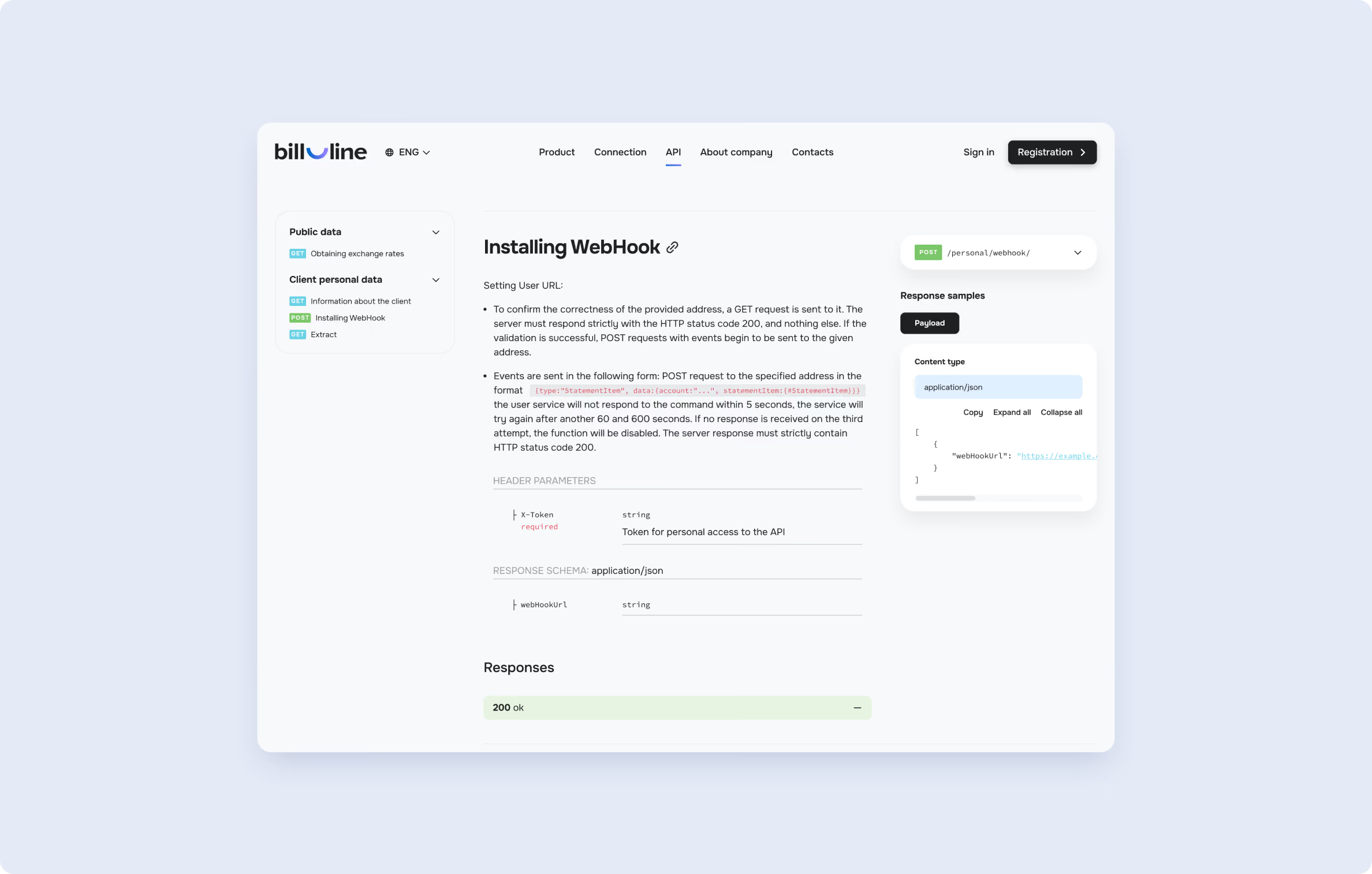
We moved the deeper product content into a dedicated page, which developed into a landing page that could support paid traffic. Each page explains a specific part of the offering, while the API section gives technical users direct access to integration information.
Personal account redesign
Take the guesswork out of account management
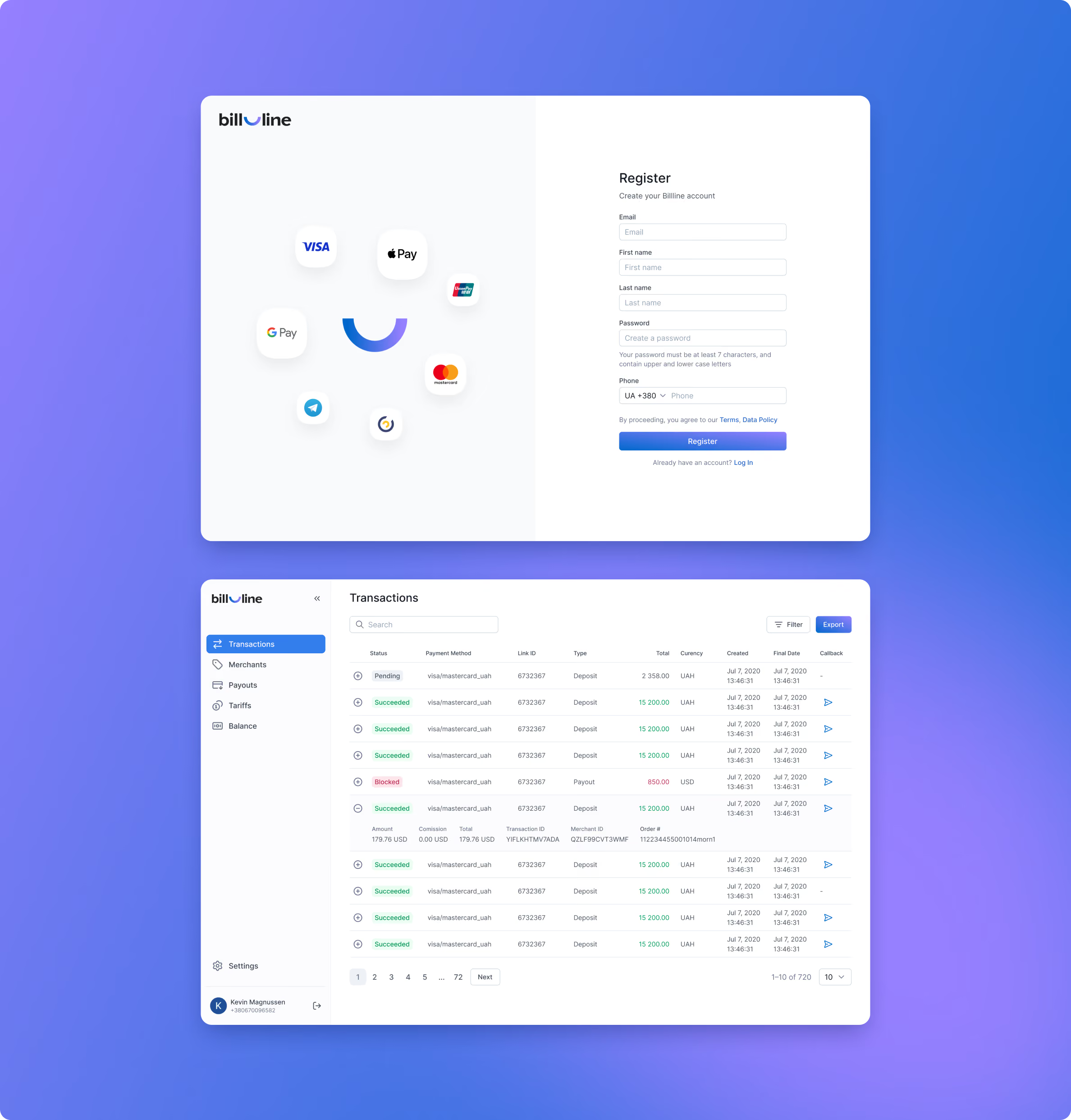
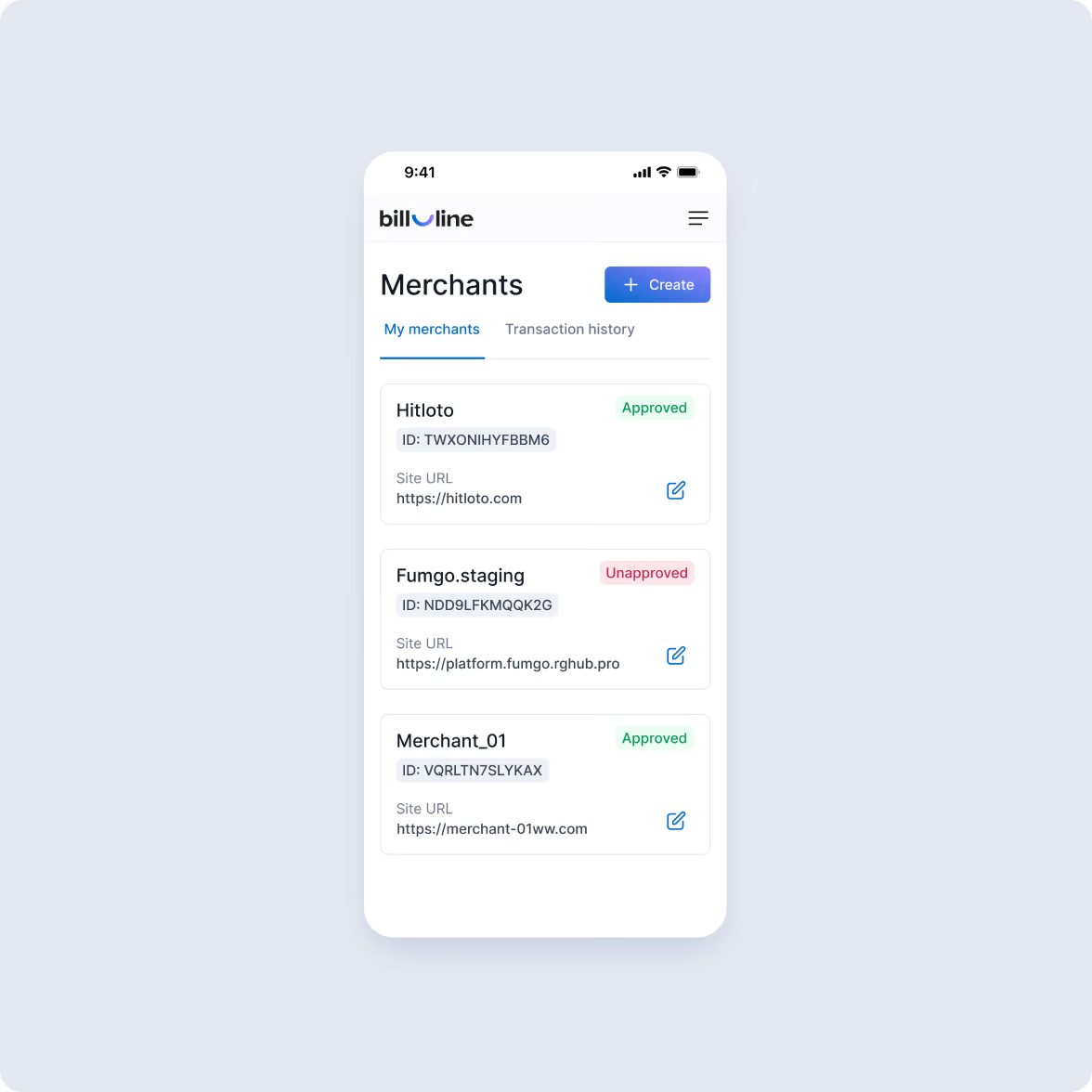
The personal account had several workflows that required more effort than necessary, particularly registration, reporting, and account management.
We restructured the experience around those tasks. Registration became a single-page flow with explanations under each field, while contextual hints helped users move through the process without relying on technical support.
Payment dashboard redesign
Put the data clients come for first
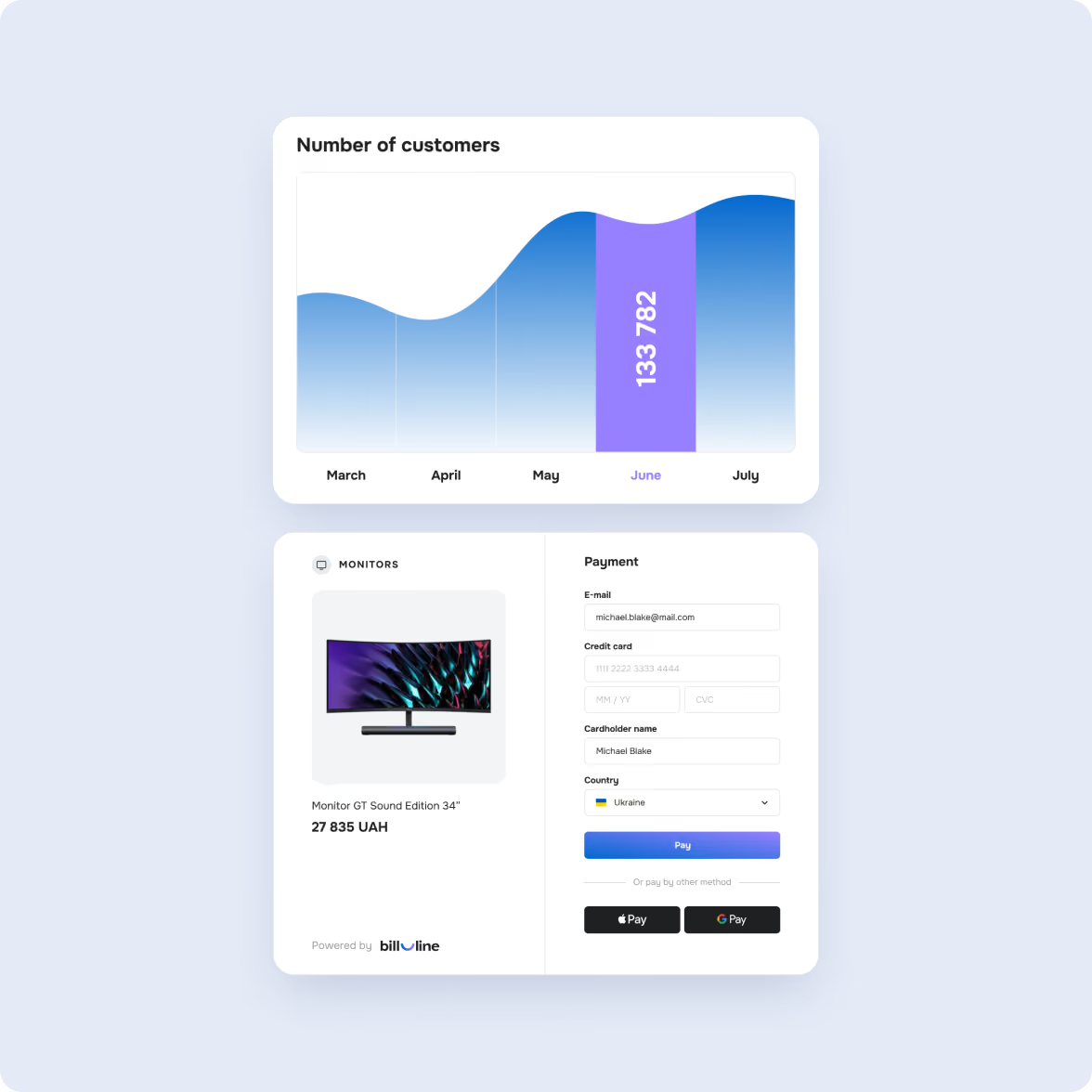
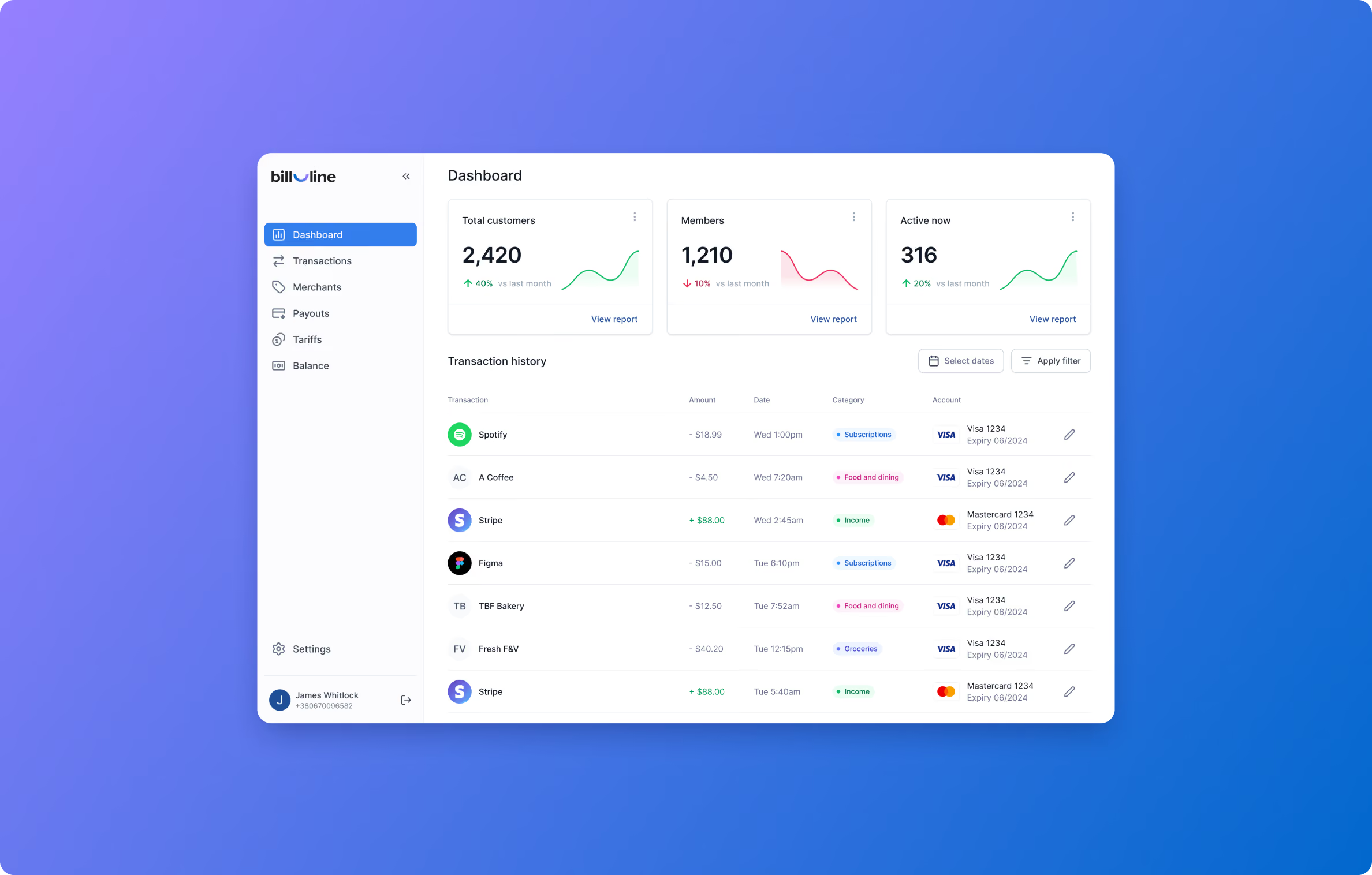
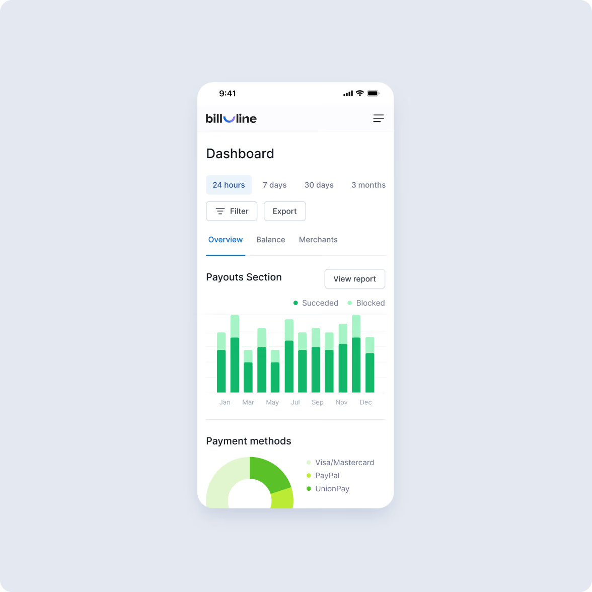
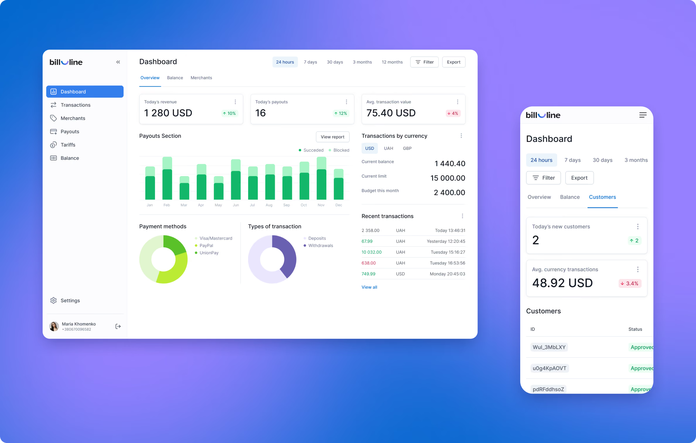
We designed a dashboard that showed key payment and analytics data immediately after login. Information was grouped logically and stripped of unnecessary elements, so clients could track transactions and generate reports without training.
Detailed UX flows covered everything from password recovery to analytics filters. All screens were designed in Figma for transparency during reviews.
A clearer experience across brand, website, and product
Bill_line received a new visual identity, redesigned website, personal account, and dashboard.
The website now has dedicated space for product information and API documentation, while the account experience gives clients clearer paths through registration, reporting, and account management.
The redesign also introduced a lighter, faster website experience, with 98–99 PageSpeed scores reported in the original case material.
Keep product decisions close to the team
The project started with a workshop to define objectives and expectations. From there, the Goodface team worked with Bill_line’s CDBO through weekly calls and daily communication.
That working rhythm kept strategy, design decisions, and technical implementation moving together rather than treating them as separate handoffs.
Start with visual trends before the product logic
Our first logo concepts leaned into gradients and more complex shapes. They looked current, but the visual treatment started to compete with the identity itself.
We returned to a simpler mark and made the motion element do more of the work.
The same lesson came up on the website. The first homepage tried to explain too much at once. Moving detailed product information into a dedicated landing page created a clearer marketing path and gave the team a better page for running traffic.
Every extra step in a payment product costs attention
Payment products ask users to work with information they already consider important: transactions, reports, account data, integrations. When those workflows become harder to follow, the product starts asking users to understand the interface before they can get their work done.
Bill_line’s account redesign shows where to look first: registration, reporting, and everyday account tasks. The same applies to the marketing site. Give visitors the information they need to take the next step, then give deeper product questions their own space.
Want to start a project with us?
Your request has been sent and will contact you soon by this email yourmail@mail.com
Let's discuss your upcoming project on a call
We usually reply within 1 hour during working hours: 9:00–20:00 (GMT+3)


.avif)